Monthly Archives: February 2019

Design thinking? MORE LIKE DESIGN STINKING!! AM I RIGHT!?!?

Oh, what a controversial post title… Welcome, fellow traveler of the #UWinDig seas. Please, grab a seat. Stick around. I did a twitter essay – two actually.

*** (CW: NAUGHTY WORDS) ***

*** (CW: NAUGHTY WORDS) ***

*** (CW: NAUGHTY WORDS) ***

Part 1 – in which I come to the conclusion that the technologist module is mostly fine, but also maybe useless.

Part 2 – in which I talk about design thinking being a sham and make 1 VERY good joke (CW: NAUGHTY WORDS)


Reflection… (a lot of reflection is in the twitter thread, so I’ll try not to repeat myself too much here)

As stated in the first twitter thread, I did not find the module to be that useful.  Though I understand that it would definitely be helpful to a lot of teachers.  As I mention in the thread, their are a ton of great links to useful tools for the classroom.  It’s just that most of it seemed like common sense to me. I’m curious how many others found the module to be mostly common sense. Am I crazy? Am I too cynical?

Anyways, because of this I had a hard time figuring out what to do my reflection on at all. I ended up doing what I always do: complaining.  It was a lot of fun!  I had already been reading about education fads a lot over the last few months, as well as instances of education misrepresenting things from other disciplines (psych and neuropsych mostly).  So this topic kind of lines up all my current education related interests.  If I had more time I probably would have made a silly video, but I’ll have to save that for another day.


Here’s some good links I posted in the twitter thread that I’m going to post here as well, because I’m such a fun guy.

  1. This Vox video on doors that is very interesting

2. This video form a conference that is also very interesting and gives some history of design thinking and the perspective of a designer (Natasha Jen: Design Thinking is Bullshit)


3. This very appropriate (and not at all edgy) Medium post (Design Thinking is Kind of Like Syphilis – It’s Contagious and Rots Your Brains) – *this guy is probably being a little harsh
Design Thinking will mess up your brains. Decline sets in. Enthusiasts embrace sexed up platitudes as profundities and believe smooching lipsticked pigs is innovation. If you manage an organization, you do not want individuals infected with these mental models in your meetings. Their ignorance and gullibility are not assets but liabilities. But for all these issues, there’s an even deeper way in which pushing the DTs in education is problematic.


Tagged , , , , ,

Technologist- A Link to the Link to the Link…

Technologist is an e campus run by a group of Northern Ontario post-secondary institutions and funded by the Government of Ontario. This site provides a vast amount of information regarding the integration, understanding, and communication of technological tools within a learning environment. While the site itself is a great idea to promote digital literacy and application to educators, it is very easy to get lost among all the links that lead to outside resources. While a variety of sources can showcase different viewpoints and ideas, having too many all in one place takes away from the overall site itself. How hard would it be for educators to find these links themselves without having to go through multiple side pages to reach them? In addition, some of the links had more information than on the Technologist site!

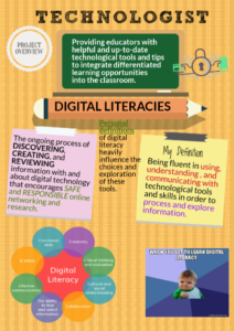
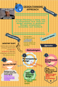
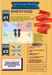
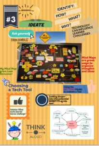
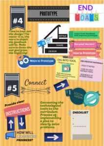
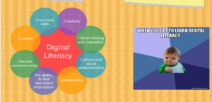
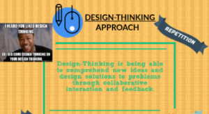
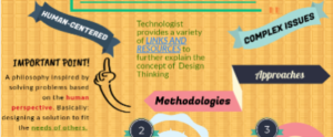
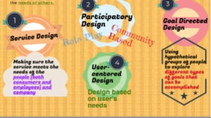
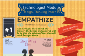
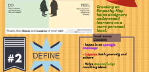
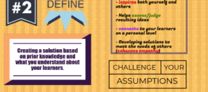
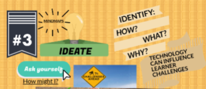
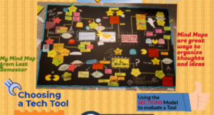
I decided to use a piktograph/inforgraph for this multimedia assignment for a few reasons: 1. I wanted to simplify all the information from the website in an organized and easy to follow format. 2. I was asked not to do another mind map and was inspired to try something new (although I did add a small throwback to my first multimedia assignment by including my pacman mindmap)  and 3. I have never used piktograph before and, considering design-learning is all about trying new things, I figured I would expand upon my own digital  literacy and try this website out.

I chose to use a blank format for this assignment to allow myself more creative opportunities. I utilized a lot of the text blocks that were provided and tried to make it as colourful and informative as I could. Honestly, I really appreciated the fact that I did not have to create everything from scratch like I did with my previous mind maps! I really enjoyed using this site. I wish I had more time to really explore all the potential creative avenues piktograph.com has (on a free account of course).

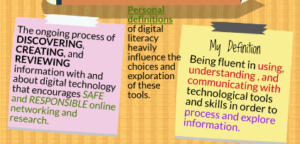
I highlighted key vocabulary from the website that I felt really defined each category. I used these words as starting points to expanding upon my ideas (rather than the actual titles of each category). However, each category is sectioned off by the titles found on the website. A lot of the information is also from the various links provided by the website such as, the empathy map and the methodologies and approaches to design thinking.

I think Technologist is a good starting point to learning about digital literacies and design thinking concepts, but I would not use it as my only resource (even Technologist added extra resources within their site). In fact, I had to look elsewhere for a few terms found on Technologist because it did not give a clear example (or one that I connected with). I believe this was the most challenging aspect of this assignment: trying to properly articulate the information (or lack there of) from the Technologist site.


1. 
2.
3.
4.
5.

6. 7.                                            8. 9.                                            10. 11.                                         12 13                                            1415                                          16 17                                          18 19                                            20 21

Design-Thinking throughout the Ages

As I took the time to read/watch/engage with the full Technologist Module of eCampus Ontario’s open PD modules, I became excited to create a flowchart-diagram using Microsoft Paint which expresses my feelings regarding multimedia.
**It is important to note that the red numbers in my picture refer to the different sections of the module, which are outlined in greater detail below**

[1] Beginning with ‘The Scenario’, we are pressed with the question: “How can we incorporate technology into teaching to enhance learning?”. This implies that there are ways that we can incorporate technology into teaching which would be detrimental to learning. So, the trick is to identify and isolate the positives from the negatives. I found an image representing chaos (the animals swirling in darkness) to represent all of the ways that technology does not enhance learning. This area is rather small in my picture, but I believe that it is a much larger region than that which is illuminated off to the left of my picture.

[2] ‘The Overview’ explains that educators often find themselves standing at the crossroads between innovative use of technology as trendy or as evidence-based practice. It is always possible to get lost in all of the possibilities that technology has to offer and missing the educational values that they provide. To do this, I chose to use The Hermit (IX) to represent a teacher who can see the positives and benefits that technology has to offer in the classroom. He turns his back to chaos and uses his lantern to illuminate all of the possibilities that technology has to offer.

[3] ‘Digital Literacies for Teaching’ explains how to use technology tools effectively to address specific learning challenges. I chose to have Mr. Hermit’s lantern represent this section, as his lantern is what he is using in order to discover technology’s learning potential. With the lantern, he can dim the light, cast it more brightly, and chose which direction to aim it. This is how he sifts through the darkness and finds the benefits of digital literacy.

[4] ‘Design Thinking Approach’ relies on feedback to improve the ideas. The light represents feedback as it is used as feedback, so that the light bearer knows where to look next.

[5] ‘Empathize’. The different directions of the light will gather different pieces of information such as the questions asked in the empathy map template. Design thinking starts with empathy.

[6] The ‘Define’ step is about narrowing in and identifying a problem, or in our case, a challenge. Each star that the light bearer can see in my picture represents a problem. Now that the problems have been identified, an action can be made in order to get closer to solving them.

[7] In ‘Ideate’, it is suggested that we form a mind map to form and build the ideal features and characteristics of how technology could address the challenge. Such as what has been done numerous times throughout our history, I tried my best to have star constellations to represent a mind map. This figure ‘Orion’ has been mapped in Egyptian times (specifically his belt).

[8] ‘Prototype’. I had this cuneiform-man represent the designing of a prototype from the creation that he saw in the stars. He gets to work on an idea, and uses his (at the time) state-of-the-art technology in order to design his vision.

[9] ‘Connect’. This cuneiform-man visualizes how to ‘integrate this integration’. He can see how this project will be brought into fruition. He needs to find a way in which his people can incorporate technology and bring his vision into existence.

[10] ‘Module Checklist’. The pyramids are as old as time itself, and yet they are so close to perfection. Laid out to mirror Orion’s belt, it is amazing that the Egyptians were able to create such a masterpiece. I am arguing that design-thinking was used in ancient times to help educate the population and ultimately create one of the wonders of the ancient world.

This is where my head went as I read through the module, and I was excited to paint my picture to illustrate my thoughts. I hope that you enjoy reading about my interpretation, and thank you for your time.

David Meloche (103428042)

Technology in the Classroom

After reading the article and examining the Technologist module, I found it very interesting how technology and the classroom intersected with one another. Furthermore, I found that there was one major positive factor that came out of the using the module. More specifically, the use of this sort of module allowed students with many different learning strengths, abilities and methods to be able to participate and interact with the same information. Not only would this allow for an entire class to progress through a lesson or unit at a similar speed (and thus allows the class a chance to come together and discuss the information they are currently covering), but would also allow the teacher to administer the class to a number of different learning styles. Furthermore, I also feel as though the module provided a quality introduction to those students who might not be very technologically savvy, as well as a good refresher for those students who may have been away from technology for a while. In addition, I also enjoyed the fact that the Technologist module emphasized the importance of gaining quality feedback from the people using the module; namely the students. While those who are creating the module might think that every aspect of it have been well-designed, those who ultimately use the finished product might have a different viewpoint. Clearly, gaining realtime feedback from those students who are actually interacting with the technological tools can prove massively useful to the producers of these types of modules. That being said, I feel as though there was a missed opportunity for the producers of the Technologist module. More specifically, the producers could have provided multiple different experiments and activities that teacher candidates could eventually implement in their classrooms. While it was nice being able to experiment with the activities that were provided, I feel as though a list (even at the end of the module) of potential classroom activities could have given users of the module another educational resource. Furthermore, I really enjoyed engaging with the module for this media reflection as it provided a more interactive experience than some of the other previous articles. Overall, I found the module very useful because it provides an effective way to implement useful technology within the classroom.


https://www.powtoon.com/c/ghhjmniTeQb/1/m


Technologist taking tech on as a Teacher

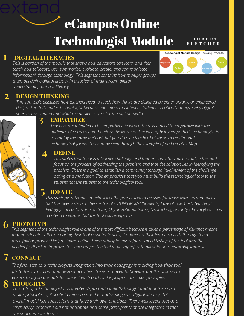
Going through the role of the technologist on the eCampus modules proved to be an eye opening experience with it showing me how much that is taken for granted as an educator who was raised into a technology the skills that I employ naturally, but a majority of teachers would not. There is a natural effort throughout our lesson planning to integrate technology into the classroom so that it is relevant to the audience, therefore aligning it with curriculum. However, the one concept that I found that I commonly skip or overlook is the prototype stage, where I learned that I tend to just risk it but not form a controlled risk or have a segmented release of the tool. This made me self reflective of the tools that I do use in my lessons and it made me realize that there is many different tools that I use but they fit the same mold . That mold is traditional education through quizzes or testing of knowledge, such as kahoot or mentimeter. This made me critically reflect on the fact that I may use technology in the classroom but it might not be fully addressing the challenges of the learners which is the end goal for integrating technology. I understand that there may be a use of technology in the classroom but it may not be effective. The role of the technologist has so many steps and subtle nuances to ensure that when you as an educator employ differentiated instruction that it not only understands the class problems but properly addresses them. Furthermore, we always learn about student centered learning as a core concept to most teacher pedagogues, however I learned that you need to select the tool for the student not the technological tool that the teacher enjoys. The overall module for technologist was effective because it mirrored what it sought to enforce by providing multimodal education with it having facets that appealed to multiple different types of intelligence by utilizing textual, visual, auditory, and linguistic elements to reach the audience. this is effective while at the end it models further strong educational skills by emphasizing the value of feedback to improve its modules, while recognizing the fact the facing constructive criticism is one of the hardest parts of integrating a new tool into the classroom. This module had a far greater depth than I had anticipated which is the reasoning for why I chose to do an Infographic because there was far too much information to express with a more visually driven platform such as Powtoon.
Tagged ,

Ecampus Ontario PD and Me

This weeks’ resource can be found at https://extend.ecampusontario.ca/modules/.

Unlike the previous multimedia reflections, this time we are discussing a professional development module as opposed to a journal article. Within the PD module, they creators discuss how to integrate technology into the classroom, in order to solve a student’s learning challenge. Overall, the module included some interesting ideas but was overwhelmed by unnecessary jargon and a number of obvious remarks. The extend activities were supplementary tasks that could be done to improve the process, but many had minimal significance.

If it aint broke, don’t integrate it.

I know I know. I’ve been talking all year about doing a stop-motion multi-media response at some point. Well, the end of the semester came at me like a freight train with a rocket tied to the back. So sadly, I had to opt for the classic twitter essay. I did one of these essay’s before and I really enjoyed the dichotomy of memes and scholarly prose. This time around, I took a look at a article which focuses primarily on how we can utilize different digital tools within our classroom to achieve different results with our students. As teaching is a self-reflective profession I thought it wise to broaden my horizons with regards to technological integration in the classroom.

The article focused primarily on classroom integration from a student standpoint, that is, integrating technology that is accessible to all types of students from different walks of life. I am very technologically savvy so when I interact with new types of tech I rarely have issues. My problem is that I think my own proficiency extends to other users, so while I may think something is easy to use, others may struggle with it. For example, I have simply been integrating technology simply for the sake of integrating technology, but the article urges us to integrate technology ONLY to fix a solution within the classroom. While I think this severely narrows down your ability to integrate, it makes sense on a grander scheme of things.   The website provides me with a very clear ‘step by step’ procedure for integrating technology into the classroom and a pace more friendly to less tech savvy users and avoid overwhelming them.  You can check out my twitter below for my thoughts about each ‘phase’ for the Design thinking approach and how each of them contributes to a effective classroom experience.

Please check out my twitter essay below!

Technologist Module – Great Idea, Poor Execution

This “technologist module” presented to us I think is a good idea done wrong to be perfectly honest.

Let’s start off first with the good aspects of it. The core information trying to be presented is excellent and is something that I would think about daily in the classroom. The “design thinking” approach I think is an excellent way for teachers to quickly triage which platforms and tools can be the most effective, and which other ones are superfluous. I think when new digital tools for the classroom are created, they are too often made by a tech start-up who are too invested in the original idea they had instead of going back to the drawing board. This is a problem not just for tools created for the educational market, but also any app or platform which started off as a good idea theoretically.

Making sure these tools are human centred and useful comes first and foremost when introducing these tools in the classroom. I like to think of it as “digital ergonomics”. I have no idea if this is a widely-used term yet, but if it hasn’t been created, then I will gladly take credit ;). I feel like a broken record saying this but far too often, humans are forced to work around the technology, rather than the technology working around their needs. I don’t blame anyone in Silicon Valley for it, technology moves too fast to be optimized. We must though take this especially into account as educators. We have higher stakes than your average joe much of the time, what we do affects the upbringing of the next generation, and the tools we use must be as close to perfect as possible.

The module also talks a lot about digital literacies and teaching them in the classroom. I think there is a deep irony to talking about teaching digital literacies in the classroom while also trying to introduce certain tools like Powtoon, and Piktochart. They make it easy and accessible for anyone to make a video or infographic respectively. Unfortunately, I also think that they do not really teach us true digital literacy. Instead they act as drag and drop tools which don’t really teach the students anything about the intricacies of the computers. They teach aesthetics and how to make something look presentable and professional. Those are real skills which students need to be taught. In terms of teaching about technology though their value is nil. We used to learn in school how to use photoshop and flash to create the same things Piktochart and Powtoon do now. I think those older tools taught us a much deeper understanding of how video and chart making is done professionally. You would never use one of these tools if you wanted to do it even semi-professionally. While I understand that there is an argument for these tools act as a “gateway” into doing more advanced things, I just don’t buy it. Students will choose the path of least resistance and if they use these tools once, they will be more tempted to use them in the future. The one place I do see a use for these tools though is when students must make presentations themselves to their class. Then these tools could be useful, but I still hold to my point that making videos and graphics using more advanced, professional tools even for a history or English presentation, will further their learning better than these easy platforms online.

Finally, I have my critiques of the module itself in this short YouTube video I made. (And yes I also understand the irony in the video of me attacking buzzwords and overly academic language while using some of that in my blog post)

  • Connor Pierotti

INTEGRATING TECHNOLOGY INTO THE CLASSROOM

For my multimedia reflection, I have done a Twitter essay, being my first time to use this sort of platform. In the past, I have done sketch notes which I enjoyed. Although using my twitter as a platform to communicate the importance of technology into classrooms, seemed like a great tool to share my input publicly. It was also very easy to include gifts in association with my points, as well as visuals and diagrams in which I referenced to. My Twitter essay is in response to the Ontario Extend article on technologist Scenario. Through this model, they discussed the many steps in which one takes to ensure a smooth transition when implementing technology into the classroom. Technology is growing and evolving every day, that is why it is crucial that educators become familiar with this tool. It can be used to overcome many different learning challenges faced in the classroom. This module was particularly easy to breakdown for educators when thinking about implementing technology into the classroom and how to do so. After reading through the various steps, I personally felt less intimidated by technology as it provided many additional resources that I can utilise in the future. I’ve learned that technology can always be refined and altered with the help of your student’s feedback. What I really enjoyed about this module was how this approach is human-centred, meaning the people who contribute to its design are the ones who are also benefiting from it. This module talks about the importance of Design Literacies, and Design-Thinking process which is broken down into six sections: empathize, define, ideate, prototype, and connect.  Along these steps, this module provided some very useful resources and tools that can ensure we are taking into account our learner’s challenges, while also considering the valuable feedback of our students, which in turn help us shift our teaching practices.

The link to my twitter essay can be found here: https://twitter.com/MissWillson1/status/1098378292414087170

Digital Thinking!!!

The use of technology in classes nowadays is becoming a necessity. Most educators are using technology superficially and they are not diving deep into its strengths and potential.  This technologist module acts as a guide for every educator interested in integrating technologies in a way that supports, facilitates, and enriches learning experiences as well as cater for all students’ differences.

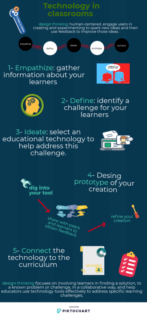
In this article, the Technologist Module first discusses the digital literacy which is the ability to locate, use, summarize, evaluate, create and communicate information while using digital technologies and web-based platforms. Then, clearly outlines an approach to design thinking that follows the path Empathize, Define, Ideate, Prototype, Connect and Test.

Design thinking starts with empathy. Gather information from and about your learners to understand what they need and their interests.

The second step is to define, which means narrowing in and identifying a challenge based on the information gathered from your learners.

Then ideate: build the ideal characteristics of how this tool could address the learner’s challenges, but when choosing your tool, make sure it is a good fit for your students, course, program, and institution.

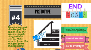
Then, come the time to design a prototype of your creation. Dig into your tool to learn more about it, share your creation with your peers and learners to obtain feedback. Based on their responses, refine your creation.

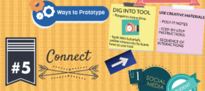
Finally, connect your creation to the curriculum and link it to the learning outcomes.

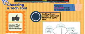
I learned throughout this course how to become more comfortable with integrating technology and step out of my comfort zone, but this module showed me a different aspect of integrating technology which is using technology tools to address specific learning challenges. In my practicum, I did not use technology much, but I noticed that few students, who were not so interested in classes, got so excited and attracted to the lesson when using technology. Relating my experience to the article, I think that integrating technology in classes serve a bigger role by providing differentiation tools to address all learners. I used pictograph again for this multimedia reflection, I find this platform easy to navigate. This time, I explored it further and I am happy with the result.