Category Archives: 332thursday10

NOW THIS IS A STORY ALL ABOUT… “FRESH” DIGITAL YO!

This multimedia reflection serves to emphasize the article on Teaching in a Participatory Digital World and the online video with Henry Jenkins It is important that educators understand that “digital technology” has changed our perception of education.  I believe teachers and students must work harmoniously with one another and create environments that allow for an exchange of learning on many different digital platforms.  Jacobsen suggests the idea that teachers matter too, their practice matters, and the classroom environment they teach in should be used to foster knowledge.  These ideas make me think about how I use digital media in a purposeful manner.  When I begin my practicum experiences, what affordances will I have? What connections will I make with curriculum and with the technology I choose to implement? Most importantly, can I make learning effective through digital media platforms?

Before reading this text, I must admit I was hesitant to choose this topic, as I was unsure about this article would come across.  I assumed it was my duty as a millennial to know and understand the digital realm–after all, I grew up in it!  After reading, I was amazed to see how this can be implemented into my own practice.  After my own practicum experience, I started to get a sense of working in conjunction with students and how important it is to use technology in a representative way to deliver curriculum.  I believe this can connect me to relevant world events, solidify connections with students and augment lessons to be creative and effective.

For this multimedia reflection I decided to create a PowToon along with a music video.  I found this to be the most effective platform to use while reading this article and watching the Jenkins video.  I had a great experience using PowToon and believe this form of media provides me with the confidence to deliver powerful and influential learning objectives and outcomes.  As I have used this before, it was nice to be comfortable in a platform, while still learning new ways to add creative texts, fix tiny timing errors and implement intricate details and subtle allusions to material.  I hope to use this in my own class one day and maybe it will spark a vested interested in classroom material.  I hope you enjoy this video and please leave a comment—(constructive feedback is welcome!).

In addition, as Henry Jenkins explains, we must not “safeguard” any of these digital media sources, but use the technology at our finger tips.  I hope to use media itself, not use alternatives to these sources.  I want to use Twitter, Facebook and PowToon sources to redefine my teaching practices.  I do not want to look for other versions that are “second best,” but instead use the technology that is already given and make good use of it in a classroom setting.  I want to be a good role model to students and demonstrate how to use technology appropriately and represent uses for it within the classroom. I value the importance of learning new skills and do not fear technology, but embrace it.  Will this be easy? No! But I like the uncertainty.  I hope to create a forum for collaboration, create conducive learning spaces and open sources that are accessible to all. I am ready, the world is too!

This is a music video I have created, and it was not an easy task.  I did not fully understand what concepts I wanted to pull and what I needed to do to show from the Jenkins video.  When I first viewed the video, I pictured a go-getter, an individual who was a media agent for social change in a positive way.  I was walking around the house aimlessly with my laptop in my hand and was trying to figure out something relatable to this.  Well… my sister had on the “Fresh Prince of Bel-Air,” I was enlightened and extremely anxious to begin.  I ran to my room and knew I had to create the theme song with my own version of the words. It was a revolutionary experience, because I had found a connection to the material that truly resonated with me. Henry Jenkins is a media agent for social change and I considered Will (the main character) to be an individual who initiates change and pushes boundaries.  In class, we focused on being model learners as educators, looking at our artifacts with a revision lens.  I believe this form of reflective practice helps initiate conversations that inform education and develop new insightful learning techniques.  This was my inspiration behind the video… and I hope you enjoy it!

Enjoy,

Anthony Pisciuneri

Tagged , , ,

How Technology (Should) Participate In The Modern Classroom

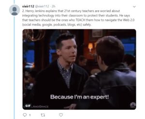
The Influence of Participatory Culture on Education is a short video that really cuts to the chase. As an in-service teacher, I can understand how scary it might be to include social media in a classroom. There is so much at risk. But like the podcast from 3 weeks ago mentioned, some risk is worth the reward.

I was really surprised when Jenkins said certain social media-based school conversations is considered cheating. I couldn’t agree with him more when he says that this just enforcing the old-school autonomous learning model. There is no difference talking about exam material face-to-face or on social media. This is one of the ways technology is excellent for education. Students can come together in a time of desperation and can help each other out with just the click of a button.

The second main topic that Jenkins covered in the video was an interesting one. I admire his intentions, however I am afraid I don’t feel exactly the same about open sourced free online education. We’ve all learnt so much from YouTube since its birth in 2005. Jenkins believes that University Professors should upload their course-related videos to the life-changing social network instead of uploading them onto a privately owned network ran by the institution. I understand that some students who deserve an education but can’t afford it would benefit immensely from this. However I am concerned how this will have an effect on teacher employment in the future. Like I mentioned in my Twitter essay, is it possible one day that a few remarkable teachers might take over the jobs of the rest of us? It is impossible to know.

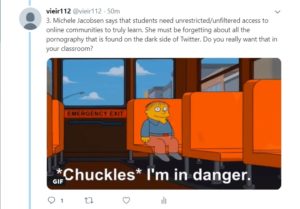
In my Twitter essay I talked about how Michele Jacobsen (Teaching in a Participatory Digital World) thinks technology can relate to real life work which would potentially get students excited about their future. She says students would get motivated about “[…] opportunities that are similar to the everyday activities of [working] professionals”. As a future math/science teacher, naturally this got me thinking. I like the idea of having my students do an project about global warming or the importance of recycling, and being able to share it with other students around the world. Or an arts teacher could upload the class’ anti-bullying posters on the internet to spread awareness. The possibilities are endless.

Finally, since reading this article, I’ve been struggling to think outside the box of how I can include technology into a mathematics classroom. I came up with one idea where perhaps students could use www.desmos.com to plot functions for an assignment that I have yet to come up with. This would graze the surface of programming functions for those who are interested in pursuing a career in that field one day, and for the rest of them, they would gain skill on a graphing calculator.


Twitter Essays are my new favourite way to publish my multimedia reflections. I am not a very visual person, so this allowed me to express my thoughts through words and GIFs. The biggest challenge was staying within the 240 character limit per post. I do appreciate the existence of this character restriction because it forced me to summarize the video/article and format my essay with informal bullet points. Because each post ranges between 1-4 sentences, hopefully it also captivates the reader more than a regular essay would.


To read the Twitter essay in its full glory, click here.

To watch Henry Jenkin’s video, click here.

To read Michele Jacobsen’s article, click here.


Tagged

IRONIC USE OF TEMPLATE TO CRITICIZE USE OF TEMPLATES!!!

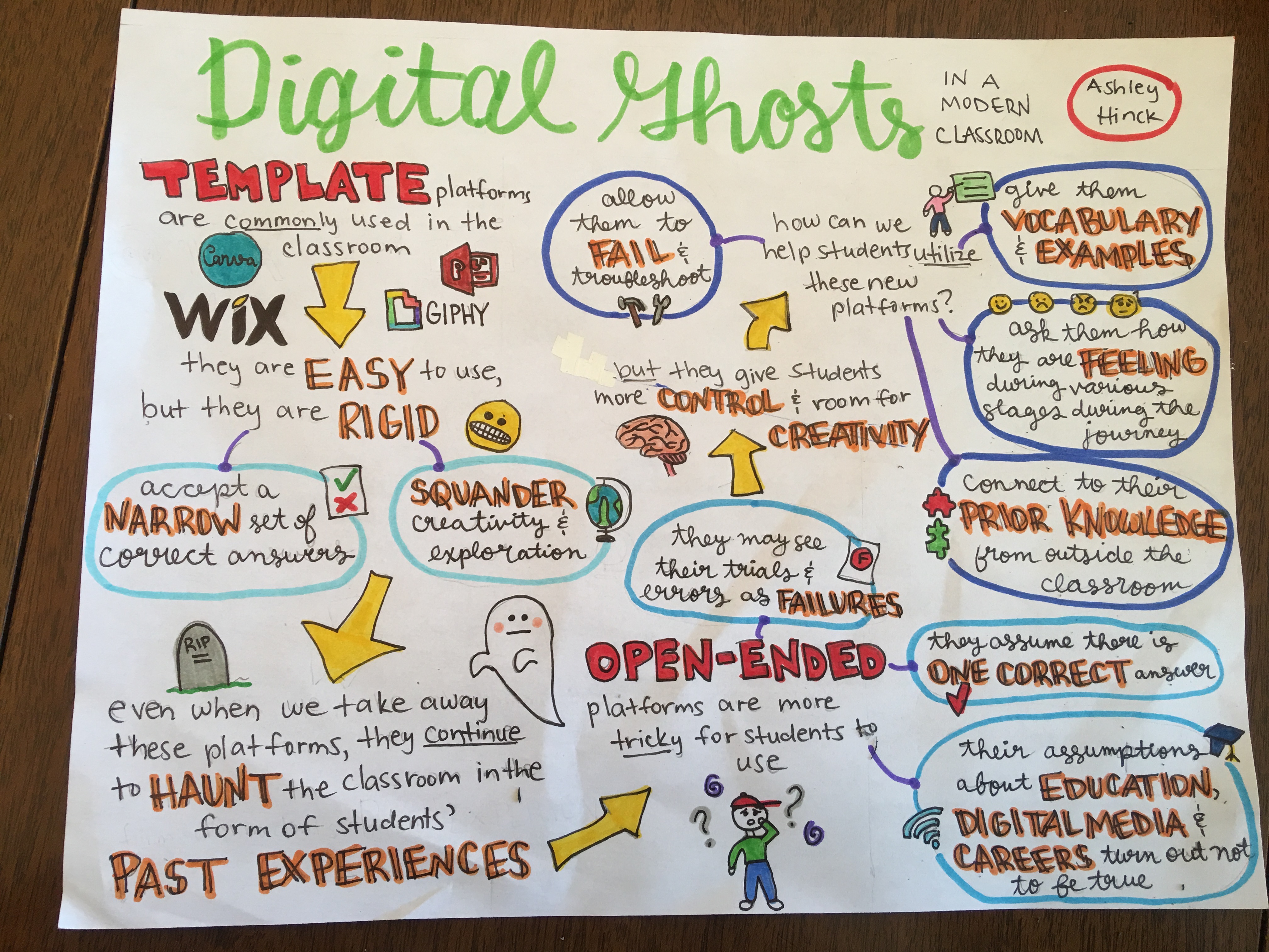
I have chosen to respond to Ashley Hinck’s article “Digital Ghosts in the Modern Classroom.”

Check it out! http://hybridpedagogy.org/digital-ghosts-modern-classroom/

I chose to make an infographic using Piktochart, because I had never heard of this website before this course, and after looking at a few sample infographics, I decided that I would like to experiment with it.  I also loved the irony of selecting an infographic template for a response to how students should not use templates, as they limit creativity.


Irony GIF - Find & Share on GIPHY

via GIPHY


Overall, I enjoyed using Piktochart.  I think that this platform allows users to generate professional looking infographics, by simply choosing layouts, fonts, graphics, and colour schemes (or by adding to a template).  I appreciated the number of creative options available to me.  I also liked that fact that I could use so many design and graphic elements without having to upgrade my free account. Although I started with a template, I was able to alter many different aspects, to create something I was quite proud of.  After reading the article, I do realize that since I chose to use a pre-existing template, I did limit my creativity to what I thought would look nice according to the original design of the infographic.  But, I am still impressed with my end result, and with my choice of using Piktochart.  I highly recommend it to anyone who would like to make an infographic!

I related to the students mentioned in this article quite a bit, considering that throughout my whole educational experience, I have liked using templates that are provided to me, and I have always enjoyed simple assessments, such as worksheets and multiple-choice tests.  After reading this article, however, I realize that throughout my education, I haven’t been able to be too creative in the way I approach my assignments, as there are usually specific outlines, and formats that must be followed.  If I had had more free range with my assignments, I think that would have allowed me to take more risks, and not be penalized if I didn’t get the perfect end-product that the teacher had in their mind. This is especially relevant to my science courses, as the way that my teachers had written assignments, and tests, there were only one correct answer.  I am not suggesting that there should always be numerous answers to questions, but that if they expect us to achieve higher level thinking and learning processes (as shown on Bloom’s taxonomy), they should allow more risks and less clear-cut answers.

Coming into this course, I don’t have that much digital knowledge, with respect to creating digital multimedia.  And if I hadn’t read Hinck’s article, I probably would have sought out very formatted, less creative, platforms to create my projects.  I am looking forward to experimenting with many platforms, that really allow me to explore numerous features, without specific expectations of what I should be able to create.  On the other hand, last year I created my own website from scratch as part of the Internet course I took at uWindsor.  I was so proud of myself, when I was able to write code and every time I updated it, my website would change accordingly.  So, I understand the type of frustrations that are mentioned in the Hinck article, but I also understand how exciting it is, to see your digital multimedia come to life!

If the infographic doesn’t load, try this link https://create.piktochart.com/output/33087202-multimedia-reflection-ghosts

#UWinDig

🙂

Ghosts of Teaching Strategies Past in the Class

Reading “Digital Ghosts in the Modern Classroom” by Ashley Hinck has given me a new perspective on teaching in schools and how that can bleed into other aspects of life. In it, she talks of how many of the digital programs that students use have a ‘drag-and-drop’ template. When using these programs, there is minimal input from the student. The template and format are already set, and the student can only exhibit influence creative divergence. This format of one correct way to do something is a direct parallel to how information is passed to students in schools. There is typically one correct way to do things, with any deviation being penalized with a lower grade. This can in turn make the student afraid to experiment with different formats and technologies.

By mainstreaming digital applications and school, students are unprepared for the more open ended aspects of design, including using HTML coding. Teachers should try to engage their students in more creative and exploratory projects that are more open ended. This can allow the student freedom to explore without worrying they are deviating too far from an “A” level project.

While I overall agree with the article, I will say I don’t agree with every aspect. There seems to be a complete condemnation of the template structure of many digital applications. For some, such as myself, the creative aspect of projects comes a little slower than others. Having a template to start with can be a great gateway into more creative projects. I will agree with Hinck in that dependency on these templates can become a disadvantage. However, I think they have a use to help people start out in their digital journey of creativity.

If the image doesn’t load properly, please check out the link for the online version of the piktochart.

Pushing the Pendulum BACK

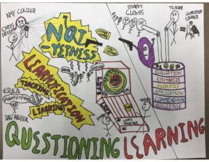
I created a SketchNote to demonstrate the main points of the podcast titled “Questioning Learning.” The coordinator of the podcast, Chris Friend, had special guest Amy Collier to explain her thoughts on how education is viewed and how to challenge the norms. The title of my SketchNote, “The Push for Critical Pedagogy,” refers to the image of Amy Collier pushing the pendulum back to the other side of the page. In the podcast, Amy describes that the pendulum has been pushed by the restrictive education system and we need to PUSH BACK in order to have critical pedagogy.

On the left side of my SketchNote you will see cooler colours and a noticeable difference in structure to the right side. The left looks like it was built from building blocks that could be found in a kindergarten classroom. This is to show how structured and confined the learnification pedagogy is for students and teachers. There is no room for interpretation or to think outside of the boxes. The image of the cannon demonstrates all of the information being shot at students, which is then required to be memorized. There is no creativity or encouragement to question the world. I chose to draw the left side of the paper as if it could be found in the teaching curriculum. The learning outcome tells you exactly what you will end up with if you follow the steps. The following steps do not promote critical thinking, curiosity, risk, etc. To the left of the building blocks you will see a picture of a student’s thought bubble being manipulated by a teacher with puppet strings. Teachers are telling students how to think. The conveyer belt at the bottom shows the end products from following the instructions–robots. The students are being taught to think the exact same and this is very dangerous to our society. School is becoming a factory, which I tried to represent here. Society needs unique, critical thinkers in order thrive.

On the right side of my SketchNote, you will see bright, happy colours. I decided to create this side of the SketchNote to represent a road. In the podcast, Amy suggests that learning outcomes can act like a road map for students, and they aren’t always negative. The right side of my SketchNote almost looks like it is under construction with the yellows, oranges, and reds–which is exactly how I think learning outcomes should be thought of. As I wrote on the bottom, the road of learning and understanding is never complete. We will be learning our entire lives and cannot be restricted to the end-products of some learning outcomes defined in teaching curriculums. Amy Collier describes the term “not-yetness” and how students can be on their way to building the experience, but haven’t fully grasped it quite yet. Amy says we should be embracing risk, uncertainty, discomfort, unpredictability, creativity, and curiosity.I made sure to put trees, flowers, and green grass to show growth on this side of my SketchNote. Our students will be on their way to find their fire–or as Amy referred to it “what makes you tickle.” I decided to put a welcome sign, like students would be arriving into a town on the road, for when the students finally find their fire. I also noted that the students will not only survive, but THRIVE. This is so important in education, and I am so happy I listened to this podcast, which has caused me to really think about the structure of the education system and what we can do to make change.


Tagged

Are templates SQUANDERING our students’ creativity??

Reading the Hinck article brought new insight into my perception of digital learning. I have never thought about how template websites could actually be hurting our creativity, I simply thought of them as an easier way to create and design projects. I agree that using more open-ended platforms can help students grow overall as creators, but I worry that this may be difficult to integrate into every-day classrooms. Subjects such as the Digital Media class that Hinck teaches may find it easier to utilize these platforms because learning how to use new technology is what that class is all about. However, when trying to integrate technology into a science class, for example, more complicated programs and software may not be practical due to time constraints, and the limited technical knowledge of the instructor. Though I think that we can easily give students more creative freedom on a smaller scale, such as instructing them to create their own themes on Powerpoint by using their own mixtures of fonts and colours instead of using pre-set themes.

During the process of completing this assignment, I came across some technical difficulties. I started out using the platform Animaker which allows users to “easily” create animated videos. I found the platform to be very slow and lagging, so I decided to switch to what I know best, which is pen and paper. I enjoyed creating this Sketchnote, and found it to be quite relaxing and fun. In the future, I hope to utilize more technology for my Multimedia Reflections.

Nicole Langlois


Who Will You Decide to Be …?

Based on the article “Digital Ghosts in the Modern Classroom” by Ashley Hinck, I have decided to create a sketchnote to portray my thoughts. In the sketchnote, I focused on the human brain being the center and key image of the sketchnote. This is to display that our minds have a lot going on and sometimes it is difficult for students to take in so much information at once and try to filter out the important stuff. As educators, there should be no “standardized” practice, therefore students should be able to be provided with more opportunities where they are able to be “creators, makers, and speakers” through the process of trying something new and failing. This will allow the students to become more confident and think outside the box, rather than being afraid and experiencing the “not-yetness” feelings of not being ready. Students are faced with a lot of pressure to create pieces of work that are what they deem to be “correct” or what is advised by the teacher. In my sketchnote, the brain is in the center of the page and embraces a bright outlook of being a maker, creator and speaker, yet there are a lot of other things going on along the sides of the page and this is to represent all of the other distractions that students are sidetracked with, since they are aware of what is “correct” or would be approved, but need to also realize that individuality in one’s work is essential. I have decided to use emojis in my sketchnote as well because I thought of them as an analogy to students being robots. The quotes that are written along with the girl emoji are common phrases that students would be likely to express, which depicts uniformity and lack of an open-mind. Every student should be able to express their own creativity in the medium of their choice. Students should be able to explore technologies without having the teachers or their own level of comfort hold them back from trying out something new. Without doing this, students will always have the fear of not being right or constantly be searching for only the “correct” answers or ways of approaching something, rather than exploring another approach. It is important to let students know that doing something different is okay, and that limiting one’s self takes away the beauty in individuality which is what I tried to depict in my sketchnote. As an educator, in my own practice, I will try to explore this aspect of allowing students to be creators and explore new pathways of learning and creation, and I think that an effective way to do this is by practice. Showing students myself, different ways of approaching how to learn something in several ways will potentially allow students themselves to break out of their comfort zones and know that it is okay to try. I will also emphasize the process of trying and failing being apart of the learning process by demonstrating this in the classroom as well. In technology, not everything works the first time, and showing students that there are alternatives to a solution will show them that problem solving and not giving up is the key to finding a solution. Overall, using digital media should be a learning process for the students as well as the educators, and it should be a continual process that would benefit both parties in the long run. Don’t be afraid to try something new!

I am noticing that my sketchnote is also blurry as I try to resize it bigger, so click here for a link to the larger version. Enjoy!

I’m experiencing a haunting…HELP!

I’ve just read the article, “Digital Ghosts in the Modern Classroom”, by Ashley Hinck and I have to say it was an interesting read.

Check out this link for a quick infographic on my summary of the article and a few of my thoughts.


I think the main idea behind the article is a sort of tension that Ashley has noticed between the previous/ current model of education and creativity. She clearly sees how this negatively impacts the way students in her digital classroom want to interact with digital platforms. So in a sense, the education system is very teacher-centred, and students just follow a set of directions (prescribed by the teacher) to arrive at a satisfactory finished product which they are then marked on. This causes them to want the same procedure to be followed in making digital media. They want templates and a series of steps to follow. She calls these the digital ghosts in today’s classrooms. I imagine this is very frustrating, because digital technology is the “new frontier“ of creativity so why would everyone follow the same old procedures? According to Ashley, a way to combat this, at least in her classroom is to allow students to experiment with open platforms where they can make mistakes and make their visions come to life. Also, they need to be able to critically examine whatever platform they are using and consider the affordances of that platform and whether it allows them to create a digital artefact the way they envision it. This can also be applied to education in the broader sense, where, within any content area, students should have room for creativity and making mistakes should be a part of the success.

I had never really thought to critically examine the way we have been taught in school and higher education until I got to teacher’s college. I definitely agree with Ashley on the fact that a lot of education is very teacher-centered. This applies to digital education as well. But I don’t know if I agree with the fact that to be creative you must use open platforms. Now, as someone who doesn’t dabble in the digital media world aside from consuming it, short-cut platforms are great. It allows me to participate in many-to-many communication using a digital/visual medium. I think for someone just starting out, short-cut platforms can be a great introduction to the digital-media creating world. If I had to do the same but write code instead, to get my message out there, I probably wouldn’t get very far because I don’t know anything about it. Now, that does not mean that I will not try to learn how to do it. But that takes time! So I think it is important to look at whether you are creating a digital resource/ website to show your creativity or to make art or whether you are just using the digital medium as a vehicle for the knowledge you want to share. In the latter case, maybe a template platform would be a better idea.

As an emerging teacher, I realize that this opinion means I am still at the Enhancement stages of the SAMR model and not yet the Transformation stages. But as I learn more and more about these template/ shortcut platforms, I am increasingly interested to learn how to design and create my own resources. Maybe even from scratch!

I used Piktochart to make the infographic for this article summary and really enjoyed it. It was my first time creating anything digital and while I was initially really nervous about it, I ended up having a lot of fun playing around with colours and graphics. I did have a few moments of frustration and I can see where Ashley is coming from because there were certain instances where I couldn’t do something I wanted to do because of the template I was working with. Even considering this, I would 100% use Piktochart again and look forward to using it with my students in my teaching career.

Thanks for reading! Post some of your thoughts below!

Bharti Mor

Tagged ,

To Learnify or to Not Learnify…that is the Question

For this multimedia reflection, I chose to do a sketchnote on the HybridPod – Questioning Learning. At first I was not too interested in going through this podcast because at the start, Amy Collier, the interviewee, was using many terms that were a bit ambiguous.  Some of these terms include learnification, not-yetness, and critical pedagogy. As the podcast progressed, I naturally started to gain a better understanding of the terminology being used. I became interested in the learning aspects and models being discussed.  The podcast focuses on the idea that education should be more willing to be fluid and ever- changing, rather than structured and strategic at times.  As individual’s learn in many different styles and modes, educators must be able to accommodate these styles and learn to incorporate them in our teaching practices.  Amy describes how life is not meant to be controlled by a formula, but creative and expressive factors.  This idea is reflected in how it may be risky for future educators to take strides and do things with out of the box thinking, but the rewards for it are remarkable. I think it is really important that teachers understand this idea and start implementing it in their classrooms.

Digital Assignment 1 PodCast PDF

In terms of the sketch note, I had never done anything quite like it this art form before. This past weekend, I attended a retreat that included a few guest speakers and received the chance to practice sketchnoting in real time. At first it felt really uncomfortable and I felt anxious about other people looking over to see my different words, sketches and unrealistic ideas, but eventually I came to truly enjoy it and realized the benefits of using this artistic form.  As a future educator, I hope to incorporate media into classroom settings through forms of augmentation, modification and hopefully one day, redefinition.  This will allow me to embrace the field of media and new advances and reach all students, learning styles and abilities.  I am not afraid to go “out of the box,” feel uncomfortable and pursue uncertainty in my teachings.  It pushes me to reach new boundaries and formulate new effective practices.  I hope you enjoy this sketch note (mind map).

P.s. If you are looking for a link to the podcast, click on the link below!

http://hybridpedagogy.org/questioning-learning/


Tagged , , ,

Ghosts in the Classroom! I Thought You Ought to Know…

I have chosen to read and reflect on Ashley Hinck’s article entitled: Digital Ghosts in the Modern Classroom.

In short she sparks a discussion about template and short cut media making platforms available to students today such as, Canva and WIX, and how these platforms are ultimately hindering their creative learning process. You see when a student is limited by a rigid number of designs, styles and inputs they can only be as creative as the program allows them to be. There is very little in the way of trial and error as one can simply drag and drop from a menu. Slowly these programs are turning our students into robots that can follow a linear path of instructions to reach a common, and often predicted, outcome. This path convinces students that at the end of their media assignment there is a correct way to display their ideas and an incorrect way to do so, based on the teacher instructions and the limitations of the programs suggested to them. However, this is a false notion and will cause them great disadvantages as they move forward. These individuals will not be able to handle failure when faced with a creative challenge they must complete on their own, ads they have not developed the skills to start from scratch and learn through the mistakes.

To banish these “ghost” platforms Hinck makes many suggestions. First she states that, as educators it is our job to analyze the tech we are using inside of our classroom but also what is absent. Perhaps introducing more open-ended and free form programs such as, Raspberry Pi, Scratch, CSS and Python to entice students to build from the ground up something they can be proud of. These programs demand trial and error (especially error) in order to better ones ability to create. She also used LEGO as an example outside of classrooms, some sets have instructions that meet and end goal but the pieces can be put together in so many ways without instruction that the opportunity to create is nearly endless.

All in all, she is asking us to think about the skills and outlooks we want our students to have when they leave our classroom and look deeply into the tools we use to do so. Students are not jars that we just fill with correct answers hoping they will one day come out on top. We need to teach them how to see failure as growth and be proud of finding skills on their own.

I whole heartedly agree with what Hinck is saying in this article and it honestly made me realize that although I have some knowledge of these open ended systems I too am a product of ghosts. Especially for this project, I used Piktochart which is a drag and drop template website. I chose a template, wrote words and found images to match my thoughts. I did not know how to stretch the medium more to what I envisioned so I went with what it already provided. I am pleased with the outcome however saddened by my compliance to it and lack of questioning what I could have done differently.


Please see my Infographic below: