
I have chosen to respond to Ashley Hinck’s article “Digital Ghosts in the Modern Classroom.”
Check it out! http://hybridpedagogy.org/digital-ghosts-modern-classroom/

I chose to make an infographic using Piktochart, because I had never heard of this website before this course, and after looking at a few sample infographics, I decided that I would like to experiment with it. I also loved the irony of selecting an infographic template for a response to how students should not use templates, as they limit creativity.

Overall, I enjoyed using Piktochart. I think that this platform allows users to generate professional looking infographics, by simply choosing layouts, fonts, graphics, and colour schemes (or by adding to a template). I appreciated the number of creative options available to me. I also liked that fact that I could use so many design and graphic elements without having to upgrade my free account. Although I started with a template, I was able to alter many different aspects, to create something I was quite proud of. After reading the article, I do realize that since I chose to use a pre-existing template, I did limit my creativity to what I thought would look nice according to the original design of the infographic. But, I am still impressed with my end result, and with my choice of using Piktochart. I highly recommend it to anyone who would like to make an infographic!
I related to the students mentioned in this article quite a bit, considering that throughout my whole educational experience, I have liked using templates that are provided to me, and I have always enjoyed simple assessments, such as worksheets and multiple-choice tests. After reading this article, however, I realize that throughout my education, I haven’t been able to be too creative in the way I approach my assignments, as there are usually specific outlines, and formats that must be followed. If I had had more free range with my assignments, I think that would have allowed me to take more risks, and not be penalized if I didn’t get the perfect end-product that the teacher had in their mind. This is especially relevant to my science courses, as the way that my teachers had written assignments, and tests, there were only one correct answer. I am not suggesting that there should always be numerous answers to questions, but that if they expect us to achieve higher level thinking and learning processes (as shown on Bloom’s taxonomy), they should allow more risks and less clear-cut answers.
Coming into this course, I don’t have that much digital knowledge, with respect to creating digital multimedia. And if I hadn’t read Hinck’s article, I probably would have sought out very formatted, less creative, platforms to create my projects. I am looking forward to experimenting with many platforms, that really allow me to explore numerous features, without specific expectations of what I should be able to create. On the other hand, last year I created my own website from scratch as part of the Internet course I took at uWindsor. I was so proud of myself, when I was able to write code and every time I updated it, my website would change accordingly. So, I understand the type of frustrations that are mentioned in the Hinck article, but I also understand how exciting it is, to see your digital multimedia come to life!
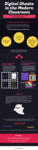
If the infographic doesn’t load, try this link https://create.piktochart.com/output/33087202-multimedia-reflection-ghosts
#UWinDig
🙂