Author Archives: varga111

Integration Begins With Empathy

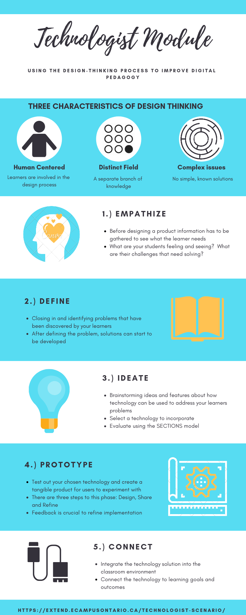
The reflection this week addresses the technologist module provided by eCampus Ontario.  This module focuses on integrating technology into the classroom using the design-thinking process.  I’ve outlined the characteristics and steps of the design-thinking process briefly in my infographic reflection, but ill briefly summarize the key points.  Design thinking must be human centred, where the users of the ultimate product have a hand in its creation.  Design thinking also deals with “wicked problems”, where no clear solutions are present.  The process for correctly implementing a technological tool in a classroom using the design-thinking approach follows the stages of empathize, define, ideate, prototype and connect.  More details about these stages can be seen in my infographic.  I think this process is a great way on testing out what works and what doesn’t when attempt to integrate technology in a meaningful way in the modern classroom.

The Universal Design for Learning (UDL) model fits well with many of the goals of the design thinking process.  Design thinking requires the learner’s involvement, where their feelings and difficulties/problems are integral to the solution.  UDL uses flexibility and inclusion to meet the needs of the whole range of learners in a classroom.  UDL requires that teachers empathize with students to understand their individual needs and work to meet those needs.  This is also an element of the design thinking process.  However, just like how UDL looks at the range of students and not the average, design thinking also acknowledges that a product cannot be designed that is a perfect fit for every student.

This technologist module took me longer than I had anticipated, as I believed I was comfortable with digital literacy.  Even though many terms and concepts were not unfamiliar to me, the depth the module went in required me to take my time to slowly absorb all the information.  One of the first extend activities was to create your own definition of digital literacies, and this ended up being more difficult than I had expected.  After having completed the module, I feel like I have a better grasp on how to properly integrate technology into a classroom beyond simple substitution.

For the final reflection, I chose to use Canva again as I felt it worked out well last time and wondered how well I could utilize all its features without the initial learning hurdle present.  Being familiar with the program allowed me to make my product much quicker than before, and I felt it turned out better than the last time I used it.  Having an awareness of the limitations of a medium beforehand meant I knew what I should not attempt, and where I should focus my efforts.  Previously, I became frustrated with the lack of features included with a free Canva account and was not aware that premium images could still be used, just with a watermark attacked to them.  This time, I used the graphics and templates, even with the watermarks, and was not really bothered by them.  Manipulation of the size of the elements made the watermarks less noticeable.  Unfortunately, since Canva is a template program, and since I was also familiar with how to use it, I felt that I did not really learn anything interesting by utilizing it again.

Brandon Varga
Error 404 not Found

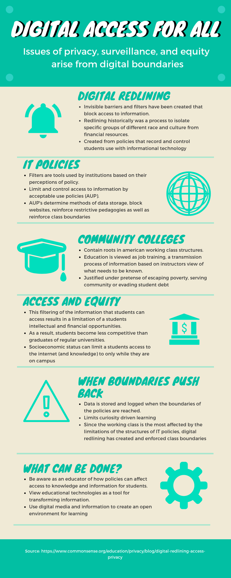
I decided to respond to the article Digital Redlining, Access, and Privacy by Chris Gilliard by creating an infographic using Canva. The article talks about the invisible boundaries imposed on community college students due to the informational technology policies put in place by these institutions.  These policies and algorithms act like filters which limit the type and amount of information the students have access to, which impacts the future financial opportunities of the students.  This places the students at a disadvantage when compared to graduates of higher-level institutions, who generally do not experience these filters.  A core component argued by Gilliard in this article deals with the working-class roots of community colleges, and how digital barriers are being transformed to reinforce class, race and ethnic boundaries.  The article ends on an uplifting note that I agree with, a call for educators to be aware of the limits imposed on students by educational technologies.  We must be careful not to categorize our students like the IT policies do and strive for creating an open environment for learning and this can be done by carefully choosing the programs and activities we assign to our students.  We need to make sure these barriers are not something that we make students encounter.

Ill admit that I never really thought about how the policies in place at some institutions could have a more profound impact than simply not having access to that information.  I ignored the fact that if some students can’t access the information at campus, they can’t access it at all and the information does not exist for them.  My personal experience and upbringing has always allowed me the freedom and opportunity to pursue and use informational technology both at home and at school.  During public school, when I was blocked from playing games or visiting YouTube on the school computers, it made sense to me because that really wasn’t what I was supposed to be doing.  Now that I know about digital redlining, I have to consider the angle that I was being limited in my education because something like YouTube has profound educational use.

The most shocking thing about reading this article was the revelation that for some students without access to internet at home, their future job potential and equity is adversely affected.   I used to think that these IT policies put in place by some campuses were necessary to protect the users from harm from malicious websites or prevent access to websites that were inappropriate to a school environment.  While this is certainly true, it is hard to look at some of these restrictions in the same way knowing that it has severe repercussions for some students attending a different campus.    I now know that, intentional or not, the filters utilized by IT polices at community colleges reinforce the boundaries of race and class present in the real world.  With this new information, it is important that I approach the discussion and use of digital redlining with the gravity it deserves and try to use digital media to transform educational experiences for students, not diminish them.

My experience with Canva was not a smooth one, I became extremely frustrated by the limitations of the program.  I’m reminded of the Ashely Hinck article, Digital Ghosts in the Modern Classroom, describing the limitations of template programs and could not agree more here.  The free version of Canva has very little elements, images and icons available to use, with premium features available for one dollar.  This creatively limited what I could present and achieve, which made me feel that an infographic may not have been the best way to respond and reflect on the article.  The free and premium features  encountered could be viewed as a boundary or limitation.  Those without the means to afford a premium account are limited to the responses they can create, and the quality of their infographic is lessened.  I found Piktochart, the program I used last for the prior reflection to have more powerful editing options and gave more freedom with a free account.

Brandon Varga

WAKAWAKA – The Story of the Power Pellet and the Ghost

I decided to respond to the article Digital Ghosts in the Modern Classroom by Ashley Hinck.  The platform I decided to use was Piktochart, which is a template program not mentioned in the article.  Hincks argues that these template programs are the equivalent to the worksheets used by students in their classrooms.  These “ghosts” provide a rigid path to the correct answer, with little exploration or interpretation left to the student.  The template program is seen as an easy solution, but the drag-and-drop method mirrors the pre-determined answers of the worksheet and limits the creativity and agency of the creator.  As I mention in my info-graphic, I summed this up as BORING.  It is a safe and reliable path to easy marks, one I often took myself, but not one that challenges or pushes students to create something more.

To combat this, the article calls for teachers to shift to a critical digital pedagogy, embracing and encouraging the use of more open alternative programs and an approach to learning based on experimentation.  As outlined in my Piktochart, students need to be able to attempt their work without hesitancy or fear of failure, realizing that a trial-and-error approach is vital for using open programs and school in general.  To accomplish this as teachers we must disturb the assumptions that students have of learning in the classroom, showing them the limitations and rigidness of the templates they are comfortable with and urge them to explore their options and provide them with all the support they need to accomplish this goal.  I absolutely agree with this, as educators we must begin to change how students view the school and learning process, looking back at their experiences as positive and rewarding, not some boring template.

My experience with Piktochart went smoothly even though it could be considered a drag-and-drop program.  Personally, everything felt clean and intuitive, things worked as they should without many hitches.  When using Piktochart or other programs I often find the best starting point is to mess around with the program first, trying out everything it can do.  From here I have a good base to build upon the functions I found worked and discard those that did not work for me.  Of course, nothing is perfect, it is difficult to find appropriate copy right free material and the options available with a free account severely limit the templates, images and features available.  These affordances forced me to be creative in the way I used the program, creating images (PowerPoint icon) from scratch, and using the provided features in different ways (backgrounds/banners).  I limited my use to Piktochart instead of relying on programs I had some experience in (like Photoshop) so I could push Piktochart as far as I was able with my skills.

Brandon Varga