Author Archives: vande113

The Technologist Survival Guide: Integrating Technology in Education with Purpose

you peeking out, meekly saying "hey"

The focus for this multimedia reflection was the Technologist Module from the eCampus Ontario website.

As you can probably tell from the banner above; my method of reflection was through Piktochart (I downloaded the image in blocks to better allow me to reflect through this medium: here is the full image uninterrupted by my thoughts and reflections if you wish to give it a gander).

I decided to do a Piktochart this time around because: a) I have not had the opportunity to play with it to this extent before; and b) I really needed a platform that allowed me to be creative; but also keep me in check (the last multimedia reflection I did was a Sketchnote; while it was fun it to create, it was also incredibly difficult for me to keep things neat and orderly and a girl needs neat and orderly sometimes, ya know?)

I found creating this Piktochart to be pretty neat; when it comes to drag n’ drop/template platforms you are always limited to an extent but perhaps the 3rd time around doing this has made me appreciate the simplicity.

Anyhow, back to the real content you’re looking for…
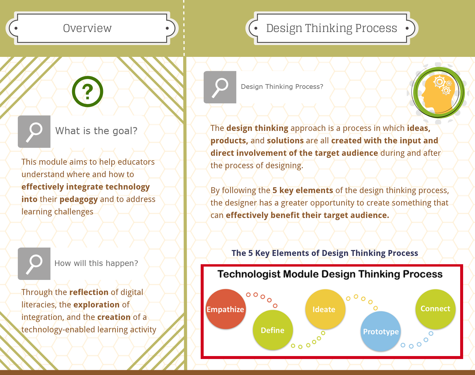
At this point of the course, it is no surprise to hear that technology can be incredibly beneficial to learners; however, there seems to always be that internal debate of, “am I actually using technology effectively in my class?”  Bitmoji Image

This module helps to answer that question by bringing you step-by-step through the design thinking process. For every process step, there are opportunities to extend your knowledge and apply what you know through the activities the module gives to you (it is also incredibly helpful with further explaining things in detail through embedded hyperlinks that the participant can click as well).

The module provides the participant with the 5 Elements of Design Thinking. 
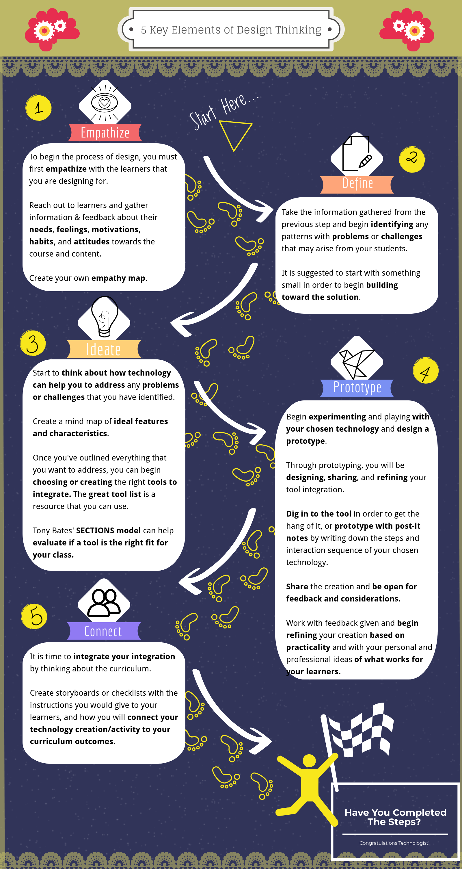
The module guides you through all of these elements and allows for you to truly explore and understand how to effectively integrate technology into your pedagogy to help your students directly. The module is filled with resources that are easily accessible and helpful in the process of creation.


Bitmoji Image

If you want to know my personal thoughts about this module and its contents, here it goes…

Personally, I feel that this module is incredibly beneficial for educators to truly comprehend.

The entire module is dedicated to the idea that technology can only be effectively integrated if we truly understand the needs of our students. With this in mind, we can then process the information and work towards a solution to help students to fulfill these needs and better their quality of learning. I believe that students should always be provided the opportunity to be involved in the process of design when it comes to their education and teachers we need to accept this input and empathize with our learners.

With this design process, integrating technology in the classroom becomes purposeful, and not just a random tool/activity that is thrown into the mix. There have been many times where I have felt teachers have thrown technology into the mix just for the purpose of having technology in the classroom.

This module emphasizes that tech. integration should be learner-focused and requires a lot of effort and time in the decision. All students have different needs – we were able to experience some examples during our in-class activity where we had to explore this module as somebody else. Due to this diversity, we need to focus on students’ needs, find patterns, and begin to address them within our technological integration.

I will definitely be trying to utilize the design thinking process in my planning (and I will definitely be looking back at this bad boy whenever I need a strong starting point).

Bitmoji Image

Is this more effective than banning phones in class?

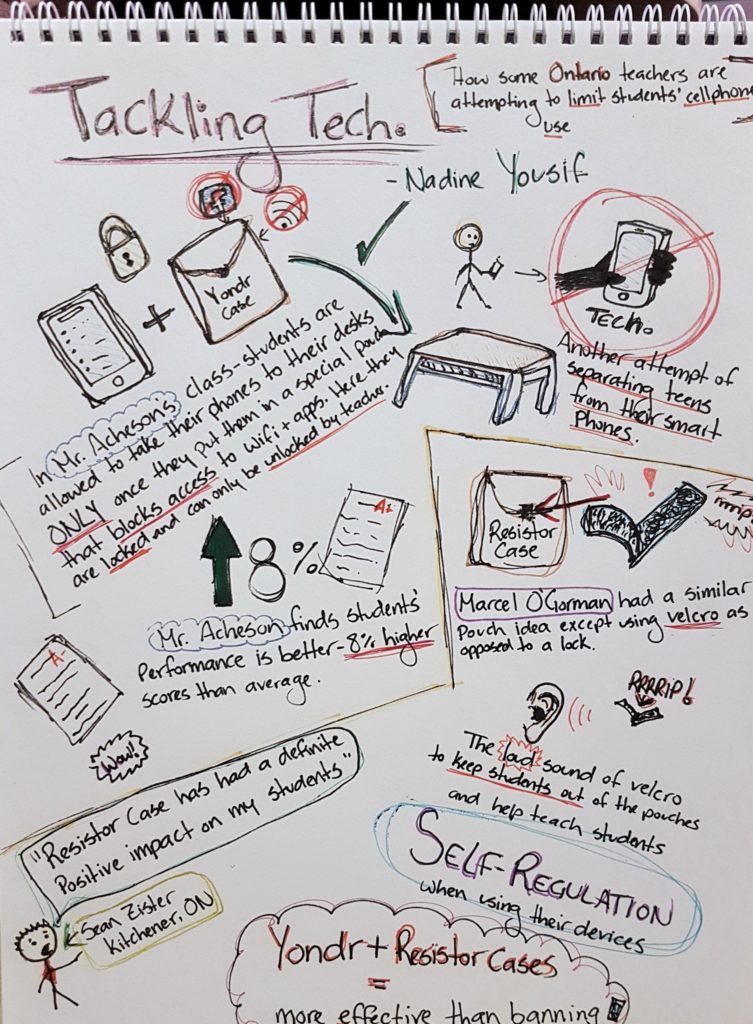
The article that I chose to focus on this week was: Tackling Tech: How some Ontario teachers are attempting to limit students’ cellphone use by Nadine Yousif.

This time around, I decided not to go with a Template or Drag-n-Drop platform and decided to physically draw out my article summary/reflection by hand. I have never made a sketchnote before (and I’m not the greatest artist around), but I found this method to be kind of freeing as I was able to do literally whatever I wanted to do. At the same time, I feel like there were some restrictions, but more-or-less due to my inability to art well.

I have never done a sketchnote before, so now I can say that I have! Image result for smile emoji

Below you will find the sketchnote of my summarization:

   (Forgive my awful drawings! It’s the thought the counts!)

This article discusses the topic of allowing students to have their cellphones with them at their desks, but only with the utilization of the Yondr Case (a case that locks students’ phones away until the teacher unlocks it), or the more lenient, DIY Resistor Case (a similar idea but with Velcro instead of a lock to deter students from opening due to the loud sound).

These cases were created as a sure way to make sure that students would not be distracted by their cellular devices during class. According to the article, there are benefits of using either of that case with claims made from multiple Ontarian teachers who state that they have noticed a difference in the performance of their students. These teachers find that with the removed distraction of smartphones and devices, students seem to be more focused and are getting better scores than they had before.

The article also makes claims that these phone cases are seemingly more effective than having an outright ban of devices in the classroom (a ban that even Ontario Premier Doug Ford has proposed).


Personally, I have never heard of these cases before, and I can definitely see and understand how they can work and be of use in the classroom, but I also feel like you shouldn’t rule out technology in the classroom altogether.

I have both witnessed and experienced the distracting nature of cellphones in the classroom; however, I have also both witnessed and experienced the benefits of utilizing them in the classroom as well.

I have been the student in the room that has tried to escape from a boring lecture by scrolling through social media, and I have also been the student that pays extra attention when Kahoot! comes into play, or if we are exploring something digitally as a class that keeps me engaged on the topic at hand.

The same thing goes for the students that I have had the opportunity to teach thus far. I can see when they are disengaging and often times this turns into reaching into their pockets for their devices to stimulate their interests and escape from something they find to be boring. At the same time, these same students absolutely love and completely engage when Quizziz, Kahoot!, Gizmo, or the iPads in general come out.

In regards to these cases, it seems as though with the Yondr case, teachers are essentially locking away students’ phones until the students leave the classrooms. This leaves little to no opportunity to utilize technology in the class altogether.

So, with that being said, if I really had to choose between the two cases, I would definitely go with the more lenient DIY version that is the Resistor Case. Although students are still “locking away their devices”, they are doing so with Velcro. This is supposed to deter them from wanting to open their phones during class (because of the loud sounds the Velcro makes) which is apparently supposed to help teach students self-regulation when using their devices.

Another reason that I like the Velcro option more is that even though students are still putting their phones away, they are not physically locked out of the cases which allows opportunities for students to utilize their cellphones in class when it is appropriate to do so (i.e when the teacher has permitted it in class and a lesson requires its use).

As a teacher and a student, I understand the frustration that technology can have in the classroom, and I can understand why teachers may want to ban it all together; however, at the end of the day, I truly believe that technology can be a powerful tool in the classroom if utilized properly. Honestly, it seems absolutely ludicrous to me that there are conversations of banning cellphones in the classroom. Technology is always advancing and as educators we need to keep up with it and find ways to utilize them in the education of our students. Yes, students may be tempted to stray from their tasks with their devices, but it is a good idea to help them learn how to self-regulate and be responsible with their devices so that they may do great things.

But, that’s just my opinion. I would love to hear yours!

The Digital Ghosts Made Me Do It…

For my multimedia reflection, I decided to do a Powtoon that summarizes what I believe to be the main points of the article Digital Ghosts in the Modern Classroom by Ashley Hinck.

Click the image to view the video

[Disclaimer: I have never used Powtoon before and I did not realize that the trial runs out even after exporting the video on their site so do look past the “PRO” and “PRO+” watermarks as I am actually incredibly bitter about this Image result for annoyed emoji ]

ANYWAY

Throughout the article, Ashley Hinck makes many valid points about the use of shortcut/template methods and the effects that these methods have on students and students’ creativity. Personally, in my own academic endeavors I have found that many of the digital creations I have made for assignments (including this response with Powtoon) have been heavily reliant on drag and drop platforms that allow for me to get my point across as easy and hassle free as possible. However, even though these platforms are incredibly easy to use and usually allow you to finish creating a product in no time at all, in my own experiences I have also found them to be immensely frustrating. In the creation of this Powtoon alone, there were many different things I would have loved to add to the slides that were not available in the resources the site provides and it did limit me a lot in that aspect. On another note, something else that is also really frustrating about a lot of these shortcut/template websites are their freemium services (something we had talked about in class previously). These sites give you a trial and let you use all services it has to offer in order to give you a taste of the capabilities and then suddenly all of those premium services disappear which makes the website even more limiting to the user if they want to use it again.

Of all the years I have been in school, most digital assignments were created with the intent of using easy shortcut/template websites and platforms that you can get easy marks from by following the step-by-step guidelines given to you. With that being said, I have also had the experience of taking a few of these courses in my time that have required me to utilize more open-ended platforms to create a finished product; assignments that were given little limitations. In one of said courses, we were expected to create a website about ourselves using HTML to do so. It was highly recommended by the professor to create these websites from scratch; however, due to the time constraints of the assignment and the few requirements that I needed to meet, I decided to take the easy route (something that I am sure we all have been accustomed to at some point). I ended up finding a website that was similar to the way that I wanted mine and used it as a template, changing things here and there to make it my own. It is not something I am proud of, but is something that I was reminded of when reading about students in Ashley’s class and their similar experiences with HTML. I found that it was much easier to create something out of something else, rather than creating something entirely out of nothing and I am sure this is a result of years of drag and drop. So, to make myself feel better about that entire situation, I feel that it is safe to say that the digital ghosts made me do it…

All things considered, I hope that some day I will truly learn how to break free of all the shortcut/template ghosts and truly utilize more open-ended platforms for my future creations. There has already been a few times in past where a drag and drop template just wasn’t doing it for me and I forced myself to utilize Photoshop out of frustration instead, but I don’t want to look at open-ended platforms as a last resort in order to get my points across – I would love to seek them out first some day.

– Jessie Vanderveen