Monthly Archives: February 2019

Technology in the Classroom

This multimedia reflection serves as a response to the Technologist module from the ecampus Ontario website. When teaching in the society today the classroom will undoubtedly have technology in a variety of forms present. As an educator it is important to have digital literacy with these technologies as it can be very rewarding both personally and for your students. Before reading this technologist module I had never really thought of having a proper way to get technology involved in the classroom. However, this module brings a variety of strategies to the educator to properly find a technological tool that can be utilized in the classroom. This video does job of explaining what the module is about.

One of the most eye opening concepts in the module is the concept of becoming familiar with digital literacy. Digital literacy is extremely important because it involves understanding relevant technology being used in the present. Technology rapidly changes. Therefore, in order to be digitally literate will always require the understanding of new technologies and programs overtime.

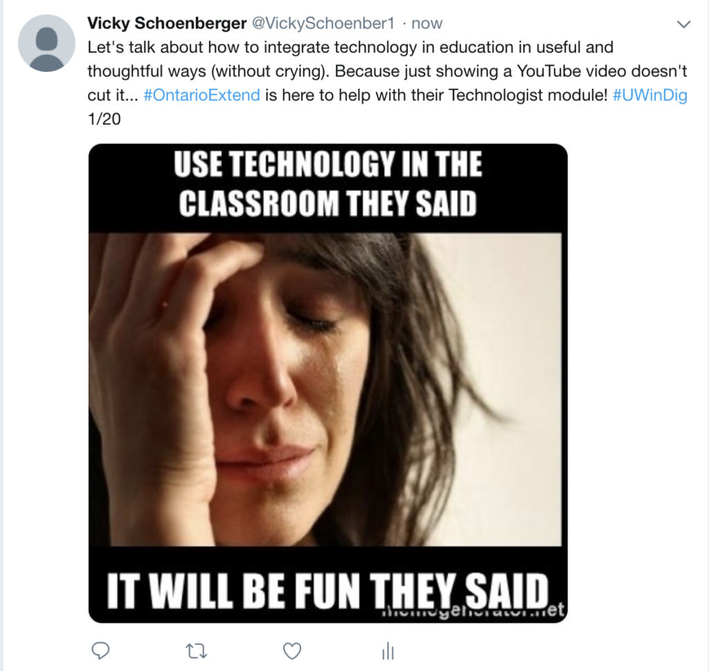
The medium I have chosen to do my my multimedia reflection on is twitter. Having used the basics of twitter beforehand I was not exactly sure how well this website would be able to get my ideas out about technology. While doing the multimedia reflection I found twitter does well if there is not a lot to say at one time. The limited characters can really make it difficult to get out a full idea in one tweet. I found twitter does a good job of providing one to many communications. Being able to hashtag your tweets is very useful for reaching a target audience.

Overall, the module was very informative and expanded my own personal approach on how to properly incorporate digital technology into the classroom. It also made me realize how important it is to be digitally literate in the world today, especially as an educator.

Technologist Assemble

Education is becoming more technical every day. We see this in our classrooms, in our board meetings, and in our society. It is important that we as educators collaborate with technology and use it in our classrooms. But teachers might wonder, where do I start? How do I implement tech? What if I am not great at using technology? Well there is an organization that might be able to help you with all your questions. Extend will help you become more tech savvy and will guide through the many skills that you would need to use tech in your classroom. During the module, I went through the scenario, overview, digital literacies for teaching, design – thinking approach, empathize with your learners, define your learner challenge, ideate, choosing a technology tool, using the sections model, and connection to the curriculum. Each strand mentioned will be talked about in my twitter essay link below. The module does a very good job explaining the role of teachers and how we should be okay with uncertainty when using technology. That the internet is so vast and has many unsolved questions that we can impose on our students to help their growth as individuals. I recommend looking at the module to experience it yourselves. Link is posted below. I hope you enjoy your journey and enjoy my views on Extend’s approach of digital literacy.

Tagged ,

Podcast – When Teachers Talk

For this multimedia reflection, Aaron Vieira and I decided to take a new approach and try out a podcast. This was probably the most fun I’ve had making a multimedia reflection for this class. I’ve always been a guy who never really enjoyed reading, so podcasts are ways to get the same information but through a different medium.Two men talking

The back and forth dynamic added a new element to my reflection. Just being able to have a conversation about my thoughts and ideas felt like I have learned more from reflecting. Aaron was able to bring up some great points that I would have never thought of and I appreciated this aspect. There were times where just listening to Aaron gave me a new idea or a new way of looking at the problem. For these reasons and many more, I would recommend a podcast to all my peers as it is a great way of reflecting.

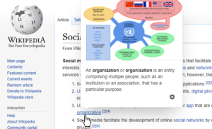
The podcast starts with us speaking about our first impression of the site. I found it really difficult to follow at first because they started with a general video but it was very general. I believed that their overview section could have been done much better just by simply stating the goal of the module, who it was directed too, and why it is important. A big issue for me was their use of hyperlinks.The first definition they give for “digital literacy” was a link to a 274-page paper about digital literacy. I expressed my concern about sending the reader “down the rabbit hole” where they get overwhelmed by the amount of provided content. A great way to avoid this with hyperlinks is the use of popup widgets directly on the page. This is similar to what Wikipedia does, where instead of opening the link and scrolling through to find the desired information, it pops up when you hover your mouse over the link.Pop up from Wikipedia
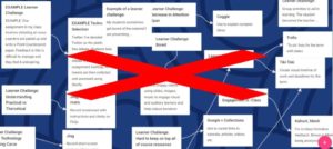
We also speak briefly on their use of mindmaps and how I always thought that mind maps are messier than they are organized. Especially for one of their mind map that is bigger than webpage itself so people have to scroll through sideways and up-down to just fit everything. There could be plenty of useful information on this page but because it’s so unorganized it can discourage users away from it. 

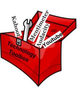
The last point I want to highlight was their resource lists for platforms. More specifically, The How-To’s and The Great Tool Links which is almost an all-inclusive list for tools that educators can use in the classrooms. Tools such as Audacity, Mentimeter, Quizlet, Kahoot, Prezi, Vimeo, and more. This is a great one-stop shop where all the needed information can be found in the module itself instead of fishing for information somewhere else.

Technology Toolbox

Technologist or Hyperlinkologist

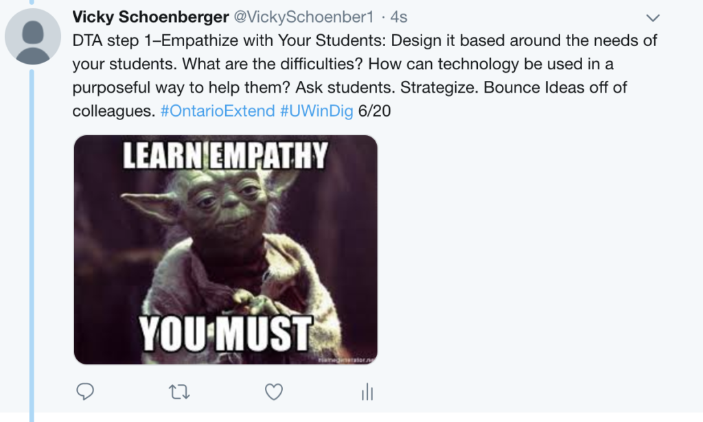
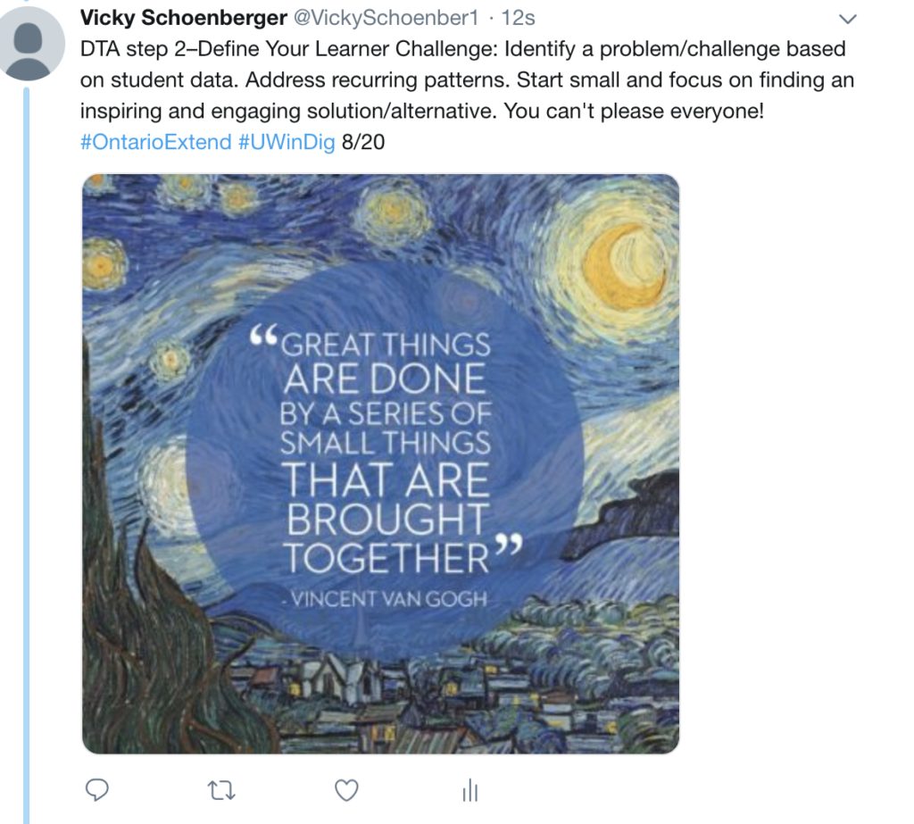
I chose to do a Twitter essay for my reflection. I thought that the Technologist module presented some useful info, but was also not organized in the most effective manner.

I enjoyed the Empathize section of the module. I found this particularly relevant to the teaching world as they explained that:  “Design thinking starts with empathy. When you design something that is going to be used by someone else—a lecture, an activity, an assessment—you must first understand what that person needs.” Teachers should constantly be putting the needs of their students before their own when it comes to designing lessons, and the same can be said about technology integration.

Although the module explained some interesting strategies and concepts, a lot of them seemed intuitive for someone who is somewhat tech-savvy. I think the platform is better suited for those who are not confident with technology and really need extra help with digital literacy.

In all honesty, I thought the platform quite overwhelming and felt as though I was being overloaded with information that wasn’t the most engaging to read. I found myself ‘shutting down’ every time I went through a new section because it seemed like I was entering a never ending labyrinth of hyperlinks which unlocked pages upon pages upon pages. I soon had more than 20 tabs open on my browser and just wanted to shut the whole thing down. I am someone who likes order and simplicity when it comes to my work, so having no guidelines for the website and never knowing what I was getting myself into when starting a new section was daunting. I found myself quickly clicking through everything and not actually retaining any information – I just wanted to get through it. I wonder if other readers felt the same way and focused only on reaching the finish line, rather than enjoying the ride and taking in the sights.  I think a ‘learning goals’ list or a timeline would have helped me better visualize what I should take home from each section and have an idea in mind of how much time/energy each section will take me. Overall, I felt like I learned a lot more about myself and my learning style than I did about technology.

Something else I noticed and found ironic: the Design Thinking section had (yet another) hyperlink for readers to explore. When I clicked on it, it took me to a Wikipedia page that explained what Design Thinking is. I personally enjoy and frequent Wikipedia for basic knowledge of topics, but I found it quite digitally illiterate for a website to directly send it’s readers to Wikipedia for a definition. No? Just me?

Lastly, it seemed like this Extend site offering the Technologist module didn’t actually contain much of its own information. It seemed as though most of the learning would occur through exploring other websites. I think that Extend would be better off summing up the other sites in their own words for their readers in organized sections, rather than just sending them to what felt like a bijillion different websites.

Anwyay, I summed up my thoughts in the Twitter essay below. Have a read through my rant and see if you can resonate with my thoughts. Maybe I’m just being a little extra with the complaining, but it is meant to be a reflection after all, right?

– Nat G


Help! I’m going off on a digital tangent!

After reading through the Technologist module, I felt like I learned more about my own learning style than I did about digital literacy and design thinking. For me, hyperlinks are distracting and I tend to not interact with them very much. I like to have a specific focus when learning about a new topic, and clicking on a hyperlink makes me feel like I’m going on a digital tangent. I don’t want to lose my place in the original text I’m reading, so I don’t usually click on hyperlinks that will lead me to a whole other world of information. Furthermore, I often found myself ignoring the “extend activities”, because they felt like extra information that was not necessary for me to understand the module.

My favourite part of the module was the video What is Design Thinking (speaking of hyperlinks…). This video was great because it showed a real life example of what design thinking can look like. The video was also easy to follow and visually appealing. However, I struggled to see how it could be applied to a typical classroom teacher. I couldn’t see many teachers spending their limited free time designing an entirely new category of technology. Most teachers (including myself) would have no idea how to even go about doing so because we  have no idea how electronic devices are built and programmed. I liked the idea of creating a post-it note prototype, but then where do we go from there? Overall, the video was a great description of design-thinking but it seems impractical for the typical classroom teacher.

The platform I decided to use was Piktochart. I started this assignment by using Canva, but after struggling with formatting issues for several minutes, I decided to go back to good ol’ Piktochart. I have used Piktochart in the past for a multimedia reflection and I really enjoyed it. It is easy to use, and the template is flexible. The only annoying thing is you cannot change the colour scheme for some templates (of course). I decided to use images instead of icons for this infographic, and I found that Piktochart had a variety of high quality photos available to use. I sometimes struggled with finding the exact picture I wanted, but in the end I managed to find some that worked well.

Overall, though I like the concept of design thinking, I didn’t really enjoy working through the online module. Enjoy my infographic below, which summarizes the main points of the module.

Thanks for reading!


Nicole Langlois

Tagged

Put Your Digital Tech in Check

I viewed the technologist tutorial from eCampusOntario as an excellent professional development opportunity for educators. I think that there are a lot of teachers out there that happen to be stuck in their own ways, not only because they are unwilling to change. Their lack of knowledge in digital literacy affects their teaching philosophies on how they view and use technology in the classroom. This is because they may not know how to use is, when, how or why. I have seen this in my own teaching experiences where teachers did not use technology to its full potential. When I came in with fresh eyes and ideas I could suggest the use of technology in different areas of lesson and ended up inspiring my associate teacher to do so. This tutorial addressed ways in which technology integration can tackle specific learner-centered challenges. This is key. Technology can be such a powerful tool, if it is used in the right way. If we as educators take into consideration the design thinking approach that is discussed, technology can be incorporated to positively enhance a student’s learning experience.

I think that each step that is incorporated in the design thinking approach is important and valued. The first step and the last step I found to be the most important. To EMPATHIZE is to meet with the student to discuss what it is that the student needs. The collaboration with the student is what makes this so important, it is necessary because it is all about the student. Empathize is all about having a conversation to see how we as an educator can help overcome their learning challenge. Technology is a way to do so, it is a way for differentiated learning and instruction. The last step in the module is CONNECT. If technology is being used, there needs to be a purpose behind it and there needs to be a connection to the curriculum. This is crucial. A lot of teachers may over look this step because of the shininess that technology brings. However, technology isn’t just a shiny object, it can bring so much to the classroom for the learning of the students.

I hope that other educators can get as much out of this module as I did. It really allowed for me to think critically about the process that should be applied before technology is brought to the table. I believe that each student is different, and needs different things. This may include different forms of instruction or different tools to complete tasks. Technology can help overcome students challenges and learning needs.

I did the multimedia reflection as a Twitter essay for the second time and I can honestly say that it was still a huge learning curve for me. As I do not normally use twitter, I struggled when trying to use the format to the best of its abilities. I learned from last time when I tried to make each tweet involve some sort of GIF that it is not always needed. Therefore, I left some tweets alone. Another struggle I came across was in the posting process. I kept posting a tweet and realizing that it wasn’t attached to the tweet before or I just simply forgot the hashtag that we needed. I realized at the end that I had only used the #UWinDig on the first tweet, and forgot to include #OntarioExtend. Over all, I think that the twitter essay is a great way to share thoughts and opinions. I felt that I could provide a good summary and reflect on the tutorial.


Integration Begins With Empathy

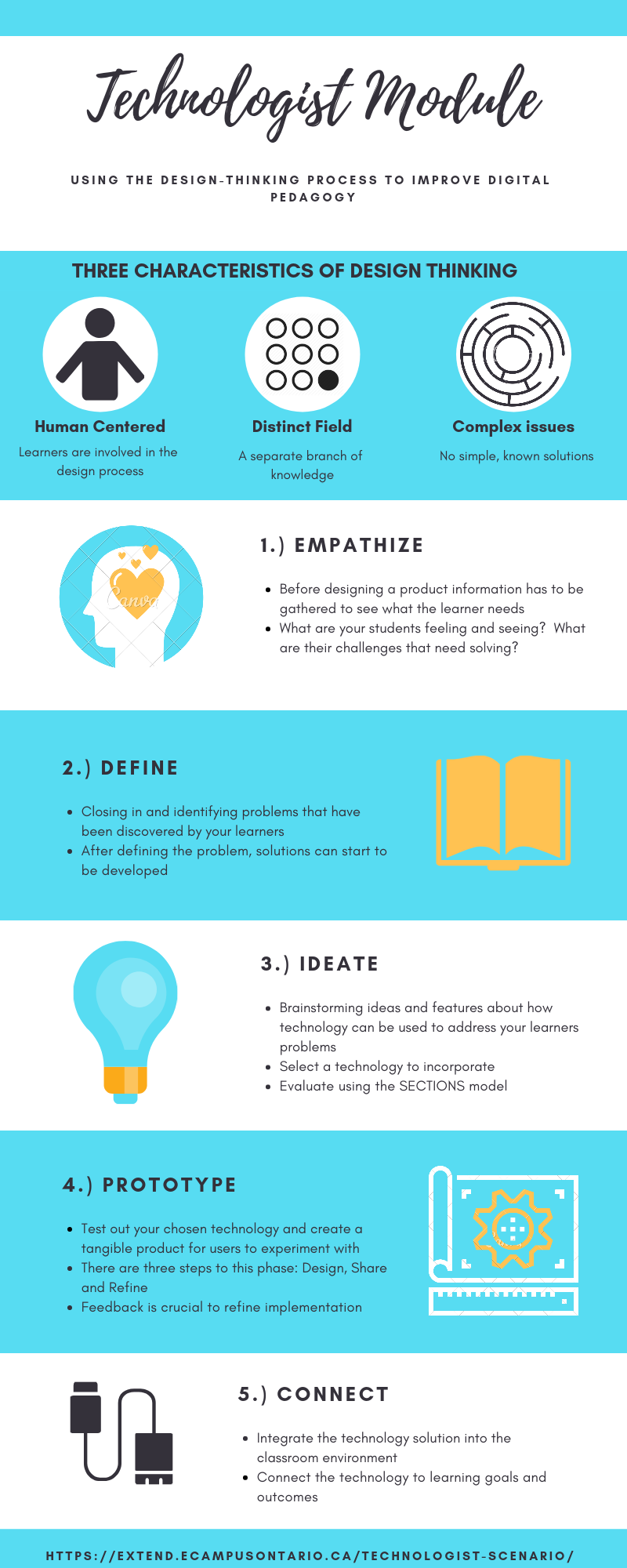
The reflection this week addresses the technologist module provided by eCampus Ontario.  This module focuses on integrating technology into the classroom using the design-thinking process.  I’ve outlined the characteristics and steps of the design-thinking process briefly in my infographic reflection, but ill briefly summarize the key points.  Design thinking must be human centred, where the users of the ultimate product have a hand in its creation.  Design thinking also deals with “wicked problems”, where no clear solutions are present.  The process for correctly implementing a technological tool in a classroom using the design-thinking approach follows the stages of empathize, define, ideate, prototype and connect.  More details about these stages can be seen in my infographic.  I think this process is a great way on testing out what works and what doesn’t when attempt to integrate technology in a meaningful way in the modern classroom.

The Universal Design for Learning (UDL) model fits well with many of the goals of the design thinking process.  Design thinking requires the learner’s involvement, where their feelings and difficulties/problems are integral to the solution.  UDL uses flexibility and inclusion to meet the needs of the whole range of learners in a classroom.  UDL requires that teachers empathize with students to understand their individual needs and work to meet those needs.  This is also an element of the design thinking process.  However, just like how UDL looks at the range of students and not the average, design thinking also acknowledges that a product cannot be designed that is a perfect fit for every student.

This technologist module took me longer than I had anticipated, as I believed I was comfortable with digital literacy.  Even though many terms and concepts were not unfamiliar to me, the depth the module went in required me to take my time to slowly absorb all the information.  One of the first extend activities was to create your own definition of digital literacies, and this ended up being more difficult than I had expected.  After having completed the module, I feel like I have a better grasp on how to properly integrate technology into a classroom beyond simple substitution.

For the final reflection, I chose to use Canva again as I felt it worked out well last time and wondered how well I could utilize all its features without the initial learning hurdle present.  Being familiar with the program allowed me to make my product much quicker than before, and I felt it turned out better than the last time I used it.  Having an awareness of the limitations of a medium beforehand meant I knew what I should not attempt, and where I should focus my efforts.  Previously, I became frustrated with the lack of features included with a free Canva account and was not aware that premium images could still be used, just with a watermark attacked to them.  This time, I used the graphics and templates, even with the watermarks, and was not really bothered by them.  Manipulation of the size of the elements made the watermarks less noticeable.  Unfortunately, since Canva is a template program, and since I was also familiar with how to use it, I felt that I did not really learn anything interesting by utilizing it again.

Brandon Varga

Sign, Sign, Everywhere Design(-Thinking)

I completed my third multimedia reflection on the Ecampus Ontario Technologist Module using Canva. Canva is a medium I was somewhat familiar with before this assignment. I have used it to make posters and promotional materials, but this was my first experience making an infographic. I still found it very user-friendly, but struggled with designing the layout so that it was visually appealing while still getting a lot of information across with it!

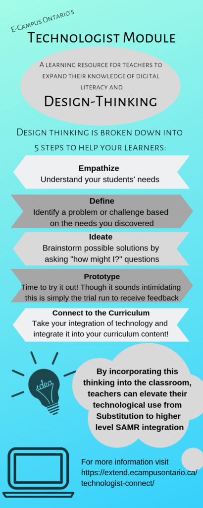
I found the Technologist Module very interesting to go through. As someone who generally likes more linear presentation styles, I usually get lost in modules similar to this one. This module, however demonstrated linear thinking with the process to incorporate design-thinking in your classroom, so I found it easier to follow. There were many hyperlinks, but I would save those until after I read the piece and see what I wanted further elaboration on. I absolutely loved the use of Padlet to allow teachers to share what has or hasn’t worked, and what they have implemented in their classrooms. This meant that even when I’m sitting at home going through the module, I have the feeling of community with other educators, and somewhere to share my thoughts. Here is my infographic summary of the module’s explanation of design thinking (click the hyperlink for a closer look)!

As a learner, throughout my elementary and secondary school education, I don’t believe this was something my teachers ever tried to integrate into my classes. As technology was beginning to show itself more in education, I feel that most of the teachers I had focused on the S(ubstitution) in the SAMR model. This included using the Smartboard instead of the chalkboard, or Desmos for graphing instead of sketching every graph. In this sense, technology was integrated into the classroom on the surface without changing the lessons from what they could be without technology.

Educators now, and the next generation of educators here on this blog, have more of a focus on the augmentation, modification, and redefinition of the SAMR model. This means that not only will students be more engaged, but we can more readily address the needs of our students through the process outlined above, as well as by incorporating this thinking into our differentiation for students with exceptionalities.

Overall, I think this module elevated my thinking of technological integration in the classroom, in addition to teaching without technology. This process is fundamental to teaching, whether individuals choose to integrate technology or not. The module used the analogy of architects, who don’t design buildings for themselves, but keep in mind the needs of the individuals that will be using the structure. So although technology makes it easier to differentiate and maintain student engagement, the design-thinking process should be at the forefront of every teacher’s mind.

Thanks for reading my thoughts! Sorry if I got this song in your head.

Kate Hatfield


Gucci, Prada, Chanel…What Design Thinking Are You Using?

eCampus Ontario’sOpen PD Modules Summary – Piktochart

For a separate window to view the Piktochart – click HERE


My response to the key points

Digital Literacies

I think that that I would agree completely that digital literacy is certainly complex. Recently I was speaking to a professor and they told me how he, and many other adults, assumed that my generation is completely tech savvy, but that was a false notion. Even though I have grown up in this new age, I still find it difficult in trying to navigate through the technology world. 

Design-Thinking

After watching the video and reading the script on the design-thinking section I was still confused as to exactly what the process was because the description it gives in the script is different than the words and explanation that the video gives. From what I did understand I do agree that it is good to find solutions directly from the people affected instead of simply following some crazy idea that I haven’t even received any feedback for.

Empathize

This is a very important step in the design-thinking process as it is the root for the whole process. The goal is to connect better to learners and if I don’t know what the learners are really struggling with or wanting then I’d be stuck throwing darts in the dark.

Define

To me this is the hardest section of the module because I find it extremely difficult to pinpoint the true reason for the challenges of a learner. Often I have found it comes to learners not being motivated, but every learner is different and that makes it difficult to pinpoint what truly motivates them. This is why I find the empathize section to be so important because then I’m not left on my own to ponder the reasons behind learners’ lack of motivation.

Ideate

It seems daunting to try and simply create ideas about each potential technology and so it is extremely helpful to have links to various places that give ideas about what questions I should strive to answer and what technologies I can look through. Here is one example – website resource.

Prototype

This makes sense that now is where I would start to develop deeply into my top technology choice(s) otherwise I would be in the design process forever.

Connect

I also agree that I only start to connect my specific goals and curriculum aspects to my technology idea because there’s that potential that after I start using one during the prototype stage I may assess that the current one may not be the right fit for me.

Module Checklist

In terms of organization of modules and a summary section, this is great. It is concise and allows me to quickly assess whether I’ve done all that I needed to do and as a checklist I can visually cross things off which would give me a greater motivation by having a sense of accomplishment with each checkmark.

Extend

All in all I believe that the extend portion of the module for each section is one of the most important aspects. The extend truly helps go that extra mile that guides the process and sharpens every detail. Especially as someone who works much better with continuous feedback from other, the extend portion easily connects me to little hubs that allow me to put forth my ideas, receive feedback, and then tweak my ideas and plan afterwards. The extend truly enables me to have a fuller picture of the process and of what my actual goal in this is.


Tagged , , ,

Meaningful Learning in a Digital Playground

Using technology in the classroom is a daunting task for even our generation. Ontario Extend’s Technologist Module is one way to garner tips and inspiration on how to use digital tools to enhance and achieve activities that would otherwise be impossible. Even when inspiration strikes for a great digitally integrated activity, with so many platforms out there, it’s important to have a strategy in place to know how to select which ones. After going through the module myself, I used the tips and strategies to help me choose the platform that would be best at facilitating what it was I wanted to say for this multimedia reflection. I considered what information I was trying to convey and how I wanted my finished product to present it. Once I decided that I had mostly text, I knew something like an infographic wouldn’t be right. Then, I considered how the layout should appear based on how my thoughts were seemingly structured in my head. I could tell that I was thinking in a more linear fashion, and therefore I knew that something like a mind map wasn’t ideal for what I was trying to do. So, when considering that I wanted something more linear in structure that could handle a fair amount of text, a Twitter Essay seemed the clear choice out of the usual platforms (canva, coggle, powtoon, etc…). I found this process to be more efficient than how I chose the platforms for my other two reflections. For those ones, I chose a platform first, mostly at random, and then let that dictate what information I presented and how. This time, by considering the information and end goal first, the process of actually creating the reflection was much smoother for me because I didn’t feel as constrained and my ideas matched well with the characteristics of the platform.

Overall the module offers some good strategies, but there’s no way around the fact that integrating technology in a purposeful and meaningful way requires creativity, research, and for most of us, a continuous learning curve.