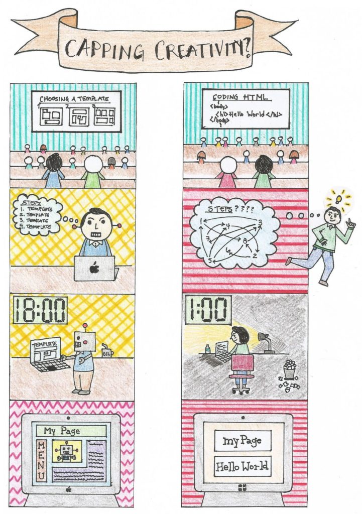
Ashley Hinck’s article, Digital Ghosts in the Modern Classroom brings up an interesting perspective on the use of templates, an idea that I refer to as “capping creativity”. Students can only be as creative as the template allows them to be. Templates are easy and quick but do not offer the same benefits as learning HTML for example. The comic above illustrate two scenarios. The left side depicts a student learning to make a webpage via. templates. The right side depicts a student who is taught how to make a webpage via. coding in HTML. For the left side, the student’s thinking process is much smaller and very systematic. The template has basically done the thinking for him. While on the right side, the student’s thinking process is more scattered and trail and error based. He had to go “outside the box” and tap into his creativity in order to get an idea he likes. The third box shows the two students working on their webpage. The student with the template finishes up at a reasonable time, while the student on the right is working well beyond midnight. You can also see the trash can pilled up with scrapped ideas. The final box of the comic is the finished product. The template looks more professional and complex, while the HTML coding is very basic. It can also be seen that the student on the left is progressively becoming a robot, symbolizing his creativity being taken away more and more.
Do not let the final webpage fool you, the immediate benefits of using templates are great but there are disadvantages in the long term. The student on the right has much greater potential in terms of what he can do with his webpage. He gets final say on color, font, picture position, and much more. The process is longer and more difficult but ultimately more worthwhile. I love the quote “there is no substitute for hard work.” This means that the knowledge you gain from taking the long route can’t be gained from taking the shortcut i.e. easy work (a point that the article was trying to convey, in my opinion).
I enjoyed making the comic because I think it does a good job of comparing two different ideas side to side. I also think that telling a story with pictures is sometimes more intriguing and beneficial than with words. The most difficult part was planning the comic and then trying to get it posted to WordPress as an image. As a teacher, I think it would be difficult to convey the benefits of hard work. Especially for students who haven’t had a lot of life experiences to back up this idea. This is how the artifact connects to teaching, the media artifact could possibly convey this message better. With the comic idea, it’s almost a pros and cons list but with pictures instead of words.
