Breaking Free of Digital Ghosts

The article I chose to look at was “Digital Ghosts in the Modern Classroom” by Hinck, A (2018). http://hybridpedagogy.org/digital-ghosts-modern-classroom/

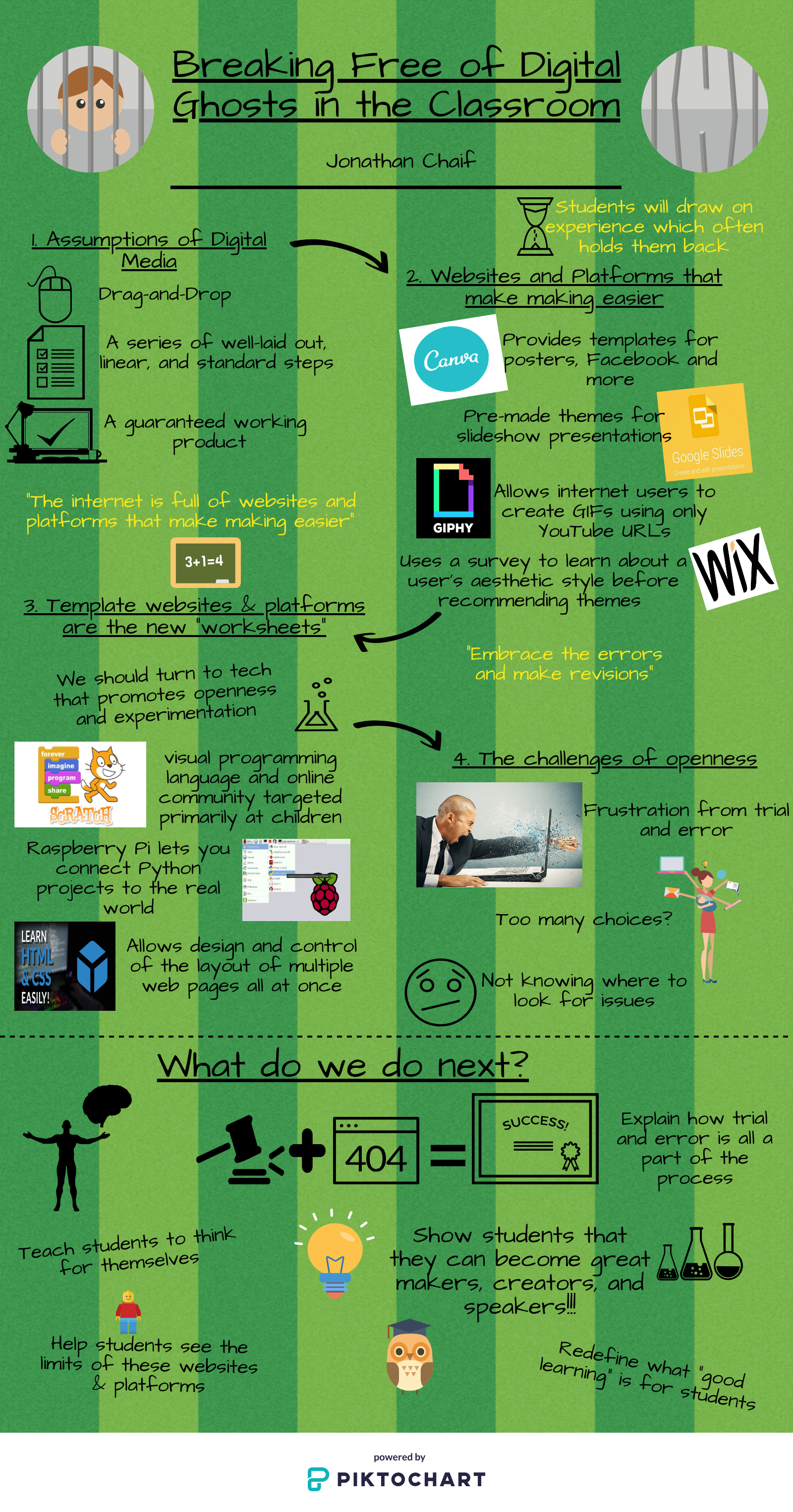
The Ashley Hinck begins writing about how students are interested in taking digital media classes because the want to learn to create media through, photoshop, HTML/CSS, and even personalized GIFs. However, what they are really looking for is to learn how to use drag-and-drop platforms to make what they’re looking for. These shortcut/template platforms have huge effects on students because similar to everything else in the classroom, there are blank spaces that the student copies information and pastes to. To me, this was often the case when using technology in the classroom. My teachers always gave us projects where we would just learn about how to create posters, presentations and such from programs what required us to just find information and paste it into the spaces. As a music teacher, I expect my students to use expression, and creativity when performing because music is about personal and group discovery and learning to bring out the beauty within. How can I as a teacher expect these things when I can’t do the same when using digital media.

As well, the article states that these shortcut/template websites and platforms are becoming the new “worksheets” and that we should be trying to get away from this and turn to technologies that promote openness and experimentation. The issue with these approaches is that students will draw from their previous experiences which happens to be the programs that are holding them back. We need to find a way to get students away from these programs from the get go so that these habits are never instilled in them.

On the other hand, when we look to these programs like HTML/CSS, Raspberry Pi, and Scratch, what we don’t realize is that these platforms don’t guarantee a finished product in the end. There is so much openness and exploration that students become very frustrated from working for long periods of time only to be met with error after error. Students are not comfortable with making mistakes and having to diagnose the problem by themselves but through trial and error and a little bit of patience, the struggles do eventually pay off. Digital media is a struggle and is full of the unknown, but allows more control over the final product.

Moving forward, we must learn from our mistakes and take the time to learn about these programs so that we can effectively teach our students. As well, we must lead the way and help guide/show them that mistakes are okay and that they must learn to try and try again until it works. If we can get to this point, out students will see that they can become great makers, creators, and speakers in the digital world.

Lastly, when I started this assignment, I decided I would look at a bunch of the recommended platforms to see which one I thought I could get fairly comfortable with before starting any of the reading/listening. When doing so, I found that Piktochart was really interesting and stuck out, especially because all I needed to do was to find a template and copy and paste my information into it… However, once I read the article, I had a moment where I laughed out loud because of how ironic it was. From here, I decided I would go and start with a completely blank page and see what I could come up with. This was an interesting time because I actually had about three other info graphics that I started only to change my idea and start a new one. I ended up with this one because I thought it worked well for what I was aiming for. There is a lot I would change but I am happy with where I ended up at with all the trial and error and I know now to try to get away from all of the copy and pasting.

– Jon Chaif

https://create.piktochart.com/output/32980414-new-piktochart
Taking Time To Tinker

Hinck’s article Digital Ghosts in the Modern Classroom discusses how most students only know how to create digital media using the template/shortcut platforms, and I am one of them. I remember taking a course during my undergrad where I had to use coding to create a basic website, and I can recall feeling frustrated and discouraged by the difficulty. I’ve always been more comfortable using applications and websites that don’t have a big learning curve so that I can get through the task, and move on to the next one. I like assignments that require me to give an answer that is either right or wrong, because it’s the way that I’ve been trained. Hinck compares template/shortcut platforms to using worksheets in the classroom, which reflect a standardized model of education. Students are using pre-set fonts, colours and layouts, while their ability to make choices is restricted in the digital media making process. As teachers, we need to show our students that they are not limited to using templates, and that there is much more available at their disposal so that they can showcase their creativity. By promoting students to become creators and makers of original and thoughtful digital media, teachers can embrace an authentic model of education. As teachers, it is our job to design tasks for our students that involve technology based on Puentedura’s SAMR model. When technology is integrated to redefine a task, it allows for more creativity.

After reading Hink’s article several times, the word that stuck out to me the most was “tinkering”. I knew the meaning of the word, but looked it up in a dictionary to see the true definition: “attempt to repair or improve something in a casual or desultory way, often to no useful effect”. I love the idea of tinkering with different things – exploring them in a casual manner and seeing what happens. Unfortunately, this opportunity has not presented itself to me in my educational experience. We should promote to students that trial and error should be encouraged rather than being perceived as failure. In the real world, trial and error is important and unavoidable in order to learn, therefore it should be valued just as much in the digital making process. Providing students with opportunities to make discoveries on their own without always having explicit instructions allows for a more rich learning experience. We can put students out of their comfort zones by not giving them linear instructions. Although there will be failures during the process, it makes celebrating successes so much more rewarding. It is a much more gratifying experience to accomplish something you didn’t know you were capable of, rather than just accomplishing a redundant task. I liked how Hinck modelled her own failures and troubleshooting to her students, because it’s important to see that they have value. We should have our students reflect on their experience with failures by discussing them in class, or by having them submit a written component about the challenges they faced and what they have learned from mistakes that were made in the process.

Let’s encourage students to take control over the programs they use and the final products they produce. Let’s take away the power from templates and platforms and develop students who are makers and creators.

I created an infographic because I do not have a lot of experience creating digital multimedia and I wanted to start the first assignment with something relatively simple, while still challenging myself. I chose a template, but I made a conscious effort to change the layout, images and colours that were preset. The template help me to start my assignment, but I still took control over the final product so that it didn’t look like anyone else’s artifact. The most challenging part for me was synthesizing my ideas, rather than developing them like in a writing assignment.

The Well-Worn Path

The podcast: HybridPod, Ep. 10

To encourage learning in the classroom, teachers must realize that there is seldom a clear answer for how a lesson should be taught. Each student that enters the classroom has a different way of learning. During my years as a student in elementary and secondary school, I found that I learned best when shown visuals and given handouts; I was fortunate enough to have most of my classes providing me with this method of visual incentive. Unfortunately, some of the other students in my class indicated that they learned better by being taught one-on-one. The teachers were grateful that I stepped up to assist these students with this learning aspect as I had a good grasp of the concepts being taught. But, not every teacher will have this kind of help available in their classroom; as such, other methods to teach will have to be experimented in order to try to allow every student to learn. The notion that every student that happened to be born the same year must take the same path to achieve a good grade is unrealistic. There are students that cannot learn at the same pace and need more time to absorb new knowledge. This problem is complex and doesn’t necessarily have a single solution; but, it does follow a pattern which is what the teacher should be following. When the teacher works with students they should look for a pattern with their learning to work through the problems – this will help the students to individually learn in the classroom. The education boards must see the importance of allowing teachers to take risks and not allow technology to replace teachers. The concept of risk is important in the classroom because the students will enter a world outside of school that isn’t a safe haven of learning. In order to learn in society, one needs to take risks and make mistakes which takes the individual to that next step in their knowledge. The idea of complex problem comes into this as well as the teacher is taking risks to find the solution – this is an emergent practice. When a teacher is willing to take risks for their students and allow them to participate in it; this allows them to already have a risk-taking experience. The integration of technology is useful in the classroom; but, it cannot replace the teacher. In one of my placements, my associate teacher explained to me how she encouraged her French class to speak to a former exchange student that came from France to learn a new perspective. The students were prepared to ask questions in French and were able to learn about French in a new aspect and from a different voice. There are advantages of having technology, but the teacher figure should always remain to always have a connection to the knowledge and encourage discussion. The students are able to learn from the teacher and the teacher, in turn, learns from the students. As a teacher candidate I use augmentation from the SAMR model, I add audio and videos to my presentations to teach my students as I find it is a good way to allow the students to absorb the knowledge being taught. Integrating technology, taking risks and learning from each other are a few of the important aspects to consider in the classroom to ensure an effective learning environment.

The Friend/Collier podcast is a discussion about the education system between two people, Chris Friend and Amy Collier. The interviewer is challenging the thoughts of the guest to get their true thoughts about the topic. The guest begins to rant about their opinion, which shows their true passion for the topic. I chose to do a rant due to their passion of the topic and my passion on the topic. I find that a rant allows a person to get their point across with emotion and it can be done visually, which is why I selected to do it as a video. The guest explains how the system needs to evolve in order for students to learn from the teacher; move away from standardized education to an individualized education (to an extent). I believe that students should be given different paths due to their differences in learning and this is strongly believed from the guest as well. The rant represents how individuals feel about a topic, emotionally and visually, you can see it in the face and the sound of their voice; and explains their opinion clearly for the audience to understand. This is why I chose to represent my opinion and connect to the podcast through a rant video.

The platform I used for the video is MovieMaker; it is provided with the Acer computer. I found this platform restricting to use in the way of editing; adding effects, colour changing, etc. The difficulties I also had was finding a reliable site to use to edit my video. The sites required money or too much restrictions that it made it difficult to edit. I tried a program called VideoPad, but it was too difficult to use, I did not understand the different buttons and tools. So in the end I used the platform MovieMaker to polish off my rant.

Digital Ghosts in the Modern Classroom – Dana Ishaq

Digital Ghosts in the Modern Classroom  is an article written by Ashley Hinck which tries to define critical digital pedagogy. Hinck’s objective was to represent the environment of modern day classrooms while also discussing topics like authority, roles, and agency. Students understand the fact that technology is and will be essential in both their personal and professional lives. The issue here is that these students have been taught to think that digital media is all about using a template or some sort of shortcut in order to succeed in the end. These template based platforms tend to reflect traditional school culture and banking mode of education. This makes learning very rigid which causes students to lose that sense of exploration and discovery when working with digital media. These template are what Ashley Hinck considers to be the “ghosts” that hover over the students and their learning. The goal of this article is for teachers to understand that we should be moving students from simple users of template platforms to “makers, creators, and speakers”.

Personally, I grew up only knowing and using Microsoft Office as my form of digital media and that too was all about templates and shortcuts. Just like Hinck said in the article about students being apprehensive and nervous about technology, I too feel the same way because of this. I tend to be a very creative person when it comes to visual art, but only when I have something in my hand like a pencil and paper. Alternativley, when it comes to digital media, I seem to lose all my creativity. This relates to the article in that, I too, have only used templates as platforms for digital media, it’s all I know. I tend to get anxious at the idea of having to create my own digital media product when starting from scratch. The idea of failure is also one which pushes me away from technology as I have become comfortable in doing things hands on. With this in mind, I am able to appreciate where these students are coming from and why they would be frustrated.

To represent this article using a form of digital media, I chose to create a sketchnote and present it in video form. The video aims simply guiding the audience attention at specific parts of the sketchnote at different times. On the other hand, the sketchnote itself is the main focus here. I felt it was very fitting to create this form of media as there are no shortcuts or templates to be used. As a creator, I was in charge of picking out points from the article which I found to be most important and delivering these points in a way which highlights them. Take a look at the video created here:


Tagged

The Ghosts You Chase You Never Catch

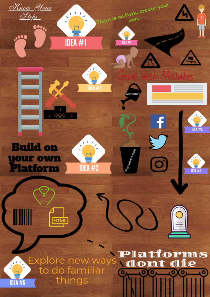
I chose to read “Digital Ghosts in the Modern Classroom” by Ashley Hinck and I chose to use Canva to create an Infographic. In a nutshell, the article is about the dangers of linear thinking and processes in the classroom that limit digital literacy while also limiting making, development and creative thinking.

I chose the Infographic platform because I thought it would be fairly simple to use and I figured it was really just a mini poster and I have some experience making posters so I figured it’d be an easy platform as my first one. I also felt although there was a template made for me I could still modify the layout the way I wanted.

In reality, using this platform was simple to move things around apart from the fact that I was working in a small space I sometimes had difficulty selecting the correct box to edit (then I learned about the zoom feature). When it came to the creativity side of things I had to be a bit more creative, their frames would cut off my pictures and I couldn’t really adjust so I had to get creative and use a form of photoshop that I have to be able to create the look I wanted. Overall,  I had a lot of fun making this and the challenge to making this artifact was that I had to condense the information presented from the article as much as possible to fit and then had to make it more visually appealing. My process consisted condensing these sections first in words and then see where I could remove the words and replace it with pictures. In the end, I think it turned out pretty well and it’s a nice snapshot of the information. I think this could be a great tool in the classroom to make it visually appealing and hit the main ideas.

Since there was restricted space it was difficult to put a full explanation or reflection. However, I have lots of space here. The student belief that internet is important for the future is valuable but their simple drag and drop one path fits all outline is not feasible for the jobs that we are preparing students for. I think I have adopted this one path mentality when it comes to doing assignments, probably from my own experiences as a student much like this article is outlining. Making the adjustment is important for students to be able to be makers, creators, and problem solvers. Taking this to the classroom I will encourage failures and successes to be able to stop this cycle. I will reduce worksheets and structured learning and increase their creativity to develop their own set of worksheets, and develop new ways of learning in the class.


Artifact (since Embedding it wouldn’t work) ?

  • You’ll have to sign in . . .
  • UPDATE: This platform is not sharing friendly!
  • Just kidding it’s the WordPress that’s not nice; artifact below


Tagged

Oh ghouls just wanna have fun!

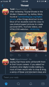
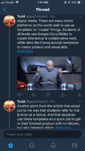
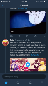
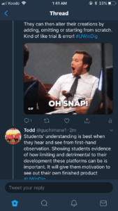
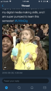
I chose to read “Digital Ghosts in the Modern Classroom” by Ashley Hinck and decided to use Twitter for my reflection. I thought Twitter would offer a nice template (character limit) while allowing for some freedom of creativity (the tweets themselves, GIFS, images, etc).

While going through the article it allowed me to reflect on many past projects between the faculty of education, faculty of human kinetics, high school and elementary school which were very template oriented focused mainly on the drag and drop aspect as mentioned in the article.

There are so many useful tools and resources on the world wide web. And there are many platforms which allow for open-ended learning and exploration, but the expectations and assumptions of templates linger in the classroom. These template platforms set the tone for another way that students “try to get the right answers”. But the question is, are the students learning anything from these platforms? The notion that students find trial and error as a failure is baffling to me, I think that students have such a fear of failure that they look for the simple, straight shot answer. Using shortcut template platforms resonate with today’s society of getting to the destination as quick and as easy as possible – students often use these platforms as a scapegoat to try and please their teachers by doing what they think their teacher is expecting and wants.

Below are some screenshots from my Twitter thread, and the link to my thread is right here –> https://twitter.com/guchimane1/status/1046273261972201472 

Digital ghost blog response – Kyle Fortier :3

Digital ghost catching – See above 🙂

The spooky Article – see below 😮

Digital Ghosts in the Modern Classroom

The article summarized the dangers of our electronic culture, making creating too easy and readily available. The problem with the way electronic culture is heading is the fact that nobody will understand the value of why things like Facebook, and snap chat are so easy people don’t realize they’re hard to make. When things are easy to make people don’t value what they create, anyone can drag and drop, copy and paste and follow a script. The article is trying to get students to recognize how easy things are and try to illuminate being creative. Students are using a vast media outlet to become copy and paste zombies when they could be aspiring tech artists. A stencil is traceable and easy to recreate works of art much like facebook and snapchat are the stencils of the online world. The article also highlights the immortality of these platforms, you can still create your original artwork and facebook will still be there and it will even allow you a huge platform to share your work. What I interpreted from this article also was the reason I chose it, a simple format to create my piece. Its simple, its creative, its slightly more than drag and drop and it doesn’t claim to be anything its not. You follow the steps, and gradually my piece becomes more interesting and involves different shapes and images. 

How I started this  project was creating an image only mind map of anything I could think of in relation to the article, checks, ghosts, garbage cans, lasers they all made it into the picture. Once I had all the images infant of me I could highlight the important ones and create my response through censoring my own ideas which I thought was a very unique way to do such a creative thing. Finishing this project was a huge sigh of relief because I felt comfortable and secure with how it looked in terms of the websites object design and ability to choose colour and font. I think this references the article because most people choose things like facebook and snapchat because its safe and you cant do anything wrong. This site did not give me the option to fail because it sized things for you, it colored them for you and provided you with ready to use stencils which promoted success; however with coding its all open ended and there plenty of room to fail. The ability to fail is what I think the article was about and we need to encourage our students to fail and keep getting better every time they use something different and more challenging.

Why did you choose your outlet? Were you comfortable or were you challenged? Tell me how you started this project and your first initial thoughts

Tagged

You Can’t Photoshop Knowledge and Creativity

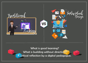
I chose to analyze and illustrate the article on Hybrid Pedagogy, Digital Ghosts in the Modern Classroom. The article starts off by explaining the common reasons for why students may take on the endeavor of learning about tech. Some of the reasons being that it is fun, interesting and that there are job prospects. From a personal perspective of both a learner of tech and future teacher of digital pedagogue, I created a poster to compare two very broad concepts of learning. The first category is an image of a teacher at the traditional starting point of learning, a blackboard. Within this blackboard there is an image of a laptop. Much like in the article there is a concept of traditional learning and teaching. Although the teacher is teaching a new subject he is still using an old teaching method of a chalkboard and self-centered teaching. If the viewer takes a closer look they are able to see that the computer screen has little avatars dropping and placing various images and texts on specific spots. This is a representation from the article of how the many of the current types of tech teaching in classrooms resembles the past ghost of fill in the blank hand out toil.

The right side of the versus contains individual design which can mean many things to different people. Perhaps the concept of dragging and dropping might be one person’s cup of tea and may be how presidential Obama marketing made their campaign, or perhaps it can also feel restrictive for those looking to make their vision come to mind. I chose this specific graphic for this side as it portrays many things spilling out of the screen without a proper place to land. This is how much of tech works as it can be messy business and will not always go as planned. There are various small icons within this graphic such as color pallets, eyedropper, camera, etc. All these images imply that there is not just one way of doing things but rather multiple mediums to the computer tech world and how we go about implementing our ideas right in the middle.

Now, what is good learning? This can vary from individual to individual. For new teachers, good learning is stepping away from standardized education as the article discusses that in previous classrooms this was the norm. The article emphasizes the need to depart from the ghosts of traditional classrooms in the digital world so students are able to experience good learning instead of traditional learning. Good learning is not perfect learning, meaning there is room for failure, success and growth.

What is building without direction? Well, with any stable project or endeavor a firm foundation is needed. This foundation can come in many forms, if it comes in the form of a template then it is based on one direction with spots to fill until the template is complete. Now when it comes to building something like a sculpture or an HTML webpage, there is no solid template, yes there is the initial blob of clay which is the foundation. There is the original HTML code that sets the framework, but the rest of the sculpture and format of the website is rightfully dependent on the maker.

Overall I agree with the article and that is why I chose to illustrate the main concepts of it in a self-made photoshop image. The fonts, colors, images have all been edited and altered by me to fit my own vision of the article Digital Ghosts in the Modern Classroom. There were a few trial and error copies that I discarded and even started from scratch at one point. I chose to create my own piece on a non-template program to further push the concept of individual design and individual learning. I am a self-taught photographer and amateur graphic designer. My experience outside of the classroom such as henna art, a photography tumblr, advertising jobs, lead me to the discovery of the tech world. Which further pushed me to learn about photoshop, lightroom and HTML through online articles and youtube videos. I believe the tech world is very much based around individual learning, individual design and individual variation, a concept of having one’s own voice and being a maker. I believe digital pedagogues must reclaim this right and allow their students to fail, succeed and fail again through inquiry-based learning in the tech world.

Yours in education,

Mrs. Ahmad

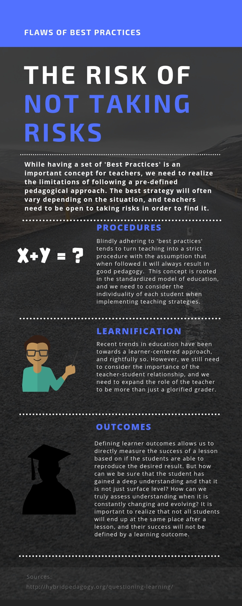
The Risk of Not Taking Risks

In episode 10 Questioning Learning of the podcast HybridPod, host Chris Friend and guest Amy Collier engaged in an informative discussion about the flaws of blindly adhering to standardized pedagogies.  One of the  important concepts from the discussion was the necessity for teachers to take risks and deviate from standardized models in order to meet individual student needs and maximize student potential.  I decided to outline a few of the issues of standardized pedagogies described by Amy Collier using an infographic as it was an effective way to visually represent the important details of the discussion. To create the infographic I used the website Canva.  This was my first experience using this website, and while there were limitations and struggles, it was a very easy site to navigate and proved to be a useful tool.


Eric Dunmore

If one door closes and an other one opens, your house is probably haunted.

After reading Ashley Hinck’s Digital Ghosts in the Modern Classroom, I am enlightened about an issue I had never been aware of. She talks about how students are accustomed to a template based technological world. She argues that we need to move away from these types of platforms and teach students from the ground up – like having them code a website instead of using aides like Wix or GoDaddy. She encourages students to be creators instead of imitators and recognizes that failure is part of the process. She refers to digital ghosts when students become disappointed or frustrated when technology challenges them in ways a drag and drop platform may not.

In the spirit of this article, I chose to try something without a template as my first multimedia reflection. I highlighted some important words and sentences from the article and had many different people read them aloud for me to film. I then put it all together into a quick video summarizing the article. Unintentionally, it also tells the story of my day from school, to work, the gym, then home later that night. Please enjoy by following this link: https://youtu.be/aVi2EDgG9u4

In all honesty, I haven’t yet figured out how I feel about this publication. I agree with Hinck on many levels, but am not sure we need to change everything about the way technology is taught. I do not see the issue in embracing technology and the ease that template based platforms allow as long as we also incorporate template free platforms as well. Students are fascinated by their instant fabrications which develops a quick interest that may potentially lead to a deeper desire to learn – I would hate to take this away from them. Also, we as teachers would be so limited due to time constraints if all technological expressions were made from scratch throughout the semester. However, I understand the merit of allowing for some truly original work and the appreciation that comes from learning about how things operate in the background. I wonder then if there is a balance. If we can explore template based technology as well as original work from the ground up, I feel a student’s education would be maximized.

Tagged