Category Archives: 332wednesday12

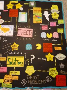
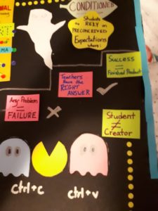
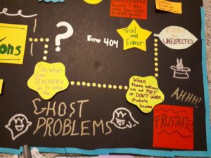
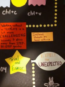
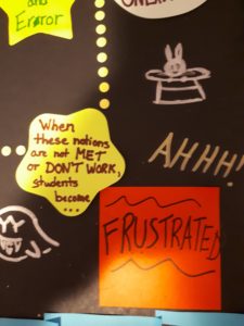
Mind map of “Digital Ghosts”

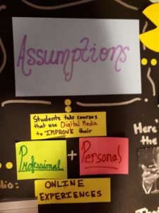
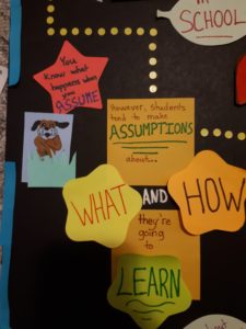
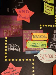
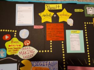
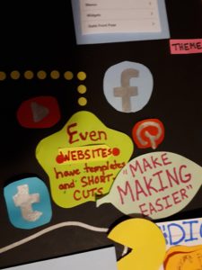
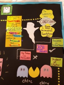
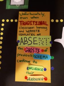
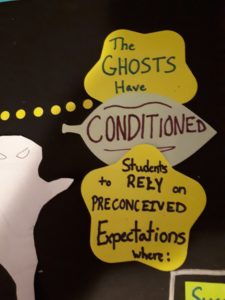
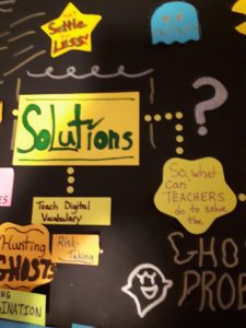
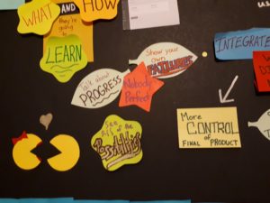
Since the article, ‘Digital Ghosts in the Modern Classroom’ by Ashley Hinck discusses stepping away from using short cuts/templates in the classroom and with digital media, I decided to do that as well. I found it ironic that the websites we were encouraged to use for this assignment are prime examples of a template format. Therefore, I decided to make a mind map using sticky notes. The variety of colours and shapes definitely allows the text to stand out, and the pictures are both hand drawn and printed from the internet. I decided to go with a Pacman theme because I believe it’s a creative spin that plays off the idea of ‘digital ghosts’. I really enjoyed this article because it encouraged teachers and students to take creative risks and develop their problem solving skills. I think it’s important for students to learn that failing is fine, as long as you keep trying and never give up. While using guidelines can be useful at the beginning to learn the basics, students should slowly be eased into more independent assignments. Students will have a much more difficult experience if they are forced to immediately avoid using templates. It could even discourage them from being creative in the future.

I think one of the most challenging aspects of this project was being able to keep everything organized and still being creative. I had to create an attention-grabbing item that, at the same time, didn’t overload the senses. Ironically, summarizing the article was the easiest part of this assignment because of the amount of time literally brainstorming how my brainstorm would look. I think using sticky notes turned out to be a great idea for this project because it forced me to shy away from the norm of just writing ideas down on a mind map. With sticky notes, I had to focus on shape and colour coordination and ask: how much text can I fit on one? Do I have enough space to fit all of my ideas on this board? How will these sticky notes affect how many pictures I use? At the end of the day there is one thing I know for certain: I’m definitely keeping my distance from sticky notes for a while.

Just in case you can’t read everything:

1) 
2)   
3)      
4)

5) 
6) 

7) 
8) 
9) 
10) 
11) 
12) 
13) 
14) 
15) 
16)
17) 
18)   
19)   
Full view again (magnified):

Ghosts in the Digital Age: A Media Reflection

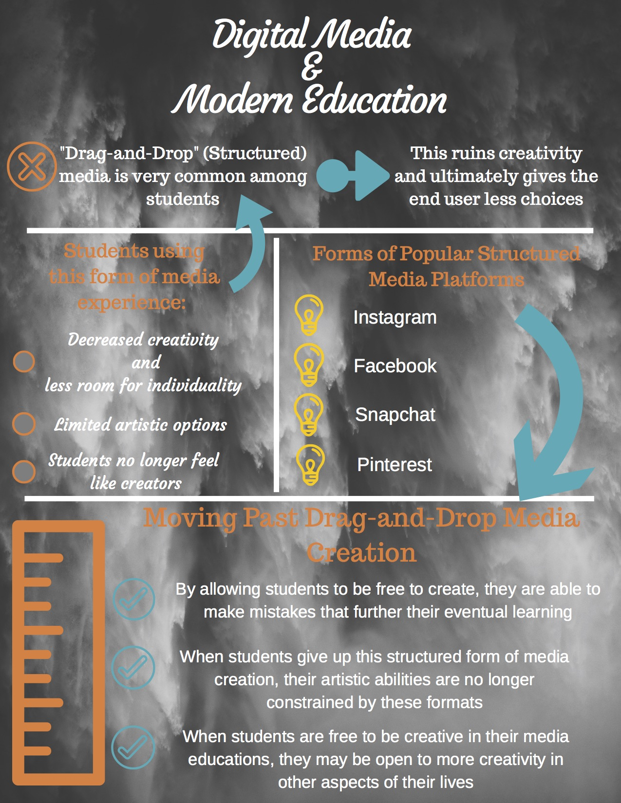
After reading the article Digital Ghosts in the Classroom by Ashley Hinck, I chose to complete an infographic to outline the main takeaways from this paper. In this article, Hinck describes how remnants of previous (older) forms of digital media are currently impacting the way in which student’s creativity and individuality are manifested in the present. More specifically, Hinck describes how students have come to expect that there is a “right answer” for every question or situation that is presented to them, rather than than taking an individualistic or creative approach to arrive at their own solution. After studying the article, I felt as though this tendency to look for one specific answer proved very detrimental to the students, as they were so focused on being correct that they actually lost the majority of their ability to be creative and find novel solutions. This feeling of requiring a “right answer” is something I can personally relate to after completing this assignment, as I am very much a linear learner. Therefore, I found it difficult at times to stay on task and keep in mind where my infographic was ultimately going. As someone who has grown up utilizing various forms of social media such as Facebook and Instagram, I can see in my own work how these forms of digital media ghosts have influenced my own work and creative abilities. More specifically, this assignment and the readings that accompanied it made me realize that my level of creativity and comfort bubble when using these more open forms of digital media (such as the attached infographic) have been heavily impacted by my relatively frequent use of “drag-and-drop” and structured media forms. When I began reading this article, I thought of how detrimental this decrease in creativity and ingenuity could be on students effected by it; but never realized that I may be one of them. However, in my critical analysis of the article, I came to realize that I was very much one of the students who had been influenced by these digital ghosts of structured media forms, without even being aware of it. This ultimately struct me as concerning, as it made me realize that every day we can be negatively impacted by forms of media that many of us include in the “required” section of our daily lives. Overall, I was forced to step out of my comfort zone in creating this infographic, and thus faced a number of challenges in utilizing an entirely new form of media. That being said, I feel as though I have produced a product of digital media that has proven useful for both myself, as well as the people who will be viewing the finished product.

Step Outside Your Comfort Zone

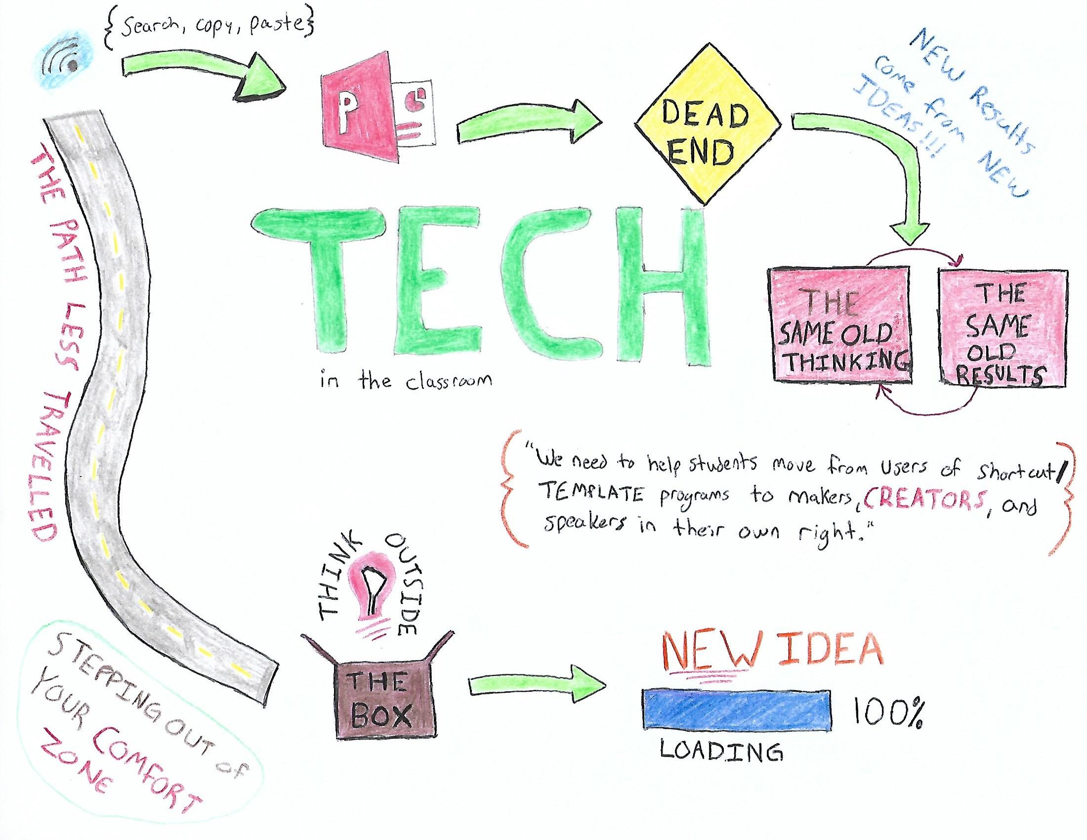
For my assignment, I chose to respond to the article Digital Ghosts in the Classroom by Ashley Hinck. In the article, the author talks about how she is a teacher in a technology class and how students are afraid to fail. She explains that this is because popular template programs are easy to use and present little to no risk of failure. In her class students do coding, meaning producing a “working product” at the end is a huge success. She identifies that a student’s believe digital media making is simply a series of linear steps, with a guaranteed working product at the end, which is not the case. Her class also required students to code their projects in HTML, I can only imagine how steep of a learning curve that would be. Hinck presents her theories on modern education in the article, describing how she believes students entire education is like a template platform; a student performs a series of designed steps, produces a correct answer, and has no risk of failure. I believe she is onto something with that school of thought, you can apply that model of thinking to nearly any course and it is accurate. Here is the link to the article: http://hybridpedagogy.org/digital-ghosts-modern-classroom/

I can relate to this “comfortable path” as I almost chose to do a PowerPoint for this assignment, however, I stepped out of my comfort zone and was able to do a SketchNote. I really enjoyed the process of thinking out how I wanted the final product to look, and figuring out how to illustrate key points in the article. I chose to do the SketchNote because I have never tried anything like this before and thought it would be a good way to experience a new medium. Overall, the learning curve was steep, I had to think about the article in a way that was different from just putting the information summarized into a PowerPoint, but I think I managed to produce something effective in learning. My experience creating the artifact related greatly to the text from the article because I was required to think of the information in a creative way. Hinck says “digital making is not a series of linear steps” as I was working on my SketchNote, I realized how true that is; I often changed my mind and had new ideas pop into my head that ended up altering the final product from how I originally envisioned it. Lastly, in using this medium I found a clear connection to teaching and learning as I continued to create new ideas for my SketchNote, I found the material from the text made more sense to me and deepened my understanding on the topic.


Also, sorry everyone this is sideways.. I have rotated it multiple times and it never stays in landscape mode when I save it.

Template? Nah. Blank Canvas? Yeah!

For my post, I chose to analyze the article Digital Ghosts in the Classroom by Ashley Hinck. This article revolves around the use of templates and digital shortcuts constantly being used by students and teachers in the classroom. I found it very interesting because I have always been a fan of templates and strict guidelines. Similarly, to her main point of the article, I found it much easier to use a template because I was afraid of doing something wrong; it was simple to just pick one and work off of it rather than going through a long process of choosing colours, fonts, backgrounds and much more than I could possibly imagine. She outlines a student’s fear of failure in the trial and error process and that is where I could definitely relate. I usually like to shy away from new things because I am afraid of failing the first time, even if it is a natural process. Hinck claims the school system is set up to have students shy away from trying new things because failure is so frowned upon – shying students away from taking risks. To break these barriers, she suggested troubleshooting with classmates and that is an excellent idea; the chances are very high that there is somebody else in the class that is sharing the same struggles. This article really opened my eyes on the importance of creativity and expanding digital literacy; getting excited about working with less detailed instructions and more so a blank canvas.

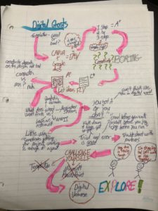
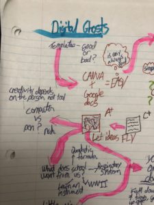
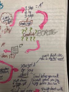
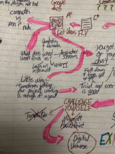
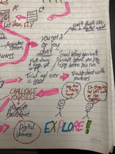
Here is my sketchnote; I took one picture of the full document and broke it down into 4 separate pictures to help view them into more detail, I hope it helps!


Stepping out of my comfort zone, I did stick with an analog approach, but with more creativity making a sketchnotes page even with my lack of artistic ability. Although it is not technically “digital”, I believe that it has helped me think more creatively and will ultimately help me expand my digital literacies in the future. The process was not easy for me, and the challenge has turned it into a piece that I am proud of. I sat there blankly for about an hour or so, having no clue where to even start. I began with a “rough draft” with a plan to redo it, making it more professional looking but those plans changed. I decided to keep my original sketch as it shows a great development in my creativity as the sketchnote goes on. It is messy, but it really encapsulates the ideas running through my mind while reading this article. Although this particular multimedia piece is not digital, it has shown me that risk-taking is fun and very rewarding, making me very excited to try something new for the next project!

Tagged

Ain’t Afraid of No Digital Ghosts

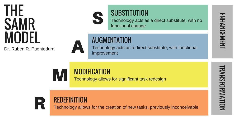
Technology is a center point to society today and is fundamental to how it functions. With deep-rooted ties to society, it permeates into education. The permeation can prove to be finicky because of improper applications of these external societal resources not fully being useful for students. It is the equivalency of trying to fit a square peg into a round hole. In the article, Digital Ghosts in the Modern Classroom by Ashley Hinck there is the argument for teachers to recognize through their use of technology in their pedagogy the dangers of using templated work. The article is a strong piece that acknowledges that students will not always know the ins and outs of coding and have the skills necessary to maximize their technology and creativity at the same time. There is the concept that Hinck argues that teachers in their pedagogy need to realize how to limit the conformity of templates, yet maximizing the creative results. This concept resonated with me because templates are the foundations to most interactive learning because it allows for that individualized student-centered contributions, yet those same templates are argued to build conformity which is detrimental to this teaching philosophy. Hinck I may not fully agree with for some of their ideas, but they presented information that forces teachers to be leary on the usage of templates within the classroom. This connects directly with the fact that my template has proven limited in how I can manipulate the photos and what I can do with the structure. Hinck argued that there are limitations on templates and this is echoed throughout the process of creating my artifact. On the other side, however, the effort and time that would need to be put in to create the infographic through coding it would have been far more problematic. There would have been issues if even one line of code was off and therefore the amount of trial and error that would take place would bog down the creative ideas. It would force the creator to weigh whether it would have been worth it to add certain information and I would have limited the construction of my infographic if I had to use something like CSS. I found that through my experience of creating this infographic that I had to reflect on tools that I have used in the past. As explained in the infographic there are concerns with Kahoot because they are only tapping into the remember and maybe the understanding levels of Bloom’s Taxonomy which is not where an educator wants to reach for a template based learning tool. From there this made me think about where it falls on the SAMR model and that it was only a substitution form. The Hinck article made me critically reflect on what resources that I have in my tech teaching toolbox and showing me that it was lacking. 
Attached below is the link to my infographic.
https://create.piktochart.com/output/32709526-media-response

Original Hinck Article:
http://hybridpedagogy.org/digital-ghosts-modern-classroom/

Tagged

Digital Ghost of Classrooms Past

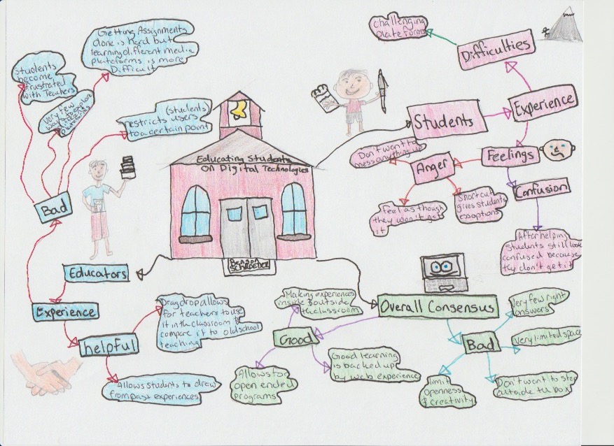
I chose to the do the article rather than the podcast because I found that the article peaked my interest more and was able to better understand the article better than the podcast. The article Digital Ghosts in the Modern Classroom by Ashley Hinck and reviewed by Gregory Zobel, Jessica Knott, and Maha Balihad peaked many things for myself but I decided to specifically to discuss how both teachers and students react to digital media in the classroom as well their experiences.

I found as I read the article that most students are facing the same issues. Some of these issues are that students are afraid of failing and pushing the limits, they would rather think outside of the box because they think it will turn bad if they do so. As teachers, we try to make students more comfortable different media platforms but when teachers try to help students they give them that look like they have four eyes and don’t understand you. I felt as though the students and teachers were so interconnected because we as teachers can learn so much from students as they can from us. The method I decided to use express was a self-made mind map. I thought that this would be the best method to use for the teacher-student similarity.

I used different colours to draw your eyes to different parts of the mind map, I also included a school which is placed in the centre of the mind map because schooling is the central part of this entire article and needs to be the main focus.

Digital Paranormal Activity and You

Hello folks, for this week’s multimedia assignment I chose to review Ashley Hinck’s article “Digital Ghosts in the Modern Classroom.” The original article can be find here: http://hybridpedagogy.org/digital-ghosts-modern-classroom/

https://create.piktochart.com/output/33034323-digital-ghosts-critique

Hinck’s article covered a unique subject, the influence of template based software on education. Her stance led me to create an infographic, which I used to break down her argument into small statements and then reflect or respond accordingly. Overall, I found her article fascinating but limited to her field of study in post-secondary. In my opinion, the basis for her argument assumes that students are capable of creating digital content without any templates, yet this is impractical for a non-digital media based course. This is extremely limiting in a K-12 environment, where students may encounter issues using the simpler templates. In my own experience using Piktochart, a simple template platform according to Hinck, I encountered a major issue resulting in the link to my artifact not being usable. Similarly, various colleagues of mine struggled uploading images to WordPress with the proper resolution.

Adam Drouillard

Tagged

Who ya gonna call? A Powtoon on Digital Ghosts

Ashley Hincks article Digital Ghosts in the Modern Classroom talks about how some digital media sites utilize and ‘drag and drop’ formulas in order for users to create a digital project. I have done my fair share of digital work, ranging from photoshops to vector images to even a few Adobe Flash cartoons back in high school. I completely skipped over the ‘drag and drop’ formula sites and jumped right into what Hincks considers to be more open and free software. As such, I initially had a hard time grasping parts of her argument because I simply could not relate to them. I realized however that my other hobby, miniature painting, follows a similar formula to these ‘drag and drop’ websites. You buy a miniature, build it, and then there are instructions in the box or on websites which shows you step by step how to do it. Now of course, the instructions are done by a professional painter, so even if you follow the steps perfectly, your product won’t look nearly as good as the professional one, which is similar to what Hincks discusses. The ‘ghosts’ that she mentions are created from formulas like the ones mentioned previously, and teach students that in order to succeed or produce a ‘good’ product, they must follow the steps exactly as they are outlined. The problem is, this teaches students that they are either wrong or they are right, when in reality they should be taught that being wrong is a necessary step in learning how to do something. As I said in my Powtoon video, trial and error learning should be given priority over the current ‘step by step’ model we employ now, because don’t learn how to creators or thinkers for themselves, rather they create or think in whatever way people of authority tell them too. If every great artist in the world followed the steps taken by some of the first artists in history, the cavemen, the Sistine Chapel would be covered in cave drawings. To create things of beauty, one must be willing experiment and break the rules and go beyond what is expected of them by others and make things that they can be proud of.  


As someone who jumped right into open concept programs, I found that these digital media creation sites which present you with a predetermined template were extremely constrictive to what I wanted to accomplish. I found myself chuckling at certain points because of the irony of the situation I found myself in. I was to make a digital media presentation about how template websites limit creativity, and I found myself in that very same situation! While the creation process of my actual Powtoon was quick and painless, I found that I didn’t learn anything from my time in the program. Specifically, I felt very restricted because I only had access to the basic website. As such, I could only use a few characters and my video have to be under 3 minutes long which made me feel even more trapped. Furthermore, I kept comparing my work to other ‘whiteboard explain’ videos on youtube and felt that mine didn’t seem all that impressive due to my limitations.  While I had a great time using Powtoon, I think in future reflections I’ll be utilizing a different medium that doesn’t hide all its content behind a paywall.  Initially I had wanted to make a stop-motion video about this topic but not having a stable camera stand made such ventures impossible. I think I’ll definitely be doing a stop-motion video later in the school year as that artistic style is just so amazing. I really enjoyed the opportunity to express my thoughts in such a artful way, having come from two writing disciplines, it was nice to not have to write an essay with references for once.


Take a look at my Powtoon below!


Is There a Digital Ghost Haunting You?

After reading the article Digital Ghosts in the Modern Classroom by Ashley Hinck, I was given a better understanding of the consequences of constantly using worksheets and pre-made templates in schools for the students’ creativity. Hinck points out that, by using those templates, we are preventing students from being creative and setting them up for what they see as a failure, when they struggle to do something on their own. Especially in a digital sense, when using templates on websites, we are restricting ourselves to a very small number of templates that might not fit what we are trying to express. As I mentioned briefly in the video, I was able to, first hand, experience what Hinck was talking about. I was becoming very frustrated working on this video because it was far from straight forward. I did what I could manage and below you will find that doodle video, made on Animaker. The video summarizes the points I thought were most important from the article, as well as touches on a few of my feelings on the topic, which may resonate with you or you may disagree with! Cheers.

https://youtu.be/r6MIjSSPVCM

My link doesn’t seem to want to cooperate but this Nelly song does, so partly to prove that I wasn’t lacking digital skills and just didn’t know how to do it (and I did trial-and-error several things), partly because throwback Nelly is great, and partly because it was only just a dream that I thought everything would work out smoothly, I decided to leave it here for you guys to enjoy! Just don’t forget to click on the hyperlink above to see my video!

It’s Time to Exercise these Digital Demons

Digital Ghosts in the Modern Classroom – Ashley Hinck

http://hybridpedagogy.org/questioning-learning/

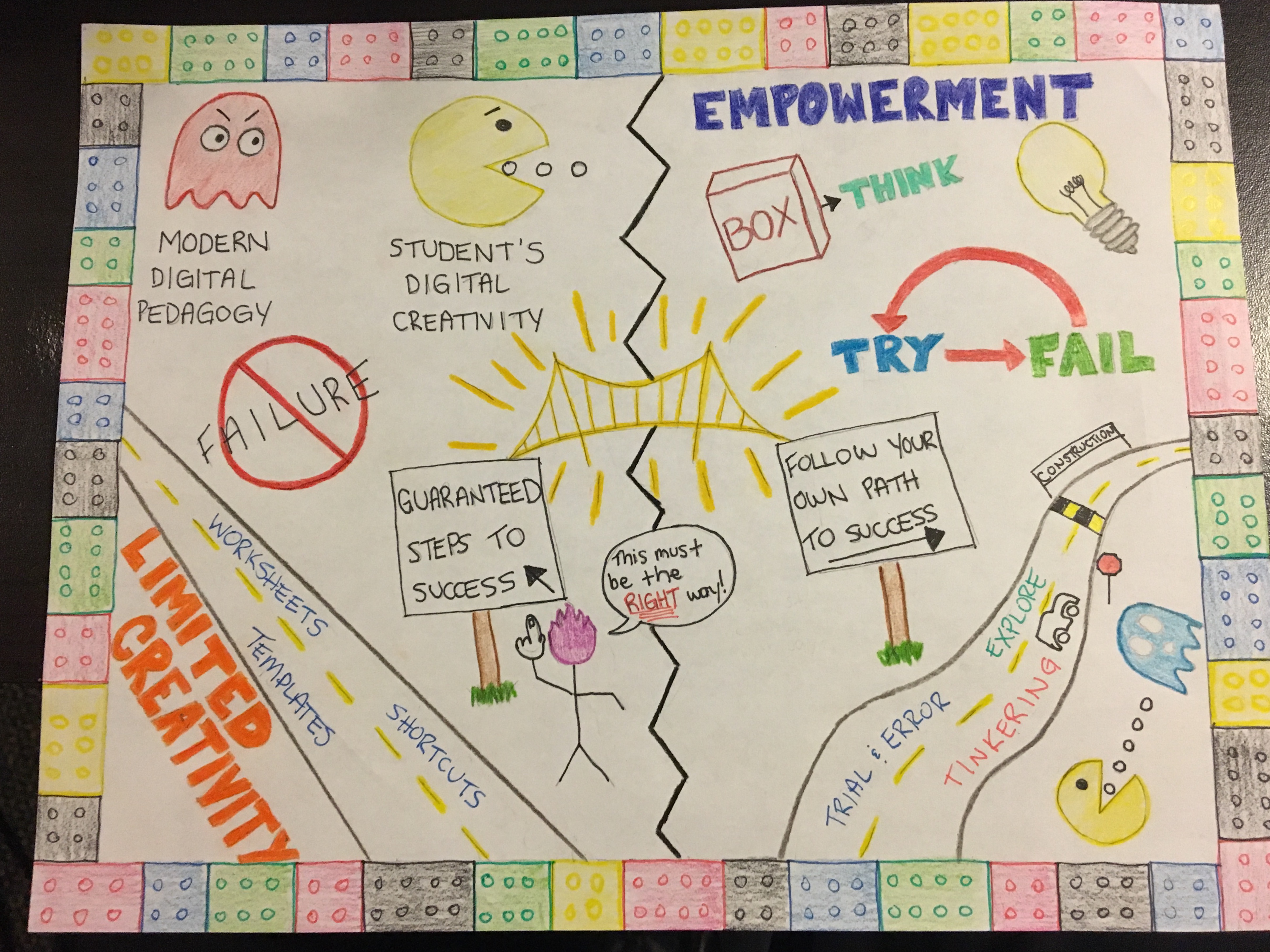
I found the article by Hinck to be extremely relevant and also relatable from a personal standpoint. Digital Technology is a massive part of education now, and will only continue to grow, and teachers are afforded the responsibility to ensure it is used to unlock the students greatest potential, Hinck points out in this article that this is not happening. As far back as I can remember, and as recently as last school year, I have always been quick to resort to pre-made templates and shortcuts when tasked with making a presentation of some sort. It was definitely not as evident then, how much this was killing my own creativity, however this issue was brought to light in this article and forced me to critically think back on how I used digital technology in my own experiences. You can’t “drag-and-drop” your way to success in life, and I believe it’s imperative that students learn to tackle problems with innovation and without a fear of failure. Shortcuts and templates can guarantee results in the end, but what was learned in the process of ‘making’, or was there really any process of making at all? One of the concepts from Hinck’s article that really resonated with me was her connection between playing with LEGO and how we should be inspiring children to think and take on projects and challenges. Hinck states that “building LEGO without directions can invite openness, creativity, and agency,” and I believe these qualities are lacking in today’s digital pedagogies. I was big into LEGO when I was a child, and I remember the sense of freedom and shear creativity when building my very own creations, no templates or shortcuts available, all my own work based on trial and error, this was the influence behind the LEGO border of my Sketchnote. As educators, I believe it is our responsibility to motivate our students to utilize methods that may not be comfortable for them, allowing them to fail and revise rather than using simple template-based programs. I tried to make the bridge in the middle of my Sketchnote a central focus, symbolizing the need for teachers to bridge the gap between the use of things like templates, worksheets and shortcuts, to inspiring students to follow their own paths to success, even if that means failing and revising multiple times. Reading this article made me realize the reason I am still quick to use templates, worksheets and shortcuts is because of my lack of knowledge in digital technologies. I look forward to learning more about how to creatively make various projects using digital tech., and expanding my knowledge so that I can one day ensure my students are taking on their work with the empowerment and cconfidence I fell it is my job to instil within them.