Category Archives: 322monday20

The Ghosts You Chase You Never Catch

I chose to read “Digital Ghosts in the Modern Classroom” by Ashley Hinck and I chose to use Canva to create an Infographic. In a nutshell, the article is about the dangers of linear thinking and processes in the classroom that limit digital literacy while also limiting making, development and creative thinking.

I chose the Infographic platform because I thought it would be fairly simple to use and I figured it was really just a mini poster and I have some experience making posters so I figured it’d be an easy platform as my first one. I also felt although there was a template made for me I could still modify the layout the way I wanted.

In reality, using this platform was simple to move things around apart from the fact that I was working in a small space I sometimes had difficulty selecting the correct box to edit (then I learned about the zoom feature). When it came to the creativity side of things I had to be a bit more creative, their frames would cut off my pictures and I couldn’t really adjust so I had to get creative and use a form of photoshop that I have to be able to create the look I wanted. Overall,  I had a lot of fun making this and the challenge to making this artifact was that I had to condense the information presented from the article as much as possible to fit and then had to make it more visually appealing. My process consisted condensing these sections first in words and then see where I could remove the words and replace it with pictures. In the end, I think it turned out pretty well and it’s a nice snapshot of the information. I think this could be a great tool in the classroom to make it visually appealing and hit the main ideas.

Since there was restricted space it was difficult to put a full explanation or reflection. However, I have lots of space here. The student belief that internet is important for the future is valuable but their simple drag and drop one path fits all outline is not feasible for the jobs that we are preparing students for. I think I have adopted this one path mentality when it comes to doing assignments, probably from my own experiences as a student much like this article is outlining. Making the adjustment is important for students to be able to be makers, creators, and problem solvers. Taking this to the classroom I will encourage failures and successes to be able to stop this cycle. I will reduce worksheets and structured learning and increase their creativity to develop their own set of worksheets, and develop new ways of learning in the class.


Artifact (since Embedding it wouldn’t work) ?

  • You’ll have to sign in . . .
  • UPDATE: This platform is not sharing friendly!
  • Just kidding it’s the WordPress that’s not nice; artifact below


Tagged

Oh ghouls just wanna have fun!

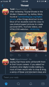
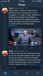
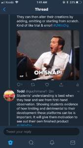
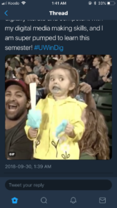
I chose to read “Digital Ghosts in the Modern Classroom” by Ashley Hinck and decided to use Twitter for my reflection. I thought Twitter would offer a nice template (character limit) while allowing for some freedom of creativity (the tweets themselves, GIFS, images, etc).

While going through the article it allowed me to reflect on many past projects between the faculty of education, faculty of human kinetics, high school and elementary school which were very template oriented focused mainly on the drag and drop aspect as mentioned in the article.

There are so many useful tools and resources on the world wide web. And there are many platforms which allow for open-ended learning and exploration, but the expectations and assumptions of templates linger in the classroom. These template platforms set the tone for another way that students “try to get the right answers”. But the question is, are the students learning anything from these platforms? The notion that students find trial and error as a failure is baffling to me, I think that students have such a fear of failure that they look for the simple, straight shot answer. Using shortcut template platforms resonate with today’s society of getting to the destination as quick and as easy as possible – students often use these platforms as a scapegoat to try and please their teachers by doing what they think their teacher is expecting and wants.

Below are some screenshots from my Twitter thread, and the link to my thread is right here –> https://twitter.com/guchimane1/status/1046273261972201472 

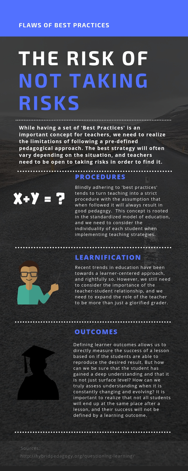
The Risk of Not Taking Risks

In episode 10 Questioning Learning of the podcast HybridPod, host Chris Friend and guest Amy Collier engaged in an informative discussion about the flaws of blindly adhering to standardized pedagogies.  One of the  important concepts from the discussion was the necessity for teachers to take risks and deviate from standardized models in order to meet individual student needs and maximize student potential.  I decided to outline a few of the issues of standardized pedagogies described by Amy Collier using an infographic as it was an effective way to visually represent the important details of the discussion. To create the infographic I used the website Canva.  This was my first experience using this website, and while there were limitations and struggles, it was a very easy site to navigate and proved to be a useful tool.


Eric Dunmore

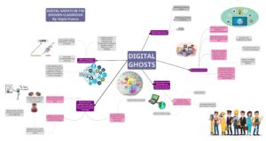
Digging Deep into the Digital World – KAYLA FRANCO

The medium Mind Mup was used to create a mind map to represent the main ideas and reflection of the article Digital Ghosts in the Modern Classroom by Ashley Hinck. The article discussed the importance of digital technology in not only the classroom but also beyond that in future careers. Thus, it is important to integrate these technological skills in the classroom at young ages to help build them through the years. As we all know, the world is becoming more and more technologically innovated and dependent. The main idea of the article was to show how the students use technology – drag and drop with a series of laid out steps with little failure and in reality this is limiting students in their creativity with their linear thinking as they look for the ‘right answer’. The article proposes a shift to a new pedagogical ideology to inspire makers, creators and thinkers through a change in this linear process and the use of trial and error.

Through my own experiences with this application, I can understand where the article is coming from. Although the medium’s final product turned out successful, there were limitations to such an application. There was no option to change the font colour or font type. Although you could change the size, background colour, and line formatting (style and colour). When attempting to insert images, there were difficult to maneuver around the page. Once getting the images on, I realized that I could not export the file as it was too big and the application wanted money to buy the full application. Therefore, in the end I exported the file without images and used another application, Photoshop to add photos to my mind map. The limitation with using two applications was the text is slightly blurry upon zooming in.  Through this application, it limited my creativity and options in creating a mind map.

As an educator, I think it is important to foster creative thinking and individuality rather than limiting our students. I encourage both failure and successes as this allows for the learning to happen rather than a linear approach that gives the desired answer. The shortcut template website/platforms are becoming over depended upon as they reduce creativity, imagination and openness. Students are becoming less tech-literate as they depended upon these pre-programmed and developed programs to help with the easy way to find a solution. Although these platforms do have value for students with IEPs and learning difficulties as it offers the framework to follow. This can help to reduce frustrations and allow students to express themselves. This article related to the debate of standardized versus authentic education which shows the revolutions to embrace student/learner differences and personalized learning. Ultimately, as educators we need to encourage students to be more open and make their own choices to become MAKERS and CREATORS.

Technology is becoming more and more apart of everyday and as educators we need to go with these technological innovations rather than against them. Technology is a great tool and asset in the classroom that can help to foster creativity and ours makers/creators.

Article: http://hybridpedagogy.org/digital-ghosts-modern-classroom/


Tagged

Who You Gonna Call? Digital GhostBusters!

This article (http://hybridpedagogy.org/digital-ghosts-modern-classroom/ ) talks about the dangers of only implementing ‘drag and drop” type assignments in the classroom, such as worksheets or pre-formatted applications that allow students to enter a specific answer to receive a mark, with little room for creativity. I believe this linear “standardized” model forced students to get used to a routine and reduces their opportunity or desire to take a risk for a greater reward. I believe this way of thinking has been reinforced to the point where students aren’t looking to educate themselves, they are looking for the easiest pathway to the correct answer. I also find this ironic because the format I chose for this artifact was in fact a drag and drop format. I think this comes from a sense of security in staying in our comfort zone and being afraid to fail.  From my standpoint, we often are not given the opportunity to try, make mistakes and try again. Often teachers have so much on their plate that they won’t accept a second attempt because they simply do not have the time to mark all of it. I really enjoyed the part of the article that said “try, fail and revise,” because I think that’s what education should mean. Being allowed and encouraged to explore, take chances and fail miserably without worrying about bad grades, and instead being marked on our progress, not just the final product.

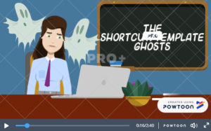
Now I chose to create a Powtoon because I did want to step outside my comfort zone with something new and exciting, and even with a new format I still stuck to a premade template rather than creating something from scratch.  I could blame this on a lack of time and knowledge to create something from scratch, but really I worried it wouldn’t be good enough. This is definitely an attitude I need to fix, so that I can show my students what it looks like to believe in yourself even if you don’t know what you’re doing and how satisfying the end result can be when you created it yourself. Unfortunately with Powtoons, it was not until the day before uploading it that my artifact decided that it required a premium membership, which would not allow me to download my Powtoon and of course why it looks the way it does with the watermark all over it. In order to get this final product I had to screen record the video on the web browser, record my narrative using multiple snapchat filters for a more “unique” voice, download royalty free music for the background and edit it all together. This was very frustrating since I did not have time to create a new visual from scratch but instead has to problem solve a way around it to have a somewhat finished product. 


To further this discussion, what is something that you currently want to work on to become a better role model for your students?


Click the link below to view my artifact (because it decided not to upload as a video) 

https://youtu.be/esdKZ2LUzyI


Paige Godin


Tagged

Digital Ghosts in the Classroom

I chose to look at the article, “Digital Ghosts in the Modern Classroom” by Ashley Hinck. A link to the article:

Digital Ghosts in the Modern Classroom

The main focus of this article is that though we are trying to push students towards becoming their own creators and innovators, we are not completely moving away from the standardized model because of the platforms and websites we choose for them to work with. For example, through the use of templates such as Canva, we are still continuing the traditional school culture, where the authority is placed on the teacher and the app’s hand. Because of the limited number of open spaces for student work, and less opportunity for exploration, we are gearing students towards the model of having one “correct” method of creating. Hinck also points out that even when we try to move away from these websites and templates, it continues to crawl up in student work, as they draw on their past experiences from within their school work and their digital world. One of the key issue is that students are used to everything being done for them so easily, that having to start from scratch becomes quite challenging for them and the many trial and errors they face is perceived as a failure from their viewpoint.

As a student and a future educator, I do agree with the article’s perspective. However, I do find myself in a bit of a contradiction as to where I stand on this issue. I am the type of person, though I believe can be quite creative when needed, prefers a guided model or a beginning tool, to help me get going and get creative. By bringing up that point, I do not necessarily agree that using these websites align with standardized education model, since the argument is that they are continuing to narrow down student creativity and exploration. I believe a good balance of guidance, with the opportunity to make your own creation is an important factor in ensuring we can meet the learning needs of every type of student. I personally was and still is, the type of student who would be completely lost and have a brain fart if I were given no template or platform to help me get started.

Below is the link to my infographic.


https://create.piktochart.com/output/32986350-new-piktochart

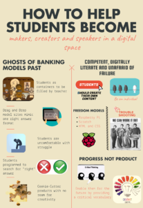
Ghosts of Banking Models Past

Multimedia artifact #1

For my first multimedia reflection assignment I chose to read the Hinck article titled Digital Ghosts in the Modern Classroom. The author begins by stating that students today are fascinated with digital media and love to create it. However, most tend to use predominantly “drag and drop” models which recall the students as container education theories of the past. This method of education saw students as a tabula rasa (blank slate) which needed to be filled with the right answers which educators neatly provided to them. The process of education was seen to be linear with no room for deviation, student centered learning or creativity.

The author argues that these popular template/shortcut platforms mimic this archaic way of viewing students and education. These sites can be seen that way because they have predetermined settings with little to no room for students to make individual choices or display creativity. If, as educators, we encourage our students to create their own meaning and connections in the classroom, why should we not do the same when it comes to digital media?

In the article it is also pointed out that when students are asked to struggle through the process of working with HTML coding or CSS they often get frustrated and see any challenge as a personal failure. The old linear way of thinking still haunts students. They are uncomfortable with making mistakes and trying to fix them, they just want to achieve success (the “right” answer) and have a finished product.

I myself struggle with this phenomenon. My ineptitude with digital media and technology has, on more than one occasion, caused much anxiety and feelings of personal failure. In beginning to create my Piktochart infographic artifact I was nervous at just the thought of having to create my own content and share it in a digital space. I spent quite some time struggling to try to get everything to look just as I wanted. I had to look a few things up and ultimately learned a few tricks along the way (like how to mask pictures together to get different shapes). The process was uncomfortable but I kept Hinck’s article in mind throughout and kept on.

In moving towards a better future with our students, we have to learn from mistakes and try to employ digital media to teach them to create original content. Part of doing so is to show them that the road to success is filled with many mistakes and that working to fix these mistakes ensures progress. Students need to learn to value progress and problem solving over rushing to create a finished product. When they can achieve that, we can empower them to see themselves as valuable makers, creators and speakers in the digital world.

-Alyssa Poole

Rant: The End of Template Models

Ashley Hinck’s article, Digital Ghosts in the Modern Classroom, discusses the expectations that students have with digital media, and the stark difference between teacher centered versus student centered media education. Beginning this assignment, I assumed that it would be a linear process in which I would cobble together some words, drag and drop some pictures and then I would be guaranteed a working final piece. Having now completed this assignment, that was certainly not the case. I found it very difficult to get started, as I wasn’t sure exactly what to do. I didn’t have a set linear procedure to guide me through the steps that I needed to complete in order to get my finished artifact. There is also no set answer to this assignment, which is very different than the standard teacher centered courses that made up the majority of my university career. With the assignment I found myself being forced to be creative and try some new things that were certainly outside of my comfort zone.

I initially started with the standard template websites such as Canva because it was easiest to use a template rather than design something myself. I decided however to try MindMup as it was much more open and it gave me some creative freedom to come up with a project that was entirely mine. Coming up with my own design was very rewarding to me as I had to troubleshoot through problems, and there were a good number of problems, as well as tinker with the project with the inputs that I was given in class by the professor and my colleagues. I found it very satisfying using MindMup and learning the inherent issues that came with that software in order to come up with a final product.

MindMup

-Brandan Joyce


The Digital Ghosts Made Me Do It…

For my multimedia reflection, I decided to do a Powtoon that summarizes what I believe to be the main points of the article Digital Ghosts in the Modern Classroom by Ashley Hinck.

Click the image to view the video

[Disclaimer: I have never used Powtoon before and I did not realize that the trial runs out even after exporting the video on their site so do look past the “PRO” and “PRO+” watermarks as I am actually incredibly bitter about this Image result for annoyed emoji ]

ANYWAY

Throughout the article, Ashley Hinck makes many valid points about the use of shortcut/template methods and the effects that these methods have on students and students’ creativity. Personally, in my own academic endeavors I have found that many of the digital creations I have made for assignments (including this response with Powtoon) have been heavily reliant on drag and drop platforms that allow for me to get my point across as easy and hassle free as possible. However, even though these platforms are incredibly easy to use and usually allow you to finish creating a product in no time at all, in my own experiences I have also found them to be immensely frustrating. In the creation of this Powtoon alone, there were many different things I would have loved to add to the slides that were not available in the resources the site provides and it did limit me a lot in that aspect. On another note, something else that is also really frustrating about a lot of these shortcut/template websites are their freemium services (something we had talked about in class previously). These sites give you a trial and let you use all services it has to offer in order to give you a taste of the capabilities and then suddenly all of those premium services disappear which makes the website even more limiting to the user if they want to use it again.

Of all the years I have been in school, most digital assignments were created with the intent of using easy shortcut/template websites and platforms that you can get easy marks from by following the step-by-step guidelines given to you. With that being said, I have also had the experience of taking a few of these courses in my time that have required me to utilize more open-ended platforms to create a finished product; assignments that were given little limitations. In one of said courses, we were expected to create a website about ourselves using HTML to do so. It was highly recommended by the professor to create these websites from scratch; however, due to the time constraints of the assignment and the few requirements that I needed to meet, I decided to take the easy route (something that I am sure we all have been accustomed to at some point). I ended up finding a website that was similar to the way that I wanted mine and used it as a template, changing things here and there to make it my own. It is not something I am proud of, but is something that I was reminded of when reading about students in Ashley’s class and their similar experiences with HTML. I found that it was much easier to create something out of something else, rather than creating something entirely out of nothing and I am sure this is a result of years of drag and drop. So, to make myself feel better about that entire situation, I feel that it is safe to say that the digital ghosts made me do it…

All things considered, I hope that some day I will truly learn how to break free of all the shortcut/template ghosts and truly utilize more open-ended platforms for my future creations. There has already been a few times in past where a drag and drop template just wasn’t doing it for me and I forced myself to utilize Photoshop out of frustration instead, but I don’t want to look at open-ended platforms as a last resort in order to get my points across – I would love to seek them out first some day.

– Jessie Vanderveen

Explore the Unexplored of Digital Skills

Link to the article: http://hybridpedagogy.org/digital-ghosts-modern-classroom/

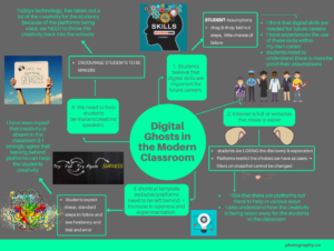
Click the link to see my multi-media image in larger form: Photography Course Mind Map-2

I used the medium of Canva to represent the ideas of the article Digital Ghosts in the Modern Classroom by Ashley Hinck. In the form of a mind map, I looked at the digital skills in the classroom and expressed my opinion on the concept of digital skills. In the world today, I think that digital skills are needed for future careers. Throughout my job history I have had to use digital skills at every job, whether it was working the register, entering information into spread sheets, making advertisements, digital skills were needed. Yes, digital skills are important but students need to understand there is more to digital skills then their assumptions of drag & drop, laid out steps, little chance of failure, they need to see the creativity behind the scenes and in my opinion the best way to do this is for the students to be hands on and active in the creating process. Growing up where the push of technology just started, I did not learn creativity through technology but I feel there is great ability for students to be the makers while using the digital sills. I like that there are platforms out there to help in various ways, templates and so on, for me these are extremely helpful, but I also can see and understand how the students are not gaining the creativity they need by using these platforms. I have personally seen that creativity is absent in the classroom, through a video assignment I assigned in one of my practicums, most students stayed inside the box and used exciting templates rather than creating their own ideas.  I strongly agree that leaving behind platforms can help the students creativity. Today’s technology has taken out a lot of the creativity for the students because of the platforms being used, we need to throw the creativity back into the schools.


Ashley Evans

Tagged