Author Archives: voyerc

#TechnologistModule @eCampusOntario

Visual Explanation:

For my multimedia assignment I focused Technologist Module of eCampus Ontario’s open PD modules and created a Twitter essay to summarize module and give readers a quick overview of digital literacies and technology integration in classrooms. After providing an overview I asked the reader in a Twitter poll to rank how comfortable they are with integrating digital literacies. Then I go through and dedicate each tweet in the thread to different tabs in the module. First I explained what is meant by ‘digital literacies,’ and then I explained the design-thinking approach. These tweets provide a basis for the technologist module design thinking process of empathy, define, ideate, prototype and connect. For the rest of the thread I described each of these processes. The second last tweet is a checklist of what the reader should be able to do after going through the technologist module. I felt like this was important to include because it provides the reader the opportunity to understand the end goals of the module before physically going through the module. At the end of the thread I used another poll to rank how comfortable the reader felt with the idea of digital literacies after going through my Twitter essay. Throughout the thread I incorporated a variety of pictures and gifs to keep the reader entertained and for it to be visually appealing.

Reflection:

I have always found modules to be generally user friendly and easy to follow. When I first looked at the eCampus Ontario’s Technologist Module it was in a critical way to critique how accommodating this site could be for differing abilities. Through doing this I discovered the limitations that this site could have depending on student needs, and therefore this set up is not a perfect model for every student. Personally, I still enjoy the module and I would consider using this type of set-up with my class depending on the needs of the students in my class. As I was going through and summarizing the information in my Twitter essay, I noticed a number of things. I found the information in the module very well laid out and easy to sum up for my Twitter essay.

follow for funny tweets – click this picture to be brought to my profile 

One challenge that I did not anticipate was the limited amount of characters in each tweet. As a twitter user, I found a big difference between 140 characters to 280 characters and so I was expecting fewer issues with space. I ended up summarizing much more than expected. The benefit to this, is that I feel as though my thread turned out much easier to read because I was not able to be wordy in my tweets.


Multimedia Assignment:

Undercover Classism In Our Schools!

Visual Explanation:

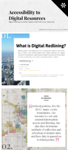
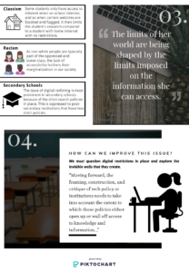
For my multimedia assignment I focused on Chris Gilliard’s article “Digital Redlining, Access, and Privacy.” The numbers in each box illustrate the order in which the information should be read. I first start by exploring what ‘redlining’ means, and the history of redlining in Detroit. The next box explains how the Gilliard uses the term ‘digital redlining’ to explain the boundaries that surround researching on the school’s internet. In the background of this is the Detroit redlining map to further the analogy. The third box explains how racism and classism is prevalent in secondary schools. This discrimination takes subtle form in digital redlining and by not acknowledging it is to not acknowledge forms of racism and classism in our educational system. The last box illustrates how educators can combat these issues in their schools.

Reflection:

As someone who has always had unrestricted internet access in my own house, I have never thought about policies blocking web searches as an unfair boundary that some students face. Before reading this article I thought that the only digital boundary that some students face is not having a computer at home, and having to complete their assignments at school. It had never occurred to me that school policies restrict access to some websites and therefore limits the student’s research. If the student’s research is limited and they do not necessarily realize that there is a lot more information out there, then their research will be lacking without the student realizing. Because I never realized that this was an issue, this demonstrates my privilege. Going forward, I will be sensitive in my classroom and be aware that some of my students may experience this. I will also explore what types of web searches my own school flags and see how I can challenge these policies to ensure my student’s research is not limited because they do not have access to internet in their homes. This issue will be especially relevant to me as a teacher because I will be a secondary school teacher, teaching history and social sciences. These two content areas are research heavy and I know my students will be needing to do web searches to complete their projects. Furthermore, some social sciences research may challenge school web search policies, so I will have be mindful moving forward. I will ensure my students know that there may be more information out there than can be seen on the school internet. To think critically about the information available will help to combat digital redlining.

Article: https://www.commonsense.org/education/privacy/blog/digital-redlining-access-privacy

Enjoy!

Caroline Voyer

Guh Guh Guh Guh GHOOOOOST!

Visual Explanation:

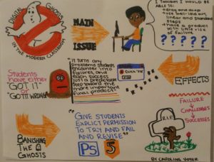
The picture attached is a fun way to explain the article “Digital Ghosts in the Modern Classroom” by Ashley Hinck. The illustration starts with a fun ghost busters logo and the first orange arrow (MAIN ISSUE) guides you to Hinck’s central issue about how students are accustom to the simplicity of digital media that allows students to use templates and themes that typically has few errors. This has led students to rely on these platforms, so when they use programs that require coding and the programming presents errors and challenges, the students feel like failures.

The second arrow (EFFECTS) shows how the students get frustrated (as illustrated by the student’s red face). The pictures show bugs and errors presented to the students, and then the student feeling fed-up .

The last arrow (BANISHING THE GHOSTS) is how Hinick suggests we combat these issues. Hinck suggests that we must change the student’s mindsets and approach their failures as challenges and turn them into successes once they have overcome these challenges. This is illustrated by an arm coming out of the graveyard and coming back to life (which is creepy… but represents the student coming back to life, so they are no longer a digital ghost).

Reflection:

I have used many different template websites like Weebly, Wix, Canva… and I have experienced the ease of using these templates to make a visually appealing digital assignment. If I were to create a website or design by myself, I know I would be frustrated and feel like a failure because every time something did not work look beautiful immediately or something did not work I would get frustrated. Knowing this is the way I am as a learner, I will approach digital media for my students as Hinck suggests. I will not take away these sites that allow us to create using templates and themes, but rather help my students to look beyond these platforms and let them experiment without fear of failure to try out different digital platforms. This will increase their comfort, and help them realize that when there are challenges and errors, it does not mean that they have failed.

Enjoy!

Caroline Voyer


Hinck’s Article:

Digital Ghosts in the Modern Classroom