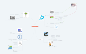
For my final artifact, I decided to try my hand at a twitter essay. This was actually one of my first experiences with Twitter (other than our in-class task). I actually found it much more suited to my style than some of the more visual multimedia choices. As I tend to be a more verbose person, being able to articulate my thoughts in words (with pictures as an enhancement) was far easier. Still, there were certainly challenges. Having to parse your thoughts into 300 character snip its is certainly a challenge. However, I would certainly attempt to try this form of media again and could even see myself utilising this as an assignment for my future students.
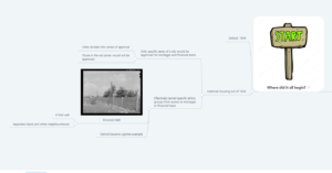
2. As an educator in the 21st century, we are striving every day to make sure that every single student can receive the best education possible. One facet to this is to differentiate your lessons to allow all different learners to succeed. #uwindig #ontarioextend pic.twitter.com/bIlnyRdGUH
— Mr Sparks (@MrSparks93) February 23, 2019
4. To successful incorporate effective digital practices in the classroom, teacher's must themselves be digitally literate. However, many teachers' greatest technological triumph is using PowerPoint.. pic.twitter.com/d366cHB2G2
— Mr Sparks (@MrSparks93) February 23, 2019
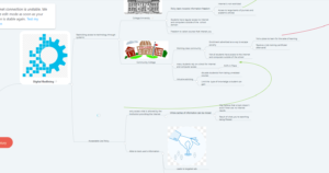
6. By following the module, this website can introduce an educator to digital literacy and the design process for integrating effective differentiation practices into the classroom. All aboard the pathway to digital literacy! pic.twitter.com/C2jzlqyy6J
— Mr Sparks (@MrSparks93) February 23, 2019
8. Aside: Rather ironically however, don't expect this tool to be at all easy to navigate. The seemingly simple tabs on the side contain solid walls of text laden with hyperlinks to send you off on an adventure all over the Internet. #uwindig #ontarioextend pic.twitter.com/EQCnktBFKP
— Mr Sparks (@MrSparks93) February 23, 2019
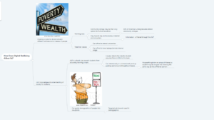
10. First, you must empathize with your learners. To incorporate your students in the learning process, you need to understand them to determine a challenge that needs to be solved. An empathy map can be a great way to gather information from students!#uwindig #ontarioextend pic.twitter.com/wp73yr3iOH
— Mr Sparks (@MrSparks93) February 23, 2019
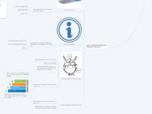
12. Now it's time to ideate! Here you think of how you can go from the problem at hand to a solution. This is where you can select the appropriate technological tool for the job. Mind maps can help you select which characteristics you'll be looking for.#uwindig #ontarioextend pic.twitter.com/em0XVx1hLa
— Mr Sparks (@MrSparks93) February 23, 2019
14. Now you need to prototype the idea. Try out the given technology and design the prototypical lesson. Sharing and refining the prototype based on student feedback can help you fine tune your pedagogical approach to be the very best! pic.twitter.com/Bpfj6C4SyH
— Mr Sparks (@MrSparks93) February 23, 2019
16. And there you have it! A website that can help you become digitally literate and can teach you how to use that newfound knowledge in the classroom. I highly recommend any educator to give it a look and see if it will benefit their pedagogical practice!#uwindig #ontarioextend pic.twitter.com/6t44660Wpd
— Mr Sparks (@MrSparks93) February 23, 2019
As to the content of the essay, I delved into the Technologist training module on e campus Ontario. This is an incredibly handy resource that both teaches a teacher how to become digitally literate and how to make sure the technology being used is the most effective tool for the job. While incredibly useful, you would have to be a digital expert just to navigate all the information provided. Each tab had snippets of information with the bulk of the knowledge hidden behind a plethora of hyperlinks. It certainly is not an intuitive website which seems rather ironic for a website that’s promoting digital literacy among educators.
When discussing digital skills, I found that the resource all aboard was efficient in laying out what skills an educator needs to develop to be successful. As well, the following TED talk did a great job of explaining digital literacies and the problems of not being literate in the 21st century.
The module then went into great lengths to discuss the Design Teaching Approach. I had absolutely no idea what that was, but the following video helped clarify it for me.
After reading through the module, I realised that I had utilised this process before without realising it. When I noticed students struggling to understand stoichiometry, I asked them what the issue was. After learning that the main issue was that they couldn’t visualize the reaction or what was occurring, I looked online for resources that might help clarify. Upon finding pHET, I found an awesome module that shows the products and reactants as both “normal concepts” (sandwiches) and molecules. Bringing this tool back to the students helped clarify the concepts and brought to their attention an awesome new resource to use in science understanding. Whilst this didn’t utilise all the DTA steps, it is founded in the same roots of empathizing, designing, ideating, and prototyping. I believe this is certainly the approach that should be taken whenever we look to incorporate technology into the classroom.
Overall, understanding digital technology and being able to use the DTA is all in an effort to be able to differentiate the instruction. This is important in the 21st century where one of the top priorities of any educator is to make sure that their classroom is equitable for all students. One way to achieve this is to make sure that all information being taught can reach all types of learners. Educators should use multiple forms of media and techniques to make sure that all learners can receive the full benefit of learning.

