Author Archives: melochl

Design-Thinking throughout the Ages

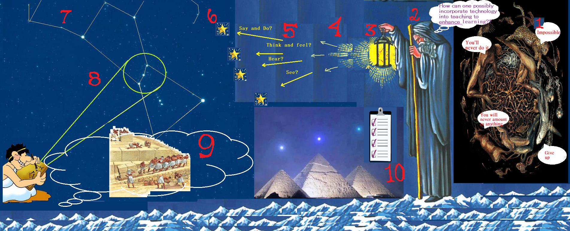
As I took the time to read/watch/engage with the full Technologist Module of eCampus Ontario’s open PD modules, I became excited to create a flowchart-diagram using Microsoft Paint which expresses my feelings regarding multimedia.
**It is important to note that the red numbers in my picture refer to the different sections of the module, which are outlined in greater detail below**

[1] Beginning with ‘The Scenario’, we are pressed with the question: “How can we incorporate technology into teaching to enhance learning?”. This implies that there are ways that we can incorporate technology into teaching which would be detrimental to learning. So, the trick is to identify and isolate the positives from the negatives. I found an image representing chaos (the animals swirling in darkness) to represent all of the ways that technology does not enhance learning. This area is rather small in my picture, but I believe that it is a much larger region than that which is illuminated off to the left of my picture.

[2] ‘The Overview’ explains that educators often find themselves standing at the crossroads between innovative use of technology as trendy or as evidence-based practice. It is always possible to get lost in all of the possibilities that technology has to offer and missing the educational values that they provide. To do this, I chose to use The Hermit (IX) to represent a teacher who can see the positives and benefits that technology has to offer in the classroom. He turns his back to chaos and uses his lantern to illuminate all of the possibilities that technology has to offer.

[3] ‘Digital Literacies for Teaching’ explains how to use technology tools effectively to address specific learning challenges. I chose to have Mr. Hermit’s lantern represent this section, as his lantern is what he is using in order to discover technology’s learning potential. With the lantern, he can dim the light, cast it more brightly, and chose which direction to aim it. This is how he sifts through the darkness and finds the benefits of digital literacy.

[4] ‘Design Thinking Approach’ relies on feedback to improve the ideas. The light represents feedback as it is used as feedback, so that the light bearer knows where to look next.

[5] ‘Empathize’. The different directions of the light will gather different pieces of information such as the questions asked in the empathy map template. Design thinking starts with empathy.

[6] The ‘Define’ step is about narrowing in and identifying a problem, or in our case, a challenge. Each star that the light bearer can see in my picture represents a problem. Now that the problems have been identified, an action can be made in order to get closer to solving them.

[7] In ‘Ideate’, it is suggested that we form a mind map to form and build the ideal features and characteristics of how technology could address the challenge. Such as what has been done numerous times throughout our history, I tried my best to have star constellations to represent a mind map. This figure ‘Orion’ has been mapped in Egyptian times (specifically his belt).

[8] ‘Prototype’. I had this cuneiform-man represent the designing of a prototype from the creation that he saw in the stars. He gets to work on an idea, and uses his (at the time) state-of-the-art technology in order to design his vision.

[9] ‘Connect’. This cuneiform-man visualizes how to ‘integrate this integration’. He can see how this project will be brought into fruition. He needs to find a way in which his people can incorporate technology and bring his vision into existence.

[10] ‘Module Checklist’. The pyramids are as old as time itself, and yet they are so close to perfection. Laid out to mirror Orion’s belt, it is amazing that the Egyptians were able to create such a masterpiece. I am arguing that design-thinking was used in ancient times to help educate the population and ultimately create one of the wonders of the ancient world.

This is where my head went as I read through the module, and I was excited to paint my picture to illustrate my thoughts. I hope that you enjoy reading about my interpretation, and thank you for your time.

David Meloche (103428042)

Digital Redlining – What’s it all about?

Hello,

I decided to create a ‘Powtoon‘ based on the article titled ‘Digital Redlining, Access, and Privacy‘ by Chris Gilliard and Hugh Culik.

This was my first ‘Powtoon’ attempt and so I ran into a few problems along the way. As with anything, it took a bit of time to get the hang of the program. I still have not explored all of the templates that the program has to offer, but I became quite familiar with the ‘student’ option which I used in my creation.

I began by clicking around on the slides, trying to figure out what my options were. I saw that I could click on the character and customize their identity and emotions. I also had no problem clicking on the text and customizing it to fit my lesson. I found this to be very similar with other typing programs that I have used such as ‘Microsoft Word’ or ‘Notepad’. I adjusted the font, text colour, size, and placement of text boxes to create the desired aesthetic of my slide show.

What I was really interested in was adjusting the animations, their placement, speed of my slides, and other effects that ‘Powtoon’ has to offer. To do this, I needed to google my questions and read a short blip on the proper ‘Powtoon’ commands required to perform these maneuvers. It really was quite simple. I thought afterwards that it would have been faster to click around some more until I figured it out for myself. Once I understood how the timing bar along the bottom of the slideshow functioned, I went to work and created my so-called masterpiece.

In their article, the authors describe the history of redlining, explain digital redlining and discuss the implications that it can have on a student’s future. I found it interesting to read about redlining because it’s something that I didn’t even know existed until reading this article. Since the implications of redlining have been laid out so clearly, I’m glad that I have a chance to reflect on the issue myself.

This article makes me wonder about how often I have been affected by redlining in the past without realizing it. How has digital redlining affected my decision making? These are questions that I will never have the answer to, but will have caused permanent changes in my life and thinking process. Going back to the article, the filtering of search results will essentially hinder a student’s learning potential. They will be unable to research undesirable or taboo subjects which will give students a false understanding of the world around them. Also, who decides what should be filtered? This arbitrary policy leaves room for political or other hidden agendas to manifest themselves into the institution’s framework.

As for the discrepancy of digital redlining between R1 and community colleges, there must be an underlying reason for it. As the authors explained, the digital redlining imposed upon working class students will deter them from open-ended inquiry, which is supported by the more elite institutions. Assuming that every college wants their students to be successful—to graduate and obtain a job in their respective field—a different approach to teaching will be required for different career choices.  Some jobs require more cognition and innovation from their employees than others. These jobs will generally be sought after through R1 schools. Community colleges probably have more success if they limit their student’s research to relevant material.

However, just because digital redlining may better prepare students for certain jobs, does that make it ethical to implement? Probably not.

Moving forward, into a classroom of my own, I want to make my students aware of digital redlining. There really isn’t anything that I can do about it, but the concept is important for students to understand. Perhaps as part of an assignment, I could have students gather research on a topic of their choosing, using different search engines, with and without the influence of Acceptable use Policies (AUPs). As a follow up, a class discussion on the issue would be interesting to see how the students feel about digital redlining encroaching on their freedom.

In conclusion, I am feeling violated, knowing that my digital freedom has been censored beyond my knowledge for all these years. It really makes me wonder how my thoughts have been affected by the covert barrier known as digital redlining.

David Meloche

Digital Dancing

For this assignment, I decided to read the article called ‘Digital Ghosts in the Modern Classroom’ by Ashley Hinck. She makes some good points about the way students are choosing to express themselves on digital platforms—ultimately, because it’s the only way they know how to do it. I certainly agree with the author that the education system needs to catch up with the times and help students improve their digital literacy. The fact that students are having trouble to express themselves on a computer means that they are not tapping into their full potential.

Once a more expressive program is mastered, ideas can be portrayed with more accuracy and clarity—but how will be teach students how to create these programs? Not all, but most students would rather do their math homework than learn how to code. I can understand that they would be disinterested in programming since it is such a monotonous process but coding and using a program are two separate fields. I believe that students become more intrigued once a program is already developed and they have the freedom to digitally express themselves. The trouble is getting students familiarized with a program that strives for transparency of emotion. Perhaps there should be a class in the school curriculum dedicated to acquiring this skill. Essentially, schools should be adapting to the digital climate and helping students to improve their digital literacy.

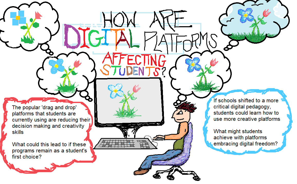
With that being said, I decided to paint a picture for this assignment using Microsoft Paint. I have used this program when I was younger and have always had a lot of fun playing around on it. There is some kind of novelty about old technology that I love—probably why I still play the Nintendo 64. My idea was to start with a simple program like this and then move onto more involved programs for future assignments. I learned some more about the tools in this program which gave me more respect for it, considering its age. For instance, when a brush tool is selected, the edges of each stroke are a lighter colour to make the painting look more realistic. I found this to be very helpful when I attempted to shade my picture; the brush tool helped the final product look more detailed than I had imagined. Also, the magnifying glass made painting much easier. I was able to zoom in and add some extra detail which would not have been possible without zooming in.

Down one path, schools ignore the potential that the digital world has to offer, and leave kids to learn it for themselves. Naturally, they will commit themselves to the programs that are the easiest to use, and their digital expression will suffer. If we take the other route, and help students to acquire the skills needed to use more sophisticated programs, a more transparent form of expression will emerge.

Please don’t laugh at my drawing: