

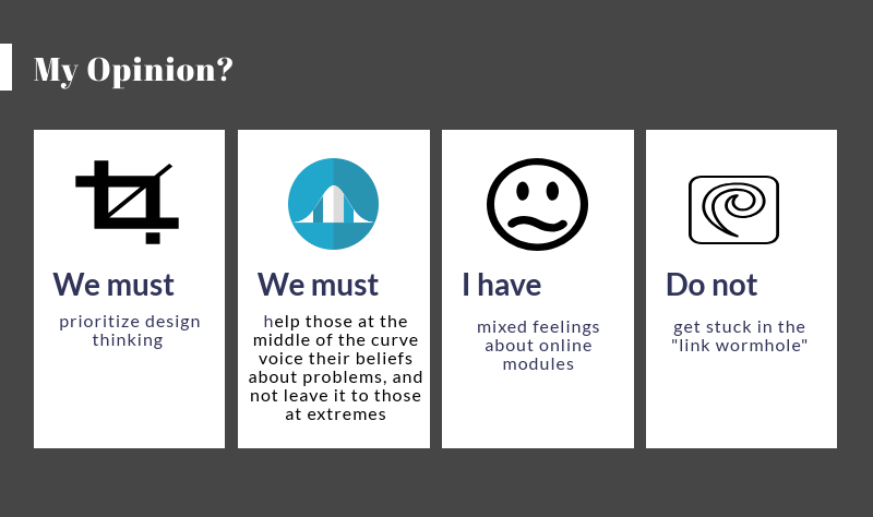

Before going through the Technologist Module by Ontario Extend, I did not fully understand how to appropriately technology into my teaching. I have definitely attempted using technology through the use of Kahoot, graphing calculators, and GeoGebra, but I am still learning on the most effective methods for incorporation. This technologist module was very helpful in facilitation of my learning regarding this topic, and lead to the production of this infographic. The main take-away that I got from this module was that we need to find ways to prioritize design thinking and digital literacy. Design thinking involves finding out what the problems are, and then creating ways to use technology to ideally solve them, while also still connecting to the curriculum.
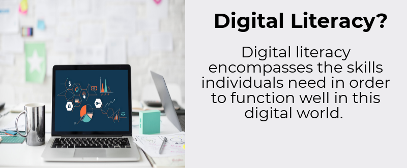
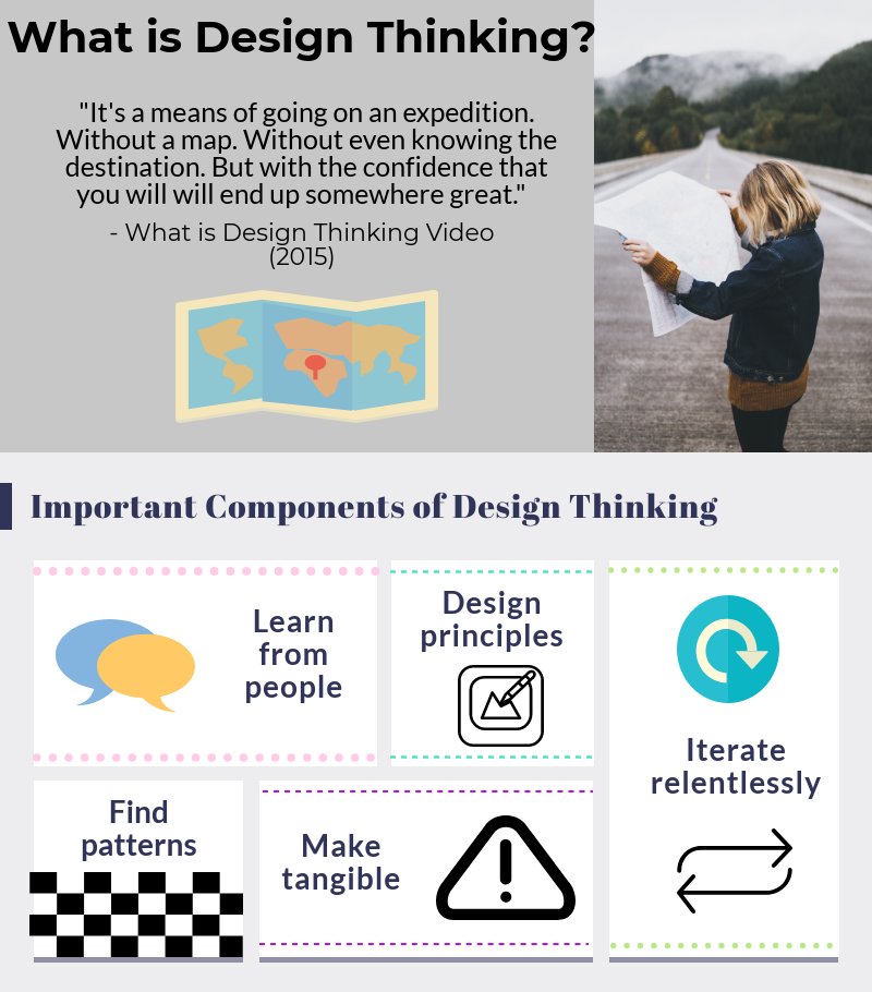
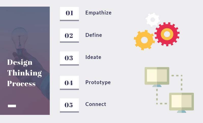
I started the infographic by discussing what digital literacy encompasses and what design thinking is. I then went into the important parts of design thinking and also the five parts of the process of design thinking. These five ideas went into a bit more detail later on in the infographic. I then lastly touched on my opinions regarding the topics of the module and the module itself, which will either have been discussed above or will be discussed below.
One thing that really stood out for me during the module was the idea that those in the middle of the bell curve, tend to have difficulties describing the problems affecting them, but those on the two extremes do not. This stood out because as a future teacher, it may mean that the students on the extremes get noticed, but those in the middle may fall through the cracks. It opened my eyes to the idea that I may need to pay more attention to my students at the middle as opposed to my extremes when discussing problems or other class concepts.
This is the second time that I produced an infographic for a multimedia reflection, and it was much easier the second time around. I was much more comfortable with Piktochart, and was able to utilize its features much more effectively than the last time. Last time I spent a lot more time fiddling around with trying to insert images or graphics, but this time I could quickly search for graphics and move them around with ease. This can kind of relate to the module in the sense that I am better able to use this technology, and increase my digital literacy surrounding this website, especially regarding the creativity and innovation subcategory of digital literacy.
I tend to have mixed feelings about online learning environments, whether they be courses, modules, or webinars. I enjoy them because I am usually able to work at my own pace which can also benefit some types of learners. However, some learners need more structure than the independent aspects online courses offer and would not benefit from this. They may even become sucked into the “link wormhole” where they keep travelling from link to link, and lose all sense of what they are supposed to be learning. I also find that I can sometimes lose focus when the learning is so independent, and realize that other learners may struggle with that as well. Overall, however, I do find that online modules can definitely be a beneficial resource, and I really enjoyed the layout of this one in particular.
