For my post, I chose to analyze the article Digital Ghosts in the Classroom by Ashley Hinck. This article revolves around the use of templates and digital shortcuts constantly being used by students and teachers in the classroom. I found it very interesting because I have always been a fan of templates and strict guidelines. Similarly, to her main point of the article, I found it much easier to use a template because I was afraid of doing something wrong; it was simple to just pick one and work off of it rather than going through a long process of choosing colours, fonts, backgrounds and much more than I could possibly imagine. She outlines a student’s fear of failure in the trial and error process and that is where I could definitely relate. I usually like to shy away from new things because I am afraid of failing the first time, even if it is a natural process. Hinck claims the school system is set up to have students shy away from trying new things because failure is so frowned upon – shying students away from taking risks. To break these barriers, she suggested troubleshooting with classmates and that is an excellent idea; the chances are very high that there is somebody else in the class that is sharing the same struggles. This article really opened my eyes on the importance of creativity and expanding digital literacy; getting excited about working with less detailed instructions and more so a blank canvas.
Here is my sketchnote; I took one picture of the full document and broke it down into 4 separate pictures to help view them into more detail, I hope it helps!
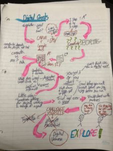
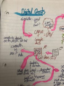
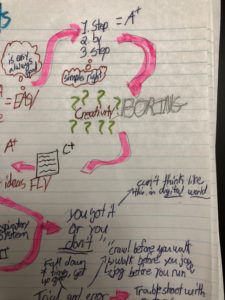
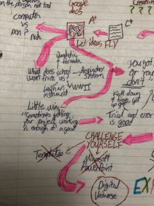
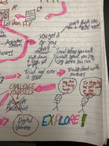
Stepping out of my comfort zone, I did stick with an analog approach, but with more creativity making a sketchnotes page even with my lack of artistic ability. Although it is not technically “digital”, I believe that it has helped me think more creatively and will ultimately help me expand my digital literacies in the future. The process was not easy for me, and the challenge has turned it into a piece that I am proud of. I sat there blankly for about an hour or so, having no clue where to even start. I began with a “rough draft” with a plan to redo it, making it more professional looking but those plans changed. I decided to keep my original sketch as it shows a great development in my creativity as the sketchnote goes on. It is messy, but it really encapsulates the ideas running through my mind while reading this article. Although this particular multimedia piece is not digital, it has shown me that risk-taking is fun and very rewarding, making me very excited to try something new for the next project!
