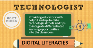
Technologist is an e campus run by a group of Northern Ontario post-secondary institutions and funded by the Government of Ontario. This site provides a vast amount of information regarding the integration, understanding, and communication of technological tools within a learning environment. While the site itself is a great idea to promote digital literacy and application to educators, it is very easy to get lost among all the links that lead to outside resources. While a variety of sources can showcase different viewpoints and ideas, having too many all in one place takes away from the overall site itself. How hard would it be for educators to find these links themselves without having to go through multiple side pages to reach them? In addition, some of the links had more information than on the Technologist site!
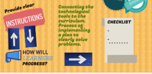
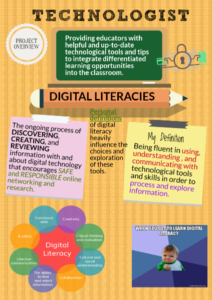
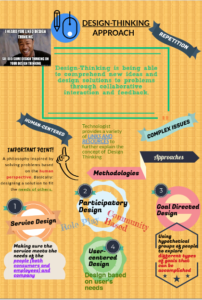
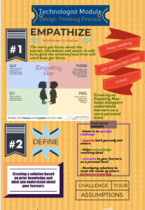
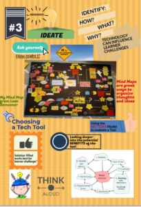
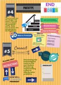
I decided to use a piktograph/inforgraph for this multimedia assignment for a few reasons: 1. I wanted to simplify all the information from the website in an organized and easy to follow format. 2. I was asked not to do another mind map and was inspired to try something new (although I did add a small throwback to my first multimedia assignment by including my pacman mindmap) and 3. I have never used piktograph before and, considering design-learning is all about trying new things, I figured I would expand upon my own digital literacy and try this website out.
I chose to use a blank format for this assignment to allow myself more creative opportunities. I utilized a lot of the text blocks that were provided and tried to make it as colourful and informative as I could. Honestly, I really appreciated the fact that I did not have to create everything from scratch like I did with my previous mind maps! I really enjoyed using this site. I wish I had more time to really explore all the potential creative avenues piktograph.com has (on a free account of course).
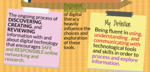
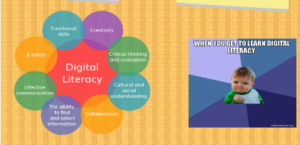
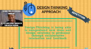
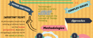
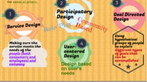
I highlighted key vocabulary from the website that I felt really defined each category. I used these words as starting points to expanding upon my ideas (rather than the actual titles of each category). However, each category is sectioned off by the titles found on the website. A lot of the information is also from the various links provided by the website such as, the empathy map and the methodologies and approaches to design thinking.
I think Technologist is a good starting point to learning about digital literacies and design thinking concepts, but I would not use it as my only resource (even Technologist added extra resources within their site). In fact, I had to look elsewhere for a few terms found on Technologist because it did not give a clear example (or one that I connected with). I believe this was the most challenging aspect of this assignment: trying to properly articulate the information (or lack there of) from the Technologist site.
6. 7.
7. 8.
8. 9.
9. 10.
10.  11.
11.  12
12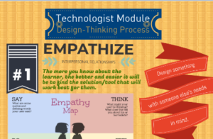 13
13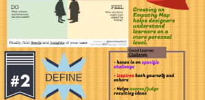 14
14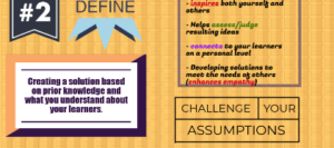 15
15 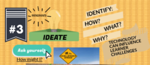 16
16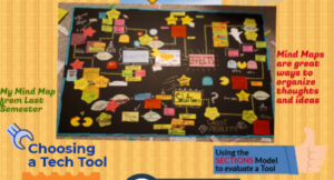 17
17  18
18 19
19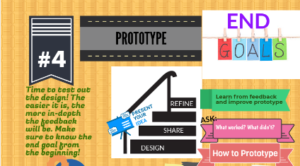 20
20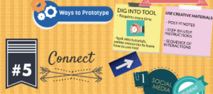 21
21 