Monthly Archives: October 2018

Critically Critiquing the Core Concepts of Critical Pedagogy (Say that 7 times fast!)

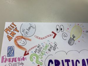
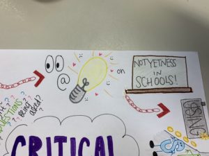
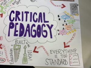
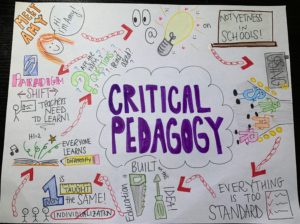
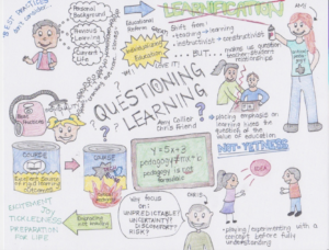
This mind map serves to illustrate the significance of Amy Collier’s Hybrid pedagogy (which you can view here). As discussed in this podcast, critical pedagogy refers to the constant analysis, review and critique of our own individual practice. As future educators there is no “best practice.” Technology helps us develop, build and innovate our own educational pedagogy. As an educator studying in the field, I wish to incorporate the use of many technologies through roles of substitution, modification and perhaps redefinition in order to evaluate, engage and enrich the learning styles of my students. This “not-yetness” to learn is important in understanding how educators must strive for uncertainty and risk in their practices. We must never stop learning, growing and implementing new and effective practices into our own teaching modes. Be willing to feel uncomfortable, fail and implement the impossible. The future generations of our educational system depend on our uncertainty now to lead them to better things. I believe I am willing and open to new technologies and will do my best to critique my own practices for the sake of my development and my future students. I am not afraid to immerse myself into this new world of media, reflection and ambiguity. My “not yetness” is my key to braving a world full of media and new advances. I am ready to begin… I hope you are too!

Please enjoy this illustration.

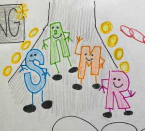
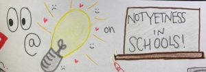
The platform I chose to use to summarize the article was a sketchnote. I personally did not feel comfortable using online technology that was new to me. As well, as I was listening to the podcast, more and more ideas popped into my head about what to draw/create in my sketchnote. In my sketchnote, the different ideas/topics that are touched upon in the podcast are connected by links.  I incorporated illustrations, with the least amount of writing. If you can see the second idea is eyes, an at symbol and a light bulb. This is to represent us “looking at her thoughts and feelings” on the topic of not-yetness. I also threw in the SAMR model (literally, the letters SAMR modelling on the runway…). Amy touches upon this in a way during the podcast and how to use this to better our pedagogy. I enjoyed making this sketchnote as I found it relaxing to colour and draw things while working on an assignment.


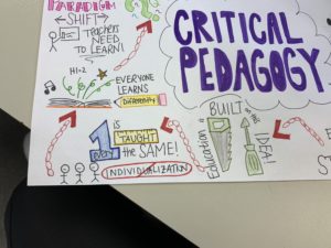
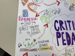
Here are more zoomed in photos of my sketchnote! Just want everyone to be able to see it! (I didn’t realize there was not a zoom in feature of the blog!)

Tagged , , , , ,

WAKAWAKA – The Story of the Power Pellet and the Ghost

I decided to respond to the article Digital Ghosts in the Modern Classroom by Ashley Hinck.  The platform I decided to use was Piktochart, which is a template program not mentioned in the article.  Hincks argues that these template programs are the equivalent to the worksheets used by students in their classrooms.  These “ghosts” provide a rigid path to the correct answer, with little exploration or interpretation left to the student.  The template program is seen as an easy solution, but the drag-and-drop method mirrors the pre-determined answers of the worksheet and limits the creativity and agency of the creator.  As I mention in my info-graphic, I summed this up as BORING.  It is a safe and reliable path to easy marks, one I often took myself, but not one that challenges or pushes students to create something more.

To combat this, the article calls for teachers to shift to a critical digital pedagogy, embracing and encouraging the use of more open alternative programs and an approach to learning based on experimentation.  As outlined in my Piktochart, students need to be able to attempt their work without hesitancy or fear of failure, realizing that a trial-and-error approach is vital for using open programs and school in general.  To accomplish this as teachers we must disturb the assumptions that students have of learning in the classroom, showing them the limitations and rigidness of the templates they are comfortable with and urge them to explore their options and provide them with all the support they need to accomplish this goal.  I absolutely agree with this, as educators we must begin to change how students view the school and learning process, looking back at their experiences as positive and rewarding, not some boring template.

My experience with Piktochart went smoothly even though it could be considered a drag-and-drop program.  Personally, everything felt clean and intuitive, things worked as they should without many hitches.  When using Piktochart or other programs I often find the best starting point is to mess around with the program first, trying out everything it can do.  From here I have a good base to build upon the functions I found worked and discard those that did not work for me.  Of course, nothing is perfect, it is difficult to find appropriate copy right free material and the options available with a free account severely limit the templates, images and features available.  These affordances forced me to be creative in the way I used the program, creating images (PowerPoint icon) from scratch, and using the provided features in different ways (backgrounds/banners).  I limited my use to Piktochart instead of relying on programs I had some experience in (like Photoshop) so I could push Piktochart as far as I was able with my skills.

Brandon Varga

Questioning Our Pedagogy

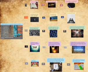
I choose to do the Hybrid Pedagogy podcast with guest speaker Amy Collier. The program I decided to use for my digital expression of the podcast was padlet. The podcast was very interesting and Amy Collier made many good points about the way educators think about their pedagogy in today’s education system. During the podcast we learn about critical thinking and how it can change the formulaic expression of pedagogy by teachers. It is very important that a instructivist model is changed and modified to a more constructivist model through the process of learnification. The education system needs to be as personalized as possible. The constructivist approach changes the way students think and instead of mass producing students that are all the same we can have students that want to ask the inherent questions about things they are interested in.

Lastly, learning outcomes are not always a bad thing but they are usually generalized to the whole class being at some specific point in the curriculum. These types of learning outcomes are forced upon the students and brings them to a point where they all know the same knowledge usually learned the same way. These types of pedagogy and learning values need to be re-evaluated. Evaluation by the use of critical thinking when done correctly can create a more individualistic learning experience that will spark inherent questions leading to new ideas maybe never seen before.

Tagged , , , ,

GHOSTS!!!! where are they???

I chose the article “Digital ghosts in our classroom” by Ashley Hinck”.

In this article, the author discussed the difficulties teachers are facing in their digital learning classes.

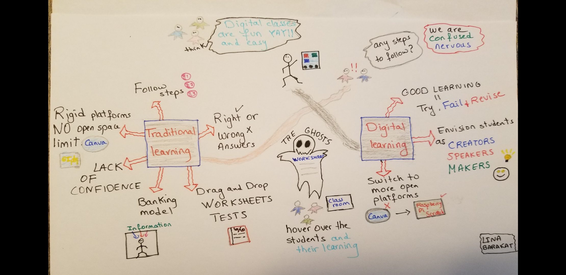
Students think that digital classes are fun, easy and helpful because they are trapped in the idea that digital learning is just follow directions to get to the final product with the minimum failure.Ashley blames this on the traditional learning where students are locked in their boxes and teachers are pouring information to fill these boxes. this system is limiting our students’ creativity and openness.

Teachers are trying now to move students from the ‘drag and drop’ ,templates and platdorms to more open platforms like ‘Raspberry pi’ and ‘scratch’ but the frustration of the unknown results is holding the students back.

The ghosts of worksheets and templates are still hovering over the students and their learning.

I chose a sketchnote for my assignment and I enjoyed making it     (it wasn’t easy). I had the control over choosing font, colors, pictures….for coming assignment, I will try to use a different source.

As a student, I learned the same traditional way so I understand their frustration but I totally agree with Ashley.

As a teacher, I will encourage my students to use more open platforms, be creative and enjoy the results.

Digital Ghosts in the Modern Classroom

Something Chillier than School AC- Ghosts in Education

The following animated video was made to summarize the article, “Digital Ghosts in the Modern Classroom” by Ashley Hinck (link attached below).  I found this article very insightful on aspects of education in the modern age.  I agree with the idea that students should be provided with more opportunities for trial and error, instead of just being given the correct answers.  This really applies to more than digital media as I believe all subjects taught could benefit from this approach.  So, using media in classes other than just computer science and using this media in novel manners is the best way to make adequate use the technology we have available.  Hopefully, this will enable students to become better critical thinkers, and to not fear making mistakes.

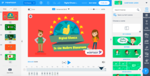
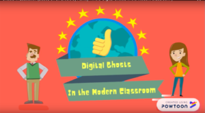
I decided to use Powtoon to create my digital artifact for this article because it seemed very interactive and visually appealing.  Once I started to use the website to create an animation, I had a bit of a struggle.  It took some time to learn the system and how to edit in pieces of animation. Here is an example of what the Powtoon looks like both in the editing stage and out of it:

During editing stage:

Preview of final product:

Once I had a basic understanding of editing, the process was fairly simple in making the actual animation.  The main issue I ran into was that after having a free trial for four days, Powtoon removes all of their ‘PRO’ items from your presentation before allowing you to export it.

Image result for meme free trial

Thus, I had to go back and find new items available on the free platform.  This process took a lot of time and was a little frustrating, however, I am better off for it as the next time I create a Powtoon it will go much more smoothly.  Another issue I noticed after publishing the Powtoon I created to Youtube, was that a few words of the voiceover were cut off in many of the sections.  This was not happening on the actual Powtoon website, so I will have troubleshoot this in the future.  Hope you enjoy my video!

Here’s the Powtoon I’ve created, posted to Youtube:

Here is the link to the original article by Ashley Hinck: http://hybridpedagogy.org/digital-ghosts-modern-classroom/

Thanks for watching!  Let’s get rid of those ghosts!

Image result for ghostbusters

-Brandon Miner


Tagged

Capping Creativity ?

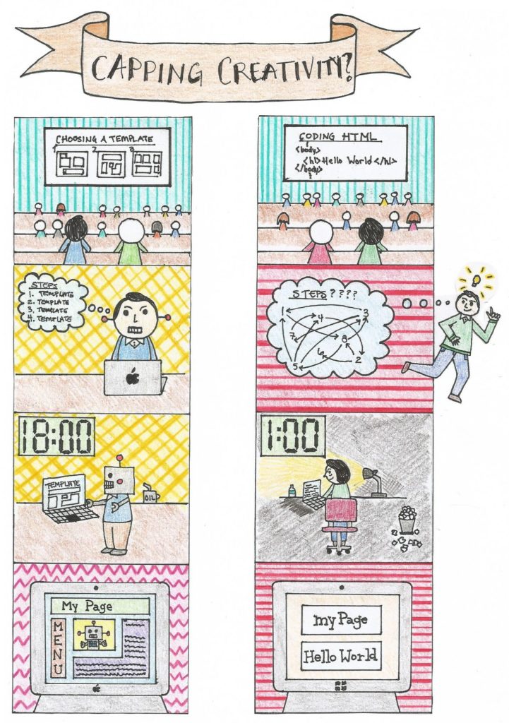
Ashley Hinck’s article, Digital Ghosts in the Modern Classroom brings up an interesting perspective on the use of templates, an idea that I refer to as “capping creativity”. Students can only be as creative as the template allows them to be. Templates are easy and quick but do not offer the same benefits as learning HTML for example. The comic above illustrate two scenarios. The left side depicts a student learning to make a webpage via. templates. The right side depicts a student who is taught how to make a webpage via. coding in HTML. For the left side, the student’s thinking process is much smaller and very systematic. The template has basically done the thinking for him. While on the right side, the student’s thinking process is more scattered and trail and error based. He had to go “outside the box” and tap into his creativity in order to get an idea he likes. The third box shows the two students working on their webpage. The student with the template finishes up at a reasonable time, while the student on the right is working well beyond midnight. You can also see the trash can pilled up with scrapped ideas. The final box of the comic is the finished product. The template looks more professional and complex, while the HTML coding is very basic.  It can also be seen that the student on the left is progressively becoming a robot, symbolizing his creativity being taken away more and more.

Do not let the final webpage fool you, the immediate benefits of using templates are great but there are disadvantages in the long term. The student on the right has much greater potential in terms of what he can do with his webpage. He gets final say on color, font, picture position, and much more. The process is longer and more difficult but ultimately more worthwhile. I love the quote “there is no substitute for hard work.” This means that the knowledge you gain from taking the long route can’t be gained from taking the shortcut i.e. easy work (a point that the article was trying to convey, in my opinion).

I enjoyed making the comic because I think it does a good job of comparing two different ideas side to side. I also think that telling a story with pictures is sometimes more intriguing and beneficial than with words. The most difficult part was planning the comic and then trying to get it posted to WordPress as an image. As a teacher, I think it would be difficult to convey the benefits of hard work. Especially for students who haven’t had a lot of life experiences to back up this idea. This is how the artifact connects to teaching, the media artifact could possibly convey this message better. With the comic idea, it’s almost a pros and cons list but with pictures instead of words.

Tagged

The Road to Critical Pedagogy

For my multimedia reflection assessment I chose to create a sketchnote summarizing the key points from the HybridPod- Questioning Learning podcast by Chris Friend and Amy Collier. I decided to draw the background of my sketchnote by hand.  I also printed out some cartoon images (to make up for my lack of artistic skills), which I then glued onto my sketchnote and coloured in. I used my sketchnote to outline the key ideas that I will further describe below.
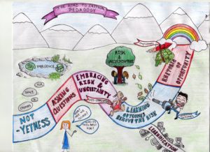
Amy Collier starts the podcast off talking about the idea of “not-yetness”, an idea that I found very interesting. She talks about how its ok to not know all the answers, and how we should embrace not-knowing and not let it stop us from moving forward. She also talks about how “not-yetness” allows for a space of emergence to be created; where there is understanding and new ideas. Chris and Amy then discuss critical pedagogy and the importance of asking questions, which is the stage that I think I am currently in. In these first few weeks of class we have had a plethora of knowledge thrown at us. This surplus of knowledge has led me to asking a lot of questions on what is important, and what will help me develop my teaching philosophy.

Amy then talks about the idea of learnification, and how technology has really propelled it. I found it interesting that when there is too much learnification, there is actually less learning. Amy gave the example of online classrooms that focus too much on the content and completely forget about the teacher-student relationship. This is an issue that I have had with many online courses throughout my undergrad. There was such a large disconnect between the students and professor, that it took value away from the course. Along with learnification, Chris and Amy discuss the importance of embracing risk and uncertainty. They talk about how learning outcomes can be too restrictive and not allow for enough flexibility; without this flexibility, there is no room for risk and uncertainty. I think risk allows for change, so having that risk and uncertainty is very important for learning to adapt and improve.

Finally, Amy talks about the rhetoric of opportunity, an idea from Mike Caulfield. She mentions how Mike believes that the rhetoric of opportunity is better than the rhetoric of crisis, and how a rhetoric of opportunity allows improvements to move forward and keeps dis-improvements behind. I found this idea interesting, and especially liked Chris’ points about viewing students as people with potential instead of waiting for a student to misbehave. I think that this idea is a really important one, and that the rhetoric of opportunity is an incredibly valuable viewpoint for educators.

[This paragraph has been added after having someone asked me to further explain my design, I also posted this response in one of the comments below:

Finally to talk more about my design, I thought it would be fun to draw out a literal road to critical pedagogy that addressed the key points of the podcast. I started with that first square of not-yetness and the rocks that led to the lake of emergence. I wanted to show how not-yetness created the room for the emergence of new ideas and knowledge. The asking questions square is fairly self-explanatory, but I thought I would draw Amy asking some critical questions). I thought it would be fun to show embracing risk and uncertainty with Amy and Chris literally hugging the risk and uncertain-tree. Along with that, having those risk leafs fall and showing Mr. Learning-Outcome with his leaf-blower blowing away the risk. I used that image to show how rigid learning outcomes remove risk, and are not necessarily good. I drew the diverging path of learnification, to illustrate how in same cases technology can lead to negative learnification, steering us off of the path of critical pedagogy. Finally I ended with the square of the rhetoric of opportunity, with the Improvements Turtle, flying to the “finish line” and the Dis-improvement Rabbit, far behind. I wanted to show how in the road of critical pedagogy the rhetoric of opportunity allows the improvements to surpass the dis-improvements. I put the rainbow at the end, because the end of a rainbow is somewhat mythical, and I think that is the same for the road of critical pedagogy. I don’t think there is a concrete end to the road of critical pedagogy, we can always improve and grow, so the road keeps going. ]
References:

Questioning Learning

Not-yetness

Image Sources:

http://worldartsme.com/images/rainbow-outline-free-clipart-1.jpg

https://img.clipartxtras.com/1825f6b2f97475593f9ffd302d68fca1_lake-clipart-black-and-white-clipartxtras-lake-clipart-black-and-white_1024-768.jpeg

https://st3.depositphotos.com/11514374/18632/v/1600/depositphotos_186329928-stock-illustration-cartoon-of-businesswoman-or-woman.jpg

https://previews.123rf.com/images/alexeyzet/alexeyzet1701/alexeyzet170100007/70672983-lieu-de-bande-dessin%C3%A9e-avec-gar%C3%A7on-et-une-fille-a-touch%C3%A9-l-arbre-sur-le-fond-blanc.jpg

https://thumbs.dreamstime.com/z/funny-cartoon-man-leaf-blower-illustration-68308205.jpg

https://img01.thedrum.com/s3fspublic/drum_kb_article/158038/main_images/TortoiseAndHare_0.jpg
 

Tagged

Guh Guh Guh Guh GHOOOOOST!

Visual Explanation:

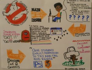
The picture attached is a fun way to explain the article “Digital Ghosts in the Modern Classroom” by Ashley Hinck. The illustration starts with a fun ghost busters logo and the first orange arrow (MAIN ISSUE) guides you to Hinck’s central issue about how students are accustom to the simplicity of digital media that allows students to use templates and themes that typically has few errors. This has led students to rely on these platforms, so when they use programs that require coding and the programming presents errors and challenges, the students feel like failures.

The second arrow (EFFECTS) shows how the students get frustrated (as illustrated by the student’s red face). The pictures show bugs and errors presented to the students, and then the student feeling fed-up .

The last arrow (BANISHING THE GHOSTS) is how Hinick suggests we combat these issues. Hinck suggests that we must change the student’s mindsets and approach their failures as challenges and turn them into successes once they have overcome these challenges. This is illustrated by an arm coming out of the graveyard and coming back to life (which is creepy… but represents the student coming back to life, so they are no longer a digital ghost).

Reflection:

I have used many different template websites like Weebly, Wix, Canva… and I have experienced the ease of using these templates to make a visually appealing digital assignment. If I were to create a website or design by myself, I know I would be frustrated and feel like a failure because every time something did not work look beautiful immediately or something did not work I would get frustrated. Knowing this is the way I am as a learner, I will approach digital media for my students as Hinck suggests. I will not take away these sites that allow us to create using templates and themes, but rather help my students to look beyond these platforms and let them experiment without fear of failure to try out different digital platforms. This will increase their comfort, and help them realize that when there are challenges and errors, it does not mean that they have failed.

Enjoy!

Caroline Voyer


Hinck’s Article:

Digital Ghosts in the Modern Classroom

Keep Calm and Question On

I chose to respond to the HybridPod Podcast with Chris Friend and Amy Collier using a sketchnote. Prior to this assignment, the extent of my art career was doodling cartoons in the margins of my class notes, which seems to have come in handy for this assignment. I decided to experiment with a sketchnote for this reflection because it is out of my comfort zone, and I wanted to embrace the discomfort of risk-taking, as discussed in the podcast! I had a ton of fun making it, and although the flow is lacking a bit I hope you can follow my thoughts.

Multimedia Reflection #1 (for a closer look)

The main take away from the podcast is the importance of critical pedagogy and questioning the latest and greatest teaching methods. I particularly appreciated the discussion of “canned” courses and how we can break through these with critical pedagogy and integrating technology in the classroom. I think Amy’s focus on embracing the discomfort of not knowing is so important, and teaches students that mistakes are allowed, and often lead to the best learning opportunities.

As a logical thinker who often places too much importance on the “right” answer, I think this podcast was a great introduction to this course for me. In my future classroom I want to emphasize the importance of giving your best effort and questioning the new things that students are learning. With my teachable in math, I think far too many teachers are “my way or the highway” thinkers. As an educator, my goal is to question my pedagogy while encouraging my students to question other ways to find the answers they are looking for. This collaborative environment will allow everyone present to embrace the discomfort of not knowing.

Kate Hatfield

Tagged , ,

Did somebody say ghosts?!?!

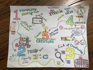
I decided to read the Hybrid pedagogy article, “Digital Ghosts in the Modern Classroom” by Ashley Hinck. The article summarizes how most programs we use have a template where we are accustomed and “trained” in a sense, to drag and drop files and follow a guideline of linear steps. The steps will usually lead to a single correct answer. These programs do not enhance student’s ability to think but instead to follow and become ghosts. Students become like an assembly line. They are all working like assembly workers to get a million different copies of the same exact product. This leads to a lack of creativity that many students face. We become like robots, where we are programmed to know a certain level of ideas but cannot work beyond our capacities, due to the template programs that surround us. We forget how to use our most powerful tool in the body, the brain. Hinck suggests that we should move on to more open-ended platforms that give students the freedom to make their own choices and just use their creativity to think outside of the box. However, this leads to a lot of frustration in students as trial and error may seem like they have failed. We need to teach students that failure is normal, and it takes time. There is more than 1 right answer and we need to learn how to troubleshoot when we run into a problem and not just give up. These platforms give students the freedom to become the creators and makers they were meant to be.

I decided to use a sketchnote for this reflection as I was able to think about how I wanted to display my ideas. Starting off with a blank sheet of paper, I was able to go through a few rough drafts and brainstorm the final picture in my head. This platform gave me the freedom to change things up and choose my own fonts, colours, pictures that certain programs may not allow you to do. Being able to choose what platform I wanted was great as it helps reinforce the fact that students do not all have to choose the same platform to display their ideas.

I love the idea of bringing sketchnotes into a classroom. There is no template or guideline that is necessary to follow. Every students work will be different from one another. I know for myself, starting off with nothing was a bit scary. There was no guideline to fall back onto, or that “I think I am doing this right?” mindset. It took some time to start, but once I started the process of making it was enjoyable. It would be a great thing for teachers to use, to see the creativity that each student has, whereas for the students, it will help them think outside of the box. It isn’t like a typical science or math lesson, where they all have to have the same correct answer. They can all come up with different things and will get the same marks as long as the criteria has been met.

Tagged