The TED Talk by Khurram Vieni on Data-Driven Education was very interesting and contained a lot of content. His main idea, the importance of Data-Driven Education, was one part of his speech, which I used to create the Infographic, found below. He is both a technologist and an educator; so naturally, he decided to compare the two, technology and education. He concluded that both serve industries, move people forward, is about people’s experiences and outcomes, are crafts that are influenced by science and they both come down to finding the best approach. At first, I did not see the link between the two and was wondering where this video was going. Upon further reflection and thinking about these key points, I realized he was spot on about the link. We are using technology more and more in the classroom, sometimes so much so, that we are leaving students at a disadvantage. Students are learning less and less on how to write and spell, and are creating students to be literate at typing and using spell check. Technology is advancing at an incredible rate, while education is lagging behind, where the gap between education and the real world of skills needed for future jobs gets bigger. Education is not changing at the rate of education, and we seem to be getting lost in preparing students for the future, because technology is creating an ever-changing world. We cannot even guess what jobs will be in need in the next decade- they might not even exist today. Unfortunately, we are no longer teaching for the future, and we are not even teaching for today! That is the biggest challenge in teaching, constant change and improving our lessons to meet the needs of all our students.
Teaching technology is beneficial for our schools, but we need to find a balance that allows students to use and learn from technology, while also learning basic skills like writing and arithmetic. Our students are becoming to reliant on technology and it is scary to see that students cannot spell, do simple math and cursive write (they no longer have a signature!) That seems crazy to me! I think we can find the balance necessary to teach students basic skills in writing, math and technology without limiting ourselves to one over the other. In my two placements, I have seen a classroom too dependent on technology and one that had a good balance. The one with the balance, used many types of technology, like Kahoot, math-based games and the Google Programs without losing out on the basic writing skills. For example, they would write and edit (sometimes peer edit) their rough drafts and have the option to type their final draft. Spelling and computing basic math facts, even in this grade eight class was still very weak. Therefore, like many things in life, I believe that it is important to find a balance with the use of technology in the classroom. Students should have the opportunity to learn both technology skills and skills in math and writing that will allow them to choose which system of skills they like best. Some students felt it was unfair that cursive writing was no longer taught and they spent their indoor recesses practicing themselves.
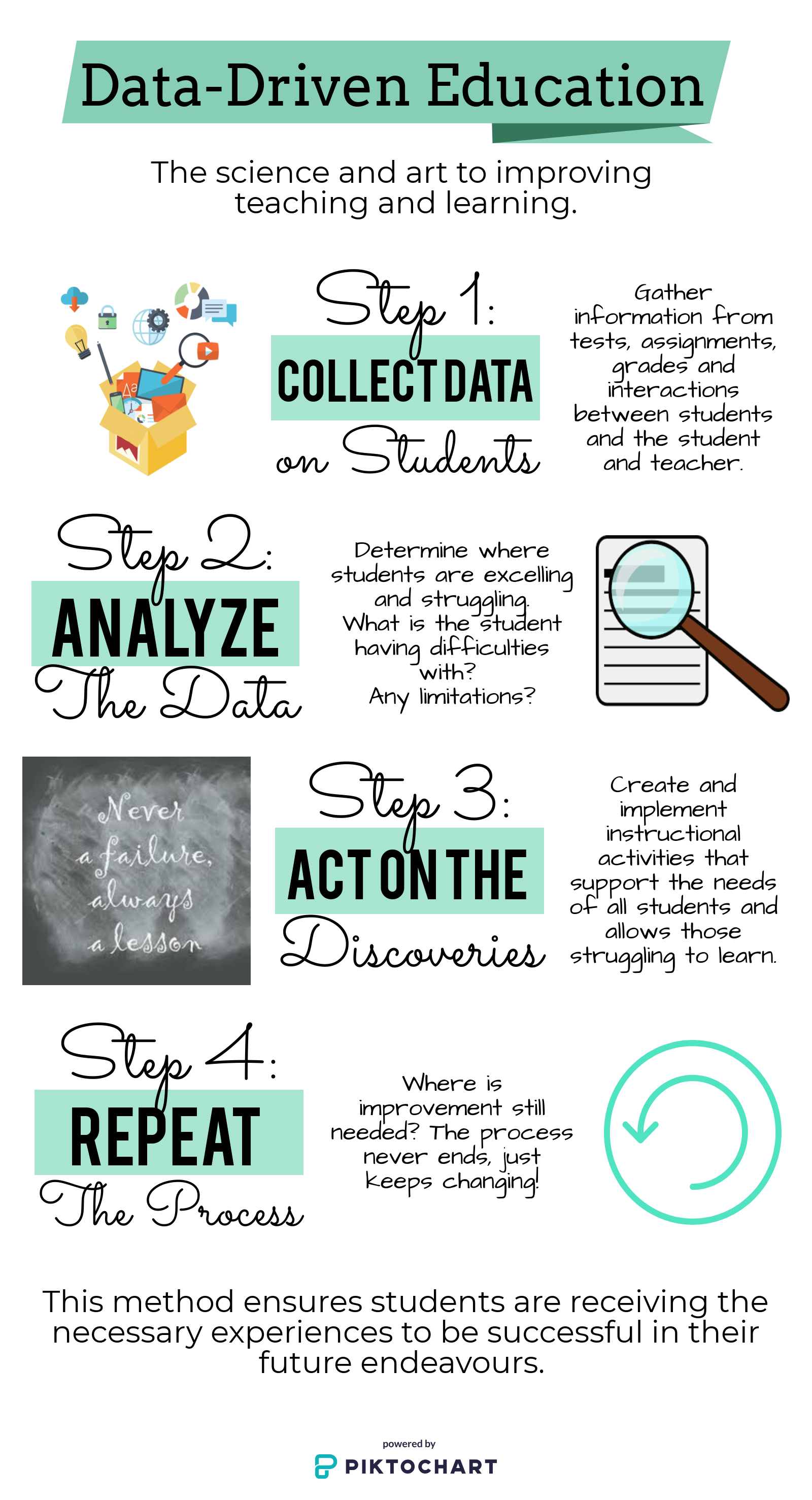
Data- Driven Education is a method for improving teaching and learning in the classroom, used by teachers. Although, I have not heard about this technique until listening to the TED talk, I feel that I am always checking in with students to see where they are at in their learning. Sometimes as teachers we have to be flexible and ensure that students understand concepts, even if we need to teach it in a different way. It’s all about experimenting and finding the best way to teach our students. Changing things up and teaching with the needs of your students in mind will help improve teaching and learning. What works for one class will usually not work for the next class. It’s all about knowing your students and catering to their needs.
I chose to represent the sequence for Data-Driven Education in an infographic because I thought the information would look best in a poster-like format. I used Piktochart to create my infographic and being new to the program, I thought it was very user friendly. I used a step-by-step guide from the website to help me and before starting, I looked around at all the options and tools for the program. I decided to start the infographic from scratch and did not choose to use a layout. I could not find one I liked, so I went to work creating my own. I would definitely use this program in the future and I would have my students create posters and other projects using this website. It would be easy for me to teach to my students and provide more variety than the common used Google or Microsoft products. Overall, I had a great experience with this infographic and I am glad I had the opportunity to try it out. I think it turned out great.