Digital ghost catching – See above
The spooky Article – see below
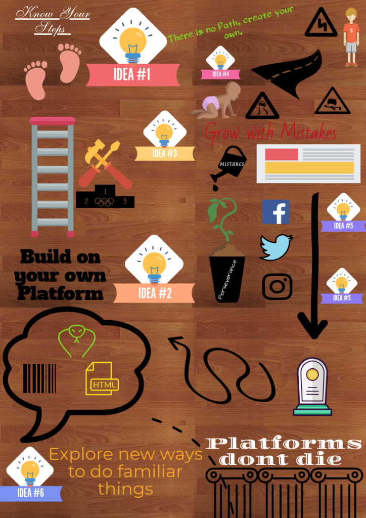
The article summarized the dangers of our electronic culture, making creating too easy and readily available. The problem with the way electronic culture is heading is the fact that nobody will understand the value of why things like Facebook, and snap chat are so easy people don’t realize they’re hard to make. When things are easy to make people don’t value what they create, anyone can drag and drop, copy and paste and follow a script. The article is trying to get students to recognize how easy things are and try to illuminate being creative. Students are using a vast media outlet to become copy and paste zombies when they could be aspiring tech artists. A stencil is traceable and easy to recreate works of art much like facebook and snapchat are the stencils of the online world. The article also highlights the immortality of these platforms, you can still create your original artwork and facebook will still be there and it will even allow you a huge platform to share your work. What I interpreted from this article also was the reason I chose it, a simple format to create my piece. Its simple, its creative, its slightly more than drag and drop and it doesn’t claim to be anything its not. You follow the steps, and gradually my piece becomes more interesting and involves different shapes and images.
How I started this project was creating an image only mind map of anything I could think of in relation to the article, checks, ghosts, garbage cans, lasers they all made it into the picture. Once I had all the images infant of me I could highlight the important ones and create my response through censoring my own ideas which I thought was a very unique way to do such a creative thing. Finishing this project was a huge sigh of relief because I felt comfortable and secure with how it looked in terms of the websites object design and ability to choose colour and font. I think this references the article because most people choose things like facebook and snapchat because its safe and you cant do anything wrong. This site did not give me the option to fail because it sized things for you, it colored them for you and provided you with ready to use stencils which promoted success; however with coding its all open ended and there plenty of room to fail. The ability to fail is what I think the article was about and we need to encourage our students to fail and keep getting better every time they use something different and more challenging.
Why did you choose your outlet? Were you comfortable or were you challenged? Tell me how you started this project and your first initial thoughts


