Category Archives: (12) 5332

Is your classroom HAUNTED?

I read Digital Ghosts in the Modern Classroom by Ashley Hinck. In her article, Hinck talks about how students’ previous experience using digital media templates and/or platforms, such as pre-made slides in Microsoft PowerPoint or HTML website code templates, influence their future learning and work in the classroom. Hinck believes that the use of such digital templates limits the creativity of students, causing them to be unable to “think outside the template”. Personally, my previous use of templates has simply introduced me to a vast variety of data presentation formats that I hadn’t thought of before. I now use formatting elements which I found in these templates for different projects, not because I can’t “think outside the template” but because I may never have thought to use these formats if I hadn’t discovered them inside templates.
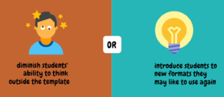
By assuming that digital media templates stop the user from making creative decisions of their own, Hinck overlooks a whole category of creative platforms. The templates within programs such as PowerPoint or Canva, or even HTML web page templates, are highly customizable. Such platforms or templates give students a starting place for their work, something to build off of and improve on. This is especially helpful for when students are having trouble starting on an assignment.
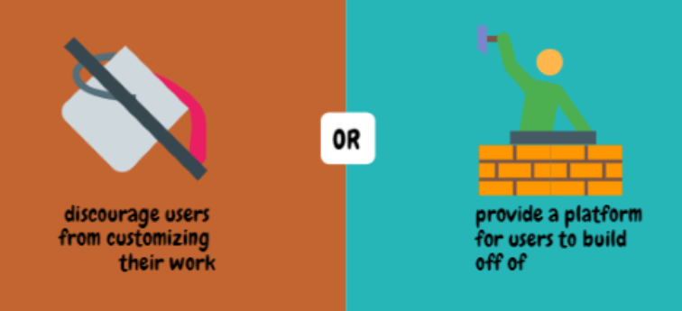
HTML web page templates were particularly scrutinized by Hinck and are of particular interest to me. Hinck believes that the use of HTML templates gives students an unrealistic expectation of how easy it is to code in HTML. She explains that she sees students in her class, who have previously used such templates with ease, frustrated and struggling to code in HTML. I, however, believe that HTML templates are a great way for novice coders to try out more complex coding applications. Furthermore, such templates can introduce particularly interesting coding applications to students who may regard coding as boring or dull. However, this doesn’t just apply to coding: digital templates can allow novices to produce their own content for digital media using just about any medium from HTML to GIFs.
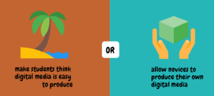
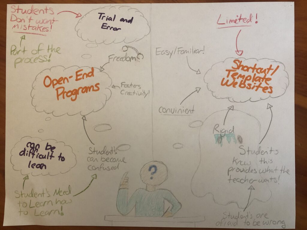
I have put together an infographic comparing Hinck’s views on how digital media templates affect the modern classroom to my own views on the matter and included it in full below.

Infographic comparing the views of Ashley Hinck to those of Kate Golden. Image by author.

Spooks Online: Digital Ghosts in the Modern Classroom

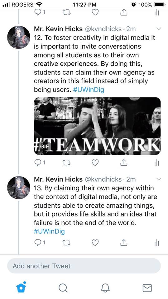
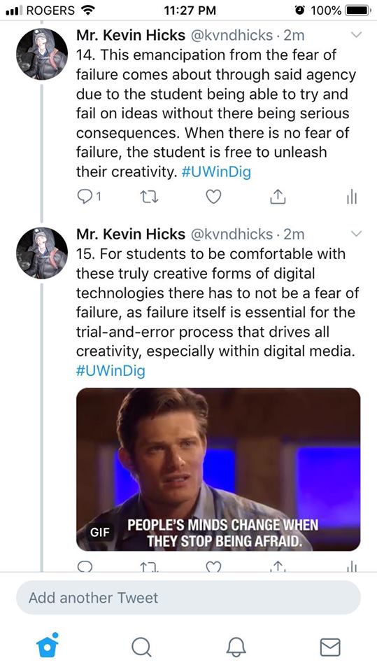
My assignment is on the article “Digital Ghosts in the Modern Classroom” by Ashley Hinck. With that in mind, I presented my multimedia reflection in the format of a Twitter essay due to the fact that I have little experience with the platform and I wish to be able to increase my knowledge on it. The reason for this primarily is that I feel it might be a good way in the future to connect with fellow people in the education field.

Interestingly enough I chose to do this article over the podcast because I was rather taken aback by the central message of it that these “create your own website” websites are not that creative and I had to dig deeper. Upon reading the article a few times I came to agree with Hinck due in part to her compelling arguments, and in part to my own experiences in the classroom as a student. To be specific. within my robotics class in high school we were taught how to do things such as both physically build the robot, and write the program for it. Although the building aspect required little trial and error, the digital aspect of it seemed more error than trial. This however was not a bad aspect of the class as it showed us that it is okay to fail, because through failure one can learn from their mistakes and then take that knowledge on to the next try at it. After reading Hink’s article, I do not believe that the same sort of experience and knowledge could have been gained without this sort of learning through failure. I honestly believe that no matter the discipline that is being taught, the ideas presented in the article such as there not being a necessarily “right” answer and that failure can be good if something can come out of it, are paramount in developing the creative minds of students.

Are Schools Really Where Students Learn; May turn out that they are not

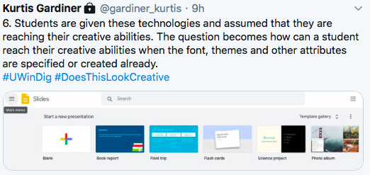
While reading Ashley Hinck’s article “Digital Ghosts in the Modern Classroom” (2018) she explained that creativity will not be found in a modern classroom. Classrooms full of linear and standard steps, drag and drop applications, and worksheets are preventing creativity from occurring. Students cannot be creative with these types of technologies in the classroom due to their lack of freedom and their structured setup.

Even if they were more open and creative technologies, it would not matter as students have been trained to lack creativity. Even when the technology becomes more open, students fear being “wrong” from years and years of structured teaching and being told that there is a “right” and “wrong” answer or way to do something. Years of being taught like this has put a depression on the creativity of students.

From personal experience I can relate that schools drown the creativity in classroom assignments with highly structured, specific projects. Projects receiving the best marks were always those that represented the idea that the teacher had in their head, never the uniquely designed project. This killed my confidence and surely killed the confidence on thousands of students just like me.

Simply giving students more open and creative technologies will not undo years of fear and insecurity grown by the structured, linear format of classrooms. Ashley elaborates that the current technologies are open yet still very structured due to font size, pre-made templates and other predetermined options. She suggests that new technologies should be introduced to help students but not be the sole change that occurs to bring creativity back. I agree that new technologies such as HTML, Scratch, etc should be introduced but introducing more open technologies will not simply cure insecure students that are too afraid to leave the structured realm of classrooms. Ashley gave examples that students struggled and feared new technologies such as coding because of their insecurity to fail and mess up. This is where she introduced the second half of the change that must occur. Students cannot simply be given more creative ways of presenting ideas, they must be taught and shown that it is okay to fail and present their ideas in new manners. Ashley gave the example of giving fifteen minutes for students to partner up and troubleshoot code together.

This idea is the key to creating creativity in classrooms again. She introduced more open, manipulative technology and gave students time to explore and be vulnerable without fear. That is the biggest difference that needs to occur in classrooms. New technology needs to be introduced along with teachers setting up environments and mindsets where students can fail and explore without fear.

That being said, for the project, I investigated Ashley’s article further using my twitter essay as my artifact. I was not familiar with twitter at all but I felt that a twitter essay could be the minimally restricted, creative technology that Ashley talks about in her article. She also emphasized the importance of students just like myself working past their fear of failure and trying more unique technologies. This being said, I figured I would do exactly as she says to prove that I agree with her opinion in her article.

So overall I concluded that new technologies and new teaching styles/attitudes are needed to stop creativity from going extinct in the classroom. The fate of creativity falls into the hands of the upcoming teachers.

A New View on Education!

I listened to Chris Friend’s Podcast with Amy Collier on Questioning Learning.

Listening to this podcast was a real eye opener for me. It forced me to develop a new view on education and the resources put out there for teachers and students. It made me realize that it’s okay to not always agree with other methods of teaching and it’s okay to ask questions; in fact, you should! I was able to get some insight on why canned courses are often seen in a negative way, that there are no set steps to good pedagogy, and that understanding is not measurable. To me, this was an incredibly insightful podcast and I will definitely take some of the lessons I highlighted above into the classroom one day with me. 

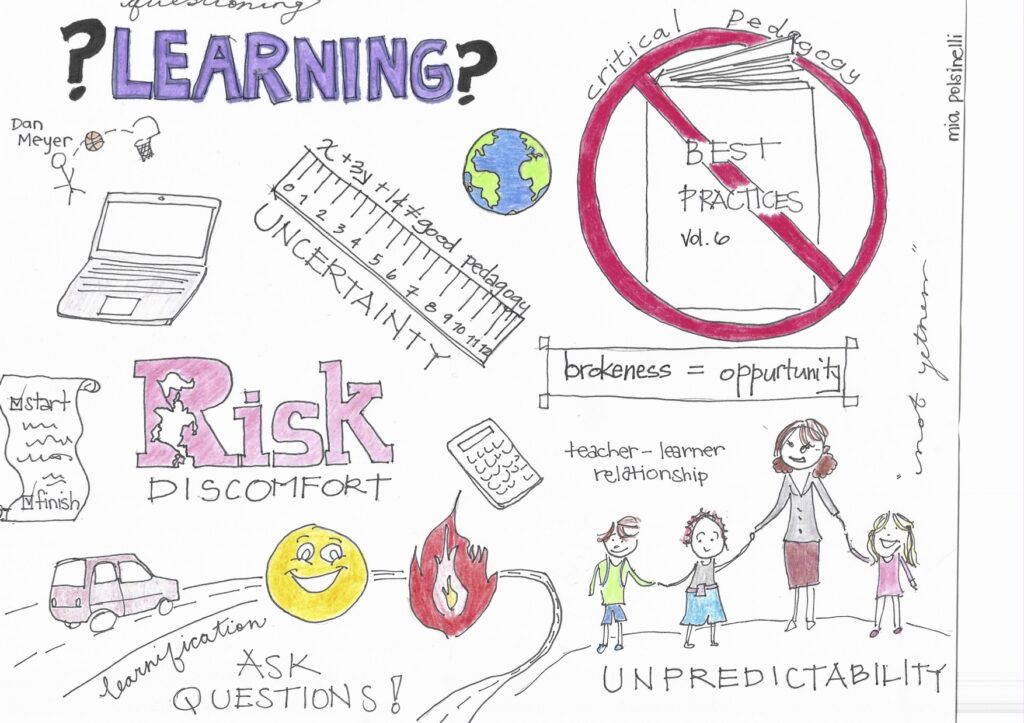
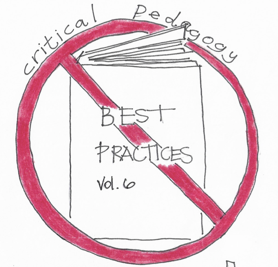
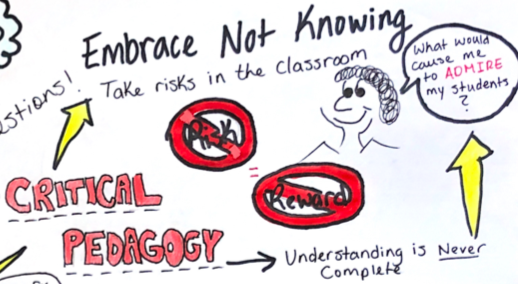
This is the main component of my sketch note. It represents how Amy Collier spoke about not taking best practices at face value. The rest of the podcast is based off the idea that we have to question these practices and think critically. I wrote the words “critical pedagogy” above this drawing because I wanted to show that there is a correlation between the two. By practicing critical pedagogy, we end up asking the questions that refrain us from using best practices just because that’s what they’re labelled as. 

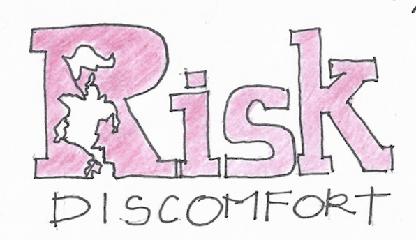
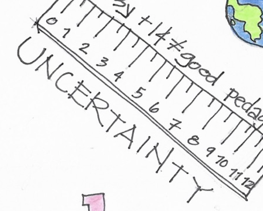
In the podcast, Chris asks Amy to elaborate on why she uses the words risk, discomfort, unpredictability, and uncertainty; words that seem to have negative connotations. I chose to include all four of these words in my sketch note with the greatest emphasis on risk. Amy states that although these words might sound scary, they are truly the ultimate goal as they create fire and excitement in the classroom. 

Another part of the podcast I wanted to emphasize through my sketch note was Amy’s desire to question learning. She says to ask yourself why we use the methods we do and to be comfortable asking these types of questions.

I would recommend this podcast to new teachers trying to gain insight on the methods of good pedagogy. I would recommend this podcast to old teachers that are just a bit too comfortable using the same lesson plans they made 10 years ago. I would recommend this podcast to really anyone in the education community that is looking to learn more and think more critically about the methods of teaching.

You Won’t Believe What Exists in Classrooms Today!

For this assignment, my infographic is based off of Ashley Hinck’s Digital Ghosts in the Modern Classroom. Hinck raises the argument about class structure and missing technologies from classrooms. Digital skills are becoming an increasing importance for jobs – and today’s students know this.

The above question is crucial to our classrooms. With the given class structure, students today are still experiencing what I did years ago. The same assessment after assessment to the final exam. Some students (like myself) found comfort in the rigid structure while those more creative struggled with this concept. Are we embracing creativity or creating robots to “drag and drop in a rigid structure to achieve a static goal?” (Lee Skallerup Bessette). Hinck, argues that we are potentially risking students creating something else envisioned or they learn to create, compose and make. (2018).

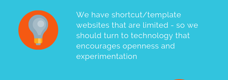
The major drawback from digital media in today’s society is the limitation of creativity. However, the ease and practicality of such websites have the appeal. Today’s teachers stray away from new digital technologies in their classrooms. We are still very comfortable using PowerPoint or Prezi. Hinck wants us as educators to switch from Canva to Photoshop or Gimp, since the assumptions (templates) under Canva are thriving. We can barely embrace creativity in scenarios like this.

Now that begs the question, should we leave these classics behind?

Technology was accessible during my time as a student, but no where near it is today. I feel that tradition is to blame. Once teachers find which technologies work for them (and not necessarily digital!), they tend to stick to it. Comparing my math classes in high school to the current digital technologies available, I will try to incorporate some of these in my practicum. We are still missing some technologies from the classroom, such as platforms and websites. We should be making students creators, makers and speakers. After all, they are our future.

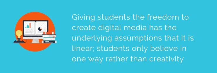
Students draw on past experiences from school and the digital world in their personal life. Student teachers will also draw on past experiences in their classrooms. The linear thinking towards digital technology is a generational thing. We want to stray away from the linear thinking and make it abstract. Students are hindered by their own thoughts of failure. One way we can curb this is to show them our own failures. Give the students permission to try and fail and revise. They can collaborate to try to figure out what went wrong, instead of being afraid of being wrong. We all need to step out of our comfort zones – including me. Creativity is not my strong suit but I am glad I was able to create this Canva infographic.

All images supplied by Canva.

Overall with this assignment, it was my first time using or even hearing about Canva. I thought it was quite ironic for me to use a template website to complete my infographic. I can personally relate to the linear way of thinking opposed to creativity. I actually made two different infographics; the first one following a rigid template with very little room for my own input. This infographic I am sharing with you today is still supplied from a Canva template, but I found more creative identity with this one. Thanks for reading!

Taking Risks in the Classroom

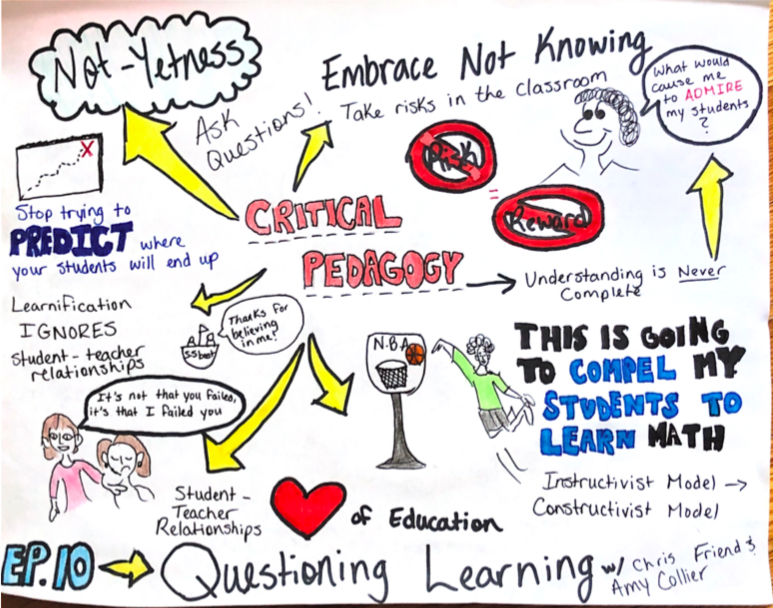
For my multimedia reflection, I chose to listen to Chris Friend’s podcast titled Questioning Learning featuring Amy Collier. I was immediately interested in Collier’s idea of Not-Yetness, and how integrating critical pedagogy in the classroom is beneficial for the long-term success of students.

First of all, let me just say that drawing this sketchnote was very much out of my comfort zone; I’m not very artistically inclined, but I am a visual learner, which is why I thought this would be a good fit. In the centre of my sketchnote is the idea of critical pedagogy, this is what Collier describes as “the notion of asking questions and being comfortable asking questions, to embrace not always having clear answers”.  Embracing the fact that you don’t know everything there is to know about the subject you’re teaching creates a safe environment where students are in control of their learning. It allows us, the teachers, to take risks in the classroom. No risk, no reward, right?

Adding onto the idea of “embracing not knowing” is Collier’s idea that Understanding is Never Complete. There are always new concepts to learn, and information that can be added onto what you already know. 

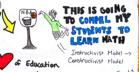
My favourite part of the podcast was when Collier gave the example of the math teacher who played a video of him standing on a basketball court holding a basketball, aiming for the hoop. He launches the basketball and then stops the video, while the ball is halfway through its arc. His students immediately ask, “Did he make it?” This creates a sense of uncertainty and curiosity. This math teacher isn’t saying “My students are going to learn this formula”, he’s saying “This is going to COMPEL my students to learn”. I chose to colour “compel students to learn” in a different colour because I believe that this is an idea that should be integrated into every subject we teach. Making students want to learn is the most efficient way to get them to learn.

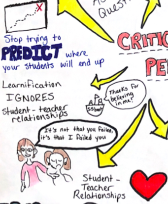
Another idea Chris and Amy bring up throughout the podcast is the idea of learnification, and how when you exclusively use an “instructivist model” in your classroom, you tend to lose the student-teacher relationship; which really is the heart of education. I’ve always believed that learning in the classroom should be focused on the learner, aka a “constructivist model”, and that when we stop using learning outcomes as a “map” and saying things like “all students should be at the exact same place by the end of my lesson” amazing things tend to happen. It’s not about a measurable outcome, rather, it’s about asking yourself “what could my students know at the end of the semester that would make me happy? That would make me admire them?” 

In conclusion, Collier and Friend talk in detail about critical pedagogy and how to incorporate it into everyday teachings. The idea of creating a comforting classroom environment is very important to me, as I know how important that can be for a middle/high school student. Being a teenager is tough, and I want to make sure I can create a happy environment where my students feel supported and excited to learn.

Why are there Ghosts in my Classroom?

I decided to do my assignment on Ashley Hinck’s “Digital Ghosts in the Classroom” article. This article focuses on the lack of creativity coming from students when it comes to Digital Pedagogy due to how they are taught in the school system. It talks about the fact that students are so afraid of failure, that they will not try something new or more challenging. For this assignment I decided to do a sketch note. I wanted to challenge myself. I usually stay away from anything pertaining to art, but I wanted to try something new.

Image

The first topic I decided to add was the fear of failing and the process of just dragging and dropping. The Article explains how students always think to do the assignment that will be less creative, but will give the teacher what they want. Students are taught throughout their education that doing simple drag and drop tasks will get you the top marks. I put the logos of Facebook and Canva. Ashley Hinck goes into detail about how Canva and Facebook work together to bring the users a easy drag and drop experience. This makes people put aside their creative side and take part in a simple user experience that these platforms provide.

Image

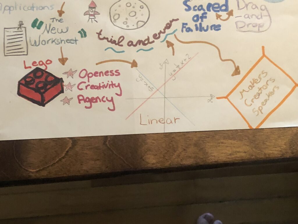
The next topics I visited were the amount of potential from no limit applications, the idea of “The New Worksheet” as Hinck calls it, and the importance of trial and error. The idea that people have so much potential when they use more complex applications, instead of drag and drop apps that they usually use. “The New Worksheet” idea looks at how the basic digital projects that students know well, is like giving out an old fashion worksheet. Like a worksheet, there is no creativity in a linear digital project. I put trial and error because the article expresses the important process of trying, failing and getting it just right. Without trial and error are world would be a lot different.

Image

The last topics I tackled on my sketch note was the example of the lego, the linear thinking of digital projects in education, and the idea that we are all makers, creators, and speakers. The article uses the example of a lego to explain what kind of digital projects we should be doing in the classroom. Building legos with no instructions allows us to be open, creative and have agency. The article says these things should be in all digital projects throughout our schooling. The author feels that digital projects in traditional school culture only provide a linear approach to thinking, instead of being open, creative, and having agency. The article also tells that teachers should be giving students the tools to be makers, creators, and speakers. Instead of linear projects, there should be more complex projects that allow students to reach their potential.

Creating a sketch note allowed me to put the information from this article into action. I went out of my comfort zone and tried something I was not comfortable with. It allowed me to try some trial and error creating this artifact. It did not turn out exactly how I wanted it, but I will keep trying to perfect it throughout time.

This article provided me with a lot of information that I will take with me into my classroom. I will add some creative digital projects that will allow my students to use their creativity. I will try to give my students the tools they need to become makers, creators, and speakers. I will also continue to increase my Digital Pedagogy.

Ghost Buster

I would like to inform you that I did study the article “Digital Ghosts in the class room” by Ashley Hinck. I made a sketch note with key points.

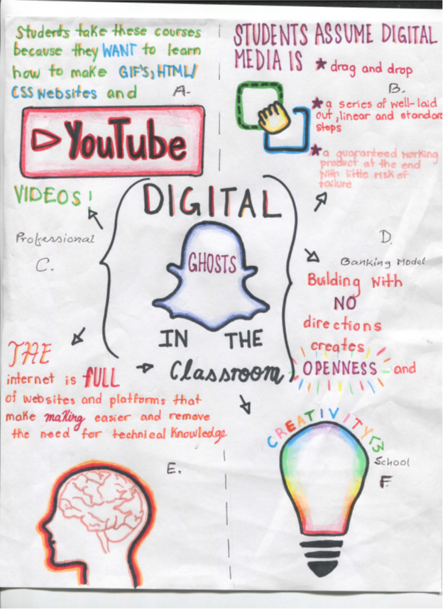
  1. YouTube, GIF, HTMW, and CSS:  Students needs to know how to make GIFs, YouTube videos, and HTML, CSS websites. They are used to make funny photo shopped pictures of their friends and capable to make personalized GIFs. They are used to get digital skills as increasingly important for jobs, both summer internships and careers after graduation. Students enter their class convinced that what they will learn to do will be useful in their professional and personal lives. Students assume their ideas in digital media: i) drag-and-drop, ii) a master of well-laid out, linear, and standard steps and iii) personal information, guaranteed working product etc.
Related image
  1. Digital Multi-Media: Usually, template websites and platforms are the new worksheet. Students might shift to a more critical digital pedagogy by leaving those template websites and platforms behind. They might turn instead to technologies that enable and privilege openness and experimentation, like Raspberry Pi, Scratch, and HTML and CSS etc. They can trade more-flexible image manipulation software like Photoshop, videos. Resources help to students draw on their past experience of both school and their digital worlds. The ghosts of worksheets, templates, and shortcut websites linger on, hovering over their learning as well as teaching.
Image result for digital multi media images
  1. Professional Ideas:  Actually, students’ assumptions about education and digital media making aren’t panning out because they can see the frustration that experience. The frustration in their faces, and they hear their frustration on their course evaluations. It creates frustration from not getting their project working perfectly. It is a deeper frustration that their different ways of thinking.
Image may contain: 1 person
Gazi Farok
  1. Banking Model:  Students can redefine interesting learners apart from the banking concepts of education, ideas to give them explicit permission to try and fail and revise. In addition, they can share critiques of school culture with pedagogical choices. They are making clear the vision for learning and embrace. This movement toward trial-and-error and tinkering. Students have more of their own failures and enacted and demonstrated the tinkerer, trial-and-error approach explicitly, attitudes. During every class for two weeks, they set aside 15 minutes of class time for students to troubleshoot with partners. This helped students to see their projects as works in progress, proposal to maintain troubleshooting.
Image result for Banking model images
  1. Technological Knowledge (Internet etc): The internet is full of websites and platforms that make easier and introduce the need for technical knowledge. Google, apps provide pre-made themes for slideshow presentations, taking away the need for the user to make choices about font, color, and placement. GIPHY allows internet users to create GIFs using only YouTube URLs. WIX uses a survey to learn about a user’s aesthetic style before recommending themes for a homepage built through drag-and-drop sections.
Image result for technological knowledge images
  1. Creativity School and Traditional Culture: As critical digital pedagogues, students have to find ways to help students as makers, creators, speakers. They have to help themselves by using shortcut template platforms and websites. Actually they have shortcut template platforms and websites as models. Students should not have to settle for half-hearted, structured participation. They can become full, active, empowered participants. Students make possibilities beyond the exact outcome prescribed by creativity, template platforms, websites and their corresponding worksheets. Students needs to keep plugging away at disturbing the assumptions. They can use those resources in their working place. An urgently-needed ‘ontological turn’ in higher education is a greater concern. It is a concept of relation to teaching, learning, and nurturing in students of the ability of intellectual uncertainty and inventing new ideas as creative schools.

I carried out this assignment on banking concept for financial information, knowledge of technology as a platform to update for internet and relative websites information. Creative school and traditional cultures had significant impact on digital ghost ideas. Multi media had a series of product based influences for personal risk and that market was natural. YouTube, Videos, GIF, HTMW, CSS were the updated software to get information as social media. Finally, professional knowledge could incorporate all of those ideas in practical aspects.

Image result for gif images

Are there ghosts in your classroom?

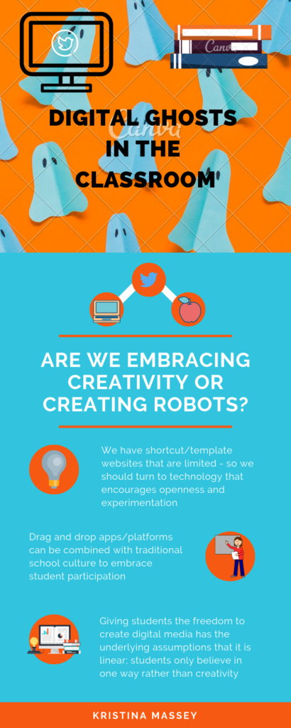
For this multimedia reflection piece, I chose to reflect on Ashley Hinck’s article “Digital Ghosts in the Modern Classroom”. To portray her main ideas, I made an infographic using Canva.

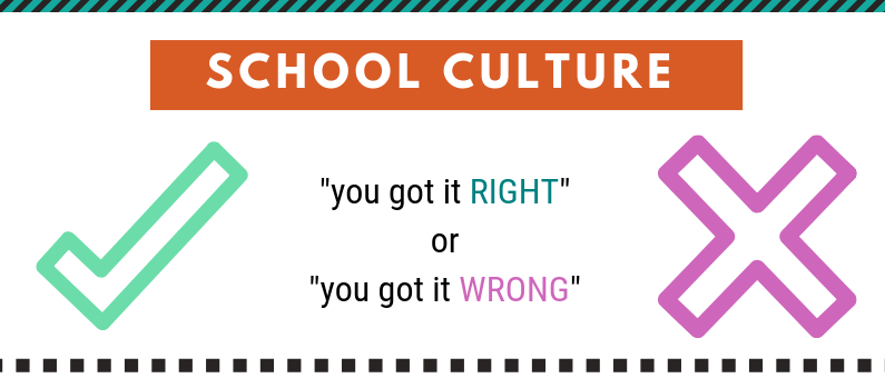
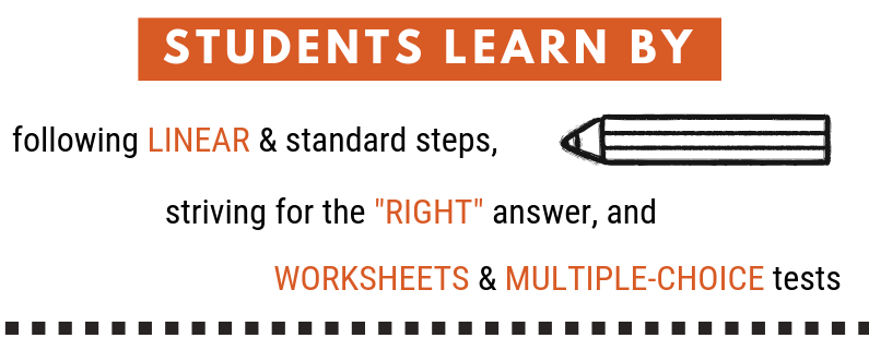
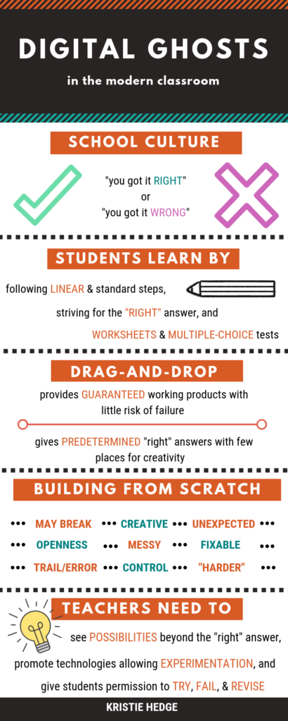
Very often in schools there is a focus on two things: the “right” answer and the “wrong” answer. By teaching and testing students in the form of worksheets and multiple-choice tests, they are not able to discover their own creativity. I acknowledge that sometimes one “right” answer is required, but there are many other opportunities where students are missing out on expressing their creativity. When I was younger, a lot of teachers used worksheets and multiple-choice testing forms and I think it becomes a sort of security blanket because they know what to expect. Branching out to new, creative teaching ways is scary at first, but the students can really benefit from it.

Students learn following linear, standard steps that lead them to one answer; the “right” one determined by the teacher. These students are more concerned about getting to that final answer that they forget, or just don’t have the opportunity, to be creative and to learn something new through trial and error exercises.     

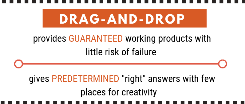
Hinck discusses some of the issues regarding the use of technology platforms that are available to students. She talks about how drag-and-drop platforms hinder students’ creativity because of all the templates that are available on them. These platforms would include Google slides and Canva, for example. By using them, students are guaranteed a working product at the end, with little risk of failure. The templates act as the “right” answer and don’t allow students to organize their information in their own ways.  

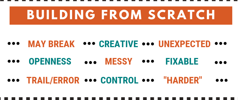
When coding something on your own using HTML and CSS, for example, there are “errors” that can be made and problems that will have to be troubleshooted along the way. These templates can often lead students to present their information in a certain way, and they can also restrain students due to the chosen template. The process may take longer, look messier, and be unexpected, but the results will be creative, the students will have total control over what is shared, and there won’t be a focus on a “right” answer.

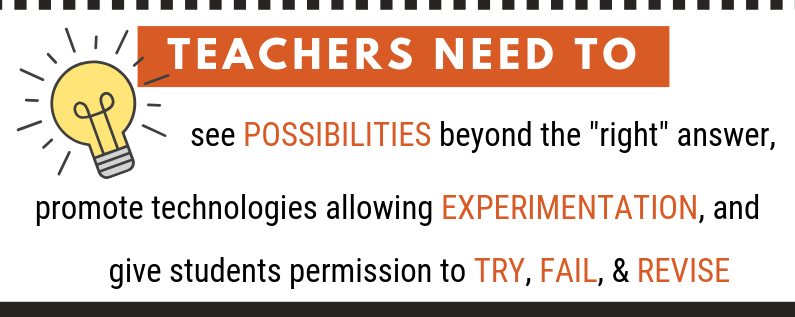
As teachers, we need to eliminate the “ghosts” in our classrooms by giving students the opportunity to show their creativity through the experimentation of technology. We need to acknowledge all the possibilities. As role models, we should be encouraging and giving students permission to “try, fail, and revise”, and to make it a learning experience for everyone, not just the students.

For my artifact, I decided to use Canva to try and prove the point made in Hinck’s article. After receiving this assignment, I read through the article, made notes, and went on to pick a template on Canva. I think I spent a good thirty minutes, almost as long as it took me to gather my information, to decide on a template. There were many things to consider as I was trying to pick which one would fit the information I wanted to present to my audience. The drag-and-drop feature allowed me to insert text boxes and images, and although I changed the information on the infographic, I kept to the overall theme and format. If I had to design my own infographic from scratch, I don’t think it would look like the version below. Although this one is effective, it didn’t allow for very much creativity on my end. Going forward, as a teacher, I want to incorporate these ideas into my own classroom. I think that it is important for students to be able to express their ideas in their own creative ways.

#uwindig

Encouraging Our Students to FAIL!

I recently read the article “Digital Ghosts in the Modern Classroom” by Ashley Hinck. In the article Hinck discussed where our educational system stands in terms of technological skills and where she would like the system to turn. In the article Hinck speaks about how the educational system has encouraged Template/Shortcut Platforms for students to complete assignments online. I found this extremely relatable, as this is exactly how I felt in school! In the article, Hinck mentioned that the template/shortcut platforms “are rigid”, and that, “(they) accept a narrow set of predetermined ‘correct’ answers”. Hinck continues to talk about how she has attempted to move away from the cookie-cutter platforms in her class, with a ghost of them being left behind!

“Ghost Picture” from Pixabay, an Open-Source Picture website

I found that Hinck’s analogy of the Ghost’s in the class room very creative! When I think back to high school, I often find myself reminiscing of the projects that I completed just for a mark, that have nothing to do with who I have become today.

Sketchnote by Brandon Nantais

Ken Robinson – “We stigmatize mistakes. And we’re now running national educational systems where mistakes are the worst thing you can make – – and the result is that we are educating people out of their creative capacities”

Hinck mention that students learn to “create the product the teacher wanted – that counts as the right answer. I couldn’t agree more! Students aren’t trying to answer the questions on the test the way they feel the question should be answered, they are trying to provide the answer the teacher wants. Hinck’s goal in their classroom was to praise the students for struggling through mistakes, it helped the students become stronger and persevere! As Ken Robinson mention, “Mistakes are the worst thing you can make”. Hinck spoke about her students and that they “perceive their hesitancy and trial-and-error as a failure”. I feel that students need to learn to fail, and by staying inside of their comfort zone they will never be able to adapt and learn new things!

I prepared this Sketch-Note in a pretty reasonable amount of time. I found the sketch-note as a pretty good way to organize my thoughts about the subject as well as an easy way to link my ideas together. I like working with pencil and paper because I feel like I have a lot more control over the medium, compared to making a similar presentation on my computer. I was able to do a few rough drafts to organize my thoughts and how my ideas were going to be linked together.