Category Archives: (10) 5332

Think Outside of the Box! Inspire Students with a New Way of Learning!

Hello everyone!

I decided to do my first multimedia reflection with Friend & Collier’s Podcast ‘Questioning Learning’.

I really related to this podcast because, as a student, I always wanted to be creative when completing and presenting assignments. I love to perform and I would jump at the opportunities where I could ‘bend the rules’ and do something I was so passionate about by incorporating skits, songs, and dances into my presentations. Unfortunately, these opportunities were few and far between in my elementary school. There was little ‘wiggle room’ when it came to math and science, as some of my teachers thought there were specific learning outcomes that could only be learned one way.
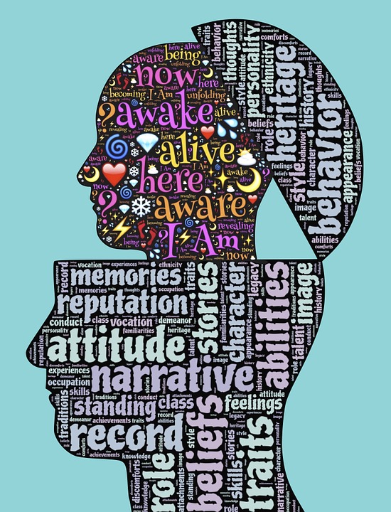
As an artist, when you are limited by rigid structures and aren’t allowed to take risks, you feel as though you aren’t able to share who you truly are.
https://pixabay.com/illustrations/awakening-emergence-transcendence-675330/

In high school, I was encouraged to be creative in my arts courses (music & dance) but I found that there were still many limits and rigid rubrics/goals that were in place, preventing me from ‘doing my own thing’. I am so passionate about the performing arts and being creative, as I think everyone has a voice and a story to tell. This podcast allowed me to reflect on my learning process and I have realized that I learn best when I am able to create. My digital artifact is a parody rap of sorts and I find that creating a song or dance or scene helps me learn because I had to organize the information, as well as be artistic. I not only chose what I thought was important, but I had to think about using different words to rhyme, follow a beat, etc. I had fun doing this assignment because I got to use my musical knowledge in a way that I am not super comfortable with yet. I was challenged in both a new concept and in my own field, so I was able to grow as a learner and artist.

As a teacher, I hope to create a nurturing and creative environment, where students can feel comfortable taking risks and expressing themselves. This podcast talks about how classrooms are so diverse and each student is passionate about different things. Our interests and experiences make us who we are so I want my students to be confident in embracing themselves and give them the chance to learn in a way that is exciting and engaging. Questioning and reflecting on my teaching methods will be an ongoing process because I want to continue being creative as a teacher and guide my students in their own personal journeys as they prepare for life in this wild world!
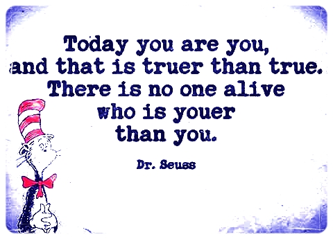
We need to encourage our students to be themselves because they are all awesome and uniqueness is what makes someone great!
https://www.flickr.com/photos/fugitivesavant/16450954528

Is Technology Stunting Students Creativity?

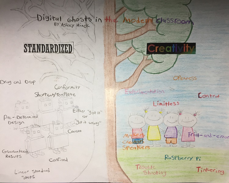
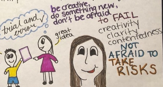
For our first multimedia assignment I chose to read the article Digital Ghosts in the Classroom by Ashley Hinck. In this article Hinck highlights the fact that templates and digital shortcuts are constantly being used in the classroom (by both students and teachers). I found this article interesting because I never really thought about the strict guidelines in most digital platforms and how limiting they are to creativity. One of the main points she highlighted in this article that really resonated with me was the fact that students are so scared of doing something wrong. This is an ideology that is built into all students brains early on in education, the idea that you either “got it” or “got it wrong”. If I’m being honest, I’m also a victim of this ideology having a fear of failure in the trial and error process and shying away from experimenting with new ideas. Hinck claims the school system is set up to have students shy away from trying new things because of a fear of failure. This shuns students away from taking risks, stunting their creativity and original thoughts leading to a generation of students with a thought process more in tune with robots than humans. This article helped open my eyes on the importance of avoiding limiting digital platforms and learning how to work in more experimental, trial-and-error spaces.

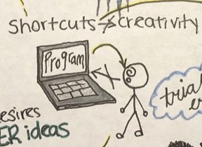
Like most things so far in teachers college, this assignment made me step out of my comfort zone. I decided to create a sketchnote even though I don’t have the most pristine artistic skills, but I believe that this skethnote helped me think more creatively. Looking at a blank canvas is a terrifying endeavour at first, but all this freedom sparked many ideas which then allowed me to follow the creative process to wherever it was going to lead me. I experienced firsthand how limiting digital platforms can be while I was creating my sketch note for this assignment. While formatting the word “creativity” in PowerPoint I found that many of the ideas for how I wanted to design this word were not possible on PowerPoint. Having premade templates is nice when you are trying to make a quick PowerPoint but when you are attempting to implement creative ideas the premade template becomes extremely frustrating.

Ghosting Digital Ghosts

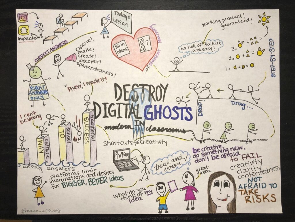
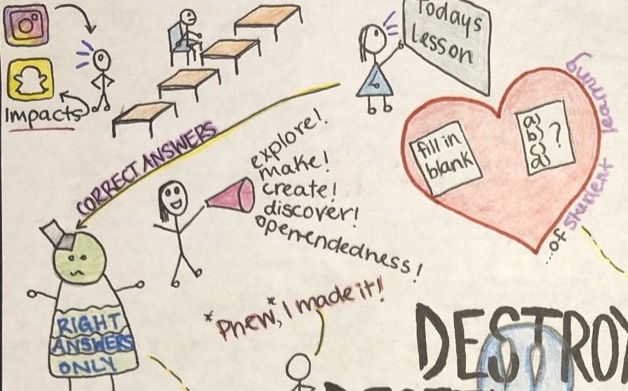
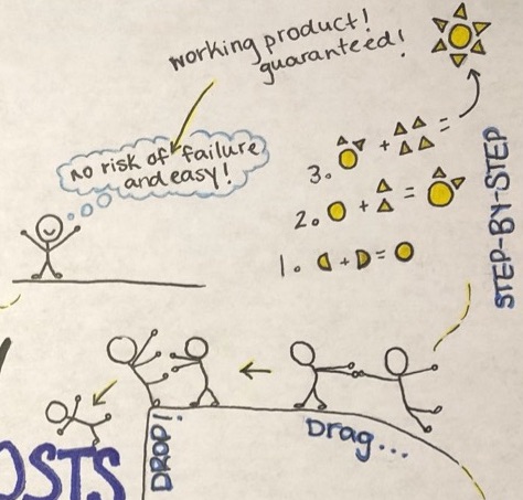
For this assignment, I decided to read Ashley Hinck’s article “Digital Ghosts in the Modern Classroom”. From reading the article, I must say that Hinck’s did argue good points most of which I agree. I decided to create a sketch note highlighting key information from the article that connected with me. Hinck discusses traditional school culture and how in today’s day in age students are losing creativity due to the use of certain programs and template/ shortcut platforms, many of which depend on basic drag and drop and step by step instructions. Yes, this may seem easy and familiar to many of us, but Hinck’s argues that these basic “guaranteed working products” have diminished students drive to think outside of the box, to use their imagination, and be creative without risk of failure. I feel that the platforms and shortcuts we are used to using has without knowing lessened our drive to be original and create on our own, and once allowed to use more intricate programs, realize how time-consuming and difficult it is.

I remember a time I was taking a time-based course, where we made videos using Final Cut Pro, Audacity, and Photoshop. I found it challenging and almost preferred to use IMovie, which was quite familiar to me, but we were restricted to the other applications. Hinck’s also discusses how teachers have been so focused on “the heart of student learning”, which consists of evaluation tactics such as fill in the blank and multiple choice worksheets, as well as student-teacher relationships and class layouts.

While in placement I found this was a go-to for many teachers during evaluations, which I do not completely disagree to use, although I feel this tool is not always as proactive for all students and tends to aid students to become dependant on them. That being said, this has distracted us or taken priority over the fact that many of which are influencing our students are behind closed doors, and out of view of educators. Teachers do not realize the influence these applications are having on students creativity. Basic filters from snap chat and Instagram trick students into thinking they are being original and creative by applying them to their photos during editing processes. What they do not see is that these are all defaults and what they cannot access is creating these filters themselves. But once being allowed to do so, realize the difficulty that truly lies behind such apps (ex. Adobe’s Photoshop, Audacity). The influence this has on our students haunt them without recognition, like a ghost.

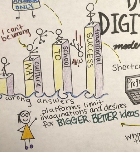
Hinck’s goes on to discuss how traditional school culture has also led students away from being speakers of their imaginative processes, thus making them fear failure. When in reality failure is what drives them to success. Students nowadays tend to ask what a teachers preference would be of different fonts, colours, sizes or themes in regards to an assignment where they might be using something such as slide show.

This was a constant question I would receive from my students, they come to feel that teachers are biased and have a particular idea of how they want student assignments to look. To fix this mindset, we should be encouraging student’s to “create, compose, and make” because such platforms and mindsets “limit imaginations and desires for bigger, better ideas”. I agree with Hinck’s that traditional school culture has manipulated students into feeling that being wrong is one of the worst things to be, thus feeling like they have to restrict themselves to a particular way or creating. Students must believe that it’s okay to make mistakes, to explore, discover, and create. They shouldn’t have to feel restricted or that they need to stay in the lines to be successful, they do not always have to be right but believe that trial-and-error and troubleshooting will inspire them more than always being right. Students are not little robots, they are creators, who make mistakes and they cannot forget that.

For this assignment, I felt that the sketch note was in my comfort range. I did enjoy creating the sketch note, it turned out differently than I had imagined but I’m happy with the result. I found that once I got started creating the sketch note, it helped my understanding of the article, which I feel will be a useful tool for student learning. From learning this skill I hope to be able to incorporate this into my teaching practice in the future, as it is creative and innovative. #UWinDig2020

Tagged ,

Who Ya Gonna Call? Digital Ghostbusters!

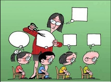
For this assignment, I chose to read “Digital Ghosts in the Modern Classroom” by Ashley Hinck. I thought the article was insightful and informative. The idea that shortcut/template platforms limit the open spaces for students to be creative is one that I had never considered, but certainly one that I can relate to. The vast majority of my learning has been based around the banking model of education which emphasizes the importance of correct answers and minimizes the need for creativity.

Image depicting creativity being minimized in school environment.

I completely agree with Hinck’s belief that shortcut/template platforms limit a student’s ability to be creative, however, I don’t view this as a bad thing. I believe that shortcut/template platforms reduce the amount of stress that students face when creating digital media. The platforms are easy to use and guarantee a working final product. Open-ended platforms are much more difficult to use and don’t guarantee a working final product. For me, a platform that limits my ability to be creative far out-weighs the risk of creating a product that might not even work. Furthermore, I believe that there are many students who don’t necessarily desire the ability to be creative. Many students are content with using a template platform to create a “cookie-cutter” final product that will get them a good grade. Drawing on my previous educational experience, I would argue that students’ value good grades over the ability to be creative.

Although being creative isn’t something that I value, I do believe there is some merit in attempting to break free from shortcut/template platforms like Hinck suggests. Limiting the use of shortcut/template platforms forces students and teachers to step outside of their comfort zones. While open-ended platforms are more difficult to use, they can teach both students and teachers valuable life skills such as troubleshooting and problem solving. I don’t think that students should be forced to use open-ended platforms but I do believe that they should be taught and made available to students who would appreciate the ability to express themselves creatively.

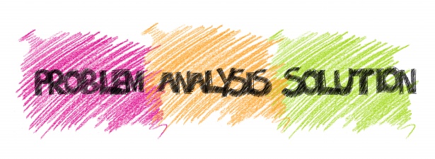
The three phases of problem solving.

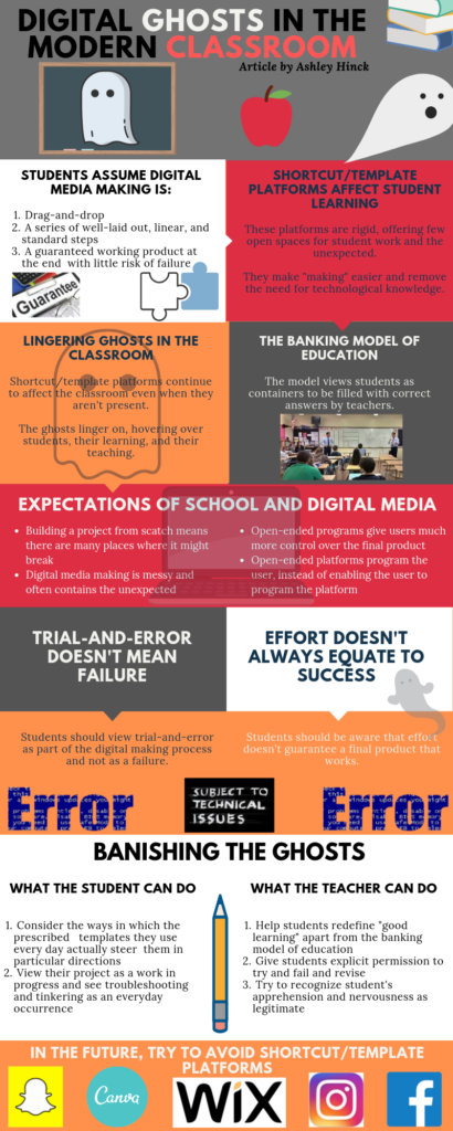
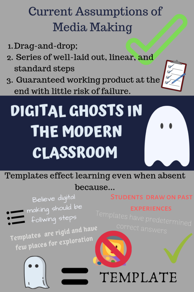
When creating my artifact, I completely ignored the main message of Hinck’s article and decided to make an infographic using Canva. Canva is a drag-and-drop website that provides users with hundreds of templates to choose from. The website is free and allows you to save and download your infographic once it is complete. Although Hinck warns against using websites like Canva, its drag-and-drop interface aligns with my previous digital media making experiences. When I become a teacher, I will attempt to break away from the traditional banking model of education by encouraging my students to choose platforms that allow for creativity.

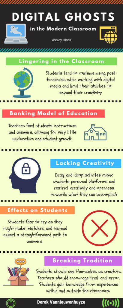
Infographic summarizing Hinck’s article.

Tagged

Are Ghosts Taking Over the Classroom?

I read “Ghosts in the Modern Classroom” by Ashley Hinck who argues that templates found in Word and Power Point and so on are limiting students abilities to be creative and experimental. The current education system teaches students how to follow simple steps and that there is always a right or wrong answer. As a results, students have false expectations on what digital media making is really about. With the addition of platforms that have templates and limitations, the assumption is digital media should be quick, easy and effortless. The reality is digital media making is complex with no simple path to follow nor any right answer. Students are now scared of making mistakes and so have more difficulties with being creative and thinking outside the box.

I agree with the author in that some platforms do limit creativity and causes students to have unrealistic expectations. Templates give students an easier way to make presentations in that they don’t need to worry about formatting. Also, for some platforms, only a limited component of the website is free which can limit how students can use the website. For instance, Canva has some free elements and others that cost money.

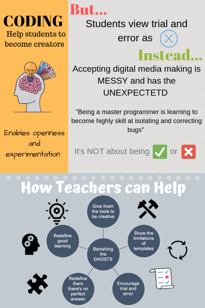
For my artifact, I chose to do an infographic by using Canva which summarizes some of the main messages she pointed out. I thought Canva was a great platform and fairly user friendly. From using this platform, I believe the main factor that inhibits student’s creativity is that they may not know how to use the platform to its fullest. There were some things I wanted to add but couldn’t figure out how to do it or how to do it for free. So, I didn’t necessarily have the tools or resources to be creative simply because of the limitation of my own knowledge with this platform. I also attempted to not use a template to see how limiting the platform was and found that with some practice, students are able to use their own imagination by using this platform.

However, from my experience, whenever I did presentations, the goal wasn’t to have the most creative power point or poster. The purpose is to have your topic be clear and interesting. Using templates for me was more of way to save time because making something from scratch is extremely time consuming. Coding is an extremely difficult skill that takes a very long time to master. I know people who took computer science courses in university and struggled trying to solve the assignments. For that reason, it may not be realistic to have all students code websites or infographics and so on. The students will simply not have the time. Perhaps there should be a compromise between taking a template and having to start something from scratch to enable students to be creative, understand there aren’t any specific steps to follow and prevent them from feeling like a failure when they can’t do something on their first try. 

For that reason, perhaps the templates aren’t really the problem but the fact students simply don’t know how to use the platforms to their full potential which therefore limits how creative the students can be. 

Teachers Aren’t Teaching Their Students How To Think

A Reflection on Ashley Hinck’s Digital Ghosts in the Modern Classroom

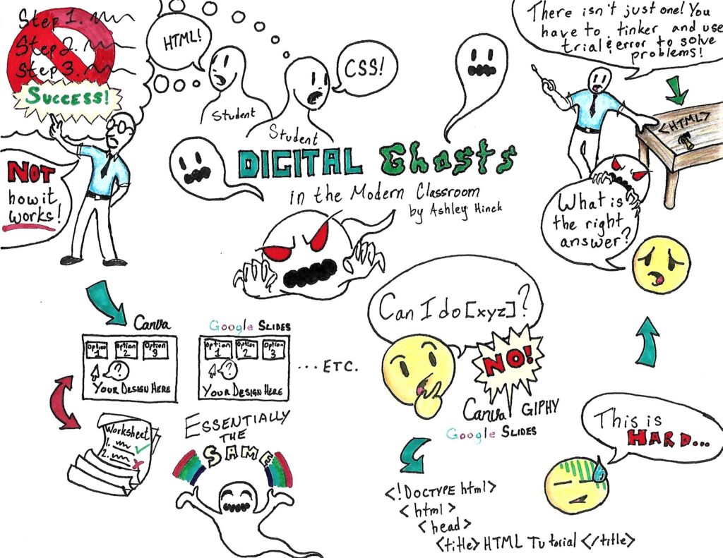
Sketchnote by Sebastian Bachmeier

In Ashley Hinck’s article Digital Ghosts in the Modern Classroom, Hinck discusses the various issues people face when working with technology in the school environment. For many students in the past and even today, the bulk of schoolwork is very cut-and-dry. There is one way of doing things; your answer is right or wrong. Worksheets are a classic example of this type of exercise: you fill in the blanks and you get a nice little check mark beside all the blanks you have filled in correctly. It is easy to see where you are successful and where you have failed, and it is not necessary to do much creative thinking in order to achieve top marks.

With the advent of technology, times began to change, however. Teachers began trying to integrate tech into their classes, but while the effort comes from a good place the technology is often misused. Hinck mentions such projects as creating one’s own website — a very valuable skill in this technological age! There are platforms like Wix or Squarespace whichmake building a site easy; simply follow the steps, drag and drop, and presto! A fully-functional website all your own! The problem, as Hinck mentions, is that creativity is severely limited on these platforms. She argues that these methods of creating content are not representative of what creation of web-based content truly is, and I have to agree.

Assignments which use these “Web 2.0” platforms in school only offer the illusion of creativity, always working within the platform’s constraints. They end up being graded in a manner very similar to the worksheets of yesteryear, where you either have a nice-looking website, presentation, etc. which checks all the boxes on the grading rubric, or you don’t. The problem with this kind of activity is that it does not represent true content creation, and does not teach students the skills needed to thrive in this working world: problem solving.

Hinck talks in her article about the countless students she has seen come into her classes ready to learn HTML or CSS, only to be caught off-guard by how hard these languages can be. They become concerned with all of the wrong problems, thinking that because their code or program is not working, they must be wrong. They believe they have failed because for their entire school careers they have been told that there is a set of steps to follow to ensure success, and they end up missing the point of learning these skills in the first place. The real key to these types of activities is the learning process. What matters is whether one is able to identify a problem, fix it, and continue learning. The process is the focus, not the product.

This concept is foreign not only to students, but to many teachers as well. As teachers, we aren’t doing our students any favours by creating product-oriented projects. They will not gain anything by following a set of steps until they reach success, but they will learn valuable lessons by working their way through problems, facing and overcoming failure, and documenting their progress along the way — even the messy parts.

I found this assignment to be very closely tied to the article. It forced me to get out of my comfort zone and try a different approach to an assignment which I had never attempted before. It certainly had its challenges — I had originally planned to do the whole sketchnote digitally using a digital art program and drawing tablet, but I couldn’t get the tablet to work properly and ended up drawing and colouring the entire note by hand. Then I had to find some way to get it from a physical page to a JPEG format on my computer, which was not a step I had expected to face. The process of dealing with these issues taught me about which skills I am already comfortable using (drawing by hand, using a scanning printer) and which skills I will need more time to master (using a drawing tablet successfully, troubleshooting digital art software). Regardless of how successful I may be in the end, the message in the article couldn’t be clearer: students need to learn to value process over product, and that needs to start with teachers (like us, hopefully) who teach their kids how to think.

Technology: Is it really a Benefit in Education?

For my first multimedia reflection I have chosen to read Ashley Hinck’s article “Digital Ghosts in the Modern Classroom.” In the article the author speaks about the education system and how there has been this idea created of a correct or straight path type of approach when working with digital media. The students conform to this style where they are hesitant towards trial-and-error, and instead proceed with a cyclical order of correct steps without a single mistake to be found. This idea has produced a lingering of worksheets and shortcut/template websites in the classroom that students are constantly thinking about, and limiting their potential to become open and creative, and to show their true abilities.

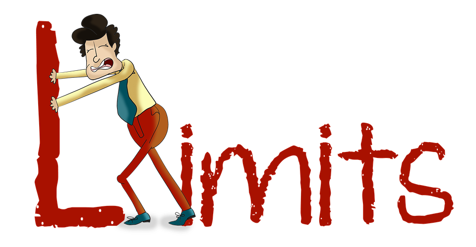
A picture of a man pushing away the L in the word limits.

I can relate to the statements made by Hinck in her article, as I recall when I was completing my education in either high school or my undergrad I was never pushed to explore or try new platforms. I constantly utilized the likes of both Microsoft Word and PowerPoint as I know how to effectively work my way through the program.

A picture of a chalkboard with the quote “Never a failure, always a lesson.”

Hinck later on in the article states a few different approaches to diminishing these looming expectations, by developing students creativity and helping students see themselves as makers/creators/speakers. Approaches such as explicit permission to try, fail and revise, giving students the tools they need or making connections between experiences in and out of the classroom and sharing with their peers. When making digital media students need to feel comfortable with trial and error, they need to know that failure is okay, as long as they take it as a learning opportunity, where they can then build upon and improve. I strongly believe in giving students the tools needed to complete a task and guiding them in the right direction, without definitively giving them the answer. I also believe in allowing students the freedom of working alongside each other and completing tasks in any form which they choose. 

I have chosen to create an infographic using the website Canva. This was my first time using this tool, and I found it extremely user friendly. Originally I was not very open to trying something new and had thought of using PowerPoint as I find it simple and am not a very technologically advanced individual, but after reading Hinck’s article I was given a different view in which I wanted to expand on my horizons and go outside of my comfort zone. I decided to choose an infographic as I have always been curious as to how they were made. At the beginning it was challenging as I had very little knowledge on this subject, but the Canva platform was very user friendly and I thoroughly enjoyed exploring the website as I worked towards creating my infographic.

Ready to Learn? Not yet…

I chose to listen to the podcast of Amy Collier being interviewed by Chris Friend.

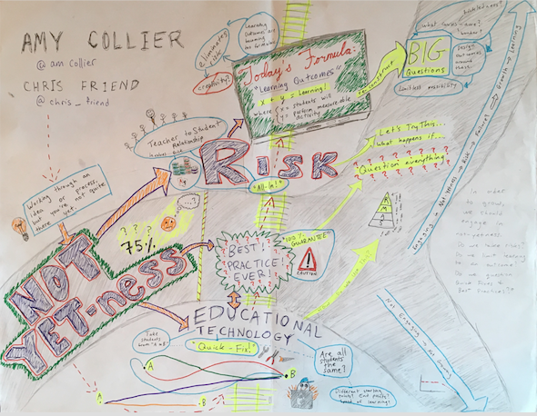
This image is a sketchnote summarizing a podcast by Amy Collier and Chris Friend. It discusses Collier's idea of "not-yetness" as it intersects with educational technology, questioning best practices, taking risks, and learning outcomes. The sketchnote is set up with the idea of "not yetness" being like a vehicle that is waiting for a train to pass by. Cars of the train include ideas on educational technology, best practices, risk, and learning outcomes. The learner is placed in the vehicle of not-yetness, and their level of engagement with these ideas either allows them to stay the same (by not engaging with these ideas) or to grow (by integrating these concepts into their learning).
This image is a sketchnote I composed summarizing a podcast by Amy Collier and Chris Friend. It discusses Collier’s idea of “not-yetness” as it intersects with educational technology, questioning best practices, taking risks, and learning outcomes. The sketchnote is set up with the idea of “not-yetness” being like a vehicle that is waiting for a train to pass by. Cars of the train include ideas on educational technology, best practices, risk, and learning outcomes. The learner is placed in the vehicle of not-yetness, and their level of engagement with these ideas either allows them to stay the same (by not engaging with these ideas) or to grow (by integrating these concepts into their learning).

This project was quite the learning experience for me! A little bit about my process: I had decided to reflect on the podcast, since it was a learning experience for me different from summarizing an article. I initially wanted to do a video response, but decided on the sketchnote because it was something new that I could try… I had watched some sketch-noting in the past, but never thought I’d be “able” to do that. So I channeled my inner Amy Collier and put the idea of not-yetness to the test!

picture of laboratory test tubes
https://www.pexels.com/photo/laboratory-test-tubes-2280549/

I decided to map out the ideas as they stood out to me. There was a wealth of information covered in the 40-minute interview, but what I have outlined in my sketchnote is what I found to be the key take-aways. First off, the concept of not-yetness was the main theme, and then I decided to create a railroad track with the other ideas as they relate to not-yetness in learning… more specifically, educational technology, “best practices”, risk-taking, and learning outcomes.

map with coffee cup on it
https://www.pexels.com/photo/white-ceramic-cup-on-map-2678301/

When reflecting on the content of this podcast, I was reminded of some fantastic music teachers I’ve had the opportunity to learn from. Their mantra’s of “failing forward” and “progress over perfection” combined with a proposal-based-experiment approach to learning were real-life examples of the idea of not-yetness. In these learning environments, failing is used as a tool to learn from, not-yetness is embraced as progress instead of perfection, and risk-taking and learning outcomes are combined in a way that enhances exploration, curiosity, and creativity.

person playing piano
https://www.pexels.com/photo/person-playing-piano-1288489/

I think the concepts outlined by Collier lead to an active participation of risk-taking students, who build confidence by taking action and doing something. This type of learning trains students for the real world. I don’t know about you, but I’m faced with decisions regularly that I feel I’m “not-yet” able to handle, or that I don’t have all the information I need to decide the “best course of action”. These decisions provide me with an opportunity to take a risk – to experiment, grow, and learn –  or not to take a risk. Taking that risk and engaging in not-yetness allows me to grow and learn from situations so that in the future I have more knowledge and experience to base my decisions off of. But if I don’t engage in not-yetness, I just say, “No, not yet…” I risk staying in the same place – not growing, not taking risks, not evolving, and not reaching my full potential.

light bulb in though bubble
https://www.pexels.com/photo/analysis-blackboard-board-bubble-355952/

As a lifelong learner, I am glad I chose to represent this podcast as a sketchnote. I know it’s not perfect, but I wanted to experience Collier’s concept of not-yetness and taking a risk in order to learn something new. Thanks for reading!

-TG

You Can Be A Ghostbuster… Read this Blog Post to Find Out How

I created an interactive sketchnote to represent ideas presented in Ashley Hinck’s ““Digital Ghosts in the Modern Classroom”.

Interactive Sketchnote of Hinck’s “Digital Ghosts in the Modern Classroom”

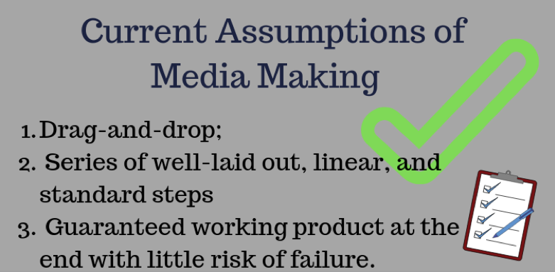
Hinck presents three main ideas involving the use of shortcut and template platforms in modern classrooms. She first discusses how these templates “make making easier”, as no technical knowledge is necessary to producing a final product. Some of these platforms include Canva, Google Slides, and WIX. Students have adapted to following series of linear, standardized steps with guaranteed products at the end and little risk of failure. This is dangerous. This method does not require open-endedness, exploration, and discovery. Shortcut and template platforms can be compared to worksheets, as views of students being containers to be filled with correct answers are reinforced.

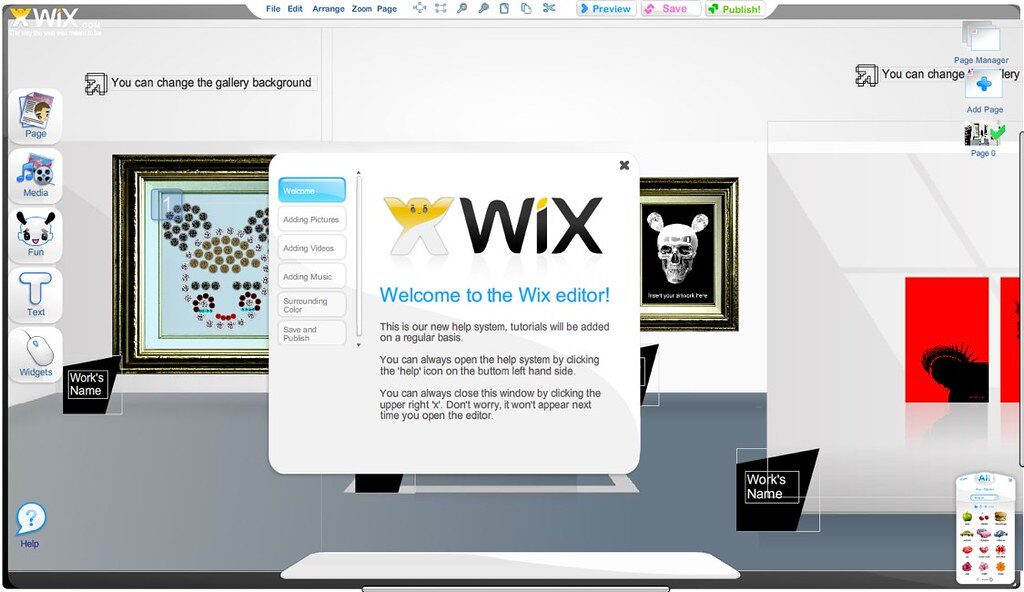
WIX is a digital template platform, well-known for its drag-and-drop, step-by-step features.

Hinck also states that worksheets, templates, and shortcuts have lingered, like ghosts, in the working mentalities of students. Students are influenced by their past experiences: following linear steps with clear end goals. Many individuals do not expect the difficulties and messiness associated with digital media making. This consequently affects their confidence as creators and decision makers. Their focus should be centered in problem-solving, rather than if they “got it” or “got it wrong”.

You have the power to banish these ghosts within your own classroom. You can be a ghostbuster!

So how can you banish these ghosts and dislodge expectations that students have attained through past experiences with worksheets, templates, and shortcuts? Hinck suggests that you can give students permission to try and fail. She also suggests that teachers enable discussion where students can compare and contrast making experiences inside and outside of the classroom. Analyzing the limits and possibilities of different platforms can also banish these digital ghosts.

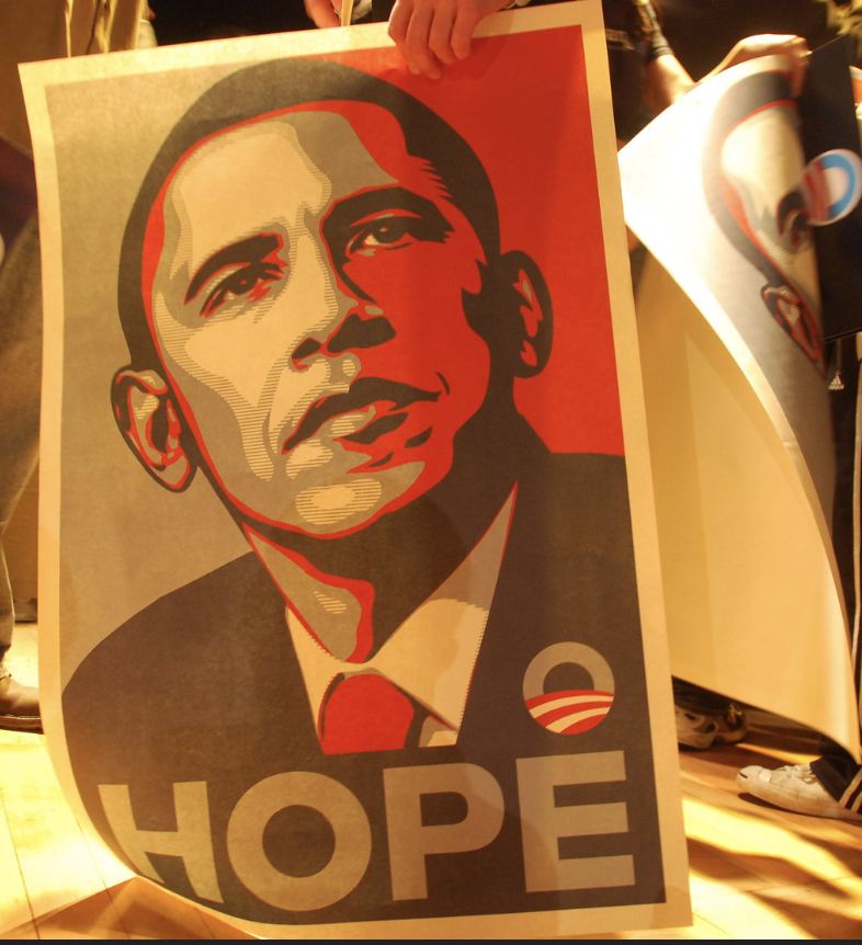
Hinck used the Barack Obama “Hope” poster as an example for analyzing the limits and possibilities of different platforms. “Could this poster have been created using Canva?”

This article helped me gain perspective on shortcut/template websites and platforms and their effects on education and the creative process. While reading the article, I reflected on my own experiences creating digital media on these platforms. As a musician, I have used many of these platforms to create advertisements for myself and my projects. Bandzoogle is a “Drag-and-drop” website maker that resembles WIX. The platform is specifically tailored to musicians and bands. This website enabled me to easily and neatly present information about myself and my product; however, there were limited opportunities for me to make my page distinctive amongst the pages made by other musicians using the platform. The implications of this issue could be dangerous in educational settings as it promotes conformity and standardization.

Worksheets, Templates, Shortcuts = The Box

Inspired by the ideas written in the article, I wanted to incorporate another dimension to my artifact. A sketchnote does not have many limitations to what students can creatively produce. I am not a strong illustrator; however, I love thinking “outside the box” in terms of presenting information. The interactive component of this artifact provides more opportunity for differentiated learning experiences, as students can see and feel the ideas written by Ashley Hinck.

Madeline Doornaert

Tagged

Go Past Your Limits! Breaking Student Expectations in the Classroom

For this assignment, I decided to read Ashley Hinck’s “Digital Ghosts in the Classroom” article, and chose to create a Twitter essay as my artifact. The main message I took away from this article was how students were struggling to demonstrate creativity when learning digital skills because they were stuck inside of a linear learning mindset. 

As I read through the article I was fascinated by this idea because I had never considered the sheer amount of digital tools that are based off of already made templates and worksheets that limit expression for the sake of “an easier time.”

When I reflect back to the majority of my time in school using digital tools, I was never expected to realistically use something outside of PowerPoint, and was therefore never taught how I could potentially explore beyond the creative expectations that were set for me. 

Hinck alludes that a major reason why students use these shortcuts is that their assumption of media is equal to their understanding of the school system where there is always a right answer, and that you earn the right answer’s through a basic step-by-step method.

Students aren’t willing to commit to trial and error because being willing to fail has not been what they have been taught during their time in school. It is because of this that Hinck suggest that students start looking at school projects as works in progress so that they do not have to feel as critical when evaluating their work. 

When students are willing to take risks they will find their best chance to go beyond linear thinking and have a greater sense of exploration in their work.

As I continue to develop my digital pedagogy, I want to incorporate a system where students understand that there is more than one way to solve a problem. By making troubleshooting and tinkering a common practice in the classroom students will not be as afraid to explore more in their creative practices, and become more engaged participants in their work. 

When a project is allowed to simmer and cook instead of coming out half-baked it’s a more rewarding result for both the student and teacher, and helps to further break the expectations that have maligned themselves in classrooms for years.