Author Archives: wong1119

The Tantalizing Technologist

For my second multimedia reflection artifact, I chose to create an original sketch note based on the Technologist module. This module is used to assist educators with the process of selecting, using and integrating technologies that will help support and enhance student learning. I have never created a sketch note before, however I do enjoy drawing and sketching and thought it would be a cool new opportunity to create one. I used a variety of fonts and graphics to help the reader with understanding the main ideas of the module, and giving them something interesting to look at while doing so. As this is a sketch note, I wanted to keep the amount of text I had on it to a minimum (keeping it to the main ideas) and use the space for related sketches instead. The title is in the biggest font in the middle of the page that can tell the reader the main topic of the entire sketch note at the start. My sketch note begins in the top left corner with “Access Your Digital Literacy”, and moves clockwise as you go along, with loopy arrows to keep the reader on track.

My sketch note on the Technologist module

The first step begins with accessing your digital literacy collection. The development process is ongoing and your library will continuously grow, but by understanding what they are, you understand the many abilities of using digital technologies and web-based tools, including ways to create and communicate information, that can help address specific learning challenges. I displayed this with examples of knowledge, technology and access cards in a brain on my sketch note.

“Access your digital literacy”

The next step is to identify a challenge with your learners. Understanding their point of view through empathizing with them and planning your materials based on them and their opinion can help you with identifying a challenge that can be addressed with technology. A key is to keep the focus on something small rather than something big, so once you have a challenge, you will want to narrow it down to define it. This is exhibited in my sketch note by someone climbing a mountain in the background (large focus challenge) with puzzle pieces and a lock in front of it (small focused challenges).
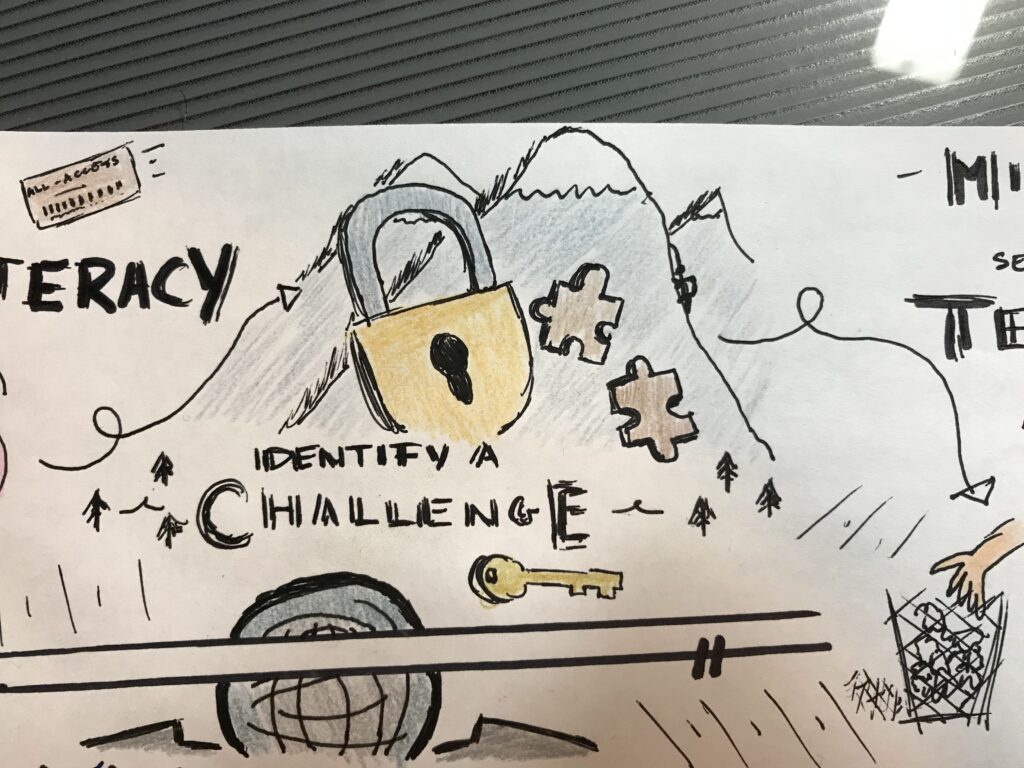
“Identify a challenge”

Once a challenge has been identified, a technology can be selected. Picking the right technology for your problem is a process that can be cleared by laying out your thoughts on what you need from your technology for your solution, and a good way to do this is using a mind map. My sketch note has a silhouette of a head with thoughts of a map with sticky notes on it to show the thinking process, and a hand reaching in a basket of options to show the selection process.
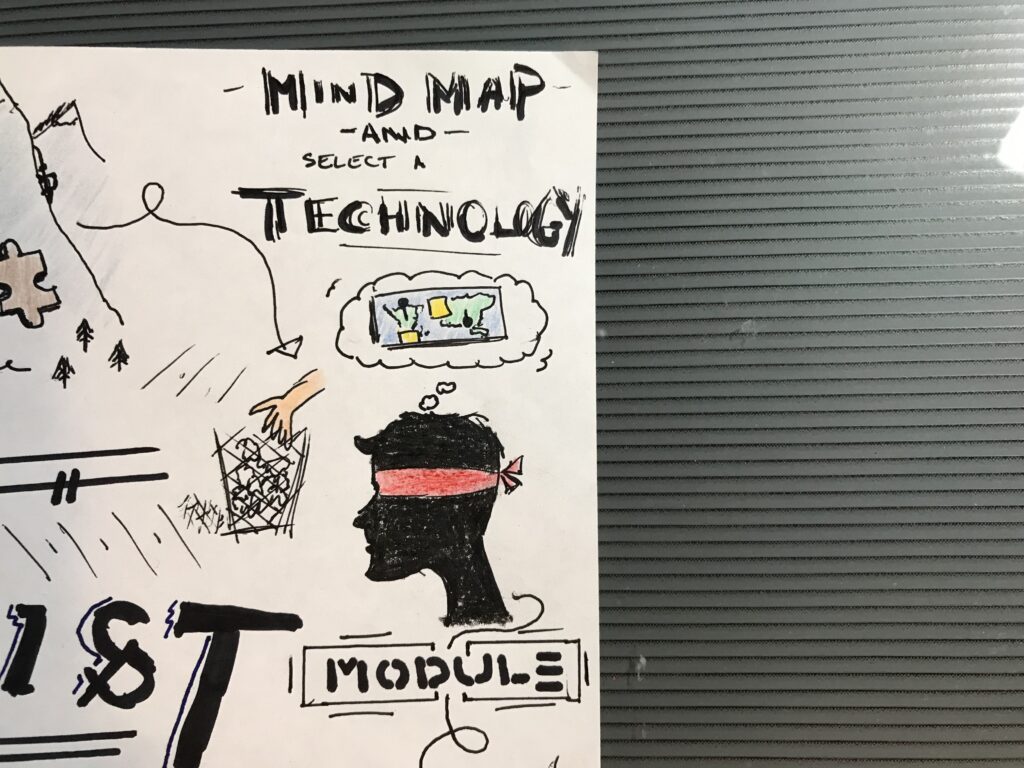
“Mind map and select a technology”

Prototyping comes after the selection process, and the creation of something tangible to see rather than just hearing about ideas (the “testing” stage) can enhance the richness of feedback received. On my sketch note, I represented the prototyping stage with a person at eye level of a table carefully constructing some type of abstract prototype, with a pencil and design book open next to him. There are voice sound lines above him to show the thoughts of feedback that will be received once it is built and shared to help refine it.
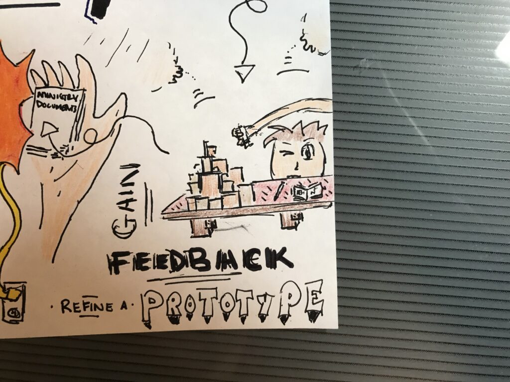
“Gain feedback, refine a prototype”

Once you have the product, connecting it with the curriculum is the next step. Educators have to keep the original learning goal in mind, understand and review that their technology is being used to address this, and sharing this information with the users to show them the link between the two. This is displayed on my sketch note with two hands, one with a piece of technology, the other with curriculum documents, being brought together with a connected wire explosion in between.
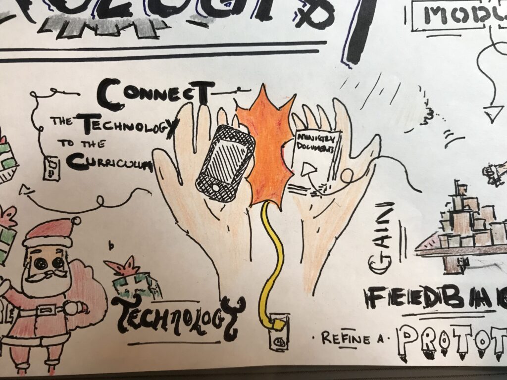
“Connect the technology to the curriculum”

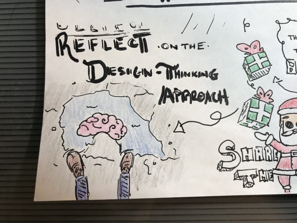
Once this is all done, it is time to share the technology with your users. I have represented this on my sketch note with Santa Claus throwing presents around him. The last step is to reflect on the entire design-thinking approach that you took to generate this technology. This is shown on my sketch note with someone looking into a puddle on the ground, and seeing their reflection (a brain). The brain is something that was seen at the start of my sketch note and is used here to connect all the ideas together and signify the end of the process.
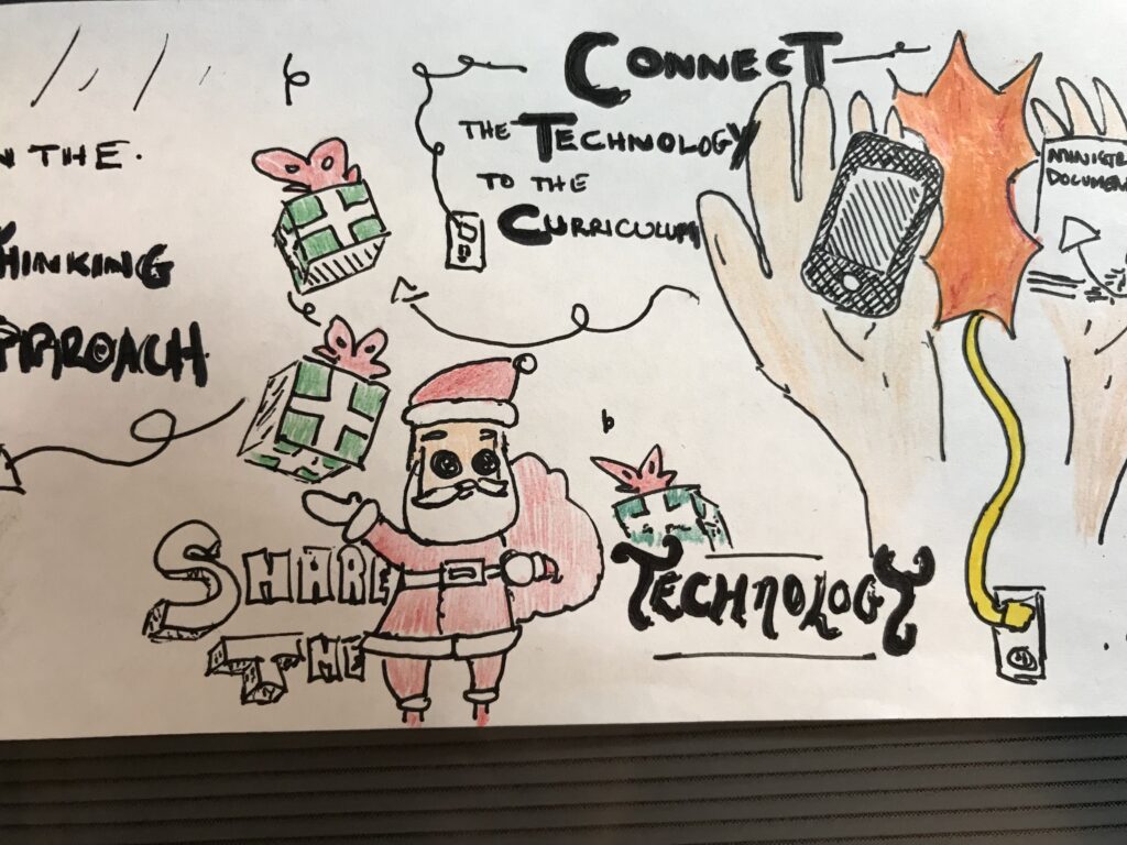
“Share the technology”
“Reflect on the design-thinking approach”

All in all, with the world and technology evolving at a rapid pace, using this technologist module as a new way to address learning challenges gives innovative options for an educator. While this is still a fairly new concept, and may lack examples that can help with the understanding, I believe it provides a good basis of an approach for educators to go off of when exploring solutions with a technologist mindset. I think this is a great way to find new methods to address learning challenges. I believe the biggest focus when using this module is to not get caught up with something because it is new and shiny, but to make sure to relate to the main goal of helping the learning challenges.
GIF from giphy.com
https://media.giphy.com/media/UWD6pyspC3nI5fXhdF/giphy.gif

Tagged

Move Over Casper, New Ghosts Are In Town

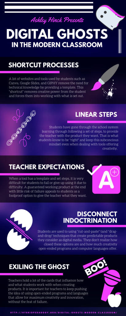
I read the article “Digital Ghosts in the Modern Classroom” by Ashley Hinck. In the article, the author speaks of how existing tools and platforms, “shortcut” templates as she calls them, causes students to lose creativity and just do what is required to complete assignments by creating a desirable product for the teacher. She claims students have been indoctrinated to follow a set of steps to reach an end goal without the high potential of failure and mistakes, and that mindset has lead them into losing creativity and simply following the mold set out for them for success. She encourages teachers to give students the open-ended tools and languages that will not limit their creative ability and allow them to create without a guaranteed result.

I decided on this article due to the topic directly relating with my experiences and interests. I use a wide variety of template tools and platforms in everyday life, both for school and leisure to create digital products, as well as having prior experience working with open-ended language. I chose to represent the article with an infographic using Canva as a way to show the creative potentials of a “shortcut” template identified in the article.

Infographic made on Canva.com.

I agree with Hinck that students have been trained to think a certain way when it comes to completing assignments and projects as they made their way through their schooling, and that it may have hindered their bold creative ability. I also agree that open-ended programs and languages should be encouraged to students. In terms of limited creativity, there is no arguing that template websites and platforms offer less creative potential than open technologies. However, I do not believe that they should be a requirement over existing template tools and platforms. Not every student will share the same exuberant passion for digital media and with a finite amount of time, spending it trying to come up with something from scratch that can be easily achieved with an existing tool should not be forced upon students.

Retrieved from Giphy.com.

I think the option should absolutely be there for students who choose to explore this creative endeavor, with an incentive that will not put them at a disadvantage when compared to their peers using templates, such as an extended due date if needed to compensate for potential mistakes and errors in the process. But for a lot of students, I believe what the current options offer are more than capable for what they are aiming to do, and should still be an option for use.

When creating my Canva infographic, despite all the options, it was difficult at first to find one to suit my vision. I knew I wanted a modern look with a vaporwave aesthetic for my infographic to look professional and represent the digital side of the article, but didn’t know exactly how I wanted it to look. By finding one that represents the colour scheme I wanted but couldn’t come up with in my mind, it was perfect. It offered me something a blank canvas couldn’t have given me, and that was a spark of inspiration and ideas. It got my creative mind flowing with possibilities as I explored the available elements and tools I could use with it, of which were completely unrelated to what was already shown on the default setting of the infographic. So from just my experience using Canva for this project, I can say that if a student is not happy with what they see available to them, it will not stymie their creativity and cause them to settle for something less than they desire.

Retrieved from Giphy.com.

I noticed, through my own experiences using these platforms and tools, they open up another aspect of thinking in students – it works on their creativity, flexibility and adaptability. By finding ways to change their product to suit what they can use while keeping the quality of their work at top tier, it enhances all three of those traits. For example, a student who is not able to remove the background or change the colour of a photo on one tool is able to use a seemingly unrelated tool, such as Microsoft Word, to perform that task. Also, with Canva specifically, there are limitations on what photos and elements are allowed for use on a free account. This may seem debilitating to creativity at first, but afterwards you learn how to work with different elements you can use and get very creative with them to get your desired result.

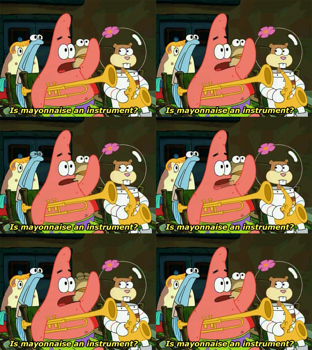
An analogy I have to this situation are musical instruments. There are many musicians who practice their craft and create their art using instruments that already exist and are widely available, like saxophones, trumpets, and flutes. However, the instrument of their selection limits them on what sounds are possible. Should musicians be inventing their own instruments to use to open all possibilities for them to get their perfect desired sound? Or are they able to push their musical talents to their full potential by using existing tools? I believe the second one.

Retrieved from Giphy.com.

In the end, I feel that while it is important not to stifle the creative world of students, it is also just as important not to force students out of their ability range with open-ended programs and languages lacking limitations. After all, some creativity is better than none, and that “some” is actually a lot. I think a happy medium is to give students the option to use existing templates and tools or open-ended programs and languages, and make the conditions fair for whichever option they select. There are still many creative possibilities in the realm of the “shortcut” templates and they are very capable of producing work that students can be proud of – like I am.

Tagged