Author Archives: Candice H.

I used technology to talk about technology

Digital tools can be a boon to any classroom, but a teacher shouldn’t just select an app they stumbled upon, give it to their students and expect miracles. There is a lot of work that must be done before and during (and after) the implementation if the tool is going to be of any use.

Ontario Extend’s Technologist Module explains one procedure teachers can use when selecting digital tools to enhance a lesson. I decided a quick video would be an interesting way to summarize the module. It’s also completely different from the sketchnote that I completed last year! Please enjoy.

Note: This thumbnail was the only one Youtube selected that didn’t feature my completely open mouth. So flattering…

Interestingly, the module doesn’t start with selecting the technology or with anything to do with implementation, but with several definitions of digital literacy. Some of these definitions were rather wordy, so here’s a boiled down version: a person is digitally literate if they can effectively navigate, communicate and create information using digital platforms. The module explains (and I agree) that a teacher who understands how literate their students are will select an appropriate tool for the benefit of all their students.

As a physics and math teacher, I’ll be entering a field that complements with tech pretty well. However, understanding and interpreting what digital literacy means in regards to students and their abilities must be considered before handing any tech to them. If a student doesn’t have the capability to use it yet, they will gain little from it.

This module goes into great detail while discussing a process called design thinking. It lists five steps an educator should consider when attempting to implement tech into their classroom.


Empathy

The first step is to empathize with your students which (to be honest) is something all teachers should be doing already. Empathy is something outlined in the OCT’s Ethical Standards.


Video Snippet: Empathy. It’s in the Ethical Standards for Teachers.

The module suggests building an empathy map to help organize how to students are responding to your current lessons by noting their feelings and reactions while in your classroom. I believe this is a harder activity to complete accurately than it sounds. Some of the pieces of the map might be very difficult for a teacher to decipher on their own. I think I would show students my completed empathy map and allow the students to give their feedback on what they believe is missing to get a more accurate picture.


Define and Ideate

Video Snippet: The ideal educational tool


The next two steps in design thinking are to first define what parts of your lessons could be changed or improved with a digital tool and then to decide what features of a tool would be ideal for your classroom. These two steps will use the empathy map (or whatever was used to collect information). The goal is to narrow down what you need and what you want in order to make your search for the tool as efficient and effective as possible.


Something I did not mention in my video is the use of the SECTIONS approach when selecting a digital tool… Four minutes just isn’t a lot of time to discuss something as robust as this technologist module! Luckily, there is an excellent resource by Anthony William Bates that explains everything you could ever want to know about the approach. It narrows down eight elements to consider when selecting a new tool for students to use; all conveniently organized in a delightful acronym.


Prototype

Video Snippet: Check out this cool thing I found!

Time to implement the tool! By making a prototype or a test run of the tool for their students to play with, a teacher can observe what the tool enhances and where it may fall flat. By making changes to how the tool is used, these new iterations should become more and more effective, resulting in (hopefully) improved learning. A successful implementation should always be shared with others. Don’t keep your digital creation a secret; I don’t intend to!


Connect

The final element of design thinking was a no-brainer: connect the use of the tool to the curriculum. I found it very strange that this step is at the end. I believe that it would be better placed in between the defining stage and the ideating stage. To put all this time and energy into implementing a tool only to reflect back on its usage and find that it does not help in teaching the curriculum would be very frustrating. So frustrating in fact that I don’t believe any teacher would fall victim to this oversight.


Though I agree with many of the steps outlined in design thinking, I do not agree with the order in which they are presented. As I said earlier, I think it would be foolish to wait until the implementation is nearly done to check if your technology-driven lesson addresses the curriculum properly. This problem shouldn’t even really arise if the define and ideate phases of the implementation were done correctly.

One final note: I believe that having the end goal in mind at the very beginning would be beneficial to the project in the long run. To blindly rush headlong into a problem with no solid aim to work towards seems like it could waste a lot of time and resources. The idea of asking “What do I want the students to be able to do” is absent in design thinking’s protocol. It asks this question of the technology, but not the students and that is a tremendous omission.

Cookie Cutter Websites: Killers of Creativity

After reading Ashley Hinck’s Digital Ghosts in the Classroom, I decided to try my hands at a sketchnote. Since this is my first time attempting something like this, I thought I would start with a medium I was most comfortable using: traditional pencil and paper!

Sketchnote featuring many concepts and ideas presented in Hinck's article

One obstacle with drawing traditionally is once the mark is down on the page, it can be very difficult or nearly impossible to remove it, especially when using permanent inks and pencils. This means that a fair amount of time should be set aside to sketch out a rough copy to plan out how the space on the page can be used effectively. In my case, I made three rough copies before committing to a final version which was a bit time-consuming. Another drawback for me was creating the digital copy of my drawing. I used a large piece of paper for my final piece; a piece of paper that did not fit in my scanner! Unfortunately, all the lights in my house have a warm, yellow tinge to them which muddies the colours of the drawing when taking its photo. I tried to use some colour correction after taking the photo, but computers are just tools, not miracle workers.

Enough with my struggles, let’s talk about the process of making this sketchnote. It was my hope that the article’s title would be the focal point of the drawing. By selecting a very vibrant green for the lettering similar to what people may see on their own digital clock at home and using red (green’s complementary colour) for nearly everything else in the drawing, the intent was to have the words “Digital Ghosts” really pop out. I would like to note that I wanted the product and corporate logos to remain as close to their official colours as possible so they were spared the red touch! Finally, it is probably obvious that my sketchnote relies heavily on drawings more than words to get the points across. I wanted to focus more on the sketch part of the sketch note!

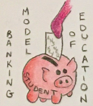
Hinck discusses a shortcoming that has appeared in her classrooms recently: a lack of enthusiasm in her students when building digital artifacts of their own. She brings up the banking model of education that she fears is still being instilled into students today; the idea that students are simply containers to be filled with answers. It was this statement that gave me the idea to draw her thoughts and ideas as little cartoons. In this illustration, someone is filling the student piggy bank with an answer key.

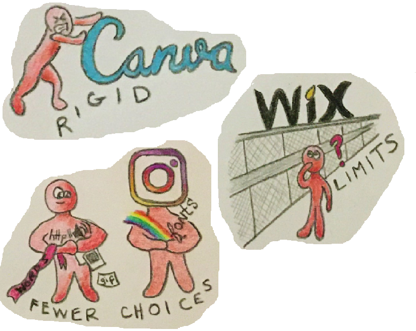
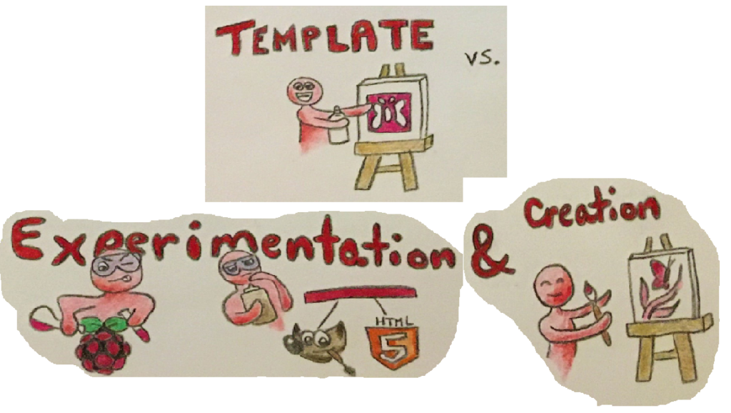
Hinck mentions several platforms that she believes contribute to students’ reluctance to learn digital skills from scratch. Platforms such as Instagram, Canva and Wix are some of the drag-and-drop websites that add to many students’ preconceptions of how to make anything digital. By providing pre-made templates, these websites hinder creativity since filling out a template can be much easier than designing your own format. The final piece may not come out looking exactly as planned and can lack originality due to the limitations imposed on users. I chose to focus on three of these platforms (though I drew rough sketches of a few others that did not make the cut to the final sketch including Facebook, Snapchat and GIPHY.)

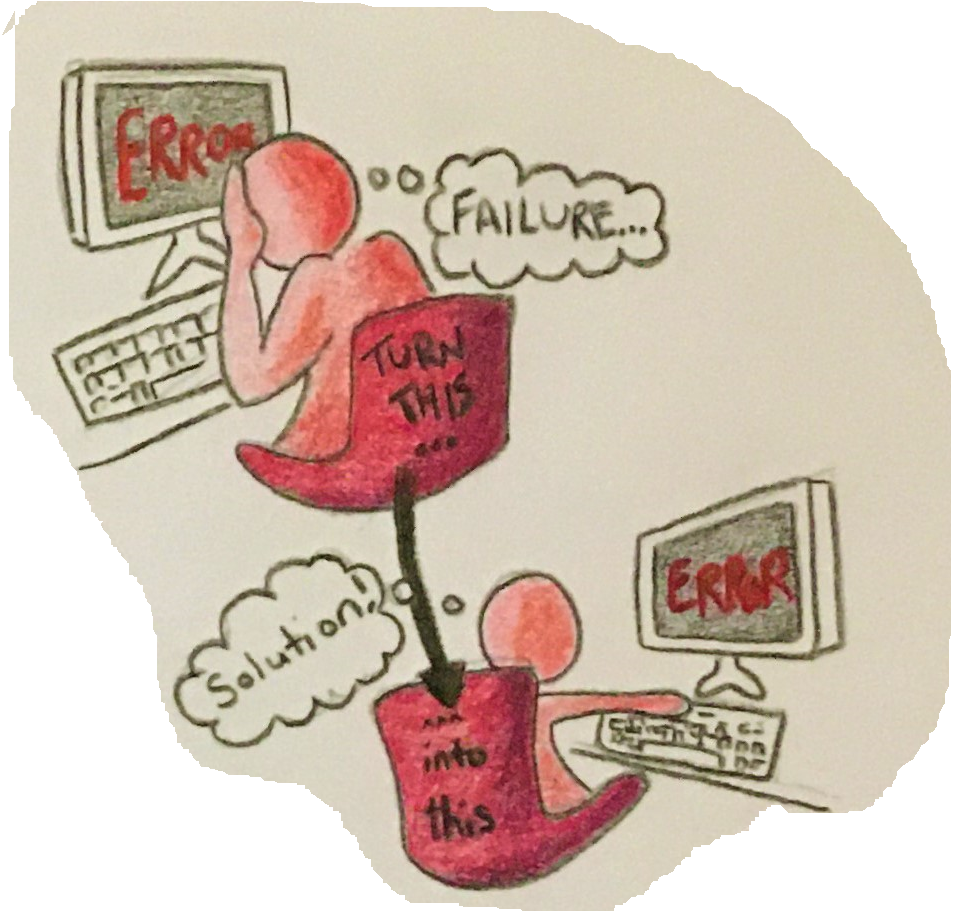
The article mentions that some students feel very discouraged when they are confronted with difficulties and errors when learning how to format their own digital works without the aid of the template platforms. To drive home the idea that a mistake need not be a reason to quit, I thought of two images: a person despairing with the old fashioned head-in-the-hands pose we’ve all probably felt at some point in our lives (or possibly at some point while completing this assignment!) and a person continuing to work through their difficulties.

I made this set of images to show the limitations the template platforms place on creativity. The student in the top image is pleased that the stencil (or template) they are using will produce a butterfly (or a program/website) on the canvas, though it will be fairly basic-looking. The bottom two images has the student experiment with different hardware (Raspberry Pi), software (GIMP) and languages (HTML5) to create a much more customized and original work.

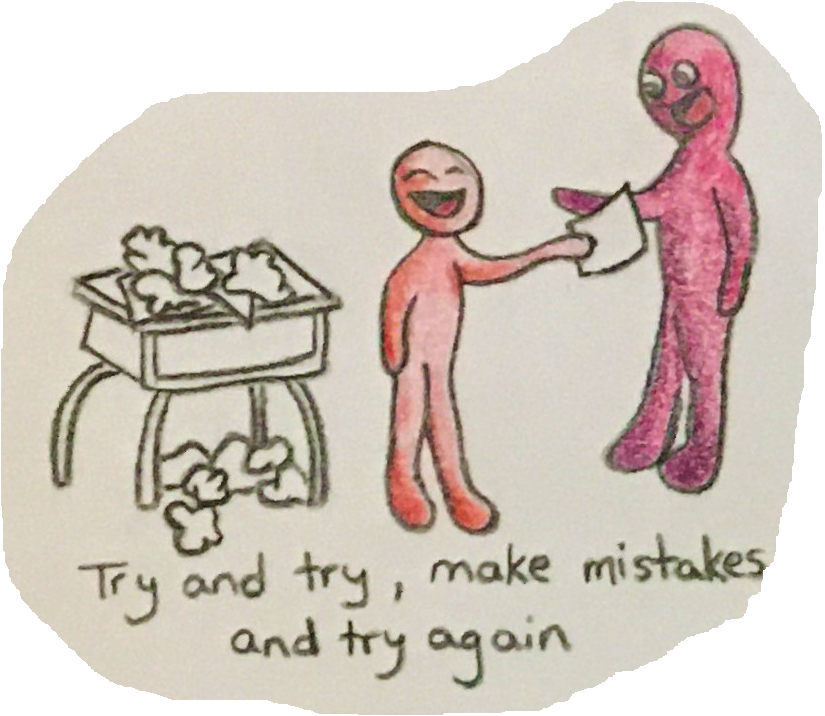
The last piece of my sketchnote I want to invesitgate in this reflection is the image of a student handing in a finished work to their teacher. Even though there is a pile of previous attempts and mistakes cluttering their desk, there is also a big smile on their face. The message I took away from Hinck’s article is that students have become afraid or ashamed to make mistakes, especially when making digital works. This may be largely due to template platforms offering easy-to-create cookie cutter works with little chance for experimentation and failure. The satisfaction of hunkering down, correcting errors and completing your work exactly how you envisioned it is lost on many students.

Perhaps if teachers focused more on the process of creating the digital work (or the process of completing schoolwork in general) rather than only acknowledging the finished work, students would be more enthusiastic and willing to try new things, experiment with new software and languages, and will be less likely to hide their progress and mistakes. This could also be accomplished if teachers showed students their own struggles with learning these new techniques.

On a side note, I took the article’s message to heart when preparing this blog post! I wanted the page to look a certain way, but the standard controls in WordPress did not include the formatting options I wanted. Luckily, this site also supports html code so I was able to move beyond the default setup of the website and customize it to look exactly how I wanted!