Monthly Archives: October 2019

Ghost Blaster

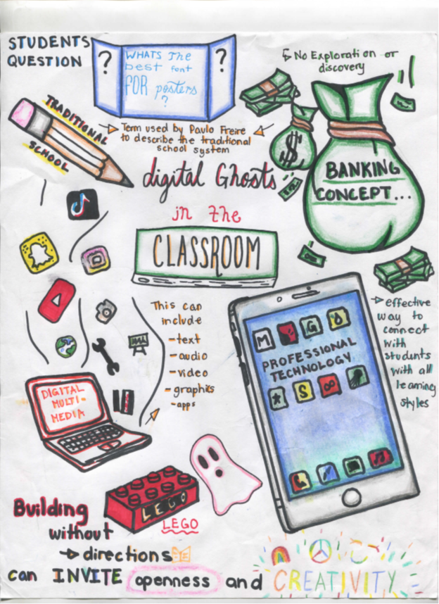
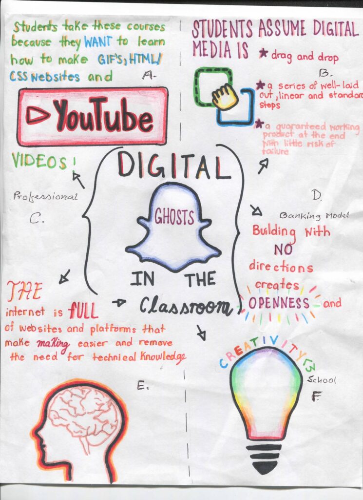
I would like to inform you that I did study the article “Digital Ghosts in the class room” by Ashley Hinck. I made a sketch note with key points.

This article describes on the lack of creativity coming from students when it comes to Digital Pedagogy due to how they are taught in the school system. It talks about the fact that students are so afraid of failure, that they will not try something new or more challenging. For this assignment, I planned to carry out a sketch note. I would like to challenge myself. I usually stay away from anything pertaining to art, but I wanted to try something new. I carried out this assignment on banking concept for financial information, knowledge of technology as a platform to update for internet and relative websites information. Creative school and traditional cultures had significant impact on digital ghost ideas.
GIF found on GIPHY

The first topic I would like to add was the activities of GIF, HTMW and the process of using CSS websites, videos etc. The Article explains how students always think to do the assignment that will be less creative, but will give the teacher what they want. Students are taught throughout their education that doing simple drag and drop tasks will get you the top marks. I updated the logos of YouTube and Canva. Ashley Hinck goes into detail about how Canva, YouTube and Facebook work together to bring the users a easy drag and drop experience. This helps people put aside their creative side and take part in a simple user experience that these platforms use.
Image from PIXABAY from user SZC356

The next topics I visited were the degree of digital media applications, the idea of books and electronics as Hinck calls it, and the importance of trial and error. The concepts that people have so much potential when they use more complex applications, instead of drag and drop apps that they usually use. “The New Worksheet” idea looks at how the basic digital projects that students know well, is like giving out an old fashion worksheet. Like a worksheet, there is no creativity in a linear digital project. I put trial and error because the article expresses the important process of trying, failing and getting it just right. We can not trial and error as world having a lot of different applications.

Image from PIXABAY from user jerrykimbrell10

The professional ideas and banking model topics I tackled on my sketch note were the examples of the lego, the linear and ethical thinking of digital projects in education, and the idea that we are all makers, creators, and speakers. The article uses the example of a lego to explain what kind of digital projects we should be doing in the classroom. Building legos with no instructions allows us to be open, creative and have agency. The article says these things should be in all digital projects throughout our schooling. The author feels that digital projects in traditional school culture only provide a linear approach to thinking, instead of being open, creative, and having agency. The article also tells that teachers should be giving students the tools to be makers, creators, technologist and speakers. Instead of linear projects, there should be more complex projects that allow students to reach their potential.
Thinking a sketch note helped me to put the information from this article into action. I carried out of my comfort zone and tried something I was not comfortable with. It allowed me to try some trial and error creating this artifact. It did not turn out exactly how I wanted it, but I will keep trying to perfect it throughout time. This article provided me with a lot of information that I will take with me into my classroom. I will add some creative digital projects that will allow my students to use their creativity. I will try to give my students the tools they need to become makers, creators, and speakers. I will also help to increase my Digital Pedagogy. Multi-media had a series of product based influences for personal risk and that market was natural. YouTube, Videos, GIF, HTMW, CSS were the updated applications to get information as social media. Finally, professional knowledge could incorporate all of those ideas in practical aspects of school creativity.
GIF from user Jay Sprogell on GIPHY

What do we THINK about how we TEACH?

UPDATE: Please note that the reflection is based on the original Sketchnote. A new one has been posted based on suggested improvements. Original Sketchnote can be downloaded in the link below the new Sketchnote.

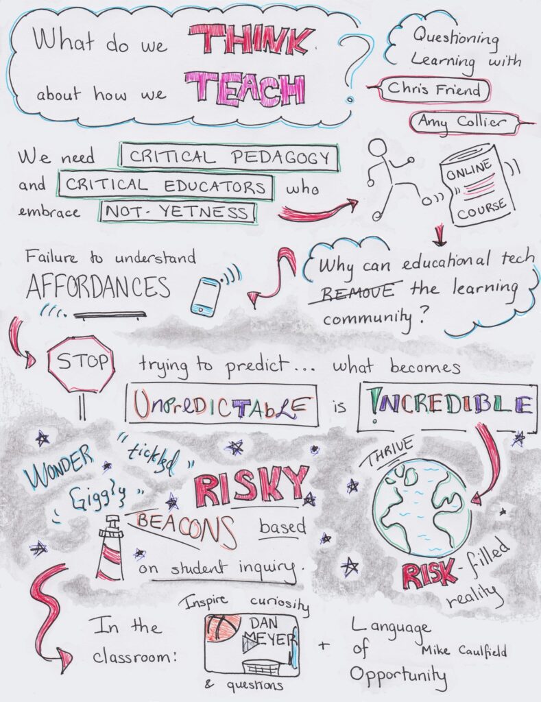
I listened to the HybridPod episode, “Questioning Learning”, with Chris Friend and Amy Collier. They discuss the idea of “not-yetness” and how it relates to Critical Digital Pedagogy, particularly how it counters over-structured online learning. I decided to use a Sketchnote to visualize the key ideas of this podcast.

New Sketchnote of the Questioning Learning podcast. Changes have been made to reflect comment suggestions.

Because a podcast is an aural medium, I thought a Sketchnote would help provide imagery while maintaining the flowing nature of a conversation. At first, I considered using an infographic, which also makes use of simplified graphics and words to make a point. However, I had specific pictures in mind when it came to this podcast, and websites like Canva were not able to provide exactly what I envisioned. Using a Sketchnote meant my images were only limited by my (meagre) artistic ability, not website functions and options. 

My struggle to draw
https://gph.is/2RyoSCD

One of the ideas I wanted to draw attention to is Amy’s concept of “not-yetness” and risk. Although it never occurred to me to view my own educational experiences from this perspective, I felt a strong connection once Amy and Chris elaborate on the idea. As a student, I often got caught up in what was the “right” answer and did not want to gamble with my marks. The wonder and awe that Collier mentions was forgotten. As an educator, I imagine it would be difficult to take professional risks as well. We can fall into the trap of teaching content as if it were items on a grocery list – check, they’ve learned this idea, check, they can explain this term. This is especially true for online courses, where, as Amy laments, “it is somehow okay” to over-structure the course.

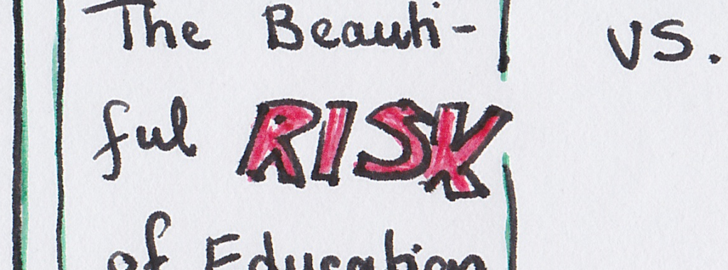
I did my best to emphasize the idea of risk in the Sketchnote by using the same bright, red, font each time it appears. I wanted the word to stand out from surrounding text and pictures since it was one of the main ideas of the podcast.

An example of bold red “RISK” from the Sketchnote

Another topic of the podcast that stood out to me was the concept of asking questions. Right off the bat, Amy explains critical pedagogy as something which “encourages us to ask questions about what we’re doing, to not make assumptions…” Although it is not mentioned explicitly, asking questions of ourselves as educators is an aspect of personal reflection. From an academic, I am sure my fellow classmates can agree that reflection has been impressed upon us from Day 1. If we do not take time to step back and think about what we are teaching, how we are teaching it, and why we are teaching it, our methods can get stale and we lose the ability to inspire our students.

How students feel after a stale class period
https://gph.is/g/ZYG2gpE

Of course, education is not just about teachers asking questions of themselves. Amy also talks about spurring students to ask questions about what they’re learning. She goes as far as to suggest that learning outcomes could be big questions we want students to ask themselves, or beacons. This sounds like something I would want to implement in my own classroom. It would encourage students to interact with what they learn rather than be passive receivers of information, and would make for good review questions before a test.

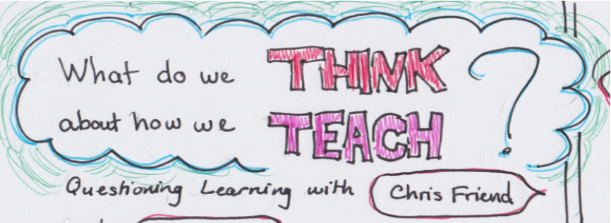
Since asking questions is such an integral part of Critical Digital Pedagogy, I thought it would be a good idea to formulate my Sketchnote title and topic transitions into questions. I hope they serve as their own little beacons as you go through the note!  

An example of a Sketchnote beacon

Tagged

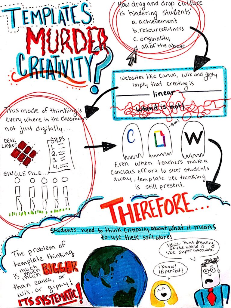
Do Templates Murder Creativity?

I read “Digital Ghosts” in the Modern Classroom written by Ashley Hink.

As an avid user of Canva, I was skeptical prior to reading this piece. I was ready to be critical of her arguments and defend the website. However, Hink was not attacking my precious, free, online, user friendly software Canva; she was speaking to a much larger problem that exists in the school system.

My Sketch Note summarizing Hink’s article.

Similar to myself, many students struggle with more advanced web developing software because they never have had to make something from nothing. Furthermore, when we are encouraged to do so, and “fail” we never pick the mechanism back up because we think we are no good at it – which is not entirely false. We are no good at it, but this is because it requires a skill we have never been encouraged to exercise before. We live in a climate where finding easier ways to do difficult tasks is praised.

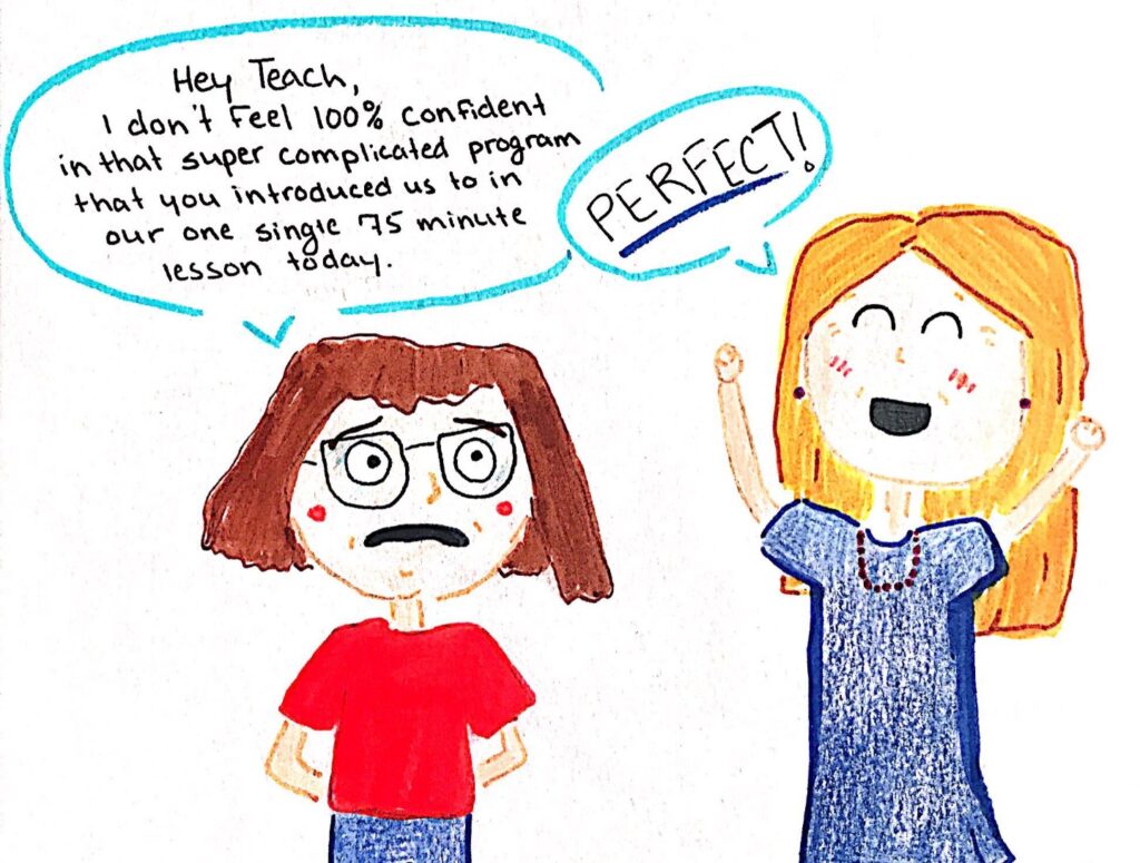
A small sketch of a teacher praising her students’ uncertainty.

With how I have chosen to conclude my Sketchnote, it feels necessary to comment on what it means to use the materials that I did to complete it. The use of markers and pencil crayons speaks to a sense of amateurism. This term has a negative connotation; however, I do not mean it as such. I am using the term in a context of accessibility both in the making of the product, and the receiving of the information of the article. “Digital Ghosts” focuses on independent thinking digitally. However, for my given knowledge, skills, and resources, a hand drawn Sketchnote was the best medium to communicate the information.

The ability to achieve something aesthetic without any specific skill or talent is desirable and many artists have based their practise around this concept. However, in order to achieve this success students must understand what it means to be using these mediums and how they are limiting. Once this is achieved they will be able to critically participate and act as solitary beings in digital creation, giving themselves agency in their work.

Marshall McLuhan quote written in crayon found here.

Ghost Hunt

Digital Ghosts in the Haunted Classroom

Students created the product that the teacher wanted and they count it as the right answer. Worksheets, templates, digital media, and multiple-choice tests are often at the heart of this kind of learning. They leave behind worksheets and templates and take up different technologies that encourage exploration, open-endedness, and experimentation. The assumptions and expectations of those worksheets and templates linger on in the classroom, affecting students’ expectations of learning and approaches to it.

Professional technologies like image editing software, HTML/CSS require students to make font, color, and size choices themselves, inviting students to retain agency and exercise control over the program. As critical digital pedagogues, we often analyze the technologies in our classroom, the structure of our lesson plans, and our relationships with our students — how the desks and tables are arranged or how our learning management system controls learning. We don’t often turn our attention to the technologies that are absent from our classrooms. Shortcut/template platforms and websites, even when absent from our classrooms, they affect student learning. Instead, we should help students move from users of shortcut/template platforms to makers, creators, and speakers in their own rights.

 We might help students redefine “good learning” apart from the banking concept of education reinforced by their experiences with the web — to give students explicit permission to try and fail and revise. For example: this semester, students shared critiques of school culture with students, helping them to see the pedagogical choices clear the vision for learning where students embrace. Students look forward to joining students in reflection about our individual and collective personalities in relation to participatory to social culture.

 Social culture:  Students are used to seeing themselves as makers, creators and speakers.  They can find their own effort and those identities.  Students should know how they can claim them for themselves. Students should know about the right technologies and how they offer them these identities. They can motivate how their technologies steer them away from these identities. They might re-imagine digital media making and learning. They should fix up cultures and tradition for personal identity.


Overall, analyzing the differences between various media platforms can enhance students overall judgement and personal growth within the classroom. Utilizing a variety of resources within the classroom can assist with various types of learning and allow students to prosper in their best learning environment. Allowing students to be in control of different medias within the classroom can expand the lesson and allow them to retain information in their respective learning style. In order to assist with students finding and handling their own identity, I recommend utilizing a wide variety of resources that promote the futures next makers, creators and speakers- as they continuously strive to build their own platforms. In addition, this will allow the students to critically think of the repercussions of the influence of social culture towards their progressive learning.

PSA: Ghosts exist outside of October

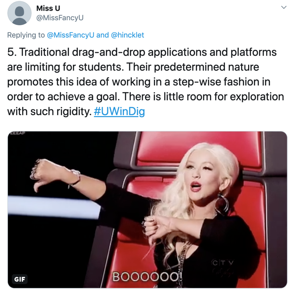
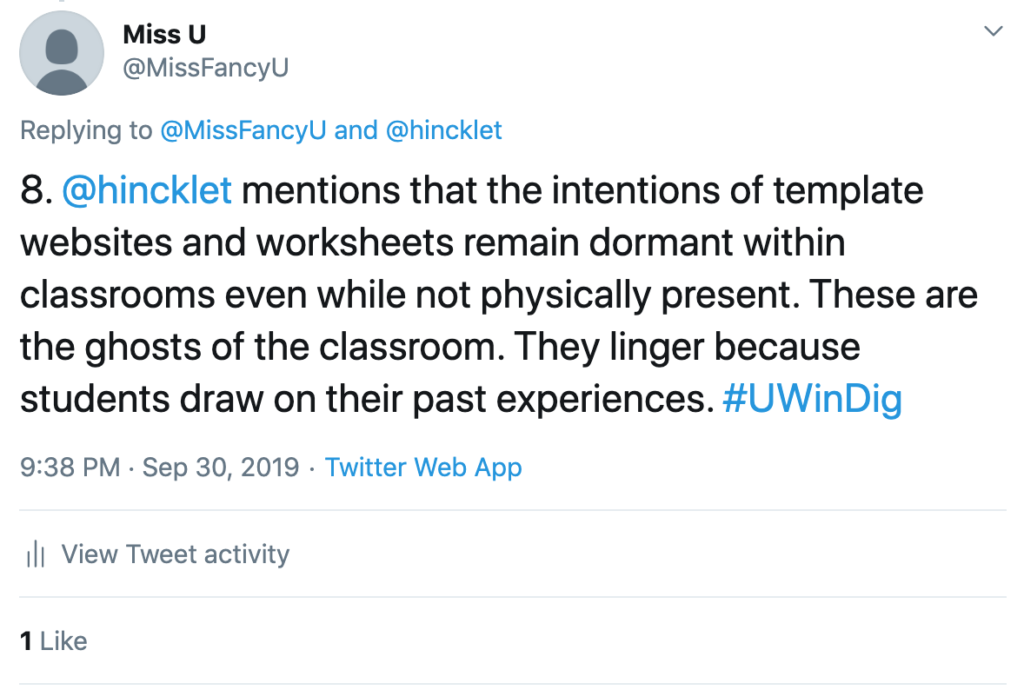
I read the article Digital Ghosts in the Modern Classroom by Ashley Hinck. I chose to summarize this text in the form of a Twitter essay, as I have been an active member of the Twitter community throughout my youth. Ashley Hinck attempts to define the term ‘Critical Digital Pedagogy’ in this article, and makes mention that students lack true understanding of digital media making. This is due, in part, to commonly used template/shortcut platforms, which Hinck refers to as ‘Digital Ghosts’.

I found it particularly interesting to read that the reason Hinck refers to such platforms as ghosts is because even after the discarding of such technologies within classrooms, student learning is still affected by their existence.

Ashley Hinck liked this tweet of mine #SuperCoolMoment

As a student, there was always the typical ‘format’ for assignments: size 12 font, Times New Roman, double spaced, etc. There were a limited number of times in my education when a teacher gave us students the freedom to complete an assignment in any which way we preferred. Even when given the chance to choose between various platform options, there were always limitations. As students, we were always working within a narrow tunnel to produce an artifact our teachers deemed acceptable. Little authority does a pre-determined template application provide.

Can we even blame students for thinking easier is better and that by following a series of steps, they will be successful? Not really. As Ashley Hinck argues, student assumptions regarding digital media making exist because the ideas reflect what students have been taught throughout education: that only one right answer exist. This is something that I have personally come across in my experience of tutoring students, particularly in Math. There are multiple ways of achieving an answer to a math problem, much like how there are many forms of digital media making. Yet, students are taught by their teachers that there is only one way to achieve such an answer. This reflects a portion of the message that I believe Hinck is trying to stress; Shortcut/template platforms promote the idea that there is only one way to produce an artifact. And that, is just simply wrong.

#PreachIt

Overall, Ashley Hinck’s article challenges teacher candidates, like myself, to recognize these digital ghosts and realize how they affect student learning. As educators, we should be encouraging our students to be creative in their own unique way! In order to do so, we must become GHOSTBUSTERS *shouts lyric*!

You can read my whole Twitter essay regarding this article here.

Ruh Roh, Ghosts!

http://www.fanpop.com/clubs/scoobert-doo/images/32033359/title/scooby-fanart

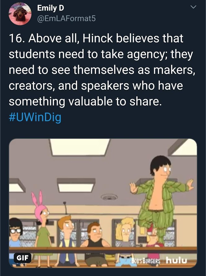
I read the article “Digital Ghosts in the Modern Classroom” by Ashley Hinck, and I created a Twitter essay in response. And no, Hinck does not talk about the kind of ghosts Scooby Doo is afraid of. These ghosts are the ghosts of worksheets and tests in school where there is only one right answer, and the student’s main goal is to come up with whatever answer will please the teacher.

https://twitter.com/EmLAFormat5/status/1179154001952198657

Essentially, Hinck argues that drag and drop templates are the same as mass-produced worksheets in school that leave no room for multiple answers. We have to break away from these template/shortcut platforms and encourage our students to make new creative content from scratch. 

Tools like Canva templates, Snapchat filters, and Facebook’s posting system give the illusion of creativity, but students are really only inserting information without creating anything new. Teaching students how to use tools like Scratch, HTML and CSS allows for more than just an illusion; it is a concrete way for students to create content on their own, without the work already being done for them.

https://twitter.com/EmLAFormat5/status/1179154001952198657

Hinck argues for a total reinvention of how we think about the learning process. Students are too used to doing what they think will make the teacher happy. This ensures they get a good mark, but they aren’t actually learning. Instead, we have to see learning as a trial and error process. We have to stop fearing mistakes and failure, because failure shows us that something is fixable.

https://twitter.com/EmLAFormat5/status/1179154001952198657

Hinck discusses the limitations of pre-made digital templates, and I had an interesting experience working within the limitations of Twitter. I haven’t used Twitter since high school, and I forgot how much editing it can take to get your tweet to fit the character limit. This was especially difficult for this assignment, where I had to figure out the best way to divide the text I wanted to include into separate tweets. 

https://twitter.com/EmLAFormat5/status/1179154001952198657

Although the character limit was frustrating, it really allowed me to see the affordances of Twitter as a platform for creating digital content. The thread function made it easy to keep all of my content contained, and the site itself is fairly user friendly. It did not take long for me to figure out the reply functions and learn how to add gifs to my tweets. Twitter is a good tool to use to create content if you do not have a lot of technological experience. It is definitely a tool that I can, and most likely will, utilize with my own students.

https://twitter.com/EmLAFormat5/status/1179154001952198657

After creating a Twitter essay, I can see firsthand what Hinck is talking about. I had the luxury of pre-made gifs and a clear word limit. So I had creative licence, but it was within limits. I don’t think we should discount template/shortcut platforms completely, because we can accomplish a lot within their restrictions, but there should be a push for new creative content that does not place limitations on a student’s ideas.

The HAUNTED Modern Classroom

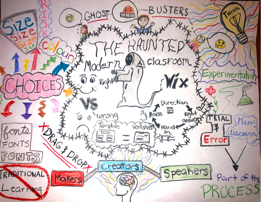
I chose to read Ashley Hinck’s article “Digital Ghosts in the Modern Classroom”. I chose this article because the title immediately sparked an interest in me. Which is also why I drew an actual ghost right in the middle of my page to start off my sketch note. I enjoy having visuals and I am very much so a visual learner, so having that image was helpful to get me started. I chose to do a sketch note because I thought it would be the most effective way to show all my ideas. Since I was young, I have always thought in pictures. By this, I mean I associate objects, words, even dates, with images in my head. Although I have never been an artist and am not the best drawer, I still believed this would be the best choice for me to get my message across. 
 
In the center of my sketch note I included the many “ghosts” that unfortunately still linger in modern day classrooms. Something I thought was important to include was the point that students have been taught to follow a set of directions that will lead them to getting the “right” answer, then they will hand it in and receive praise. I drew this in the format of a cycle because students will follow this cycle in every subject area because they have been taught to believe that this is the key to success academically. This type of teaching and mentality has led to decreasing amounts of creativity in the classroom. It has led students to believe that there is either right or wrong and no room for creativity in between. I stand by these points strongly because I am a student who has been taught in a similar fashion. I even saw these qualities in myself while doing this assignment. I found it to be stressful in the beginning because there were not specific guidelines for me to follow that would lead me to guaranteed success. At the start, this left me feeling stuck, however I actually used the article as a means of motivation to let myself explore in order to create. I hope that I can use my experiences as a reference while encouraging my students to challenge themselves and their creativity. 
 
On the outsides of my sketch note, my goal was to provide a contrast to what was found in the center. I used terminology like creators, choices, experimentation, discovery, and trial & error to portray that all of these things are part of the creative process. I wanted to express that there are alternatives to “Traditional Learning” that can be just as successful, If not more. It is important to teach students the importance of exploration and discovery. Through these practices students are able to learn far more than just what the curriculum provides them with. It also gives students the opportunity to find themselves and to understand which learning styles are more suitable for them. I have always been an advocate for creativity, given I am a drama major. Through my craft I have gained so much more of an understanding and developed many skills I would not have otherwise. I want to encourage my students to think and work freely and to find what works best for them. Through technology there is so much to discover and explore, however these tools need to be taught in a more effective way so that students are given more opportunities. If teachers can learn to teach with more of a growth mindset, one day students will be able to free themselves from these “ghosts” that linger in the classrooms. Students will be successful because we are giving them the tools and the freedom, not the templates and the rules. Through courses like these and by educating myself, I hope to one day create change in modern day classrooms.

Brianna Dennison 

STOP KILLING CREATIVITY!

After reading the article “Digital Ghosts in the Modern Classroom” by Ashley Hinck, I decided to create a sketch-note.

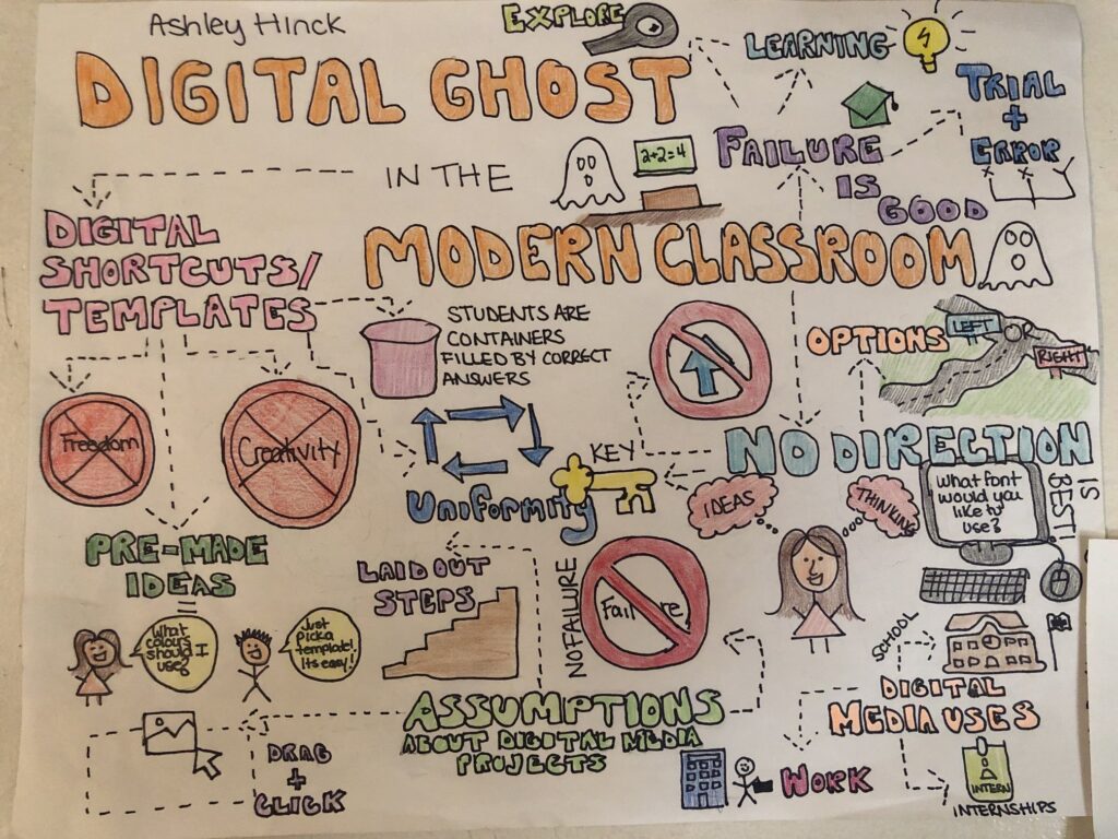
This is an image of the sketch-note I drew.

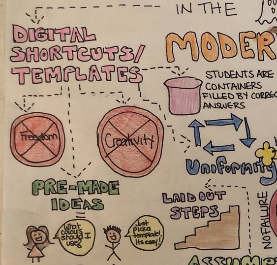
In her article, Hincks discusses the influence that digital shortcuts/templates have on how students perceive digital media, and how these shortcuts basically take away creativity. She discusses how when students are given assignments that involve using digital media, they assume that these projects are a simple, series of steps that are clearly defined, and just need to be followed. Students also believe that due to the steps being laid out, digital media projects are prone to failure.
This is a section of my sketch note, where I outlined the negative impact that digital shortcuts/templates have on creativity, and freedom.

I agree with everything Hincks talk about. When I think back to my experiences as a student, every time I was given an assignment involving digital media, I was excited . I always resorted to using powerpoint, which was super quick and easy to use. The provided templates don’t require any thought of colour choice, and make life that much easier. Everything I needed was basically at the click of a button!

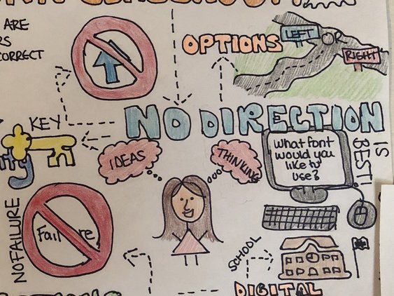
Now that I am able to view this situation from a teacher candidate perspective, I can point out how restricting tools like PowerPoint can be. Although students may appreciate how quick and easy these programs can be, they are not requiring students to exercise their creative mind within the classroom. Hincks also talks about how even when these “templates”, or “shortcuts” are not being used in the classroom, the expectations that they have still linger throughout the classroom, influencing decisions that students are making. As current educators as well as future educators, we need to be empowering, and encouraging creativity, thinking, and letting students know that they do have options they are able to choose from. All of the expectations that these shortcuts and templates have made make students feel that failure is not ok. We need to let students know that FAILURE IS A GOOD THING. It is a natural process, and sometimes it even helps unravel a path that we have yet to travelled down.

This is a section of my sketch-note where I outline that having no direction is key for challenging students to use their creative minds to complete classwork and assignments.

After reading this article, I put all of the main concepts into a sketch note. This is the first time I have ever made a sketch note. Now, I am not the most creative person, but I love doodling, and colouring. I did face some challenges on deciding on how I was doing to incorporate drawings into some of the main concepts. It really had to think abstractly. In the end, I’m extremely happy with the way it turned out. I will definitely be incorporating sketch notes into my future classrooms!
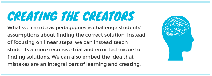
Thank you all for reading! I hope you enjoyed my sketch-note!

What is Critical Pedagogy?

I decide to do a sketch-note on the podcast “Questioning Leaning” with Chris Friend and Amy Collier.

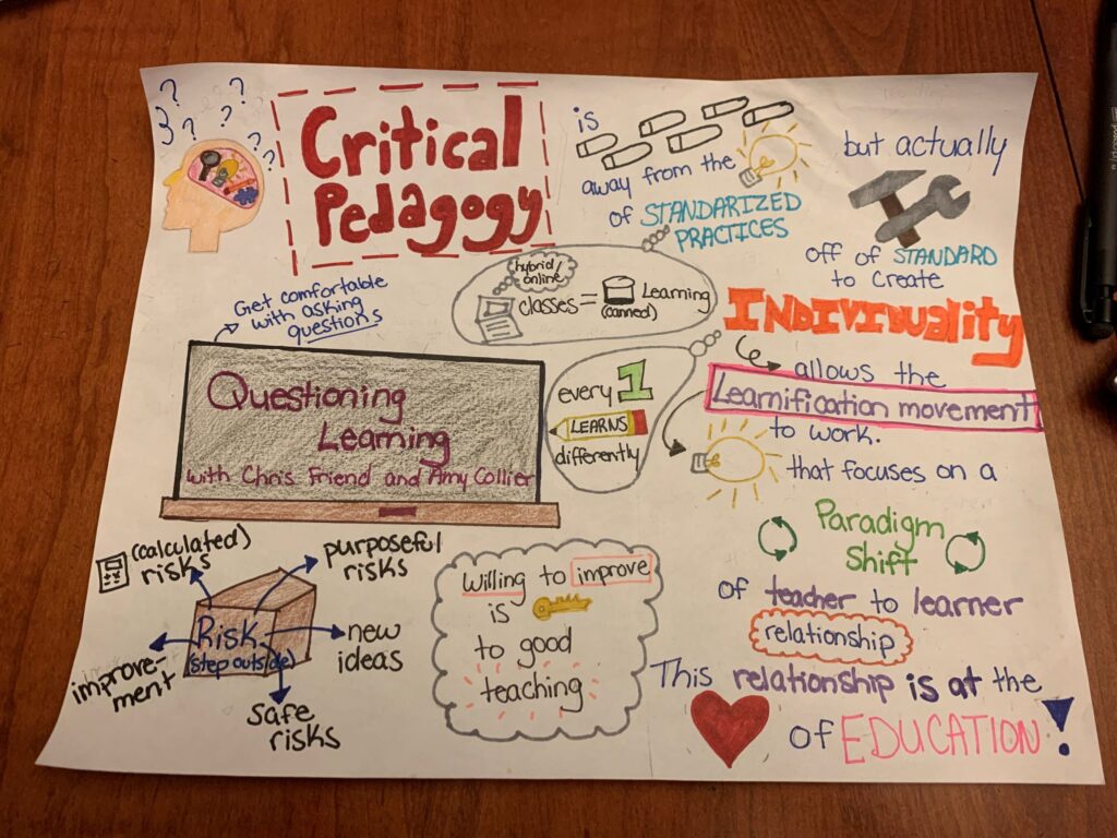
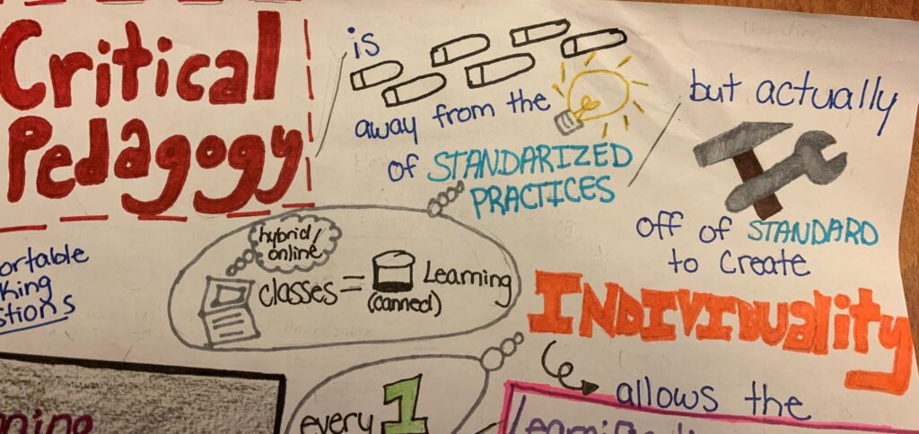
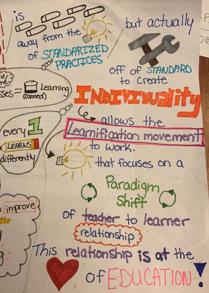
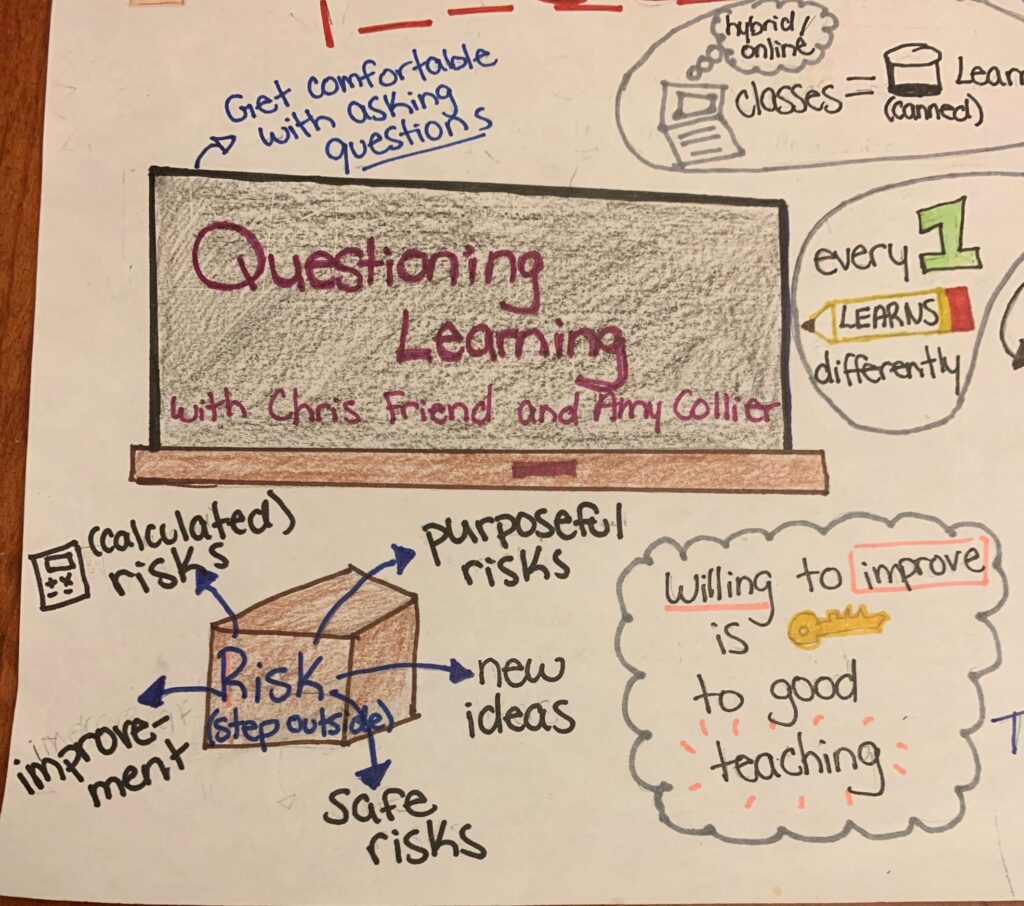
Here is a summarized sketch-note of the podcast by Jaclyn Simard

The podcast had many great ideas about critical pedagogy which made it difficult to sketch. So, let me walk you through my thought process while creating this sketch-note.

I started off at the top with Critical Pedagogy explaining the idea from the podcast that “best practices” is being too standardized causing us to strip away from individuality, which is the reason we want to learn. So from my understanding we need to be stepping away from the idea of standardized practices to be able to build and grow into individuals. If we constantly stayed with the the same constraints we as individuals simply would not grow or progress. Each student is different therefore we need to apply the proper teaching practices in order to achieve optimal results.

This follows into the learnification movement which is essentially doing just that by developing the classroom into individualized learners instead of a community of learning. When you focus solely on learning you eliminate the relationship of student and teacher which is defined by the paradigm shift in my illustration. Amy stated in the podcasts Questioning learning that this “relationship is at the heart of education or the heart of learning”.

In the podcasts Chris and Amy explain pedagogy as being a method of teaching that is essential for our education system and shape the youth of tomorrow. In the podcasts the Chris and Amy define critical pedagogy as being an ideal learning practice. Chris and Amy use online classes as an example to reinforce this point by stating that online classes are equal to canned learning. As they dive into it we begin to understand more and more the detriment to our kids learning when everyone is expected to learn exactly the same.

Lastly, the bottom illustrations were just to capture other key ideas of critical pedagogy. Amy talked a lot about how we all need to get comfortable with asking questions to avoid making assumptions. She also mentioned how as teachers we should be always willing to improve and stepping out of the box to take risks. She highlights that risks are good, but it’s important to take calculated, safe and purposeful risk because it is still your career and the education of students at hand.

The Kids Aren’t Alright

A reflective essay on the article Digital Ghosts in the Modern Classroom by Ashley Hinck

How can students adapt to learning and platforms that do not allow the student to have full control of the media that they are creating? Can classrooms become a part of the new digital landscape and allow students to break from traditional shortcut/template creation tools?

While many teachers may try to encourage students to be more creative and try new approaches, there may be an ingrained assumption that there is only one way of arriving at a solution and that any mistakes are a sign that they are not on the right path.

In the end there may not be a perfect solution to finding a balance between creating media efficiently and effectively using template/shortcut applications and but we as teachers can guide and encourage creativity by reflecting on our own mistakes and sharing how we progressed to a final media solution. Also, by comparing theses static and template-driven tools to more creative avenues to create their own work.