Monthly Archives: October 2019

Are Students REALLY Learning in the Classroom?

For my multimedia reflection, I listened to the Chris Friends interview with Amy Collier, “Questioning Learning“. The podcast demonstrates the concept of critical pedagogy and the importance of a constructivist model of teaching to enhance the learning experience. A constructivist model prompts students to construct their own learning experiences through collaboration and exchange of ideas. The role of the teacher is to mediate learning and to encourage student engagement in the classroom. One of the main ideas that Amy discusses is “canned” or “online courses” and how that restricts students learning or as what Gert Biesta calls it, “the beautiful risk of education.” Teachers should strive for methods of thinking that create opportunities and intellectual growth. Taking risks in teaching brings passion and “fire” to the classroom and allows students to see greater opportunities in the curriculum. Teachers should be willing to try new things and make the most out of incalculable circumstances and experience with new methods of teaching. To facilitate learning, I believe that teachers should encourage student observation and allow students to come up with their own conclusions to shape educational learning.

Chess is all about taking risks. Winning requires courage and most of all, calculation.

One of the key moments that stood out to me was the example of the “basketball court”, in which a math teacher demonstrates a video of himself standing on a basketball court aiming to shoot the ball. He launches the basketball and then stops the video with the ball halfway through its arc. Such a demonstration immediately makes someone ask “did he make it?” The video creates a sense of uncertainty and brings out an inherent curiosity. Instead of delivering a lesson based on content and memorization, he is encouraging a learning outcome that says, “This is going to COMPEL my students to learn.” Education should not focus on what students should learn, but that they learn something for particular purposes and be able to ask questions such as “What’s the real meaning behind this sociological phenomenon?” or “how can this be applied to my educational pedagogy?”

I believe that following a rigid curriculum de-risks the future of students and where they may end up in the real world. Within a classroom, taking risks should become something that we learn to adapt to. It allows us to operate in unpredictable situations. By using methods that appeal to student learning such as a simple basketball, teachers are bringing joy and excitement and allowing students to engage in difficult subjects, such as math.

Listening to the podcast made me reflect on my high school days and all those projects and assignments I spend hours doing, only for it to be graded and handed back to me, with zero feedback and little knowledge about how this particular assignment will be useful to me in the future. Therefore, it is essential to incorporate critical pedagogy into the curriculum because it gets students out of their comfort zone and allows them to think about topics in an exciting and innovative way. Rather than following the traditional way, it is crucial to understand that student thinking has changed and the way students understand and comprehend information is different for everyone.

For my artifact, I decided to create Canva because I wanted to experiment with technological websites and take a “risk” as the podcast suggests. Although I originally wanted to do a twitter essay, I believe that deciding on the infographic was very useful because it gave me the freedom to express my creativity. However, the website is not user-friendly, and I had constant moments of frustration because I couldn’t change the size of the textbox or insert a caption. After a few tries, I was able to become more familiar with the website and capture a visual image of the podcast. Having such creative sites allows students to incorporate their creative and artistic skills, which can be very useful for teachers to use in classroom assignments.

I saw a Ghost in my old HighSchool *real w/ footage*

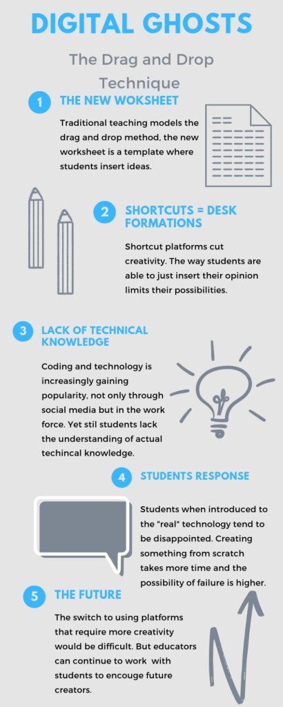
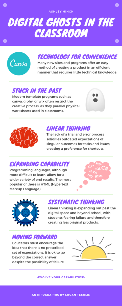
I read the article “Digital Ghosts in the Modern Classroom “, by Ashley Hinck. I chose to create an infographic using the website Canva which directly goes against the articles main ideas about the “drag and drop method”. Websites like Canva allow students, like me, to insert their ideas or opinions without the creativity behind making the technical decisions of the platform. For example, in the case of my assignment I was able to choose a template and just insert the main ideas of the article. 

Infographic Created on Canva.com

In today’s education system, I would agree with Skallerup Bessette that the new worksheet may be the short cut/template method. These websites allow for a lack of technical knowledge. While technology is on the rise and fields such as robotics continue to expand students are still not taught programming. As educators, we are preparing students for the unknown, the future can only get more technical and complex, students should be prepared for that reality.

In the way that desks influence classrooms I feel that templates do the same. If a classroom has desks row by row its stunts discussion and thought-provoking conversations. In the same way templates stunt creativity. Hinck describes the drag and drop, students are used to the idea of just inserting their content in the place of some pre-finished work. In some ways, the templates allow for better writing, if a resume template allows for a student to obtain a time job, that should be a good thing. But when it comes to creation, this is where the benefits lower. Students aren’t learning how to invent or create.

The unfortunate reality is the switch to more intense, creative, technical platforms is difficult. Students have become accustomed to the method of drag and drop templates. The other websites listed in the article allow for more freedom and creativity but it seems extremely complex. Students are disappointed and confused when shown how to really create these platforms, unaware of how much work truly goes into creating platforms.

In reality, I hope to teach students to be creative and use technology as an asset. Although the rate of success for using alternative ways of creating these projects is slim I believe the path to creating something from scratch is a valuable lesson. To attempt to move away from the traditional template and towards an unknown future. 

BOO!…There it is !

Good Afternoon, I read the article “Digital Ghosts in the Modern Classroom” by Ashley Hinck.

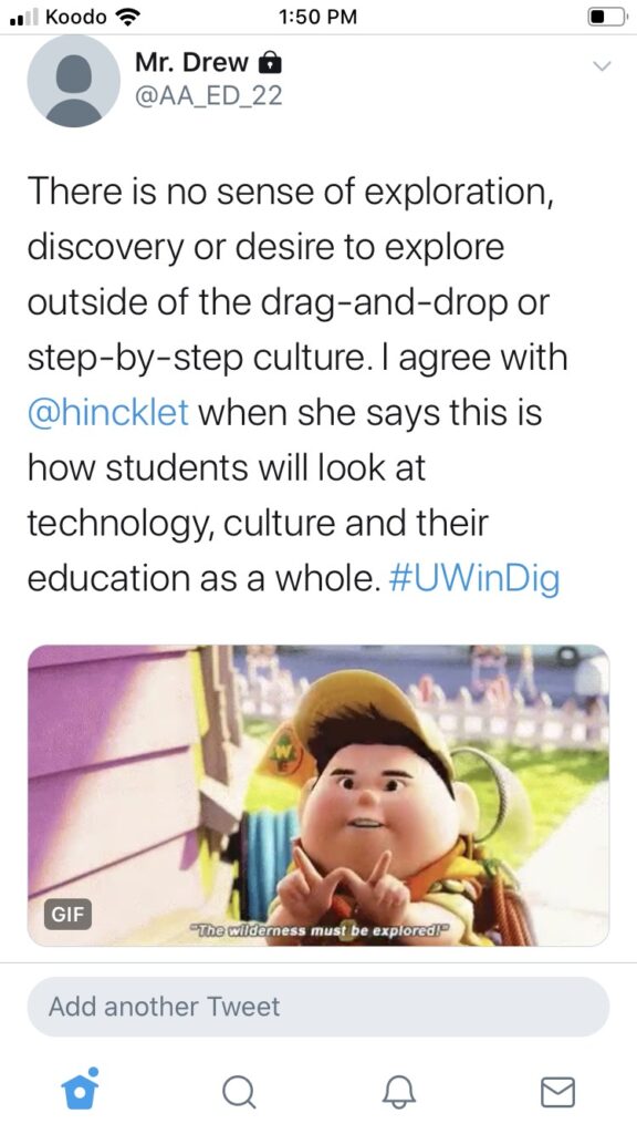
I have been an avid social media user and with that being said, I designed to compose a twitter essay to share my thoughts. Yes it is the month of October, however Hinck’s article isn’t talking about those ghosts, but instead the ghosts that exists from using worksheets and simple template systems in school.

In the article, she works towards defining Critical Digital Pedagogy and how students use their own personal experience to influence their work in the classroom. One of the main arguments she had was how work-sheets, drag-and-drop templates and other short cut systems are limiting the creativity of students.

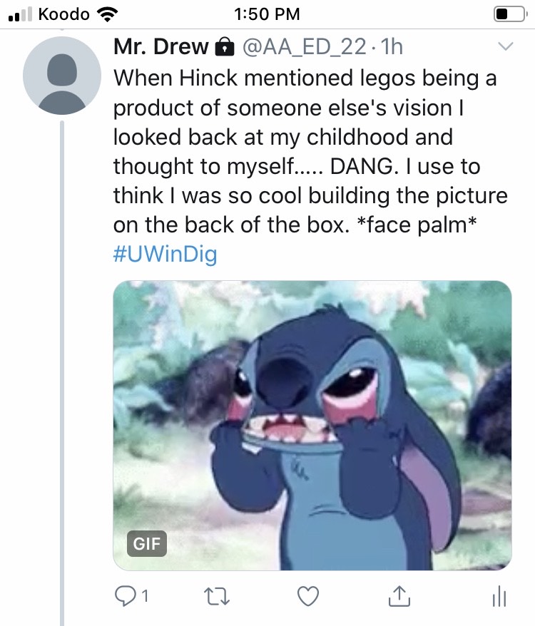
I was able to relate to this article in many ways, from legos in my childhood to easy click by click social media platforms in my everyday life. It’s interesting to see how teachers use technology ( or DON’T use) in their classroom. Even with all the options that are out there, students still have limited access to being creative.

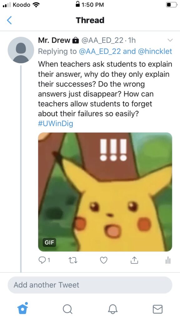
Drawing on previous education and coaching experience, students don’t know how to look at failure/making-mistakes properly. Being uncomfortable and working outside the “box” will allow both teachers and students to gain valuable life skills such as problem solving. Many students and players that I coach forget that learning is a process. There are tones of ways to get to the right answer, and Hinck really hammers this thought home in her piece.

During this project, I chose twitter because it was something I was familiar with. Something that students/teachers will do everyday is lean towards what they’re comfortable with. Some would say that we are being lazy, but others (me included) would say it was easy.

I appreciated this article written by Hinck, and I look froward to inspiring my future students to be owners/creators of their own work. The process of learning is one that I know goes unappreciated, and allowing students to take control of their own creativity and learning from their mistakes, we will set them up for success in all their future endeavours. #UWinDig

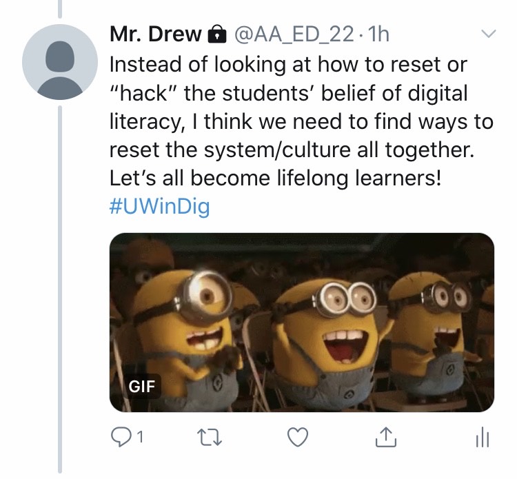
You can read the remainder of my twitter essay by simply clicking here!

Tagged

The Ghosts of Teacher’s Past

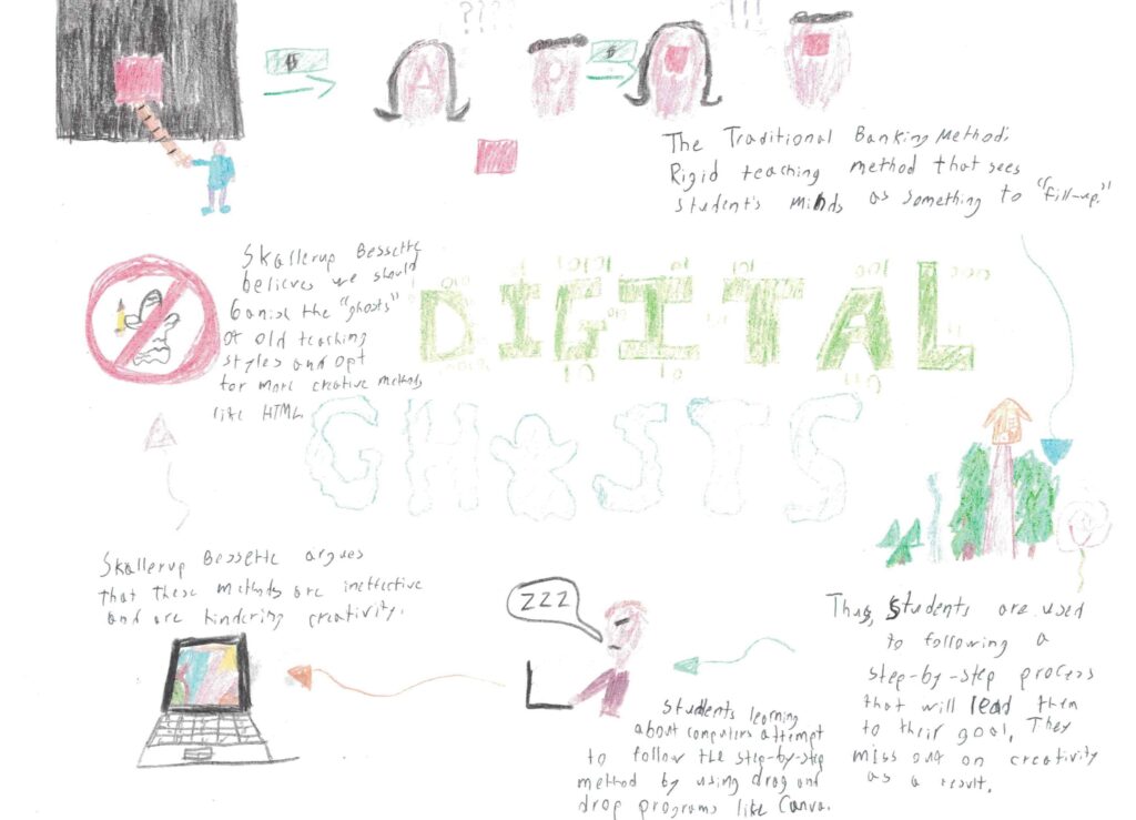
I read Ashley Hinck’s article “Digital Ghosts in the Modern Classroom”. This article advocates for a shift in education. Hinck comments on the traditional method of teaching involving systematic methods such as worksheets and templates. She indicates that this is the “banking method” of education which views students minds as something to “fill” with knowledge. This systematic method of teaching/learning is limiting to students; they are forced to adjust their learning methods and the way they understand the lesson.

The systematic approach to teaching was necessary in the days before educational technologies began to emerge due to the limitations of pen and paper. Today, we can use technologies to teach in much more creative methods. Despite the emergence of these technologies, many teachers continue to utilize the systematic methods of learning like with PowerPoint or Canva. When students learn in this way they are shoehorned away from their creativity. Teachers are not entirely to blame; the students are habituated to this method of learning and default to it. They want step-by-step instructions to make a final product to be graded by the teacher. The habit of using template-based learning methods is engraved into the minds of students everywhere; these are the ghosts of teaching past.

In my personal experience I believe that Canva (as an example of template-based learning) does inhibit creativity. You are unable to create exactly what you like and must adapt to the templates that Canva provides. Programs like HTML, CSS, or physically drawing something, are much more malleable and student’s creativity is unbounded. For this project itself, I began to use Canva because I had visual metaphors that I wanted to share. I was inhibited by the templates though and could not find what I visualized in my head. As a result, I used my lackluster artistic abilities to draw what was in my brain.

My artifact demonstrates template-based thinking through visual metaphor. A teacher is shown “teaching the square method” but the students have “triangle and circle brains”. In the metaphor, they are forced to adapt to the teacher’s lessons and abandon their ways of thinking and learning (they take the square and lose the triangle and circle). With modern learning technologies, teaching is more easily adaptable to each student’s way of learning, and thus the students are not be forced to abandon their shapes. A second visual metaphor I included is a straight and narrow path through the forest representing the step-by-step method; students follow a path to the answer. As a result, they miss out on creativity which is represented by the beauty of a river and a rose beyond the treeline.

When students learn about technology, Hinck advocates that teachers should encourage more creative ways of learning. She hopes that students will be able to express their ideas better through open-source programs like HTML and CSS as opposed to programs like Canva. She indicates that following drag-and-drop templates are damaging creativity in students; they are unable to create their own websites, just follow pre-made templates. As teachers, we need to advocate for creativity in our methods of teaching.   

Tagged

GO BIG OR GO HOME

I listened to Questioning Learning by Chris Friend and Amy Collier.

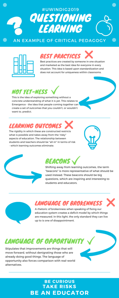
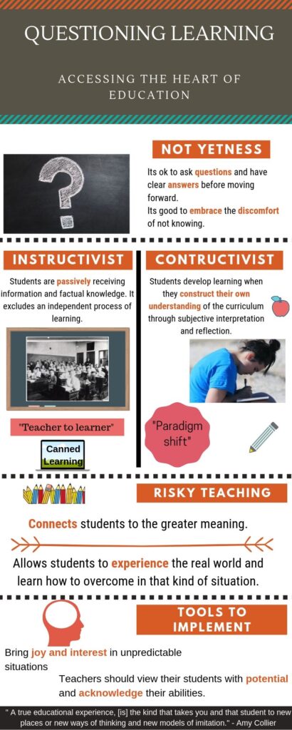
Collier utilizes critical pedagogy, pointing out several aspects of the education system that educators have an opportunity to improve. I created the infographic below, which compares teaching practices that Collier condemns, and tenets she recommends in their place.

An infographic summarizing Friend and Collier’s podcast, created on Canva.

I used Canva to create my offering. Canva is a template-based graphics website which allows users to customize a variety of documents. My experience with Canva was positive – I was able to pick a visually appealing template and extensively customize my offering by choosing fonts, icons, colours, and rearranging the template itself. Tools are what you make of them, and Canva is definitely a tool with room for creativity, although I can see why some users may fail to customize pre-existing templates, resorting to a “Drag and drop” experience.

RISK IT ALL

What really spoke to me about the podcast was Collier’s idea of risk. In terms of the student-teacher relationship, both should be “all-in” in terms of risk. In other words – go big or go home! De-risking learning would be like de-risking snowboarding – there may be no risk of failure, but the chances of achieving something incredible are now slim.

What’s more, without risk, there is no excitement, passion, or joy. The idea of beacons, rather than learning goals, also encompasses this tenet of risk. Ask yourself – what would I be blown away by if my students were to achieve it by the end of the term? This is where the bar should be set for student learning.

The process of creation for this assignment incorporated a great deal of risk. Students in our classroom were experimenting with a variety of new technologies and demonstrating a unique way of expressing thoughts. We had a general idea of what to do, but a great deal of wiggle room in how we ultimately tackled the assignment. It was daunting. It was difficult. But this risk is what will create exciting, creative, unique learning opportunities.

OPPORTUNITY VS BROKENNESS

Friend and Collier also focused in on a language of opportunity within education rather than a language of brokenness. With critical pedagogy becoming more popular, we need to be careful that we are criticizing educational practices in a constructive way. A language of brokenness when speaking of the education system does not acknowledge all those who are doing great things already.


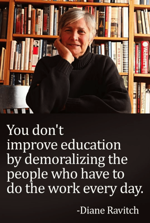
via MEME

Diane Ravitch, the former US Assistant Secretary of Education and a powerful advocate for Educational Reform, echoes similar thoughts as Collier. A language of opportunity provides room to grow, while also acknowledging that the system already contains effective practices and exceptional educators.

Questioning Learning ultimately influenced me to think critically about best practices that are continually reinforced within my pre-service education, such as student learning outcomes. I hope to develop my own educational philosophy which will be centred around critical pedagogy and risk-taking.

Thanks for reading,

Megan Elliott

The Slow, Painful Death of Our Creativity

The article Digital Ghosts in the Modern Classroom by Ashley Hinck provokes many thoughts about some of the issues in our education systems. One of the main problems brought up in the article is that schools are killing our creativity by encouraging the use of “drag and drop” rather than making unique decisions. We need to encourage making mistakes rather than everything needing to be done without errors because learning from our flaws is the best way to learn.

Retrieved from Giphy

The article critiques teacher’s use of template sites in web designing and other digital technologies as opposed to coding your own site. I agree with everything that Hinck discussed because individuality and creativity is something that is very underappreciated, and we should be able to choose what we want to make and not what someone has already made for us. Taking the easy way out is not the best solution to most problems in life.

I am not an artist but I tried!

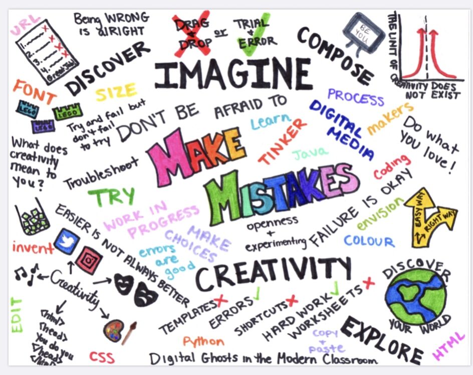
I decided to create a sketchnote because I’ve never done one before and I like the idea of being able to write down simplified thoughts and leaving it completely open to my interpretation of the content in the article. When making my sketchnote, I decided that the main message I wanted to get across was that it’s okay to make mistakes. Making mistakes and learning from them is something that should be encouraged and not shut down.

Retrieved from Bing Images

Other pieces of the article that I thought should be emphasized were the concepts of imagination and creativity. I also put the quote “try and fail but don’t fail to try” on the page because it is an important concept to understand that you cannot fail unless you don’t try. More students and teachers need to have that mentality instead of automatically assuming someone isn’t intelligent just because they get a test question wrong.

Retrieved from Giphy

Our education system supports the idea of right and wrong, but I personally believe in a less explicit approach. As well as the mandatory cut and dry assessments that will be required of me as a teacher, I plan on having more unique evaluation opportunities to give all types of students a chance to succeed in my class. Everyone learns in a different way so I will be sure to get to know all my students and their learning styles so I can be the best teacher possible. I’ve had some amazing teachers growing up that always encouraged me to make my own decisions and I’ve had some awful teachers that make you feel stupid for not being perfect. I hope to be the type of teacher that will be remembered in a positive way and really help students reach their full potential.

Ghosts of the Process *Real*

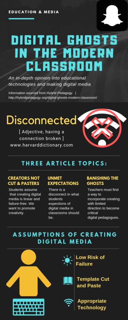
After reading the article Ghosts in the Modern Classroom by Ashley Hinck, I decided to create an infographic summarizing the article. This article discusses students creating digital media.

Infographic made on Canva.com

Students have the assumption that creating content has a set of linear steps to follow with right or wrong answers. I chose to discuss the article Ghosts in the Modern Classroom because the title caught my attention, then while reading I realized how relatable it is to my own digital experience as a student and a supply teacher. I decided to do an infographic for this project because they are visual and include simple text making them easy to follow, read and understand as a consumer. 

Disconnected Symbol

In her article, Hinck suggests that students take digital media classes with the assumption that creating content is a linear cut and paste process. Templates and short cut platforms makes creating digital media easy and requires minimal prior technological knowledge. Programs such as Canva, GIPHY, WIX and Google Slides are drag-and-drop apps used for digital learning that give students a small range of predetermined answers with limited open spaces for creativity, exploration and unexpected failures. This means students are always guaranteed a working end product and the process has already been completed in the templates.

I appreciated Hinck’s points about the effects of the ghosts on students, where she explains how there is a disconnect about what digital media making in schools should be. Actually creating new digital media requires rigorous process of trial and error along with their own creativity. Without students understanding this process, it can be frustrating when there is no linear format to follow, leaving students disconnected. In the centre of my infographic I decided to add the definition of disconnected (as well as an icon) to further illustrate this point.  

It’s All About the Process Gif by @palomakop

When thinking about the process of creating digital media, I reflect on my own experience as a student. When given an open-ended creative assignment, it is easy to feel overwhelmed and not know what to do next without a layout to follow. I believe it is important for students to attempt these tasks on their own with limited direction to continue to further their own creativity. The creative process requires practice and the ability to learn from failure. As a teacher I will provide creative opportunities for students and encourage them to discover their own version of a correct answer.

Image Quote Albert Einstein

Canva The Friendly Ghost

I read the article Digital Ghosts in the Modern Classroom by Ashley Hinck. First and foremost, I disagree with Hinck’s claim that template platforms “reflect traditional school culture”. There is a benefit to efficiency in technology, as it appeals to those who don’t wish to pursue mastery of complex digital techniques (such as myself). A template website like Canva saves time for the user. Rather than offering sites like these as the only option for students, it should be offered as one of many. Students like myself desire a more systematic approach to feel comfortable. The reason I chose Canva for my infographic (below) was because I found my other options too open-ended and immediately jumped to a medium that I am familiar with.

Open-endedness in of itself can intimidate those who don’t know what to do with vague expectations and all of this power to themselves. The question arises as to whether students explore best with a blank canvas or a guided hand. It would disservice those who crafted these sites to call it an intentional choice to parallel the ghosts of worksheets, as they are meant to help the less technologically-inclined. It is innovative rather than restrictive. 

It should not be assumed that everyone wants or needs complex creation methods such as  HTML to make something that the user is satisfied with or proud of. The majority of students coming out of high school do not desire to learn programming languages, and those that do often find ways to teach themselves and work on their own personal projects without instruction from a teacher. Opportunity does not necessarily equate to an increased demand for complexity, even if it promises a more modifiable outcome.

I do agree that schools promote a linear method of thinking that often gravitates students toward a single correct answer. I myself often stress over assignments that have an unclear final solution due to this thinking ingrained in me from high school. It makes assignments in English especially difficult to be happy with due to the open-endedness and wild variation between each student’s final product. I do not, however, believe that we should veer students away from programs that only intend to help find a solution and keep them content in the creative process. There should be a choice for the less creatively-inclined.

While I have done my best to get out of the linear thinking of aiming for one answer, I think that utilizing a resource to narrow down one’s options is helpful to students like me that draw complete blanks if instructions are too generalized. It is my theory that if one wishes to pursue a more creative outcome, they will make the effort to seek out a more advanced method of doing so. Those who do not share this desire may not know what to do with a more complicated approach.

I Was Haunted By A Digital Ghost *emotional*

I read the article “Digital Ghosts In The Modern Classroom” by Ashley Hinck.

When first reading this piece, I had no idea what Hinck was referring to when she said “digital ghosts,” nor have I ever particularly thought about the topic overall, but I thought that this article was very interesting. I never realized how limiting these platforms may be and how much students and teachers rely on them on an everyday basis, but I can say that I agree with all of the ideas.

Here is the video I made reflecting Hinck’s ideas:

I think that it’s really important to consider how the tools we use are just as significant as the content we teach with them. As educators, we are responsible not just for providing students with content, but to also provide them with the tools and skills they need in order to apply their knowledge.

I found this GIF on giphy.com

What I find most exciting about this assignment is the fact that we have been given the option to use our skills and creativity to develop a project that is entirely our own. I really enjoyed integrating traditional forms of art (my whiteboard and markers) and presenting it in a digital form (video) in order to present the ideas of Hinck’s article. It was challenging to prepare for the project, as I spent a lot of time creating concise points for my voiceover and I spent even more time trying to set up the lighting and camera for my video. By the time I finally propped up my tripod (after incorporating various items like a folding chair and a couch for extra support) and started creating the video, it was a lot of fun from that point on. I have a passion for art and digital media making, including video editing, so being able to complete an assignment using the interests and skills I already have was very exciting to me.

I found this gif on giphy.com

Overall, I think that I really took a lot from Hinck’s article and feel that I will definitely apply this knowledge to my education and future career as a teacher. I look forward to using this knowledge and these tools to bring more agency and creativity to the students in my classroom and to encourage them to enjoy every part of the creative process.

Tweeting for Students’ Liberation!

I read the article “Digital Ghosts in the Classroom” by Ashley Hinck, and composed a twitter essay in response to it. She says with how fast technological education moves, tools that were used not long ago already seem like ghost-like relics.

She also talks largely about how templates and shortcuts take away agency from students, by limiting their creative options. I understand her point, but feel templates are not entirely at fault, as they can either be inspiration for something else or be deleted from the get go. Rather, I think it is up to the teachers to make every creative option available to the students, and to treat them with the respect that transforms their class time from boring to productive and fulfilling.

The twitter essay was a totally new experience for me, as my tweeting history was very minimal. I had to learn to segment my thoughts into smaller bits. The biggest challenge was editing my tweets to fit the 280-character limit. I learnt my language had to be very concise, with every word choice being very precise; essentially, I had to learn how to get my thoughts across in as few points as possible. 

After completing my twitter essay, I see the appeal of the medium in how it gets points across with directness and clarity. It adds an attractive flair to both teaching and presentation spaces, and the limitations teach students how to be succinct editors. Using a medium many students use also helped me relate to their world, which reinforces Hinck’s notions of listening to the students. In education, technology should not be a barrier between individuals; rather, it should be what connects and inspires new generations, and students should have their agency to apply all their creative and individualistic energy to their projects.