Hello! For this Multimedia Reflection, I chose to respond to Ashley Hinck’s article, “Digital Ghosts in the Modern Classroom”, with the sketchnote format.
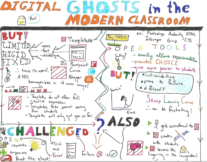
In the course of this post, I’ll talk about the article and relate it directly to the sketchnote I created, which you can see directly below:

The sketchnote shares the same title as Hinck’s article and is broken up into three main sections. First, the upper left section discusses template platforms and ends with a problem. Second, the section to the right discusses tools that provide more freedom and creativity and promote openness in creation, but also ends with a problem. Finally, the third section is near the bottom, attempting to address the remaining concerns.
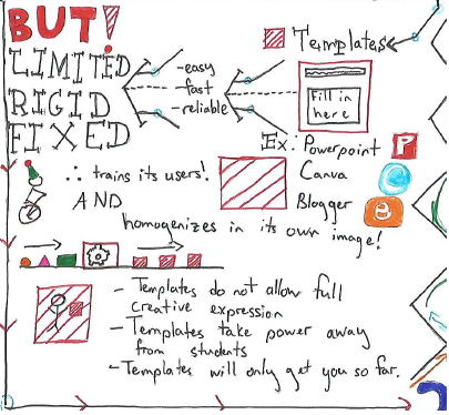
The article takes a critical look at platforms and tools that assist in the creation of digital artifacts using a template or “shortcut” method of composition. Typically these kinds of tools have drag-and-drop interfaces that interact with some sort of template, and some examples provided by Hinck include Canva or Blogger. These tools are designed so that they are easy to use to create some artifact with little risk of failure. In order to provide this kind of service, these platforms provide an easy set of steps that are foolproof; all the user must do is follow the prescription and they can’t get it wrong.

The problem with these template platforms, as Hinck argues, is that because they are designed to be easy to use, they are rigid. Their specialization forces them into producing very particular kinds of artifacts and as a result can become detrimental to true creative expression. Additionally, the more a user uses template platforms, the more that template takes hold of them and shapes the kinds of creations they make, so that there becomes a danger where creative expressions are made in the image of the template.

This section of my sketchnote summarizes these points, first by giving some examples of commonly used template platforms, then leading some of the issues that come along with these platforms. The “evil”, corrupting template is represented by the red box. I tried to express the monotony of template platforms by using the number three often along with plain colours; the examples are colourful to “lure you in”.
An additional problem that comes from template platforms is that they will only take your creative endeavours so far; the tools are easily mastered and are quickly worn out. So what is it that we do?


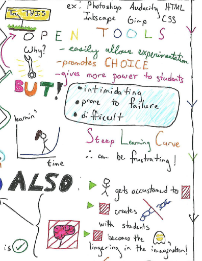
Instead of encouraging students to use template platforms to create, Hinck suggests that educators should encourage students to try out tools that provide more flexibility, like Photoshop, Audacity, or GIMP. There are no prescribed set of “correct” steps, as a template platform may encourage; instead there are many undefined steps that aren’t always progressive. With open activities like these, sometimes a student must explore a problem from the side rather than head-on.
As a result, these kinds of tools or platforms are more difficult to use, and students are prone to fail on their first few attempts. Additionally, the use of template platforms can come to haunt the student! They shape the student’s perception of expression and create a disconnect between the expectations they bring to open platforms from template platforms and the effort required to create artifacts.

Hinck suggests that we normalize the sort of trial and error process that is necessary to master these open platforms and to reduce frustration in using them. We shouldn’t expect to nail down wonderful expressions of our creativity on our first attempt, nor even the next few tries. Even if we are frustrated in creating these artifacts, we must keep in mind that this work is the necessary cost to create a true expression that rewards and empowers us. We should work towards banishing the ghosts of templates that haunt us.
In my history as an undergraduate student in physics (and later in my Master’s), I greatly valued template platforms because assignments typically required me to use them to complete the assignments in a reasonable amount of time. A frequent example is that I had to give many presentations and I always found myself gravitated towards something like PowerPoint. Often I was in some evaluative setting that only valued the scientific content in my presentations and the way I presented myself, which I didn’t necessarily have any problems with. In these kinds of cases, I think worrying about some novel presentation of scientific ideas would actually have been detrimental, because the pedagogical value in these settings was, “Can you talk about this topic that you’ve researched?” and I often liked to present these scientific ideas as simply as I could. There was no need to re-invent the wheel, so-to-speak. Trying to become comfortable with some of these open platforms often requires many hours of work and practice, which makes it difficult to use them in practice as a novice when the assignment you need to complete is due in a week.
However, I do not mean to say that this idea of focusing on open platforms would not have been irrelevant to me. In fact, there were times where I needed to create something on Google SketchUp or GIMP for some sort of report. In my Master’s thesis, I had to create my own diagrams because I wanted to avoid issues of citation with other authors, or there was no suitable template of representation I could use. So I was forced to try my hand at working with vector graphics software like Inkscape, and when I got the hang of it, it felt good that I could create what I wanted. I think it is good to keep the criticisms of template platforms in the back of one’s mind at all times, and, when the time permits, to strive towards working with platforms that encourage openness and experimentation.
