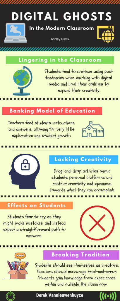
For my first multimedia reflection I have chosen to read Ashley Hinck’s article “Digital Ghosts in the Modern Classroom.” In the article the author speaks about the education system and how there has been this idea created of a correct or straight path type of approach when working with digital media. The students conform to this style where they are hesitant towards trial-and-error, and instead proceed with a cyclical order of correct steps without a single mistake to be found. This idea has produced a lingering of worksheets and shortcut/template websites in the classroom that students are constantly thinking about, and limiting their potential to become open and creative, and to show their true abilities.

I can relate to the statements made by Hinck in her article, as I recall when I was completing my education in either high school or my undergrad I was never pushed to explore or try new platforms. I constantly utilized the likes of both Microsoft Word and PowerPoint as I know how to effectively work my way through the program.

Hinck later on in the article states a few different approaches to diminishing these looming expectations, by developing students creativity and helping students see themselves as makers/creators/speakers. Approaches such as explicit permission to try, fail and revise, giving students the tools they need or making connections between experiences in and out of the classroom and sharing with their peers. When making digital media students need to feel comfortable with trial and error, they need to know that failure is okay, as long as they take it as a learning opportunity, where they can then build upon and improve. I strongly believe in giving students the tools needed to complete a task and guiding them in the right direction, without definitively giving them the answer. I also believe in allowing students the freedom of working alongside each other and completing tasks in any form which they choose.

I have chosen to create an infographic using the website Canva. This was my first time using this tool, and I found it extremely user friendly. Originally I was not very open to trying something new and had thought of using PowerPoint as I find it simple and am not a very technologically advanced individual, but after reading Hinck’s article I was given a different view in which I wanted to expand on my horizons and go outside of my comfort zone. I decided to choose an infographic as I have always been curious as to how they were made. At the beginning it was challenging as I had very little knowledge on this subject, but the Canva platform was very user friendly and I thoroughly enjoyed exploring the website as I worked towards creating my infographic.
