Monthly Archives: October 2019

Free Students from the Ghosts!

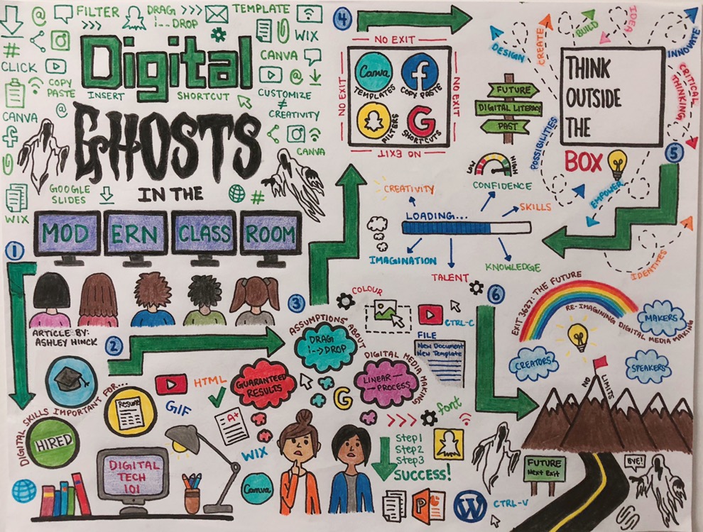
I read “Digital Ghosts In The Modern Classroom” by Ashley Hinck.

In the article, Hinck emphasizes the importance of eliminating the traditional school system that treats students as “containers to be filled with correct answers by teachers”. She criticizes the use of shortcut/template platforms in schools and in digital media learning because these platforms limit students’ understanding of digital media making. Hinck mentions platforms such as Canva, WIX, and GIPHY as examples of apps that provide pre-made themes and templates to make the process of creating something easier, quicker and more convenient for students. In reality, these platforms create users who lack creativity, sense of discovery and authority.
giphy.com

I believe that today, our world embraces the need for creativity. In our days successful and prosperous people are those characterized as creators, inventors, and great thinkers. For that reason, as future educators, we need to equip our students with the skills that will enable them to be producers of originality not “copy-pasters”. However, I also think that shortcut platforms are useful in a way because they introduce students to the digital media making process and its unique world. They provide examples and help students visualize the end product of an assignment or a project. Yet, teachers, students, and schools should not be limited to these platforms but use them as building blocks that will lead to the creation of an original product. Shortcut platforms offer only one idea or perspective of what the final product will look like.

It is also important to realize that not all students have the capacity to create an authentic project. Creativity is not a mysterious element but I believe that everyone is born with it. It is up to that person to exercise it and grow it, and it is up to the school system to promote that growth. This was my first time creating an infographic using Visme. I chose a blank template to see if I was able to start from scratch. When I found out there were ready-to-use sections that I could drag into my template, I started using them because it saved me time and it allowed me to envision my ideas and how I wanted to display them. I don’t think using these pre-made sections made me less creative or made me feel that I had less control over my project because I used them as a starting point and I was able to fix, delete, add, change whatever I desired to reach my end result.

Visme.co

Hinck argues that students have learned to always assume that there is only one right answer and only one right way to get to that answer. Again, this narrow type of thinking originates from the traditional method of teaching using worksheets and thinking that the correct answer exists in the pockets of the teachers. Users of digital media, then, are discouraged and hesitant because being a creator means that you will make many mistakes and face many technical troubles and student users translate this to failure and an imperfect final project.
Found this on Giphy.com

I believe that the role of the teacher is very important in this case because students must see their teacher as a coach, someone who will guide them and steer them toward the right ways. Educators must teach their students the importance of risk-taking and get them to understand that trying, failing and taking longer to achieve something great is part of the learning process that will help them grow as efficient learners. Digital learners must know that technology can be really complicated at times but it offers a lot of space for trial and error, improvement and creating unique products.

It is important to mention that in order to teach students how to be creators, speakers, and makers, we must teach teachers how to be all that as well. Teachers have to be creators in the sense that they must come up with new ways, more approachable and effective, for teaching students. Teachers should be models of what a true learner should look like.

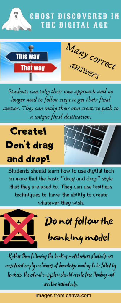
GHOST DISCOVERED IN THE DIGITAL AGE

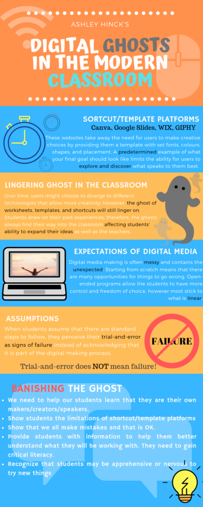
I read the article Digital Ghosts in the Modern Classroom by Ashley Hinck. I chose to use an infographic because I have not made something quite like this before and wanted the experience of trying something new. I really liked this format because it allows you to to incorporate different depths of information in a quick format. Your eyes quickly catch the pictures and subtitles and the main idea is quickly conveyed. The infographic format really allows for creativity in how the information is expressed.

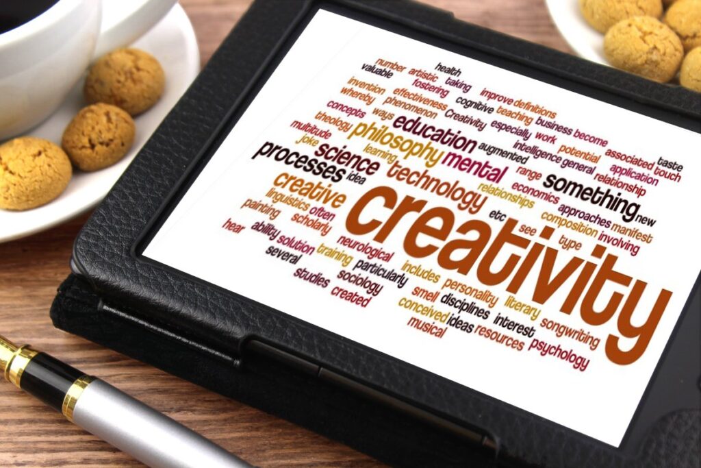
Image retrieved from The Blue Diamond Gallery

I can relate to the students in this article. I rely on a set of steps to lead me to one correct answer. This is just the way I have been learning my whole life since I am a science and math student. We have always been given a series of steps to follow, however I can really see the upside to changing this. Allowing students to express themselves and figure out their own path will prevent the school system from killing creativity in students. I like the way that in Ashley Hinck’s class the students use more creativity than what traditional template programs would allow. I believe this is a great way to get students out of their comfort zone and break the mold of the banking model of education. Hinck also mentions how these drag and drop platforms that she characterizes as “digital ghosts” always give the student a working product. This does not allow students to face adversity where they would have to learn from their failures and build upon them. This model Hinck uses is much more relatable to the real world.
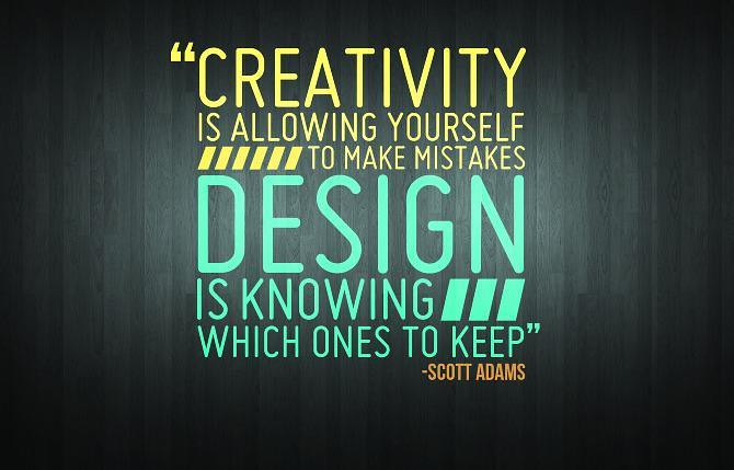
Image retrieved from Flickr

You wont BELIEVE what happening in the classroom! (it’s VERY risky!)

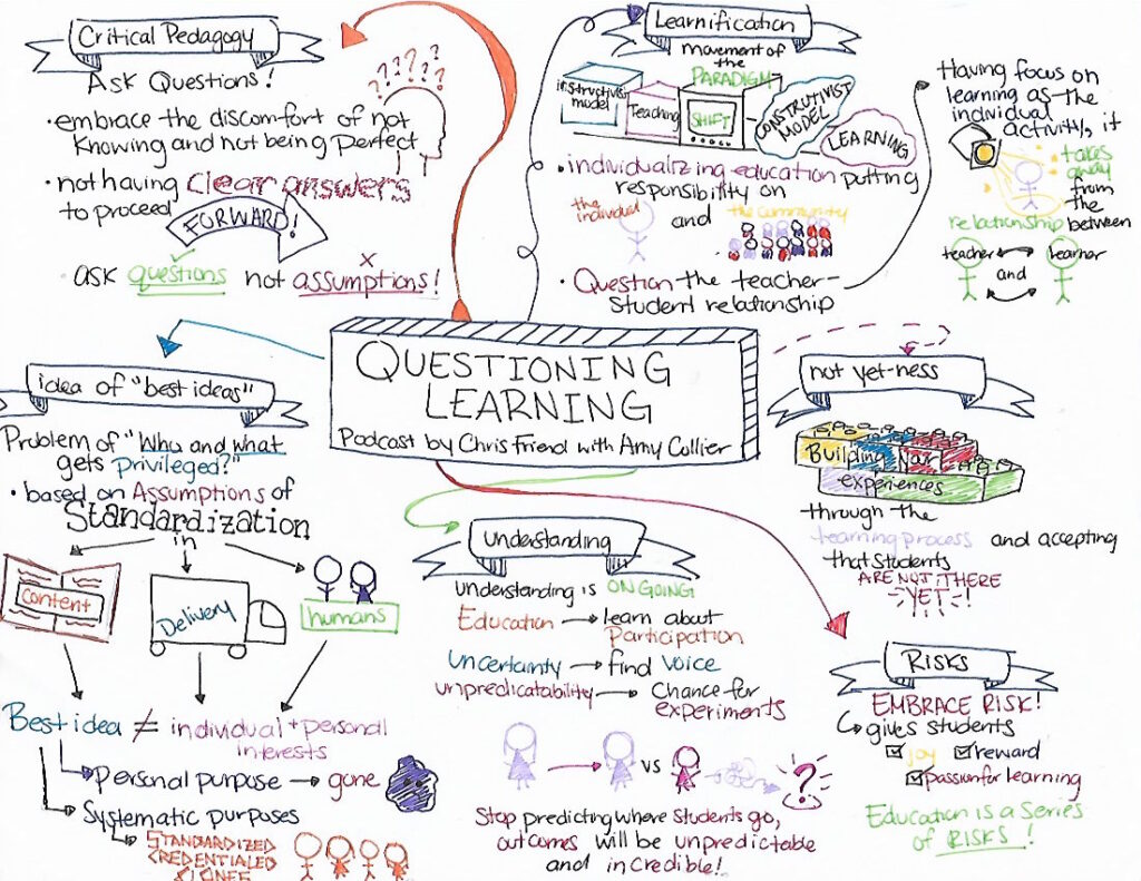
I listened to Chris Friend’s interview with Amy Collier, “Questioning Learning”. The podcast talks about critical pedagogy and gets in depth with the importance with taking risks in the classroom. Amy Collier emphasizes when you standardize learning, it creates the idea of ‘best ideas’ which are based on assumptions from the class content, delivery, and the people in the classroom. It causes a lack of personal interest and individuality in the students and it creates one-size-fits-all model for students. To avoid this, Collier explains that students and teachers should be constantly asking questions about what kind of information is being given and how the information is delivered.

In addition, to avoid the notion of ‘best ideas’ teachers and students should focus on embracing the idea of taking risks in the classroom and coming to terms with the idea of discomfort of not having clear answers to move forward. That it’s the experiences of learning that build your understandings and prepare you for the incredibly unpredictable world that we live in.

When I listened to this podcast, it made me reflect on my time in school. I remember my early grade school days that consisted of the same routine of the teacher speaking, writing on the board, and giving out handouts. This kind of learning technique discouraged me from wanting to learn because it did not fit my style of learning. It was not until grade 7 that I had a teacher that constantly made us question the curriculum and made us realize that, as students, we have a lot of valid things to say. For me, she was the gateway of pushing the limits in terms of the curriculum, and that it’s okay to not be right or have answers all the time. I find that my experience is an example of when students and teachers embrace risk and uncertainty, it allows the students to be confident in what they learn and how they choose to communicate in the classroom.

For my artifact I chose to do a mind map because I believe it reflects the idea of how education shouldn’t be formulaic and linear. How the ideas and points should be free flowing, unexpected, and unpredictable, however, when done effectively it all comes together and makes sense. As I was making my mind map, I found myself over thinking the placements of certain points, however, once I let that anxiety go I embraced the idea of being unpredictable and it allowed me to experiment with the formatting of my mind map.

Move Over Casper, New Ghosts Are In Town

I read the article “Digital Ghosts in the Modern Classroom” by Ashley Hinck. In the article, the author speaks of how existing tools and platforms, “shortcut” templates as she calls them, causes students to lose creativity and just do what is required to complete assignments by creating a desirable product for the teacher. She claims students have been indoctrinated to follow a set of steps to reach an end goal without the high potential of failure and mistakes, and that mindset has lead them into losing creativity and simply following the mold set out for them for success. She encourages teachers to give students the open-ended tools and languages that will not limit their creative ability and allow them to create without a guaranteed result.

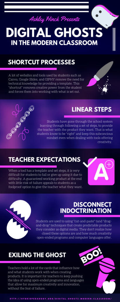
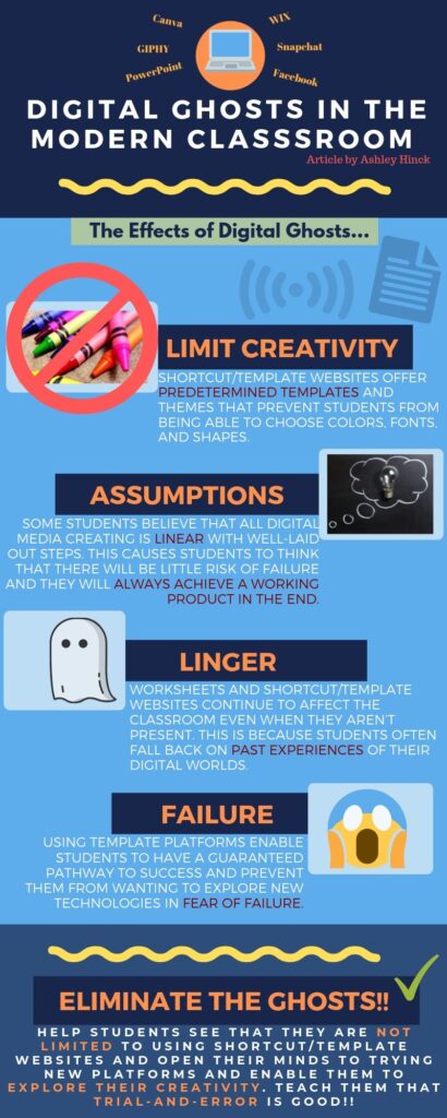
I decided on this article due to the topic directly relating with my experiences and interests. I use a wide variety of template tools and platforms in everyday life, both for school and leisure to create digital products, as well as having prior experience working with open-ended language. I chose to represent the article with an infographic using Canva as a way to show the creative potentials of a “shortcut” template identified in the article.

Infographic made on Canva.com.

I agree with Hinck that students have been trained to think a certain way when it comes to completing assignments and projects as they made their way through their schooling, and that it may have hindered their bold creative ability. I also agree that open-ended programs and languages should be encouraged to students. In terms of limited creativity, there is no arguing that template websites and platforms offer less creative potential than open technologies. However, I do not believe that they should be a requirement over existing template tools and platforms. Not every student will share the same exuberant passion for digital media and with a finite amount of time, spending it trying to come up with something from scratch that can be easily achieved with an existing tool should not be forced upon students.

Retrieved from Giphy.com.

I think the option should absolutely be there for students who choose to explore this creative endeavor, with an incentive that will not put them at a disadvantage when compared to their peers using templates, such as an extended due date if needed to compensate for potential mistakes and errors in the process. But for a lot of students, I believe what the current options offer are more than capable for what they are aiming to do, and should still be an option for use.

When creating my Canva infographic, despite all the options, it was difficult at first to find one to suit my vision. I knew I wanted a modern look with a vaporwave aesthetic for my infographic to look professional and represent the digital side of the article, but didn’t know exactly how I wanted it to look. By finding one that represents the colour scheme I wanted but couldn’t come up with in my mind, it was perfect. It offered me something a blank canvas couldn’t have given me, and that was a spark of inspiration and ideas. It got my creative mind flowing with possibilities as I explored the available elements and tools I could use with it, of which were completely unrelated to what was already shown on the default setting of the infographic. So from just my experience using Canva for this project, I can say that if a student is not happy with what they see available to them, it will not stymie their creativity and cause them to settle for something less than they desire.

Retrieved from Giphy.com.

I noticed, through my own experiences using these platforms and tools, they open up another aspect of thinking in students – it works on their creativity, flexibility and adaptability. By finding ways to change their product to suit what they can use while keeping the quality of their work at top tier, it enhances all three of those traits. For example, a student who is not able to remove the background or change the colour of a photo on one tool is able to use a seemingly unrelated tool, such as Microsoft Word, to perform that task. Also, with Canva specifically, there are limitations on what photos and elements are allowed for use on a free account. This may seem debilitating to creativity at first, but afterwards you learn how to work with different elements you can use and get very creative with them to get your desired result.

An analogy I have to this situation are musical instruments. There are many musicians who practice their craft and create their art using instruments that already exist and are widely available, like saxophones, trumpets, and flutes. However, the instrument of their selection limits them on what sounds are possible. Should musicians be inventing their own instruments to use to open all possibilities for them to get their perfect desired sound? Or are they able to push their musical talents to their full potential by using existing tools? I believe the second one.

Retrieved from Giphy.com.

In the end, I feel that while it is important not to stifle the creative world of students, it is also just as important not to force students out of their ability range with open-ended programs and languages lacking limitations. After all, some creativity is better than none, and that “some” is actually a lot. I think a happy medium is to give students the option to use existing templates and tools or open-ended programs and languages, and make the conditions fair for whichever option they select. There are still many creative possibilities in the realm of the “shortcut” templates and they are very capable of producing work that students can be proud of – like I am.

Tagged

The Hitchhiking Ghosts

For this assignment, I chose to produce a twitter essay based off of Ashley Hinck’s article “Digital Ghosts in the Modern Classroom.”

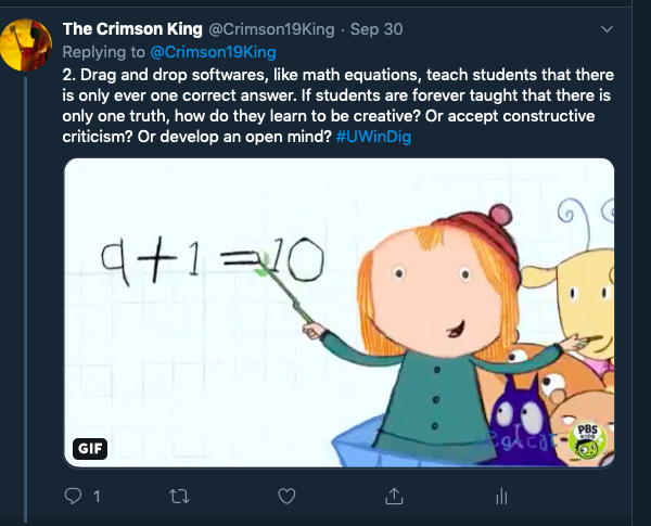
Hinck’s refers to the overused digital tools that, like class worksheets, limit the abilities of student learning… and essentially follow students around their educational careers. To some it may not seem like the biggest deal, but what Hinck suggests is that limiting student learning tools further limits student’s creativity. Because common tools are so easy to navigate, the task at hand is simple for students to simply drag and drop.

Hinck promotes digital tools like CSS, HTML, and Scratch, that allow for multiple right answers rather than regurgitated curriculum. With tools that allow for diverse thinking and creativity, students will shy away from the fear of being wrong. Teachers should promote the joy of discovery, and figuring out learning through trial and error processes. 

Personally, doing this activity as a twitter essay was very much like using the suggested tools in Hinck’s article. I admired the idea of commenting on my own posts material that was short and to the point, or at least I thought so at first. As interesting as it was to include GIFS and images in my responses, the responses themselves were limited to a low about of characters, just like any other tweet. 

My mistake was posting each tweet after finalizing it, rather than writing out each tweet individually on a document and moving them on to the twitter platform. Four or five tweets in I realized I could have added another tweet or two in-between tweets I had already posted.

This was frustrating and cumbersome to fix, but it at least allowed me to learn from my mistake and approach the platform a little differently. 


You can view my twitter essay in its entirety by clicking here!

The Invisible Classroom Scare!

I read the article Digital Ghost in the Classroom by Ashley Hinck. In the article, she focuses on defining the term Critical Digital Pedagogy by speaking about the “ghosts” that linger in the classroom and affects students learning. More specifically, the restricting template platforms that prevent creative thinking. 


Retrieved from giphy.com

Hinck argues that shortcut and template platforms discourage students to explore and experiment which affects student learning and discourages them from expressing themselves. Whether it is worksheets, templates, or multiple-choice tests, students are taught from a young age that there is only one way to get to the right answer. Students have become accustomed to the thought that learning is done by following a series of well-laid-out steps which will, in turn, lead to a guaranteed final working product with few risks of failure. Students need to be taught that it is ok to make mistakes because that is how we learn. Working with more open-ended technologies will allow students to explore their creativity.  This will help with their learning inside the classroom. Open-ended programs allow students to have control over the final product. They can choose the font, size, and colours, allowing students to create something they had envisioned.

Instead of showing kids that learning is linear and structured, we should teach them to be open to new ideas. They should focus on their creative side while working on new tasks.


Retrieved from giphy.com

I agree with Hinck. I feel these tools that aim to make designing easier and faster, are affecting the way that we think. The process of creating should be all about trial-and-error with students not being afraid of failure.  As a teacher, I plan to provide a significant amount of opportunity for students to express their creativity.


I used Canva to create my artifact. I have never used this site before, and I thought it would be a perfect opportunity to use it since it was mentioned in the article.  When I first started to build the artifact, I was not a big fan of the website. There were many templates to choose from, and once I found one that was appealing to me, I started to play around with the different elements. I found you can add photos, shapes, text and even change the background. However, there are some limitations to using this free website.  Many of these elements are either premium or pro, which restricts access to only a few elements, unless you pay for more. I was able to overcome some of these obstacles by creating images. I took different elements and combined them with other elements to create the image I was envisioning in my head. I enjoyed the fact you can change the colours of the images and fonts.  This enabled me to promote greater creativity.


Canva.com

In the end, I felt that I created an artifact I was satisfied with. I was able to show some creativity by changing colours and fonts, although I do believe had I used a more open-ended program, my outcome would be much different.

Banish the Digital Ghosts!!

I read the article “Digital Ghosts in the Modern Classroom” by Ashley Hinck. In this article, Hinck discusses how shortcut/template websites restrict student’s creativity. This is because they only offer a limited amount of preplanned template designs to choose from. These templates reduce the need for the user to decide what color or font to use, thus limiting their experimentation with technology.

Retrieved from giphy.com

Hinck also mentions how most of the students she works with assume that digital media making is straightforward and all they have to do is follow specific steps to get a guaranteed working product in the end. This is because most students are only exposed to shortcut/template websites such as PowerPoint, Facebook, or Snapchat which all have well laid out steps to follow. Rarely are students exposed to open-ended and more advanced programs like HTML and CSS, which give users more control over the final product. By sticking to these template websites, students believe they will always achieve success. Unfortunately, they end up preventing some students from wanting to explore new technologies in fear of failure.

I agree with the author’s opinion in that these shortcut/template websites and platforms discourage open-endedness and exploration. As a student, it’s a lot easier to stick to what’s familiar and known to work. I, myself, have never really left my comfort zone with technology that is unfamiliar to me. This is the reason I chose to use Canva to create an infographic depicting the article. Although Canva is mentioned in the article as being an example of a shortcut/template website, I have never used Canva and therefore wanted to experience it first hand in order to get a better understanding of it. 

As discussed in the article, Canva does provide multiple templates to choose from which makes creating much easier. Once a template is chosen, you are able to edit details on the template and add images. However, many of the images offered on this website must be purchased in order to be use.  Without purchasing these pictures, your options are limited. This could be a potential issue for students who can’t afford to buy multiple images online and could result in a decrease of their creative expression. 


Going forward, I believe it is important to instill creativity in students’ minds, and that “trial and error” is an important part of our learning process. We need to encourage them to try different platforms in order to explore their own creativity.

Retrieved from giphy.com

The Road to Success?

The podcast Questioning Learning by Chris Friend and Amy Collier was very insightful, informative and had me questioning a lot about how students learn and how we teach both in the classroom and online.

My overall experience in constructing a sketchnote can be compared to that of a roller coaster ride. It was full of ups and downs, but at the end of the ride it was well worth it. I ran into a couple of challenges along the way while creating this artifact, such as trying to find a way to express the podcast in the form of images and single words or phrases. If I had any suggestions for future users it would be to make sure you clearly lay out how you are going to connect your ideas through the use of colour, arrows, word size, etc., to ensure that it is easy to follow for the reader. Sketchnotes are a creative way to speak your mind. At the end of the day all you need is a little perseverance, imagination, creativity and a pen and paper. I would definitely do a sketchnote again and would recommend its use to future students. 

A photo of a roller coster to represent the journey that I had while creating my artifact.

According to the podcast message, the concept of “best practice” can be described as a standard way to teach, the idea that a specific way is best, and that all students can learn in that same way. This way of thinking is based on standardization, which in my opinion is a process that should be avoided in the classroom. It is important to use critical pedagogy, and question whether or not this is the best way of teaching? Why? For whom?Instead of finding the best way to simply teach all students we should be inquiring and experimenting with how specific students learn best from our teaching practices and adjusting our teaching style based on how they learn and what we’re teaching.  

The article mentions online courses being like “canned courses,” meaning the course is designed so that students do the same assignment, go through the same path, in the hope that they finish by gaining the same credentials at the end of the course. The teacher is merely there to grade assignments and answer questions when needed. Collier presents the idea of virtual office hours and bringing in online speakers. As a teacher, if I was selected to be an online teacher, I would definitely include virtual office hours and online speakers as well as add other creative ways to build that student-teacher relationship within the online world. 

A video of cans being made to represent the idea of a “canned course”. Each can in the video is being processed the same way and comes out identical at the end.

Using “Beacons instead of outcomes.”  In my classroom, I would take the time to help guide my students in creating outcomes; goals that should be accomplished by the end of the unit. The notion of creating outcomes to be interesting and inspiring (beacons), as mentioned in the video, really resonated with me. I think the idea of transforming outcomes into big questions is a great idea. In this way, students know what is expected and can also come up with their own way to answer the questions at hand. 

This gif represents the idea of creating “beacons“, outcomes that are inspriring and interesting for the students.

“Learnification” is another topic that can be described as the individualization of education with a focus on the student learning for themselves instead of attaining help from the teacher.  In this case, the teacher can be seen as a “ghost” a figure that is still present in the classroom but out-of-reach for the student.  

This gif is a photo of ghost to represent the missing presence and relationship of a teacher in a classroom based on “Learnification”.

Once again, I believe that a teacher/student relationship is key in education. When you build that relationship, you are able to get to know your students and design lessons that are built to their specific needs and learning styles. In this case, learning is individualized for the student but there is still that essential bond between the student and their teacher. 

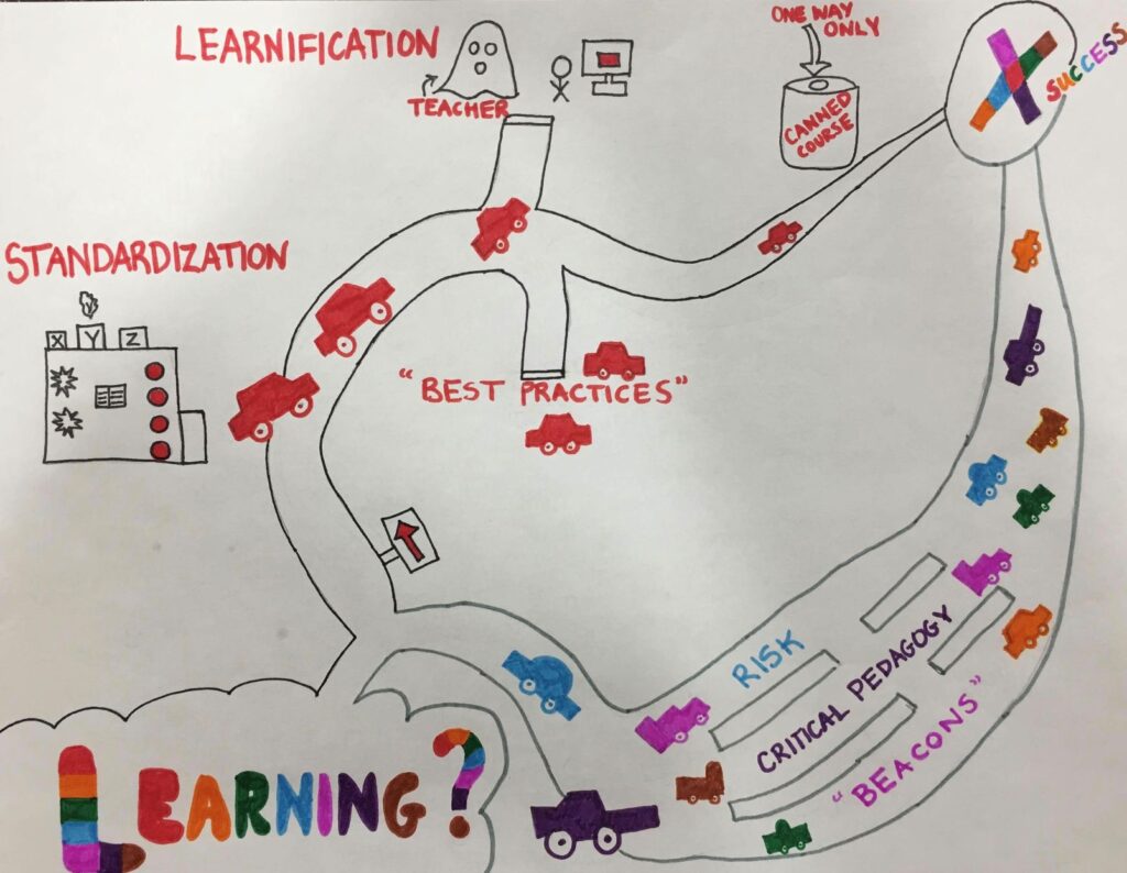
To further explain my point, I believe the article demonstrates two main paths on the road to teaching and learning. The first would be the standardized “factory model” path, an environment in which everyone is conditioned to be like clones; depicted on the sketchnote by the red cars, brought up to learn the same way and hopefully reach the same goal in the same manner.  You will have certain students who reach success since they may learn best through, or in spite of, that particular teaching style. However, you will also have a large number of “cars” that run out of gas, reach dead ends, get discouraged or give up and in the worse case scenario “dropout.”  

This is the scetchnote that I created to represent my thoughts following the podcast Questioning Learning. The mindmap demonstrates two pathways, one following the idea of standardization, that everyone learns the same way and the other demonstrating multiple learning differences that students will have in the classroom.

Alternatively, I believe the article is demonstrating another “pathway to success”, one in which not all students are the same, one which acknowledges individuality and a multitude of learning differences.  Students on this path can be depicted as cars of different shapes, colours and size, symbolizing that each individual comes in with prior knowledge, prior experiences and prior baggage that may have an impact on their learning. Drawing on my own personal teaching experiences working with a learning support teacher, no two children learn the same or reach the same goal at the same time.  I would always try different tools for students whether that be hands on activities, comedy, demonstrations, examples, etc. and some tools would work better on one student and not at all on the other. Students may seek different avenues of learning, may branch out in different directions, obtain specific directions in order to reach their desired destination. No two people have to follow the same path in order to obtain success.  

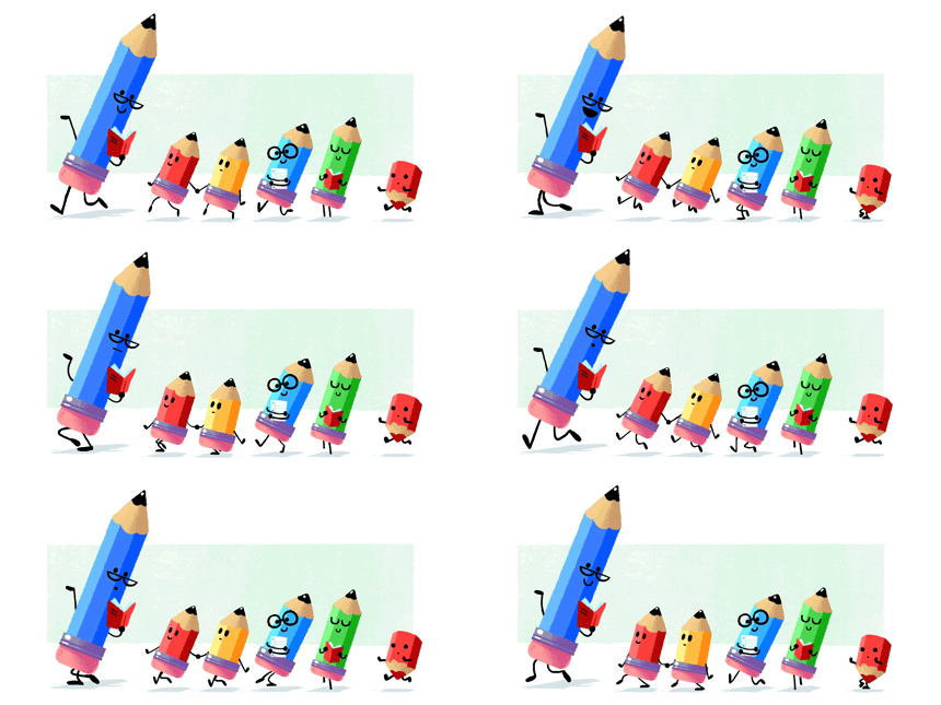
This gif is a photo of different coloured pencils all with different shapes, colours and sizes to represent the uniqueness of each student in the classroom.

Be Careful…There’s a Ghost Behind You

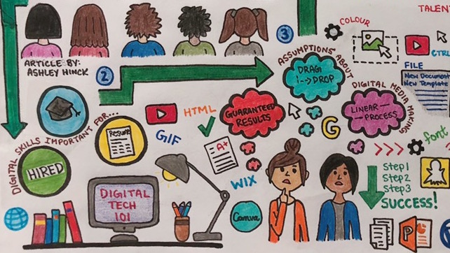
I read the article, Digital Ghosts in the Modern Classroom by Ashley Hinck. In her article, Hinck shares that many students take digital media classes with the expectation that they will gain useful skills that would help them find jobs/internships after graduation. Drawing from my own high school experience, I can relate to Hinck’s findings about students having this mindset about digital media classes, assuming that they will create artifacts in a clearly defined step-by-step process using familiar applications such as Canva, WIX, etc., and that would get them the A+ grade.

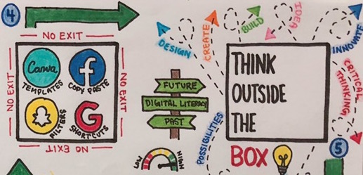
Hinck argues that digital shortcuts/templates have restricted the creativity of students, compelling them to think within certain constraints, rather than exploring outside the “box”. While I agree with her statement, I believe it’s rather the overuse of these applications in the classroom, which is limiting the creativity of students. 

Applications such as Canva and Powerpoint are useful in the sense that they provide a starting guideline for students. They help students get familiar with different digital media formats and are user-friendly applications that require minimal difficulty. However, the problem starts to occur when these applications are repeatedly used for every class and all assignments. Overuse of these applications will eventually cause the students’ learning curves to become stagnant. They will be applying the same level of skills and knowledge, and do the same task – the only difference being the course subject.

As future educators, it’s important that we realize that there have been immense advancements in technology in the last decade, and there will only be more in the years to come. Today, technology consumes our day-to-day lives, and shortcuts/templates have become embedded into our lifestyles. We (students and also teachers) open a Powerpoint document, and without thinking, we begin selecting a theme for the presentation. This behaviour comes second nature to us; it’s the culture that we have grown up in/into.

That being said, it’s our responsibility as future teachers to also step outside of the “box” and help break that cycle just a little bit. The first step in doing that is understanding that these applications are simply a tool. It’s how we (teachers) use and incorporate these tools creatively into our Be Careful…There’s a Ghost Behind Youclassrooms is when the magic starts to happen and the ghosts begin to disappear.

Tagged

EINSTEIN had it right years ago-what took us so long!!!!

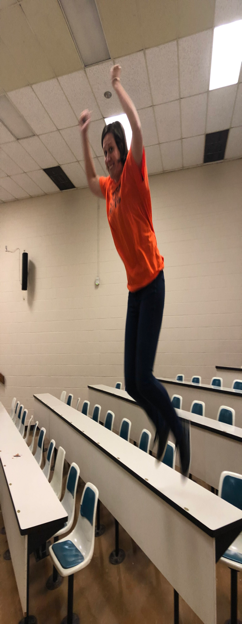
Amy Collier discusses what is important in education today by discussing the concept of “NOT-YETNESS” with Chris Friend from HybridPod.  This is my initial reaction to having to create a digital artifact. I wanted to jump off something! Luckily the highest thing around was this trusty 3 foot high desk. All kidding aside this assignment was a huge LEAP for me, into the unknown FUN yet CREATIVE world of educational artifacts!

Bonnie forcing me to take RISK! Ahhh….
https://images.app.goo.gl/Z3navFbqs22FRW389

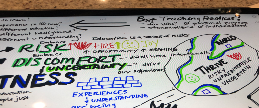
In response to this podcast I tunneled my creativity into a digital sketchnote!  The process of creating this digital artifact was surprisingly very fun however tedious primarily because of using the iPad pen. It would have been much easier to just use thicker pencils or markers of a different colours. With the iPad however each change of these elements was 4 maneuvers with the pen on the touch screen. Next time I will simply utilize a pen and paper, because it is the process of condensing and summarizing thoughts and adding creativity into the artifact that is the point, not the medium.

MY SKETCHNOTE

The creative visuals I brought into the sketch note-the stop sign, flower, globe, can, pendulum definitely helped me and would aid other students as well in remembering and mastering the content.  I would have my students create a sketchnote from one of my lectures and share it with the class. It would also be a great way of displaying to students that perspective and internalization of the same information is different, therefore learning is a creative individualized process. RISK, CREATIVITY and DISCOMFORT would definitely come into play as they presented their works and defended their interpretations-having them live in this realm of uncertainty each day, as Amy suggested. Uncertain of others opinions and perhaps open rejections and responding to these situations would help greatly to prepare them for a world they will THRIVE in.

THE WORLD

Amy defines “NOT-YETNESS” as when you are working on building your experiences and understanding but you are not quite there yet therefore you are embracing RISK and DISCOMFORT. Amy is talking about the critical time when new, ground breaking discoveries could be made….. the BRINK !!!  She believes education is a series of risks and that we need to swing the learning PENDULUM outcomes to qualitative measures. I definitely believe this to be critically important for growth. We can do this by bringing our experience, background and our inspiration into the classroom and creating excitement about the topics we present!

When I reflect on my own education, we focused on key concepts, formulas, memorizing, canned courses and rogue answers. I was on the road everyone else traveled (see me on the road above in my sketch note) and it was not personalized, did not involve risk and discomfort. I was not on the BRINK of discovery, yet could have been if my teachers tapped into my love for chemical reactions and science and let me explore this more through collaboration and development of further experimentation. I would love to share this passion with my students.

Learning outcomes were not individualized based on my interests, where creative freedom was embraced. When I think back I don’t even know if all of my teachers knew my interests, heck some did not know my name. I think it would be amazing to ask myself instead what I would ADMIRE as a learning goal for my students as Amy suggested. For me I would admire my students if they developed an ability to collaborate and foster respectful relationships while experiencing risk in areas that interest them. My teachers did not concentrate on what brought me JOY and what ignited a FIRE within me. It was A +B =C student who understands the concepts and who we can check the box for. Many on-line “canned” courses as Amy refers to them were exactly the same, creating clones of regurgitated information. Deposits in the heads of students like money in a piggy bank. To try to avoid this I would try to make online courses more personal and foster connections with students.

For students to THRIVE in this WORLD today they have to be exposed to unpredictability and uncertainty because the WORLD is exactly this!! I could not agree more!! Students spend SOOO much time in the classroom so let use this time wisely and prepare them for the REAL WORLD. 

In order to do this we have to focus on creative educational experiences, so that our students can be the next generation of CREATORS. What would this look like to me in my classroom?  I would give opportunity to build confidence with creative learning opportunities that are NOT EVALUATED. 

An example in Science would be to have my students devise a new and creative way to deal with environmental sustainability. Even if their creation is not at all practical or sustainable that does not matter, what matters is their reflection of what they learned. Why they chose to make this creation, implications on society and understanding of sustainability in practice.  The reflection demonstrates a whole other level of understanding and ties together their overall learning experience and does NOT KILL their CREATIVITY!!

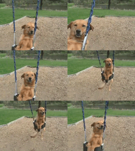
https://media.giphy.com/media/Pl7MhjWSvFwzu/giphy.gif

You never know, maybe just maybe one of my future students will come up with a brilliant creative idea because I provided the scaffolding for such an opportunity. Or maybe a few students could collaborate on an risky idea and expand it into a groundbreaking innovation. After all CREATIVITY is a precursor for innovation!

Another way we could have students experience more risk is to get together with other classes and have OPINION BASED DEBATES on CREATIVE APPLICATIONS of the curriculum. This puts students into a RISKY environment where they have to know material well, be ready to defend their point of view, think on their feet, and apply their knowledge to creative opinion-based forum. Again NOT KILL CREATIVITY with right or wrong questions yet utilize their content knowledge and apply it to creative concepts.

Amys notion of critical pedagogy, encourages us all to NOT always have clear answers and best practices and to embrace this discomfort as a best practice. If teachers adopt this GROWTH mindset in class it will force students to do this as well and will better prepare them for the work force. I have worked in the pharmaceutical industry for 20 years and embracing change and discomfort is critically important for developing new therapies and asking new questions as to what should be studied or investigated next. Risk and uncertainty has always been an integral part of the pharmacy industry and of my personal and professional growth.

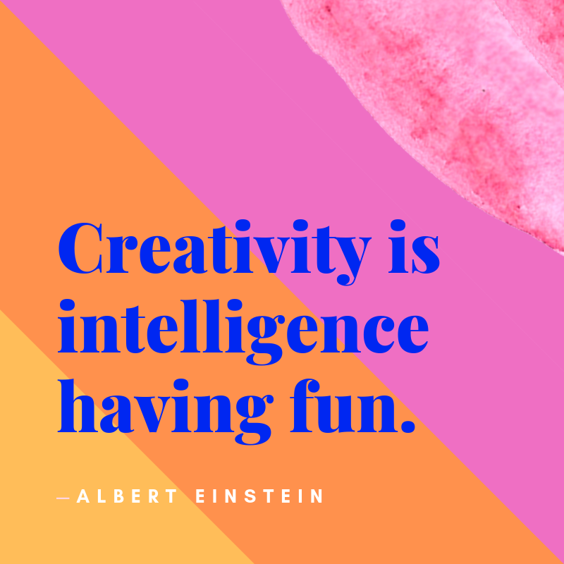
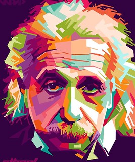
IT IS THE SUPREME ART OF THE TEACHER TO AWAKEN JOY IN CREATION EXPRESSION AND KNOWLEDGE-Albert Einstein

After all Einstein had it right decades ago…..so why has it taken us so long to catch on, and make CREATIVITY a priority in TEACHING.

PASS IT ON!