Monthly Archives: September 2019

Can Teaching Kids to Code Save Lives?

You may think that using coding to create artwork is boring, a waste of time, and too difficult. You may think kids in classrooms shouldn’t waste their time creating original pieces when they can just use easier platforms such as Canva and Wix. But what if I told you that the benefits of coding far outweigh the negatives? What if I told you that by teaching kids to code, you might actually end up saving their lives?

Think this is a far stretch? I am here to tell you, it’s NOT. Many studies have proven that developing resilience in kids has been proven to reduce suicide rates. And what do the hours of learning to code, trying to code, and failing to code over and over again teach kids, if not resilience?
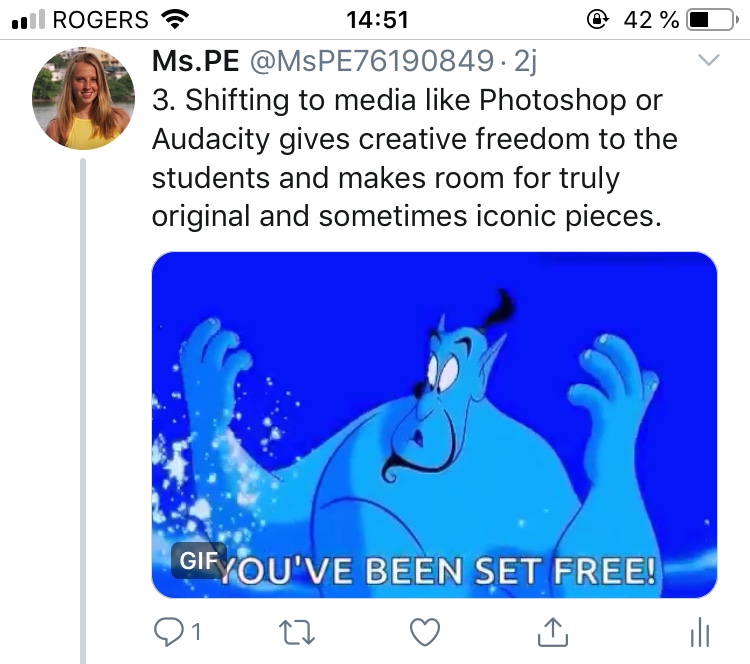
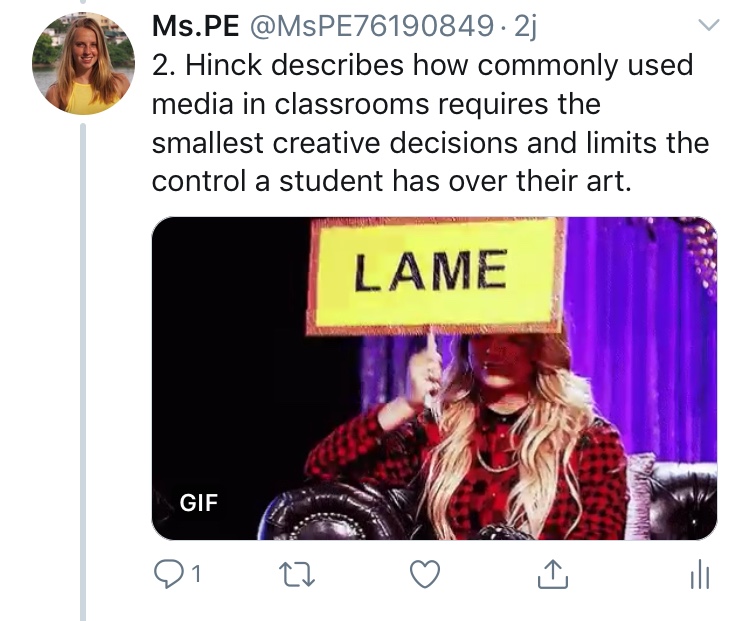
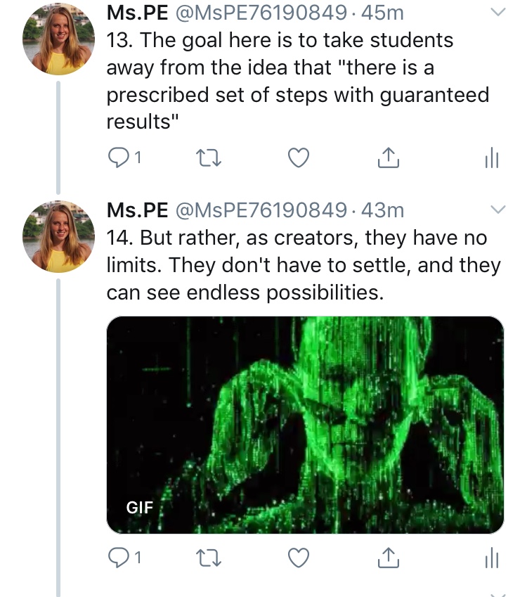
Ashley Hinck’s article talks about why she began implementing a coding program into her classroom, and the difficulties along the way. Here is a quick twitter essay summary-
In my own teaching experience, I have come across students who are afraid to be wrong, students who give up when they encounter the slightest difficulty, and students who believe that there is either wrong, or right, and no in between. Hinck provides a valuable tool to teach students the one skill that can help them with their everyday lives; resilience. Whether it is trying to ask out a girl and getting rejected, applying to get into university and getting denied, or whether it is trying to make a sports team and failing – the students will know that this is okay, it is not the end of the world, keep trying, and never expect anything on the first try.
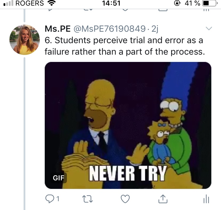
Hinck’s article discussed the apprehension of her students who must take her coding program at the school. She mentions how kids will come up to her frustrated about how their supposed simple coding procedure is not working out for them, annoyed that an easy colour change is taking them so long and nothing they are doing can fix it.
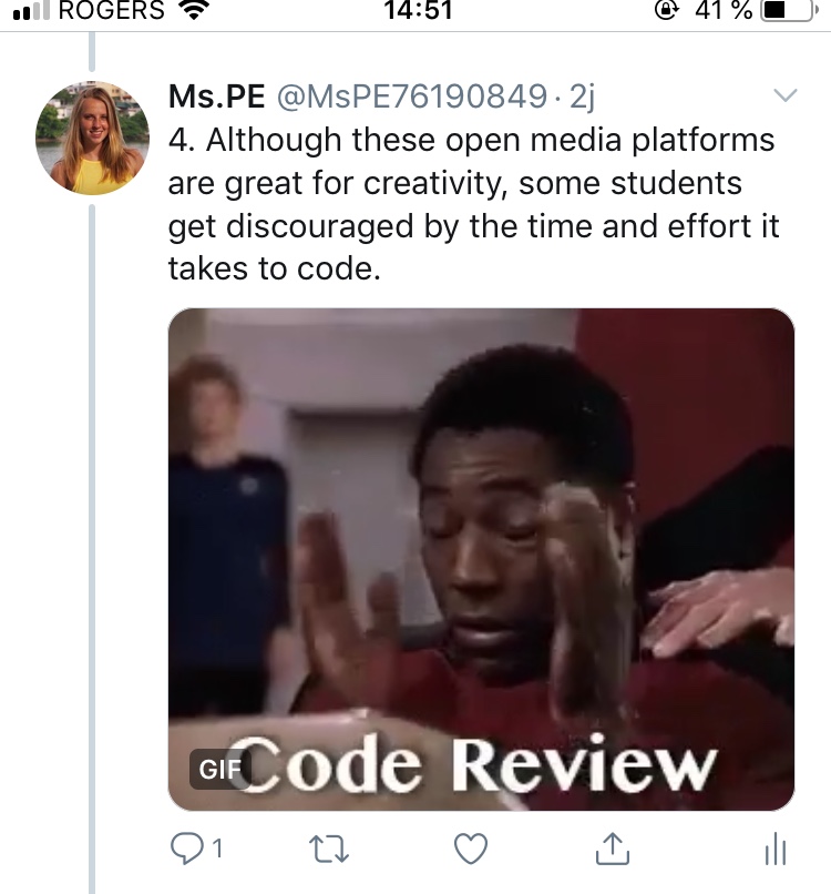
Hinck doesn’t believe in giving up. Instead of telling her students how to change the colour, she will encourage them to continue trying. When they finally work out the smallest of bugs, she will overtly and enthusiastically congratulate them. The student looks confused – isn’t this just a simple colour change that should have taken them less than half the time it took?
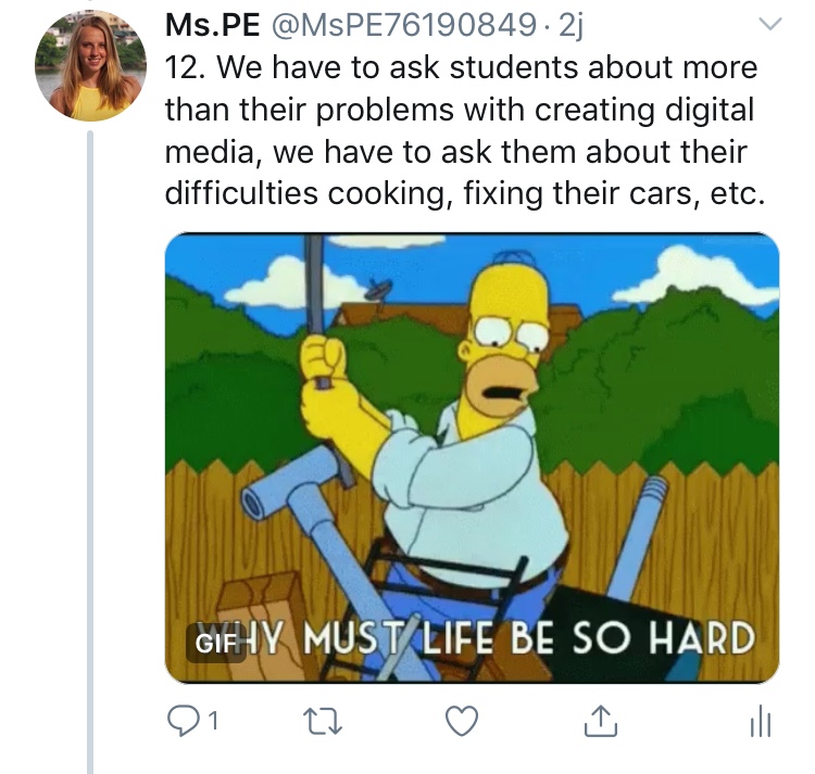
But no, Hinck celebrates every victory in her class, acknowledges each failure, and teaches her students that yes – failure is a step everyone must take to succeed. And she encourages them to share their failures with their peers, to effectively normalize the trial and error process that so many kids nowadays have trouble grasping.
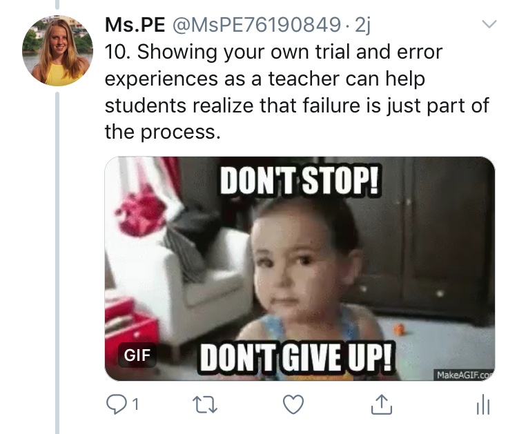
So I am here to tell you, giving kids difficult tasks that may seem boring and time-consuming may actually help them develop their own creative agency, resilience, and maybe save their lives one day.
Eliminating Digital Ghosts in our Classrooms

For this assignment, I chose to take a look at the article “Digital Ghosts in the Modern Classroom” by Ashley Hinck. I was intrigued by the ideas in her article and could also relate to many of those ideas. I think that she is absolutely right about the culture in schools surrounding digital technology being that it is there to make our lives easier by staying limited to sites that have templates that create one end product. I can understand why teachers may enjoy those kind of sites; it could make it easier to grade projects if they all look the same, there would be clear elements to compare and contrast. This type of template software removes the creativity and exploration out of the classroom.

We need to start educating “makers” and “creators”, instead of teaching in a way that emphasizes uniformity within the students. Trial and error is a huge part of the learning process, and I believe that should apply while learning with digital technologies as well. When students learn to be comfortable troubleshooting ideas and making mistakes, it will lead to learning and most importantly, creativity and individuality. Our school culture is one of following instructions and producing an end product that meets all of the teacher’s criteria, so removing those guidelines and allowing students to create in their own way can be a tricky process. 

Hinck made a very interesting point in her article when she said “Are we really teaching them [students] to make, or are we just teaching them to drag and drop or to effectively follow a set of rigid instructions in order to achieve a static goal?” At stake is whether students create something someone else envisioned or whether they get to learn to create, compose, and make.” (Hinck 2018). I can relate to this statement because from my own experience going through the school system that I did, most of our projects that were produced using some type of digital technology, had a strict set of guidelines and set software and websites that we were allowed to use. Our main goal was then to meet the criteria given and surely not make any mistakes in the fear that our final product would be so different than what everyone else had done. 

In my future classroom, I intend on using more open-ended sites to enable and privilege openness and experimentation for my students, as Hinck had mentioned in her article. For example, using Canva for this project was a challenge for me because I was so used to having a set template to fill in, but having that openness for me to create what I felt was important and represented my own ideas, was a great learning experience. I also think that it would be a great idea to go off of what Hinck described to “emphasize this movement toward trial-and-error and tinkering” and show students some of our own struggles and failures using digital technologies to make them feel more comfortable using technology and getting them to see their projects as a work-in-progress as opposed to a failure.

Learning: How Do We Question It?

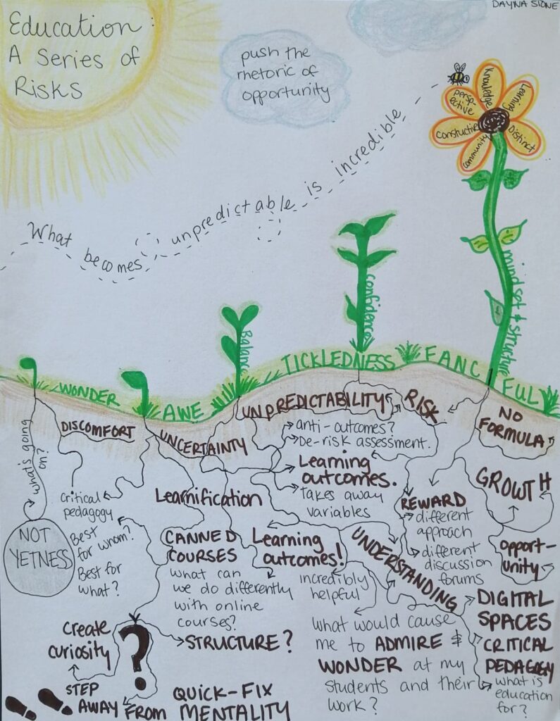
I recently listened to the HyridPod podcast called Questioning Learning by Chris Friend and Amy Collier and created a sketchnote as my artifact (see below). I found this assignment helped me gain more technological experience that I can now add to my pedagogical content knowledge. While creating the sketchnote, I found that my first drafts were very wordy and confusing to the eye. I then began to think about how others would view this artifact and what would make sense. That is when I heard the word “grow” near the end of the podcast and immediately thought to use plants as a metaphor. Above the surface are strong plants all developing at their own pace, but underground, the intertwined roots give a strong base for the plant to continue to grow. Creating the blog post and embedding the artifact has taught me that technology does not have to be complicated in order to be effective. I encourage future educational practitioners to consider technologically interactive assignments to not only challenge students, but give them creative freedom as well.

Excited Bitmoji

Now onto the podcast. I enjoyed when Friend and Collier discussed various pathways and mindsets of teaching can impact the students’ learning. I agree with the points that Collier made about how learning outcomes can act as a guide for educators to build off of in order to see true growth in the student.

Bitmoji growing up

During my undergraduate degree, I created many lesson plans for elementary and secondary students, so I am quite familiar with writing learning outcomes. When I first started, I really disliked having to explain a goal for each activity or lesson plan. I found that even though I had written it down, it was nothing more than words on a page for me. It was not until last year that I realized the power of learning outcomes. Not only are they a tie to the curriculum expectations, but they allow the educator creative freedom to teach the content in ways that make sense for the students. In a way, learning outcomes can act as a pathway to discovery.

Bitmoji with magnifying glass

Collier also mentions that the word “understand” is defined in many ways, and even though the learning outcome for the lesson is for the student to understand the topic, each student will understand differently. For instance, one student might understand from a technical side, by relating to personal experiences, or by applying the topic to the assignments and projects in the future. Learning outcomes and understanding are difficult to define. Collier states that she “can see the ways in which they can provide a roadmap to faculty and students”. Even then, a road map contains many back roads, long routes, and short cuts. Metaphorically speaking, the class as a collective will not all take the same exits, take the same green lights, or the same right turns. Everyone finds their way differently, and everyone has a different experience.

Sketchnote summary by Dayna Stone of Questioning Learning podcast.

This student read an online article: you won’t believe what he did next!

https://www.slideshare.net/secret/rD8sWpLloo3rrG

I worked with the Article written by Ashley Hincks “Digital Ghosts in the Modern Classroom.” I decided to create a slide deck with a voice-over to break down the key messages within.

The main ideology of the article is to criticize the use and adaption of modern “template” based software in schools. The reasoning being that they are no different than a worksheet, serving only to have students fill in blanks to guide them step by step to a pre-completed object. The problem is that this removes a personality or creativity on the part of the student in the creation process. The critique is that this software operates in the same fashion as a teachers worksheet. the student follows along and makes the “correct” product at the end that’s already been pre-molded by the teacher or someone else.

I personally believe that this article may speak truth to an uncomfortable reality in schools. in all my formal education cation teachers encouraged us to use any tool traditionally found in the Office suite of software. they did so because these tools allowed so creativity so we could express ourselves and connect with knowledge but still limited us in what we could do. These teachers did this because these tools were easy to use and functional and practical to be implemented for the assignments. As a result now as an adult, I can operate and function competently in these areas, but not much else and many other students are the same. There’s no creativity, no uniqueness to our work. we all have the same mediocre abilities and competency when it comes to these technologies. Now compare this to those of us who did have access to more open software in younger years and the difference is noticeable. students engaged with open software can think my critically because of the challenge involved in the software’s operation, and as a result, these students have better skills and are more valuable as assets.

I rather enjoyed my work with the article, I chose to use the tried and true slide deck method, because it allowed me to both highlight basic info and graphic images to be appealing and quick to comprehend, but also involved an audio overlay so I could expand and explain deeper on each slides meaning. While I do feel that there could be more “flashy” additions added I lack the skill to do so. which is personally fine as I m old fashioned and prefer to not cover my works in flashy eye candy just for the sake of doing so. I feel that the software used was open enough that I could create as I needed and if I honed my skills more I could, over time, improve the overall product.

I will probably try to incorporate this article and this technologies lesson into my teaching to some extent. But in all honesty, I do have to recognize that I will also most likely rely on tried and true templates as well because even though the article points out several good critiques, it does fail to realize that lessons have time restrictions, and so do teachers. As a result, I’m going to use whatever is fastest, easiest, and effective to teach lesson. While I did enjoy the articles critique and will incorporate the idea of more “open” tech, I do recognize that it has its place in my class only in some roles/aspects. But to be incorporated on a large scale is impractical as it requires too much effort as a teacher, and to much student time, to be worthwhile.

Somebody Get this Classroom a Priest!

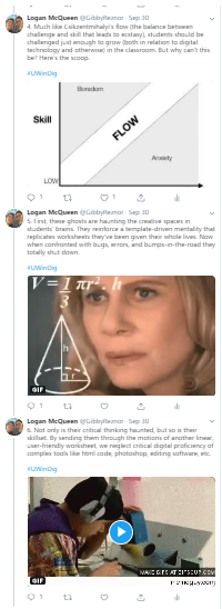
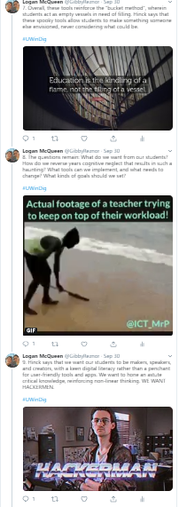
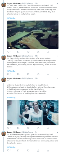
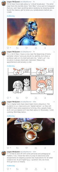
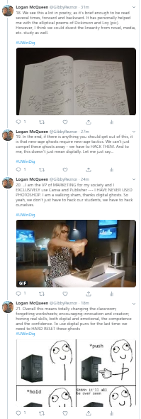
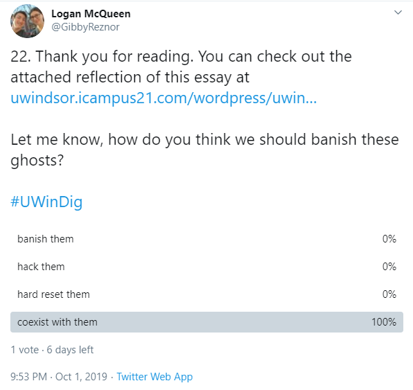
For my artifact, I decided to create a Twitter essay. While I’m not an avid Twitter user, I think the platform provides neat opportunities and constraints that make for an interesting presentation. Here is the link: https://twitter.com/GibbyReznor/status/1178835636373086214

Below I have the entire thread in a gallery. I apologize for the fuzziness.

To begin reflecting on the platform I used, I must say that it’s a little ironic how drag-and-drop Twitter really is. The searchable gif and image function was very user-friendly and convenient, but took no thought whatsoever. Of course it was my decision as to what to do with the media, but it was really no work on my part. I am possessed by the ghosts.

While I criticize Twitter (at least in regards to this assignment and its themes), I must say the 140 character limit and the multi-media opportunities made it super fun to use. Making sure my point was concise enough to fit that limit, while also honing my ability to add media, made each tweet feel somewhat like an accomplished craft.

Something especially neat was the interactivity of Twitter. While I’m no networked pedagogist, I do think that the comment, retweet, and even poll functions make it a great pedagogical tool with a vast social capacity. I actually once had to argue with a professor over whether Twitter had pedagogical functions or not; I think this artifact has proven me right.

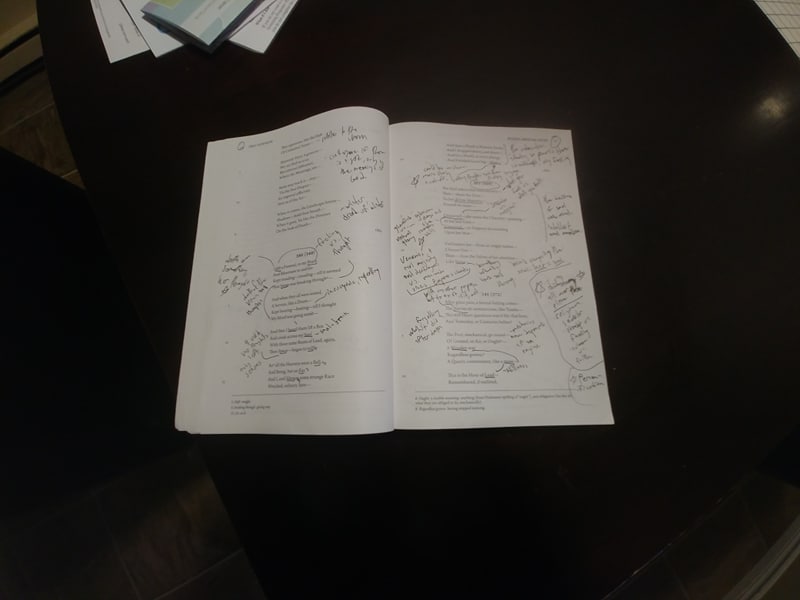
More toward my application of Twitter, I think I used a good variety of images, gifs, and personal visual artifacts of my own. If I really couldn’t think of something to apply, I left it out (all but two had visuals, however). The context and tone of my visuals varies as well, with a good blend of humour and visual aid, I think both of which furthered my analysis.

Overall, I would definitely use the Twitter Essay format again. While I could tell that it was a popular choice from the #UWinDig, I don’t think it was a lazy one. I really think it is an interesting and intuitive tool to convey information, whether casually or pedagogically. Some people and educators really tear apart social media, but if (like the digital ghosts) it is used appropriately, it can have great potential.

Bibliography (by order of appearance in blog)

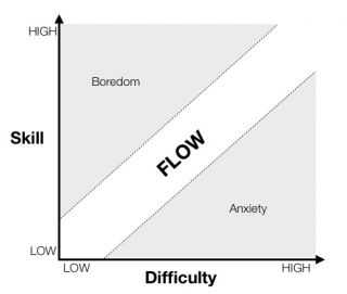
http://i.i.cbsi.com/cnwk.1d/i/tim2/2014/02/13/Flow.png

https://www.youtube.com/watch?v=KEkrWRHCDQU (thumbnail)

Banish the Ghosts of Digital Technology

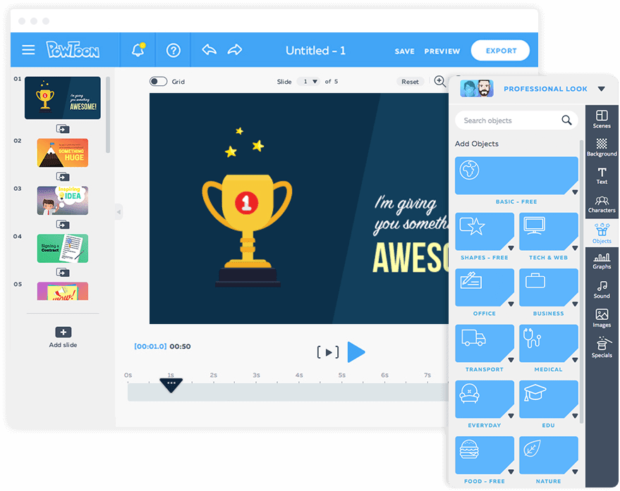
I engaged with Ashley Hincks article: “Digital Ghosts in the Modern Classroom.” I decided to create a Powtoon to demonstrate the main ideas portrayed in Ashley Hincks article.

http://hybridpedagogy.org/digital-ghosts-modern-classroom/

Essentially, Hincks article aims to criticize the current digital pedagogy represented in school. She states that most students are only aware of the template/shortcut platforms, which consists of basic step-by-step, drag and drop methods in order to receive that guaranteed working final product at the end. However, these platforms remove the need for creativity for students to truly express themselves. Hincks also relates this method of digital technology to the way the students are taught in school; that students learn through following the steps. Essentially, the students create the product the teacher wanted and that in turn counts as the right answer. The students never really have the opportunity to express their creativity and they become accustomed to the “one correct answer” type of mindset.  

Make Your Own Path

I would have to agree with Hincks statements, as throughout my educational experience teachers would also prompt us to use the basic programs for assignments. For instance, I believe that 90% of my projects that needed to be handed in were either, pencil and paper, or typed on the computer using a Microsoft word document or PowerPoint for a presentation. We rarely had the opportunity to create and design our own projects to demonstrate our knowledge on a topic or issue. Personally, I didn’t mind the basic platforms and templates because I was accustomed to using them and I knew how to work them well but I also agree that this did not require much creativity on my part.

To be truthful, I understand that it is important for students to be able to have the opportunity to be creative and to express themselves in different ways but I believe that that would have put extra stress on me as an adolescent. Even today, I am not very technologically savvy and I feel that if the teacher instructed us to use a multimedia platform that we weren’t used to in order to create something with very little instruction that I would have been lost and stressed as a result. Now, if I were introduced at a young age to discover and create things on my own without much instruction I believe that I would have adapted to this. Even today, with this project, I felt lost at first because I wasn’t even sure where to begin. Although, I am not disagreeing that moving away from the template and shortcut methods is a bad thing, in fact I agree whole heartedly that creativity should be pushed throughout school to give students the opportunity to think and create on their own but I do believe this should be introduced at a young age.

Next, although it was challenging at first, I really enjoyed working with Powtoon. I am proud with the way my video turned out although the only downside was that I had to make my video less than three minutes long, which meant I had to cut some information from my reflection out. I also noticed one thing that I did not like about the platform. I do not like the fact that when you were writing text you were not able to change the size, font or color of one word in the text. Therefore, you had to create a whole separate text box to do so and then you would have the trouble of trying to time it to show up right after the previous text. Besides this one thing, I believe that the program was easy enough to use. The platform did involve a lot of “drag and drops” but I found that it did allow you to be creative in the sense that you got to decide how the material would be viewed in video format and you were able to change just about anything in the video.

Lastly, I believe that when I begin to teach that I will be incorporating this creative platform into my lessons. I thoroughly enjoyed creating the video and felt a sense of pride when it was completed, even if it wasn’t exactly how I’d picture it to be. I want my students to feel the same sense of accomplishment and pride when doing assignments in my classroom. I even noticed that I’ve been introducing creativity into my lesson plans for other classes without really realizing it until I looked it over. Looking back I realized that that is exactly how I want my teaching career to be; to add an element of creativity into every assignment the students are required to do.

I hope you enjoy my video!

Jessica Landgraff

SCHOOLS ARE KILLING STUDENTS CREATIVITY

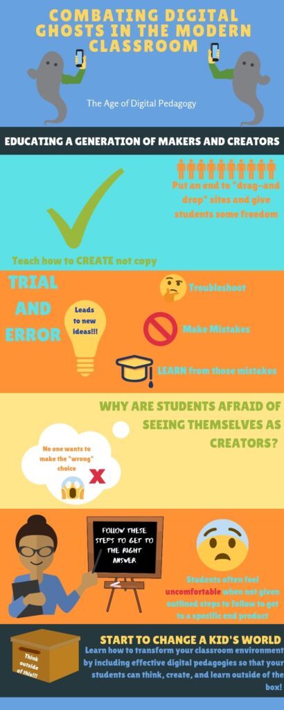
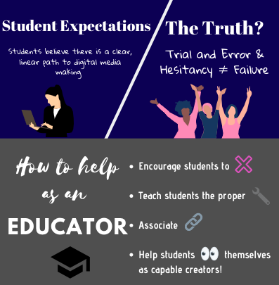
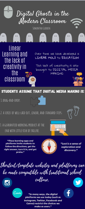
For this assignment, I decided to work with Ashley Hinck’s article “Digital Ghosts in the Modern Classroom”. In the article, Hinck criticizes our school system by stating that our education system has developed a linear way of learning. This belief stems from the idea that all students are expected to get the same thing out of lessons, and only create products that they believe the teacher will want to see. We are so comfortable with these methods that we expect this sort of linear, step-by-step method in other aspects of our life, such as in digital media making. These forms of learning can be harmful, as they discourage creativity and difference. We are teaching students to follow a specific set of instructions in order to achieve their goals. 

An important aspect of every app/website that promotes digital media making is user friendliness, and therefore most of the widely known platforms are very easy to use and understand. This removes the need for technological knowledge and limits the amount of choices creators have to make their creations unique and different. These websites provide things like drag-and-drop processes, a series of well laid out steps and a guaranteed working product at the end with little risk of failure. 

How might we discourage this static view of digital media making? Leave the shortcut/template websites behind! There are many websites that allow users to take a more hands-on approach and that allow the user to develop their computer knowledge, take a shot at coding and truly express their creativity. These websites, while more complicated, show students that there is no linear path to success. It will show students to appreciate tiny victories and will teach them essential skills such as problem-solving and critical thinking.

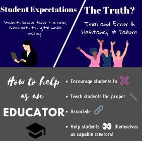
Students have expectations on what digital media making entails, and when they begin the process of using websites that requires the user to do more complicated things such as coding, they begin to feel discouraged. The linear path to success that they are familiar with is no longer relevant and students start to feel frustrated. They truly believe that because they are experiencing difficulties and must engage in trial and error, that they are failing. This is far from the truth, as hesitancy and trial and error are essential aspects of digital media making. 

In order to change the ways students see digital media making, there are a few ways we can help as educators! Firstly, it is important to encourage students to try, fail, and try again! Students believe that failing is something they should always avoid, however this is not the case in digital media making! Failing allows the student to learn from their mistakes and develop necessary knowledge on how they can improve. It is also essential that we teach students the proper tools and language of digital media making. In doing this, we are giving them the necessary vocabulary and resources to troubleshoot any issues they might have, so that they are able to become true digital media makers outside of the classroom. Thirdly, associating their digital media making with other examples of making, troubleshooting and fixing will allow students to recognize that they are capable creators! 

For this assignment, I decided to use Canva as I had no previous experience with the website and I thought it would be fun to challenge myself (in the context of this assignment) to create an infographic without using any of the provided templates, in order to insert a bit more creativity. I found it easy to use, and I can recognize how websites such as Canva make it very easy to produce a good looking product with minimal creativity and work. This article has definitely opened up my eyes and will definitely influence the types of digital media making projects I give as an educator.

Here is the full Infographic that is not split up if you would like to see it in your entirety!

Welcome to #UWinDig

This site is a workspace and connection platform for University of Windsor Faculty of Ed learners in Dr. Bonnie Stewart’s 2019-2020 Ed 5332 courses: Digital Technologies and Social Media Applications.

Participants in the courses will share reflections on digital educational issues and applications through a variety of digital media, trying out the tools and practices we explore intellectually. We will be sharing our work in class with small groups, but will also be building conversations here via comments and replies, across courses.

The hashtag #uwindig (short for University of Windsor Digital) will allow us to extend these reflections and conversations on social media, building familiarity with both the platforms and the educational Communities of Practice present there. Our URL for this site matches our hashtag. 

Looking forward to the conversation!

Bonnie