Monthly Archives: September 2019

Did I Draw a Podcast? Click to Find Out!

For this multimedia assignment, I decided to create a sketch note based on Chris Friend and Amy Collier’s podcast, Questioning Learning. This podcast explores topics such as learning outcomes, online learning, and student freedom. This sketch note took a lot of thought and editing in order for me to express what  I found to be important, and how I would represent this.

sketch note

The first topic I included on my sketch note was learning outcomes. The header for this topic is the largest one on the page because I thought the points Collier brought up about them was important and vital for successful teaching.

Learning Outcomes

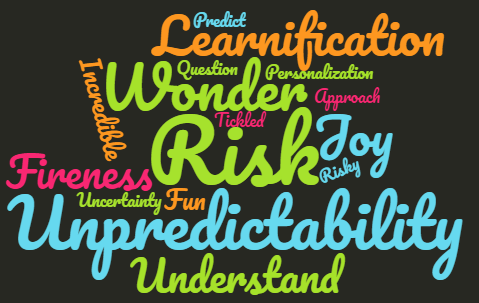
Throughout my time in school, I have always come across learning outcomes that provide students with a direct, structured, and restrictive list of what teachers expect. Collier mentions that these outcomes ¨de-risk¨ learning and can become formulated. ¨Students will…” and ¨students will understand¨ are popular terms used when writing learning outcomes, but what effect can this restrive format have on students? Collier and Friend talk about how this format puts students in a box with no way of getting out. Although, neither of them is ¨anti-outcomes” they do believe that inspiring learning outcomes allow students to grow and explore in their learning. Inspiring outcomes inspire students to think and relate to the lesson at hand. Understanding should not a term used in learning outcomes as understanding is not measurable as it is ongoing, evolving and emerging. Learning outcomes should explore the bigger questions that allow students to ¨wonder at their work” and teachers should write them thinking ¨what would cause me to admire my students¨.

I found in school these formulated outcomes do not allow students to explore their own thoughts and interpretations. Obviously, it is important that students work relates to the topics at hand, but this podcast made me question why assignments and takeaways from a lesson have to be so strict. Not all students learn and think the same, so I believe using aspirational outcomes, such as what Collier and Friend spoke about, allow students to grow as learners and enjoy what they are doing.

Learnification

Learnification was another term that Collier and Friend spoke about during this podcast. I had never heard this term before, and it definitely is important to know when you are questioning learning. Learnification focuses on learning rather than teaching. This term is not necessarily a negative one, but it must be questioned and used properly. This style of learning personalizes teaching and can be quite damaging as it forces students to be seen as products rather than a vital relationship between students and teachers.

This term goes hand in hand with online learning. Canned courses is a popular formula used when creating online classes, but these classes hinder students learning.

Canned Courses

Canned courses take away the instructors/teachers ability to customize or create the online courses they are teaching. These teachers have no say in how the class is designed, how students engage with one another, or how tests and assignments are formulated. These classes are impersonal, structured and restrictive and improperly use learnification so that students are used as products rather than a relationship. These classes are designed to formulate and produce answers from students so marking can be done quickly.

Much like restrictive learning outcomes, learnification and canned courses place students in a box that impacts their learning. These types of learning are not acceptable, and should not be used while teaching. Collier mentions that canned courses seem to flourish online, but could never exist in person without being shut down. Online learning should be structured in a way that is interactive and allows learning to flourish. I have taken online classes during my time in university, and I can concur that some of these classes are dull, restrictive, and make us students feel like products just trying to pass in order to receive credits.

Opportunity

After I took a look at all these different learning styles and expectations, I questioned what should I take away from all of this?

I believe that when students are given the opportunity to explore their own learning, they will flourish. Risk-taking compels students learning and leads students to wonder and awe at what they are being taught. When students are given the freedom to express what they have learned, the outcome can be unpredictable, and this unpredictability is incredible. Seeing what students take out of a lesson rather than forcing work out of them will allow you to see what your class is capable of, what needs to be improved, and the different formats students use to express themselves. Using a critical pedagogy allows you to ask questions and question your own teaching without fear or shame. When we become comfortable questioning ourselves and our students, our ability to teach and our students learning will flourish.

I will keep all of this in mind when creating lessons plans and teaching on my own. What I learned from this podcast is what can restrict learning and I cannot wait to explore how to apply this in my own teaching and classroom in the future.

Digital Ghost’s in the Modern Classroom

For this assignment, I decided to explore Hincks article called ‘‘Digital Ghosts in the Modern Classroom’’. Hinck, (2018) explored a topic regarding the preparedness and skillfulness of digital media leaners. The statements and observations cited by the author are of good quality. One thing remains true is that in the practical sense and in a work environment, the kind of training offered will not help, as the client product requirement is hardly linear and straightforward with standard steps to achieve the desired output. Neither is there a guarantee of a working product as increasingly there is the risk of failure due to the dynamics of the industry.
The tools that learners are using hardly prepare them for these realities. Reflecting on the topic, I have completed an Infographic using “Piktochart”. “Piktochart” is web based software offering straightforward themed templates that are useful in the creation of standard infographics and
other visuals. One of the remarkable features of the application is that as a creator, one is able to come up with web-publisher ready, and individual multimedia content. Overall, the application is simple to use. I prepared the infographic embedded in this document within a reasonable period. Hinck (2018) also notes that by following the simple to understand instructions that the application requires I was able to come up with the infographic attached. Some of the features and resources offered by “Piktochart” were rather intriguing to use.

For instance, the templates available are modifiable, easy to manipulate text aspects such as font, size, and most importantly, I could use my own images together with those offered by the software. Additionally, the software allows the users to easily organize their information by use of drag and drop. Remarkably, the drag and drop feature is amazingly flexible and straightforward to make modifications and additions of text. The HTML publisher is also straightforward to manipulate for users who intend to have their visuals available online or embedded on websites. The information presentation tools are also practical ranging from animated icons, charts, videos, and map visualizations further making the software’s output product more appealing and adaptable to multiple scenarios. I cannot help but disagree with Hinck (2018) since despite not having technical knowledge on the development of such features using HTML or other suitable coding languages, an individual is able to come up with incredible creations within a short time. I would like to think of it as the difference between accountants who keep their books manually using traditional ledger books and files whereas there are available accounting software such as SAP and others by Microsoft, Oracle or Sage. In addition, despite having a ready to use software, Hinck (2018) fails to acknowledge the fact that the most critical skill of a creative presentation is the ability to visualize the desired outcome in one’s mind. The availability of applications that make it more accurate and faster to deliver is reasonable and having learners use them is in fact useful and prepares the digital media learner for the real world. Supporting the accounting profession analogy, an accountant who understands how a transaction should be recorded does not depend on the tools available to them. Reflecting on the experience of developing the above infographic, I support the use of such platforms. Rather than focus on the mundane tasks of keeping the images, charts, and text in the right organization, digital media presenters can now focus on what actually matters; the ideas, message, and the means of appealing to the target audience. In comparison, the essence of digital media is primarily to appeal to a specific audience and as such, creativity and a human feel of the multimedia messages cannot be overlooked. There is a possibility that the final products will be similar on multiple instances due to the over reliance on software templates, a scenario that is unlikely when each creative and digital media professional is able to develop their content from the beginning. For example, “Piktochart” has only six hundred templates in its database. Considering the billions of multimedia content generated annually, six hundred templates will probably lead to uniform structures and feel of such creations. Therefore, there is a place for the software applications available on the internet but still a lot of work is required to be done in order to inspire uniqueness and creativity in the digital space.

Meet your classroom ghosts and tell them to leave!

Or learn to live with them cautiously.

A response to Digital Ghosts in the Modern Classroom by Ashley Hinck .

As a student teacher, I am just starting to create my teaching philosophy. As I read about multiple approaches to teaching and learning, I have conflicting feelings about what I want my teaching philosophy to be. Do I let my students decide what interests them and facilitate their learning or should I make sure that we cover everything in the curriculum with diligence? I went to high school when handouts and templates ruled all classrooms. So, I feel comfortable learning with templates, but I am not sure how valuable they are in the long run. Did they really help me retain much information? I would have to say, no.  In the long run, classrooms where we explored topics through class discussion or hands on exploratory learning are the classes that I remember most from school.  

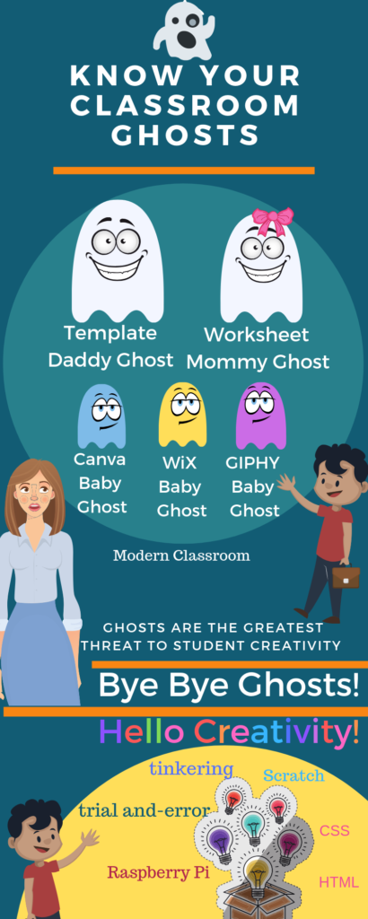
Know Your Classroom Ghosts. Canva. 2019.

Who are our classroom ghosts ?

In the article “Digital Ghosts in the Modern Classroom” by Ashley Hinck the author talks about “The ghosts of worksheets, templates, and shortcut websites” and how their presence in the classroom defines our students’ learning, and our teaching philosophy. The author goes on to say that the drag and drop websites and platforms, such as CanvaWiX or GIPHY, are the new template and worksheets of digital media and are ultimately damaging students’ creativity. Her classroom experience reveals that students’ expectations are so tightly linked to these template platforms that they find learning a computer language completely unsatisfying. She explores the idea that learning through trial and error is not encouraged by these platforms as well as in our kindergarten to grade 12 education system. The author believes that students should be encouraged to explore more open-ended programming languages (CSS, HTML) or programs like photoshop so that they can see themselves as the creative authority of their own work. She suggests that students’ work must not always hit all the marks and a greater value should be placed in the idea of exploring, and the trial and error model of leaning. Having had some experience in the working world and particularly in product development, I agree with the author that learning through the trial and error process is important for surviving the real world. Coming out of school that was a hard concept for me to grasp and it was an idea that I had to accept and adopt, as formal schooling certainly did not introduce me to the trial and error model of learning. 

However, I also believe that not everyone needs to reinvent the wheel. If students in the digital media classrooms enjoy, have an interest in, learning more about these platforms, I think time should be made to explore them.  Templates created by designers on platforms such as Canva are useful, beautiful tools that can be used, explored and enjoyed by students.

Playing with Canva

 Creating the infographic for this article, and using Canva for the first time, I enjoyed working with the platform. Canva provides beautiful templates, but that doesn’t mean that one has to use them as they are. I think Canva templates could also be used as a creative starting point for students. They were definitely that for me. I enjoyed playing with the different features of this platform and creating the ghost characters in the infographic by layering different shapes. I also enjoyed that you could try the platform for free for the first month, so that someone just starting on the platform can explore all features for free.

Approach Ghosts with Caution!

Learning how to code and creating a website from scratch is a valuable skill. In addition, learning the coding language will serve students in the years to come but I think that template platforms are also valuable and can be used to benefit us as teachers to present information in a creative way. Students can use these platforms creatively present their ideas. However, students should be aware that their knowledge about these platforms can be obsolete in a few years because they are always changing. Furthermore, students’ ability to present information creatively will always depend on such platforms if they don’t put an effort to learn the basics of more open-ended tools such as photoshop or coding languages.  

Tagged , , , ,

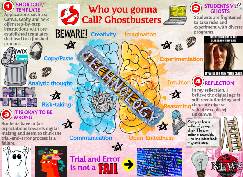
Who you gonna Call? Ghostbusters!

http://hybridpedagogy.org/digital-ghosts-modern-classroom/

For this assignment, I decided to explore Hincks article called ‘‘Digital Ghosts in the Modern Classroom’’ to delineate the critical digital pedagogy. Hinks focuses on the linear way of learning that our school systems have ultimately developed. It was a very interesting topic to read because Hincks also incorporated and analyzed the different roles, effects, and applications that the media has on K-12 students. Throughout the article, there are diverse questions that got brought up discussing whether or not these shortcut/template websites are killing student’s creativity. I agree with the statement that school systems are killing student’s creativity due to the fact that teachers are promoting websites that are very user-friendly and offer pre-made templates with copy and paste features. In the past, I found these programs to be exceptional and convenient; however, I have concluded that students lack opportunities to express their creativity and imagination. Consequently, we are encouraging students to use shortcut/template-based applications in which their learning diminishes, and they do not gain any valuable skills. Are we praising students for following rigid instructions to achieve an overall expectation? Yes, yes we are.

https://www.daglega.com/
This image is a human’s brain that is exploding with creativity. It is illustrated through the use of vibrant colours and sketches.

Personally, my classroom experiences have also included these shortcut template features. Every student was at a different level, and I found that by using these pre-designed templates, it justified that every student was forced to start with an identical base. Based on my teaching and learning comprehension thus far, my future students should be compelled to contribute their thoughts, and not be frightened to take risks while exploring a variety of softwares. I will allow my future students to have freedom in order to explore self-expression, creativity, and analytical thinking. I included keywords that circled the main image of the brain featured in my Glogster because I found these qualities to be very important when I was a student. Based on my experiences, not only will my students learn from me, but I will learn from them. The year I obtain my Bachelor of Education is not the year that I stop learning. With that being said, I will continuously strive to attend conferences, additional courses/qualifications and discuss with my colleagues. 

Additionally, this technological barrier that co-exists amongst generations may be concerning the teacher’s inability to fully understand the technology and their willingness to experiment with the digital technological education process. Even if educators leave the templates and long-established worksheets behind, and apply technologies that encourage risk-taking, exploration and intuition, the expectations still linger in the classroom affecting student’s willingness to experiment with different learning approaches. Nonetheless, a good number of teachers are adapted to traditional school cultures designing one correct method to attain the ‘right answer’. With that being said, it generates students to feel frightened to take risks because they are afraid of the trial-and-error process. The trial-and-error processes are very important for students to gain valuable knowledge and application-based skills in the field because they will ultimately learn from their mistakes. I believe students do not experiment with different software’s because they are comfortable, and they expect instant gratification with an immediate payout; however, if we slowly begin to implement changes, we can convince students that results will be more rewarding and successful at the end. In educational settings, it is crucial to learn and get accustomed to using more complex and challenging softwares in order to fully achieve expectations.

https://thriveology.com/the-trial-and-error-life/
This image says “Trial & Error” and contains a pencil with an eraser that is frequently being used. This is to encourage students to make mistakes and try again. Nobody is perfect!

To conclude, I do not suppose these changes will happen overnight. However, with time, knowledge, and experience, educators will properly begin to implement new technology into their classrooms. As we learned in our Digital Tech classroom, chairs are a technology that conceptualizes behaviour, and students are always the ones sitting in the chairs while the teacher is standing, so all the attention is directed towards him/her. However, teaching is not all about the classroom setup, relationships with students or lesson plans, it is about adding concrete technologies that are missing in classrooms. In the near future, I look forward to guiding my students in becoming exceptional creators and individual thinkers. This article has provided me a whole new perspective on digital media and inclusivity in classrooms, and I firmly believe we should distance ourselves from the shortcut/template and copy and paste features. By doing so, educational institutions will lean towards creative applications that will explore self-expression and invoke risk-taking skills.

Leave the shortcut/template websites behind!

The future generations are full of capable creators!

https://www.futureeducators.org/technology-in-classrooms-pros-cons/
This image includes 7 students, and a teacher working together in a classroom with the help of digital literacy.

For this assignment, I decided to use Glogster! It was my first time experiencing with this website, as I wanted to challenge myself by using the free trial that was offered. It was fairly easy to use; however, when it came to converting the glog, it was not user-friendly in relation to files and formatting. With that being said, I could not demonstrate my Glogster’s interactive features on UWinDig. Nonetheless, this is a fantastic multimedia application to apply in my future classrooms, as it is beneficial for all types of learners. I could certainly use Glogster as a source in some of my lesson plans to enhance a certain topic with visual representations and engaging educational concepts! I think my students would enjoy experimenting with Glogster because it is very interactive, and contains diverse pertinent images/videos.

https://edu.glogster.com/

Jessica Beaulieu

Are we banishing platforms or are we banishing creativity from our students?

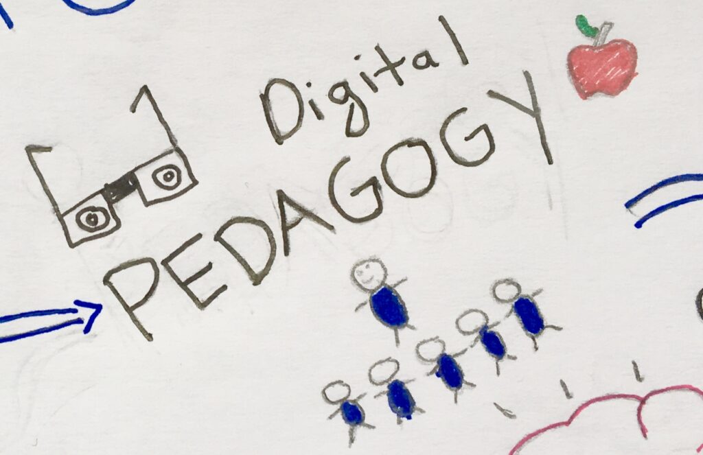
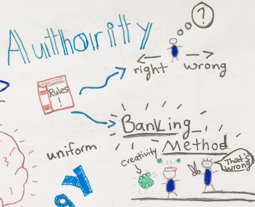
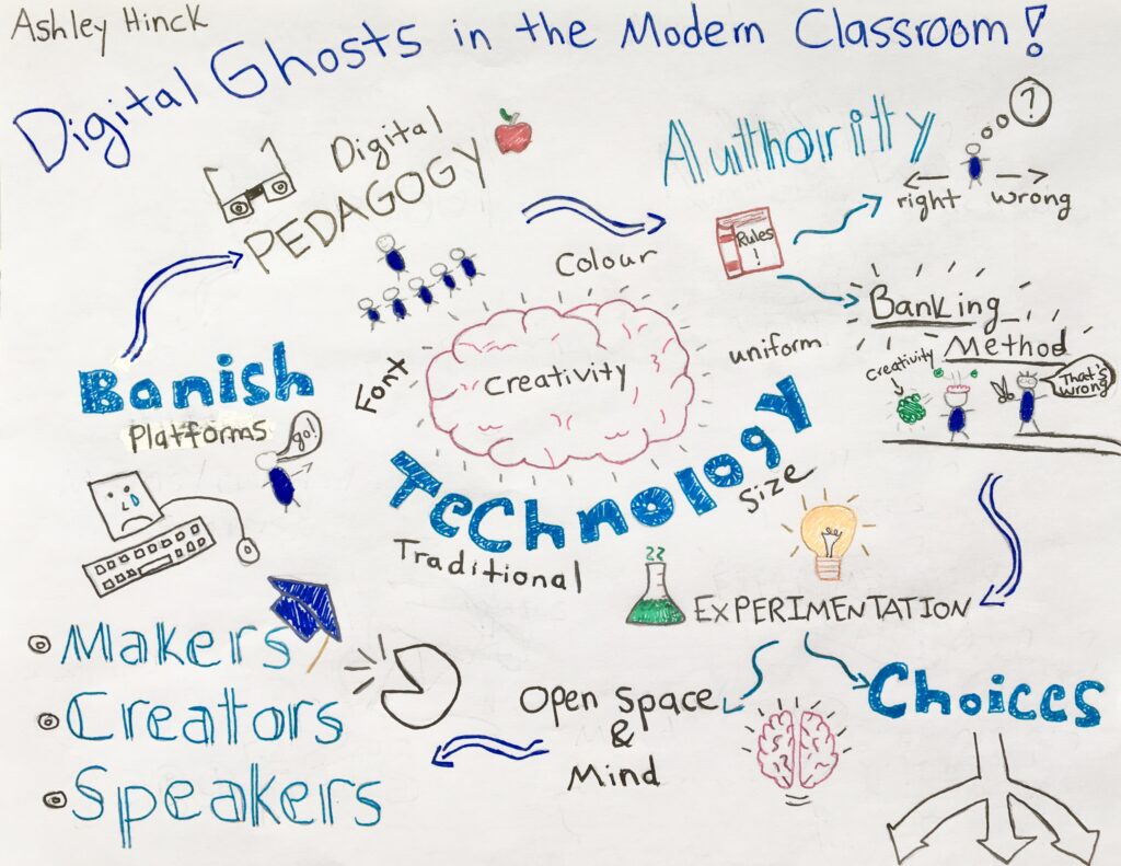
I chose to read Ashley Hinck article: “Digital Ghosts in the Modern Classroom.” I decided to create a sketch note in order to show the main points that were portrayed in Hincks article. I’m far from being an artist but I thought I would challenge myself.

I started my sketch note by writing down in the top left corner “digital pedagogy”. In the beginning of the article Hinck uses her digital pedagogy and explains that the only thing that students know about digital media are the shortcut/template platforms. As a student who grew up in the generation of technology I remember starting off with platforms such as Prezi with the templets being given to me. I feel that the teachers might have recommended these sights because they were “easy” to use. Some teachers also lack in digital technology which could affect how the student learns. Now that i’m older i’ve started to realize that a lot of my work lacks creativity. I chose to create a sketch note, not because I wasn’t sure how to use the other platforms but because I wanted the chance to get creative.  

Students have the fear that there can only be a “right answer”. “Are we really teaching the students to make, or are we teaching them the right way to do things.” ( Hinck 2018) Students follow the directions, to get the right answer, but this is not how they should be taught. Authority is shown in the platforms and the teachers but how can the students open their minds to new things if they are only taught one way? I included the words “banking method”, Hinck talks about how students are viewed as containers. Teachers are filling the students minds with how to do things the ” correct way.” I learned a lot about the banking model of education in my second year of university. I believe that filling our students minds with the “correct way” of doing things could affect how they think in the future.
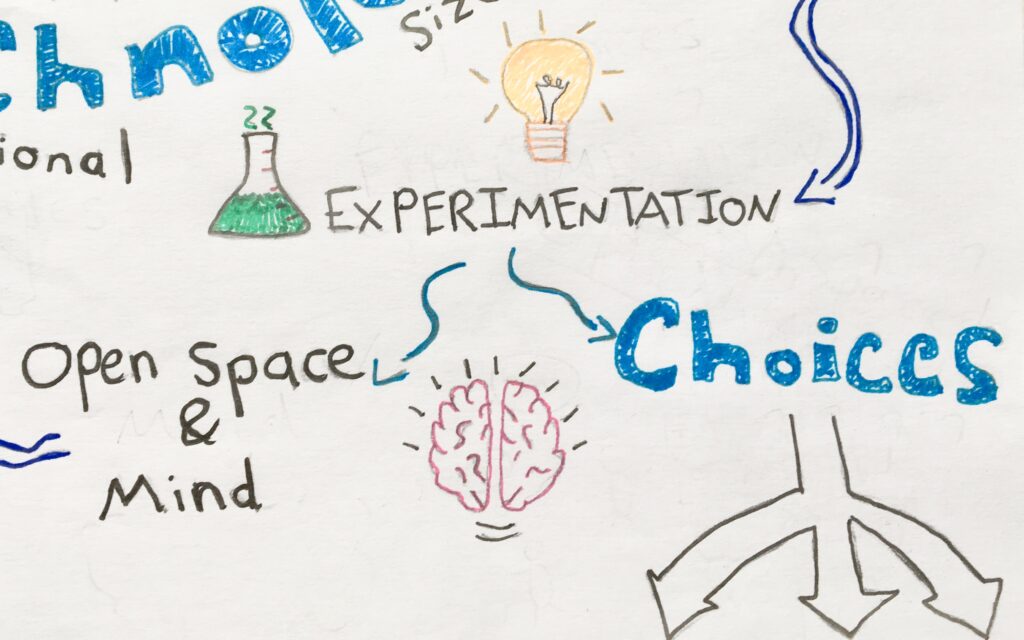
In the next corner of my sketch note I wrote the words “ choices”, “ experimentation” and “ open space and mind”. Sometimes it can be hard to have an open mind about certain things because you are afraid to be wrong. Teachers should encourage platforms that will give the students more freedom to experiment, for example Photoshop.

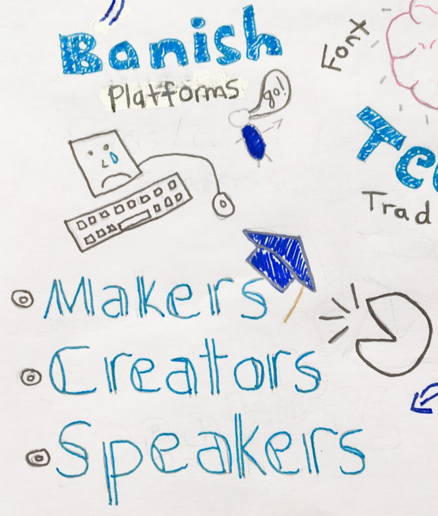
Some online platforms limit openness and creativity, I included the words “banish platforms”. We need to move away from platforms that don’t give the students the freedom they need. I also included “makers, creators and speakers”. We want our students to be their own makers/ creators rather than have the platforms and templates take that away. As future educators we should be teaching students to be “makers, “creators” and “speakers”, instead of teaching in a way that shows there is a “right” way.

Hinck doesn’t give up on her students, she is always encouraging them. As a future educator I want my students to see themselves as creative people and that they should embrace their creativity. I also want to teach my students to love themselves for who they are, it’s okay to be wrong sometimes. I hope you enjoyed my sketch note, I had a lot of fun creating it.


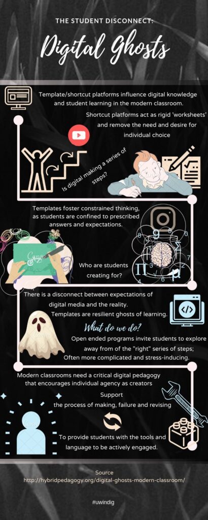
The Student Disconnect: Digital Ghosts

I read the hybrid pedagogy article titled Digital Ghosts in the Modern Classroom by Ashley Hinck. Her article explores the use of template/shortcut platforms and how they place limitations on creativity and literacies in the classroom. To counter this, Hinck refers to a “Critical Digital Pedagogy” to positively impact the learning process for students. To summarize this article, I chose to make an infographic using Canva.

Almost immediately after delving into the article, I was able to make some quick connections. As a high-school student, I can remember taking a digital media course with the explicit purpose to learn how to create digital pieces using photoshop or HTML/CSS. I can remember the mixture of anxiety and eventual boredom I felt when I realized digital making involved more than following a set of instructions and conveniently plugging in my own ideas into a template. While this sounds obvious, this new approach in the classroom went against everything I had learned and continued to learn as a student. As such, the idea of template/shortcut platforms as ‘worksheets’ resonated with my own experiences as a student, as well as allowed me to reflect on my own pedagogical experiences. I find I am most comfortable learning and teaching in a lecture-based environment. My undergraduate program consisted of factual material that had one or few varying answers. I had not considered the implications of this, or how everyday use of media platforms can reinforce this traditional mindset of structured knowledge, rather than creativity. This ‘ghost of worksheet templates’ has real implications in our day to day learning, both as students and teachers.

In my practice, I would like to encourage learning as a process of trial and error, rather than what Hinck describes as linear steps that lead to success or failure. I think it’s really important for students to be confident in their work and achievements, as well as to be able to take constructive criticism and improve when necessary. Incorporating digital media may be one way to gain essential literacies to build on students knowledge and communicate through open and engaging methods. For example, students can recognize the limitations of template platforms and create new digital experiences that they can draw from. As well, it can provide an avenue for educators to gain new pedagogical knowledge and foster ‘good learning’ practices for which allow students to ‘try, fail and revise’. These can be applied even without digital context (i.e.: allowing a student to improve on a test they did poorly on).

In my experience with Canva, I wanted to try and create an infographic that didn’t rely heavily on using a template. However, I found myself repeatedly looking up Youtube videos on how to create a good infographic and which template styles would be the best to use. I decided on a template and tried to use this as an opportunity to see if the experience was limiting in any way. While I found it easy to navigate Canva and its ‘drag-and-drop‘ options, it was difficult to summarize the article using the available graphics. While I did change the font and choice of colours, there was not a heavy selection of images that were available to the free user. Furthermore, it was hard to deviate from the prescribed format. Alternatively, Canva allowed me to create a finished digital product that followed an easy set of steps.

In the end, I found myself worrying a lot if I was making an infographic correctly and experienced a bit of stress. Linking back to the article, I feel like even when given the opportunity to be creative, I worried that I was not following the correct format. I think this impacted my infographic, as well as my engagement with the tool as I was more worried about the finished product, rather than the process.

With a “Critical Digital Pedagogy” I am confident students will be better able to interact and engage with content, as well as recognizing the influence that platforms have on their learning and creative output.

Cookie Cutter Websites: Killers of Creativity

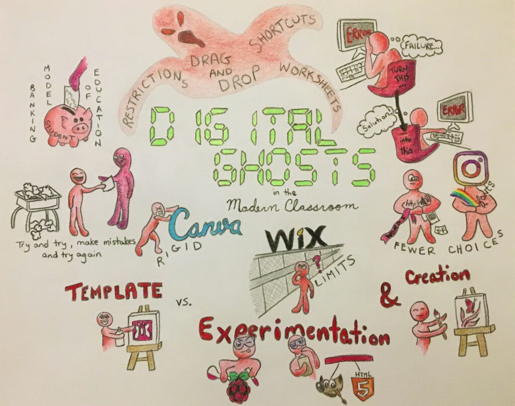
After reading Ashley Hinck’s Digital Ghosts in the Classroom, I decided to try my hands at a sketchnote. Since this is my first time attempting something like this, I thought I would start with a medium I was most comfortable using: traditional pencil and paper!

Sketchnote featuring many concepts and ideas presented in Hinck's article

One obstacle with drawing traditionally is once the mark is down on the page, it can be very difficult or nearly impossible to remove it, especially when using permanent inks and pencils. This means that a fair amount of time should be set aside to sketch out a rough copy to plan out how the space on the page can be used effectively. In my case, I made three rough copies before committing to a final version which was a bit time-consuming. Another drawback for me was creating the digital copy of my drawing. I used a large piece of paper for my final piece; a piece of paper that did not fit in my scanner! Unfortunately, all the lights in my house have a warm, yellow tinge to them which muddies the colours of the drawing when taking its photo. I tried to use some colour correction after taking the photo, but computers are just tools, not miracle workers.

Enough with my struggles, let’s talk about the process of making this sketchnote. It was my hope that the article’s title would be the focal point of the drawing. By selecting a very vibrant green for the lettering similar to what people may see on their own digital clock at home and using red (green’s complementary colour) for nearly everything else in the drawing, the intent was to have the words “Digital Ghosts” really pop out. I would like to note that I wanted the product and corporate logos to remain as close to their official colours as possible so they were spared the red touch! Finally, it is probably obvious that my sketchnote relies heavily on drawings more than words to get the points across. I wanted to focus more on the sketch part of the sketch note!

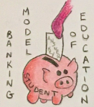
Hinck discusses a shortcoming that has appeared in her classrooms recently: a lack of enthusiasm in her students when building digital artifacts of their own. She brings up the banking model of education that she fears is still being instilled into students today; the idea that students are simply containers to be filled with answers. It was this statement that gave me the idea to draw her thoughts and ideas as little cartoons. In this illustration, someone is filling the student piggy bank with an answer key.

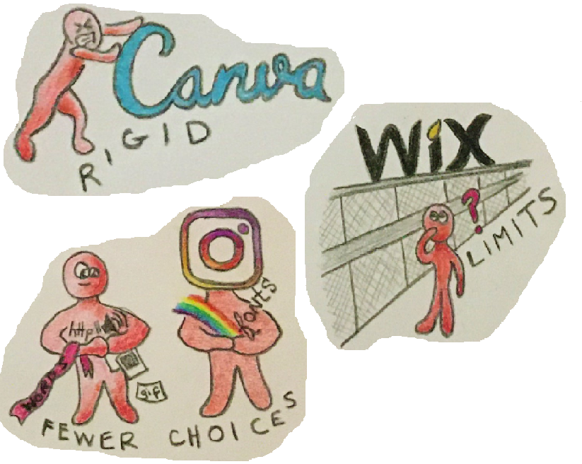
Hinck mentions several platforms that she believes contribute to students’ reluctance to learn digital skills from scratch. Platforms such as Instagram, Canva and Wix are some of the drag-and-drop websites that add to many students’ preconceptions of how to make anything digital. By providing pre-made templates, these websites hinder creativity since filling out a template can be much easier than designing your own format. The final piece may not come out looking exactly as planned and can lack originality due to the limitations imposed on users. I chose to focus on three of these platforms (though I drew rough sketches of a few others that did not make the cut to the final sketch including Facebook, Snapchat and GIPHY.)

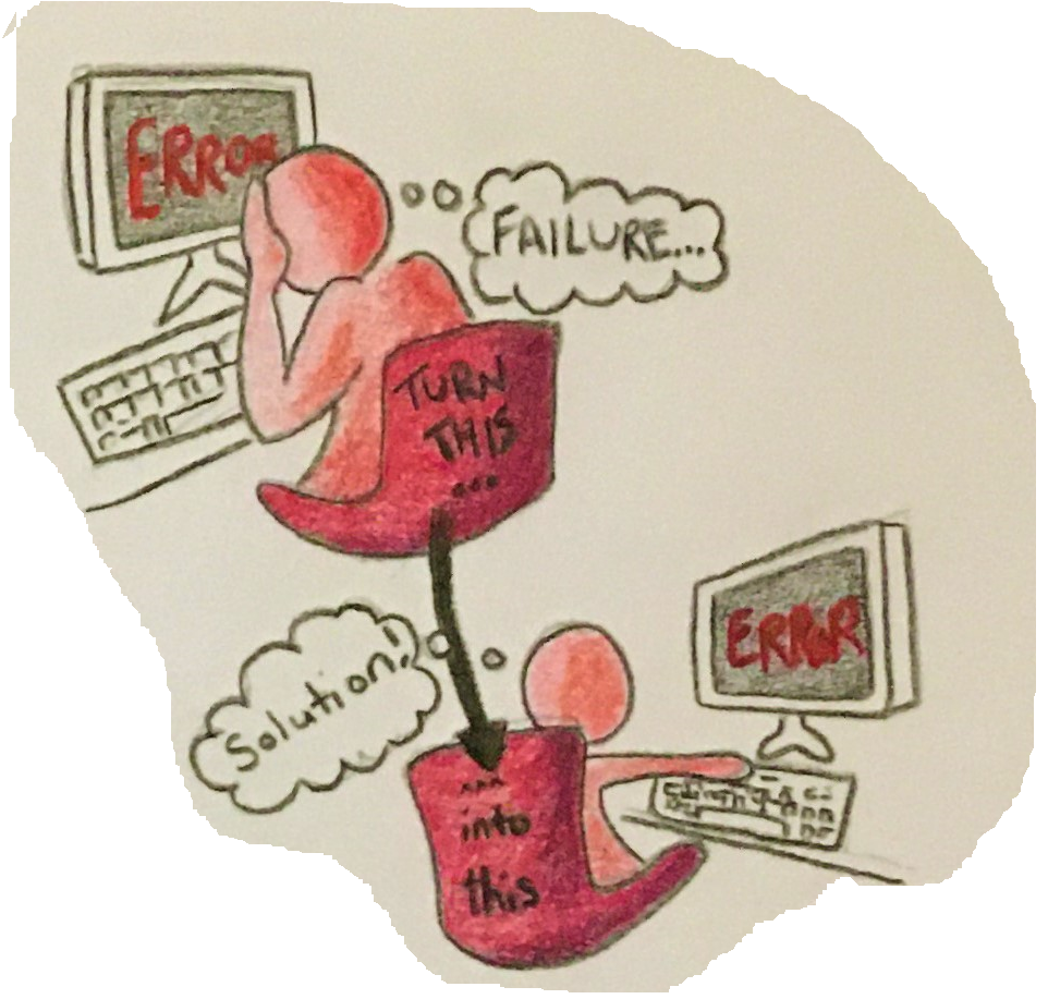
The article mentions that some students feel very discouraged when they are confronted with difficulties and errors when learning how to format their own digital works without the aid of the template platforms. To drive home the idea that a mistake need not be a reason to quit, I thought of two images: a person despairing with the old fashioned head-in-the-hands pose we’ve all probably felt at some point in our lives (or possibly at some point while completing this assignment!) and a person continuing to work through their difficulties.

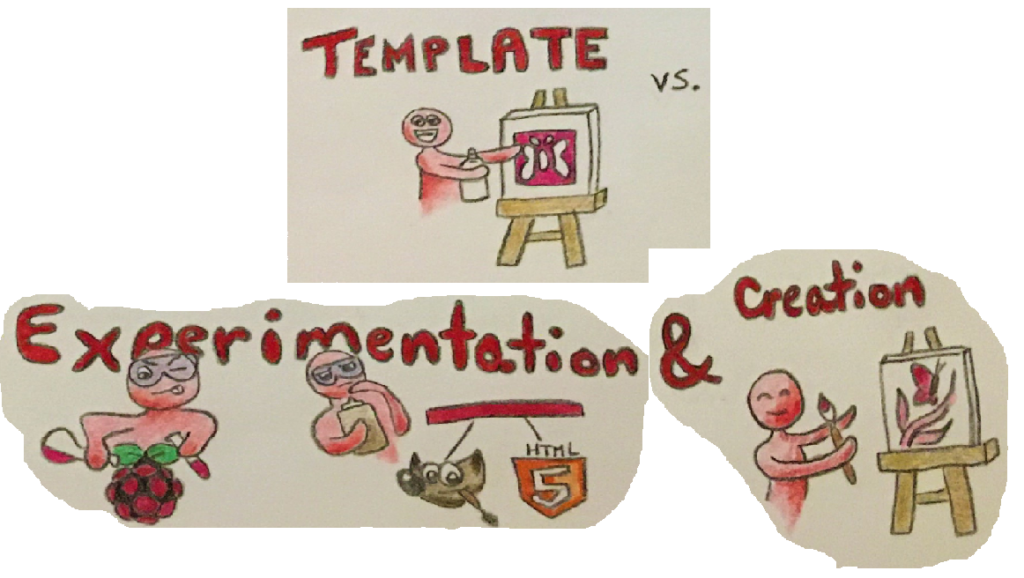
I made this set of images to show the limitations the template platforms place on creativity. The student in the top image is pleased that the stencil (or template) they are using will produce a butterfly (or a program/website) on the canvas, though it will be fairly basic-looking. The bottom two images has the student experiment with different hardware (Raspberry Pi), software (GIMP) and languages (HTML5) to create a much more customized and original work.

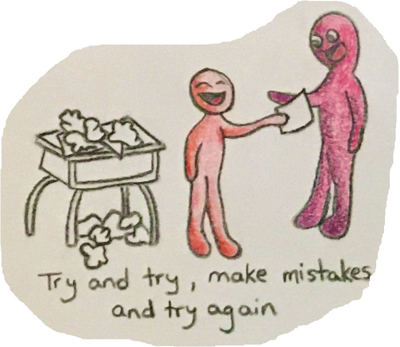
The last piece of my sketchnote I want to invesitgate in this reflection is the image of a student handing in a finished work to their teacher. Even though there is a pile of previous attempts and mistakes cluttering their desk, there is also a big smile on their face. The message I took away from Hinck’s article is that students have become afraid or ashamed to make mistakes, especially when making digital works. This may be largely due to template platforms offering easy-to-create cookie cutter works with little chance for experimentation and failure. The satisfaction of hunkering down, correcting errors and completing your work exactly how you envisioned it is lost on many students.

Perhaps if teachers focused more on the process of creating the digital work (or the process of completing schoolwork in general) rather than only acknowledging the finished work, students would be more enthusiastic and willing to try new things, experiment with new software and languages, and will be less likely to hide their progress and mistakes. This could also be accomplished if teachers showed students their own struggles with learning these new techniques.

On a side note, I took the article’s message to heart when preparing this blog post! I wanted the page to look a certain way, but the standard controls in WordPress did not include the formatting options I wanted. Luckily, this site also supports html code so I was able to move beyond the default setup of the website and customize it to look exactly how I wanted!

Digital Ghost: Don’t Be Spooked!

Hello world of Digital Technology & Social Media,

I choose to work with Ashley Hincks article “Digital Ghosts in the Classroom”. I choose to use Movavi Video Editor to create a video containing key concepts from the article.

To begin, Hincks’ article was an awesome read, I really enjoyed some of the concepts she chooses to isolate. In the article, she spoke a lot of creativity and how to incorporate that for all student. She used her digital pedagogy while portraying the concepts of templates and shortcuts which proves that students are used and familiar with step by step methods of direction. As this is being covered she hints that creativity is not being used and expressed by students as they simply follow templates and do not use other resources. Students follow templates to reassure success and that criteria are covered by what the teacher desires.

In Hincks article, she agrees that creativity is declined in schools and I can support that statement. having a teacher who was limited to digital technology for many reasons was a hindrance to my education. Not only did I not get the chance to create anything myself, but I never even got to see anybody work with technologies and spread creativity with youth in the purpose of education. Although throughout my education I have enjoyed simplistic work and getting familiar with important programs that are used in the field of work, I still would have liked to expand my creative instincts with technologies as I believe it can change someone’s decision on career choice. Personally, I am not great with technology but maybe I would have been with more exposure. Regardless, I feel for students who are technologically inclined and can excel as there are many careers in the field of technologies that do not apply to everyone and need specializations which would be achievable for them. As for a teaching standpoint, I will definitely encourage creative pathways and give opportunities for projects to be done online through digital technology applications.

Additionally, working with Movavi was a lesson in all, I challenged myself creatively and made myself a better computer person doing this. I learned key skills and expanded my technological knowledge. Movavi was limited however was easy to use and simplified a lot. The application was able to provide me with default setting and example to guide me through starting a video and from their creativity took the rest away. I enjoyed the fact that you could use many different technologies such as video and audio at the same time and in sync. This will help me bring creativity to every activity I do and allow me to effectively teach students.

Lastly, I will begin to incorporate technological ideas and creativity into the classroom. I believe it is crucial for students to have options and gain technological skills as the world is turning that way. I also realize that working hard on technological productions can be personally humbling, and can raise a major sense of pride amongst individuals. If a project can be rewarding to a student, I would rather they do it in that manner to inspire them to continue their life long education. I know that somehow my teaching will have the creativity and I will find many ways to incorporate it throughout many different pathways.

I hope you all enjoy the video/ slide-show voice over!

Lack of creativity: who’s to blame?

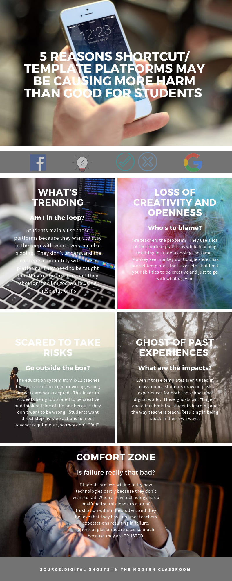
For this assignment I worked with Ashley Hinck’s article “Digital Ghosts in the Modern Classroom”. I chose to make an infographic using Canva. 

The main message the author portrayed from the article was that students only know the bare minimum when using these shortcut/ template platforms which can inhibit their creativity. When there is a lack of creativity this can lead to students taking less risks and just doing the bare minimum to follow with what the teachers’ expectations are. A lot of students want to step-by-step directions on how to succeed. These shortcut templates help with that because they are drag and drop methods and are easy to use. If students just complete what is asked of them, they’re less likely to “think out the box” to help enhance or open up their creativity side.

This led me to question teachers.  The author stated how teachers need to show students their own failures through trial and error.  Teachers are role models for students, they need to explore new technologies to present to their students to help enhance their learning. Of course, it’s easier to stay in your comfort zone and use the templates/platforms were all used to and trust, but where’s the creativity in that? Times are changing, there is frustration when using these new platforms and they may be more time consuming especially when learning how to use them, but I believe that more positives can come out of it. Students are so scared of being wrong because the education system have told us time and time again that wrong answer are not accepted. That alone tells students to play it on the safe side.  In the digital world there should be no wrong answers, students should see that failure can be a good thing and it leads to growth.

Never a failure always a lesson!

This was my first time using Canva. In my past experiences my teachers have used the more traditional platforms like PowerPoint, and that’s all I’ve ever used in my projects. I rarely had the option to show my creative side with a lot of assignments, especially when a lot of them are essays. Before I started using Canva I YouTube a tutorial, so I had an idea of what I was using.  It has multiple platforms you can use like presentations, social media (Instagram), poster, flyers, cards etc. I think it was easy to navigate and use, and everything is well organized and easily laid out. The big learning curve I had was although tutorials are great to get you started when learning new platforms, it’s really not the same until you start using the platform yourself. This platform was a little limiting when I was using it.  Since I was using the free version you’re limited to certain photos, templates, stickers etc. I found this limited your creativity a bit. It also gives you the option to start from a blank sheet or use a template.  Templates can be nice to start you off, but it’s frustrating when you’re stuck to a certain layout and can’t design anything the way you want it.

Overall, I fell in love with Canva. I’m slowly realizing that times are changing, students have a lot of behavioural issues. They need to be taught in a way that is engaging/ interesting so that you can help enhance their learning.  Since I’m going into the teaching profession these new digital platforms are something I will start adding to my practice.

Thanks for reading!

To Learn or Not to Learn: That is the Question

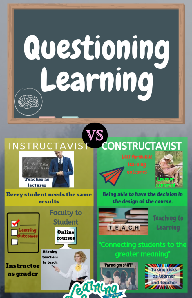
While I was listening to Chris Friends interview with Amy Collier, Questioning Learning, I noticed some major themes that developed while they spoke. Right away Collier began talking about this idea of Learnification. This got me thinking about how education really does have a divide. There are those that believe we need to focus solely on the student and their learning style, and those that consider it best if each student learns the same thing. Now I had to look up what learnification meant, and it is essentially where Gert Biesta believed that if we start to change education so that we are focusing more on the student, then the teacher will soon become obsolete. Teachers become useless in a new technological age where any question we could possibly ask has a readily available answer. Amy Collier, in her interview with Chris Friend, mentions,

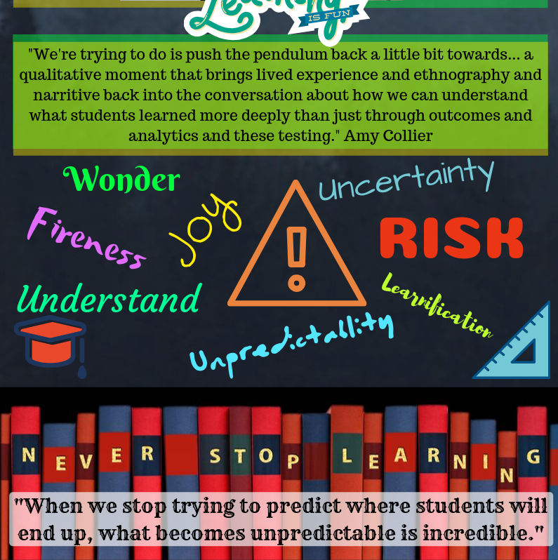
“What we miss is that learnification actually comes from the paradigm of kind of really individualizing education, putting it at the responsibility of the individual rather than kind of a community activity, taking away the relational context of faculty to student, that when you think about teaching has always kind of been there.”

Balance between knowing student and teaching.

On the other hand, you have educators that believe seeing the student and adapting the curriculum to suit them is what we really need to focus on. I think that it should not be more of one than the other. We need an equal balance of both types of logic. Within my own teaching I know that I often forget to follow the curriculum and instead focus more on what would be relevant and fun to learn. Sometimes I find myself “seeing the student” too much and not enough on what they are told to be learning. Being in Drama and English I often have more free rein on what I can teach my students, and I think that is what helps me to achieve the balance.

Education isn’t just about what the student should learn, but it’s also exactly about that.

Some words that really stuck out to me

Another major topic that they approached was the use of language in education. With a specific focus on the word “risk.” How “education is a series of risks” and we have to “embrace risk”. This was one concept that really resonated with me. Again, the balance between staying within the guidelines of what we have been afforded, while also taking risks. This is something that I find some teachers really struggle with achieving because they’re too afraid of getting it wrong, or not being liked by their students. Personally, I have been hearing the word “risk” a lot in education. I know that working with students who are “in-risk” often scares many teachers, but these are the students that I enjoy educating with the most. I enjoy working one on one with them because they are often the students that we can learn the most from. They are also the most rewarding. Working with these students in my undergrad has really made me realize that this is the type of student that I want to continue to learn from.

While I was making my artifact I tried to really capture the sides of education that Friends and Collier were discussing. I was originally going to make a video, but I was struggling with how to capture what I was thinking onto the video. I then looked at other mediums to use and landed on the infographic. This was the perfect way that I could capture what I visually imagined while listening, and how I gathered the information. I decided that the infographic would capture the essence of the podcast more, so this is the final product.

This is my infographic. I had to divide it into two images so that you could see the full image without it being blurry.