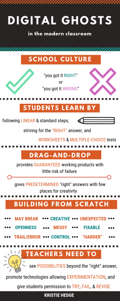
For this multimedia reflection piece, I chose to reflect on Ashley Hinck’s article “Digital Ghosts in the Modern Classroom”. To portray her main ideas, I made an infographic using Canva.
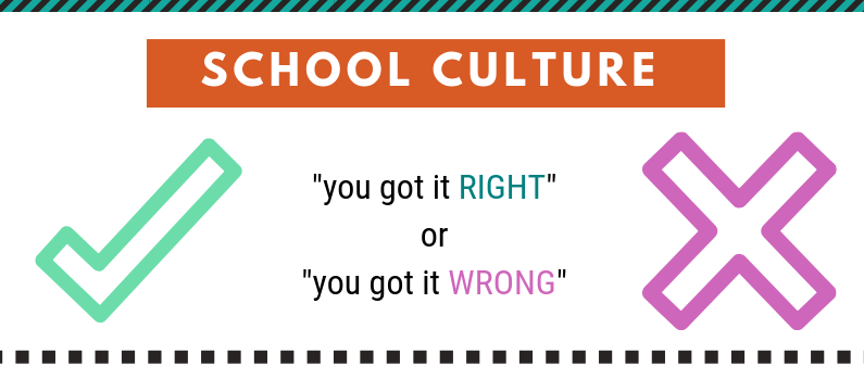
Very often in schools there is a focus on two things: the “right” answer and the “wrong” answer. By teaching and testing students in the form of worksheets and multiple-choice tests, they are not able to discover their own creativity. I acknowledge that sometimes one “right” answer is required, but there are many other opportunities where students are missing out on expressing their creativity. When I was younger, a lot of teachers used worksheets and multiple-choice testing forms and I think it becomes a sort of security blanket because they know what to expect. Branching out to new, creative teaching ways is scary at first, but the students can really benefit from it.
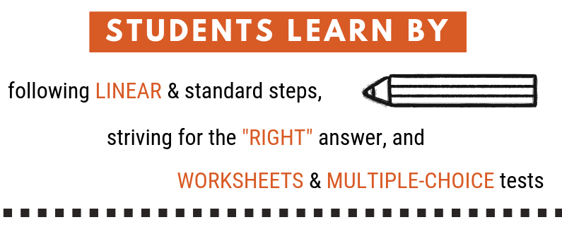
Students learn following linear, standard steps that lead them to one answer; the “right” one determined by the teacher. These students are more concerned about getting to that final answer that they forget, or just don’t have the opportunity, to be creative and to learn something new through trial and error exercises.
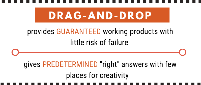
Hinck discusses some of the issues regarding the use of technology platforms that are available to students. She talks about how drag-and-drop platforms hinder students’ creativity because of all the templates that are available on them. These platforms would include Google slides and Canva, for example. By using them, students are guaranteed a working product at the end, with little risk of failure. The templates act as the “right” answer and don’t allow students to organize their information in their own ways.
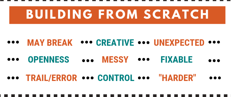
When coding something on your own using HTML and CSS, for example, there are “errors” that can be made and problems that will have to be troubleshooted along the way. These templates can often lead students to present their information in a certain way, and they can also restrain students due to the chosen template. The process may take longer, look messier, and be unexpected, but the results will be creative, the students will have total control over what is shared, and there won’t be a focus on a “right” answer.
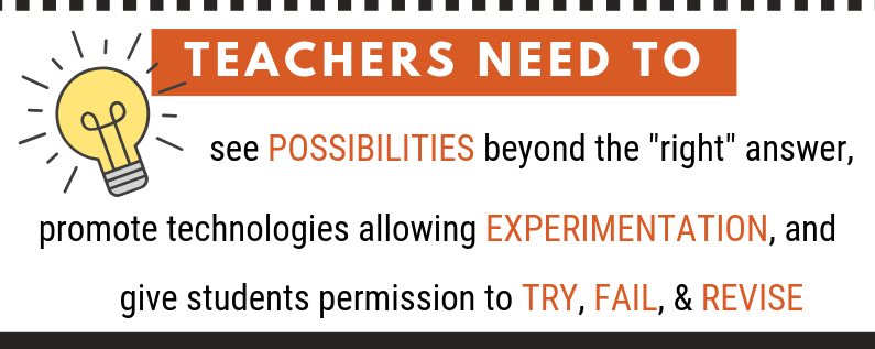
As teachers, we need to eliminate the “ghosts” in our classrooms by giving students the opportunity to show their creativity through the experimentation of technology. We need to acknowledge all the possibilities. As role models, we should be encouraging and giving students permission to “try, fail, and revise”, and to make it a learning experience for everyone, not just the students.
For my artifact, I decided to use Canva to try and prove the point made in Hinck’s article. After receiving this assignment, I read through the article, made notes, and went on to pick a template on Canva. I think I spent a good thirty minutes, almost as long as it took me to gather my information, to decide on a template. There were many things to consider as I was trying to pick which one would fit the information I wanted to present to my audience. The drag-and-drop feature allowed me to insert text boxes and images, and although I changed the information on the infographic, I kept to the overall theme and format. If I had to design my own infographic from scratch, I don’t think it would look like the version below. Although this one is effective, it didn’t allow for very much creativity on my end. Going forward, as a teacher, I want to incorporate these ideas into my own classroom. I think that it is important for students to be able to express their ideas in their own creative ways.
#uwindig
