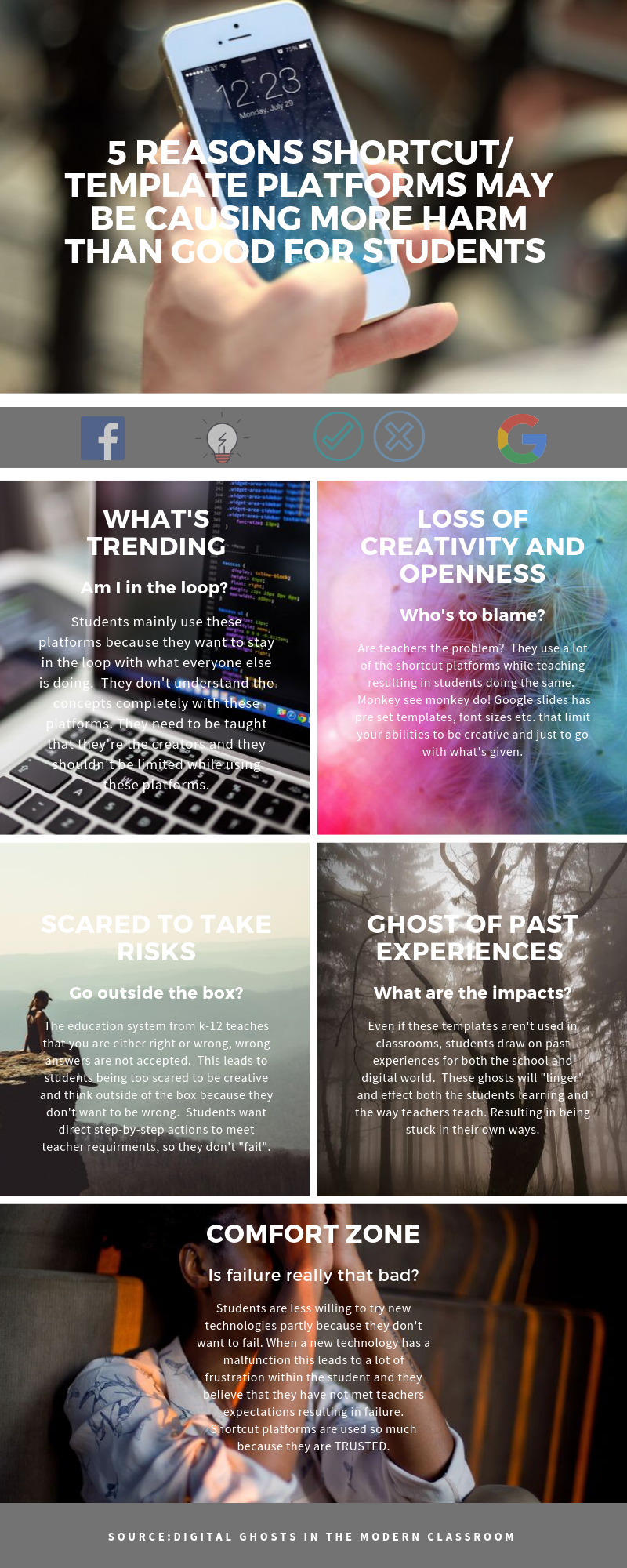
For this assignment I worked with Ashley Hinck’s article “Digital Ghosts in the Modern Classroom”. I chose to make an infographic using Canva.
The main message the author portrayed from the article was that students only know the bare minimum when using these shortcut/ template platforms which can inhibit their creativity. When there is a lack of creativity this can lead to students taking less risks and just doing the bare minimum to follow with what the teachers’ expectations are. A lot of students want to step-by-step directions on how to succeed. These shortcut templates help with that because they are drag and drop methods and are easy to use. If students just complete what is asked of them, they’re less likely to “think out the box” to help enhance or open up their creativity side.

This led me to question teachers. The author stated how teachers need to show students their own failures through trial and error. Teachers are role models for students, they need to explore new technologies to present to their students to help enhance their learning. Of course, it’s easier to stay in your comfort zone and use the templates/platforms were all used to and trust, but where’s the creativity in that? Times are changing, there is frustration when using these new platforms and they may be more time consuming especially when learning how to use them, but I believe that more positives can come out of it. Students are so scared of being wrong because the education system have told us time and time again that wrong answer are not accepted. That alone tells students to play it on the safe side. In the digital world there should be no wrong answers, students should see that failure can be a good thing and it leads to growth.

This was my first time using Canva. In my past experiences my teachers have used the more traditional platforms like PowerPoint, and that’s all I’ve ever used in my projects. I rarely had the option to show my creative side with a lot of assignments, especially when a lot of them are essays. Before I started using Canva I YouTube a tutorial, so I had an idea of what I was using. It has multiple platforms you can use like presentations, social media (Instagram), poster, flyers, cards etc. I think it was easy to navigate and use, and everything is well organized and easily laid out. The big learning curve I had was although tutorials are great to get you started when learning new platforms, it’s really not the same until you start using the platform yourself. This platform was a little limiting when I was using it. Since I was using the free version you’re limited to certain photos, templates, stickers etc. I found this limited your creativity a bit. It also gives you the option to start from a blank sheet or use a template. Templates can be nice to start you off, but it’s frustrating when you’re stuck to a certain layout and can’t design anything the way you want it.
Overall, I fell in love with Canva. I’m slowly realizing that times are changing, students have a lot of behavioural issues. They need to be taught in a way that is engaging/ interesting so that you can help enhance their learning. Since I’m going into the teaching profession these new digital platforms are something I will start adding to my practice.

