After reading Ashley Hinck’s Digital Ghosts in the Classroom, I decided to try my hands at a sketchnote. Since this is my first time attempting something like this, I thought I would start with a medium I was most comfortable using: traditional pencil and paper!
One obstacle with drawing traditionally is once the mark is down on the page, it can be very difficult or nearly impossible to remove it, especially when using permanent inks and pencils. This means that a fair amount of time should be set aside to sketch out a rough copy to plan out how the space on the page can be used effectively. In my case, I made three rough copies before committing to a final version which was a bit time-consuming. Another drawback for me was creating the digital copy of my drawing. I used a large piece of paper for my final piece; a piece of paper that did not fit in my scanner! Unfortunately, all the lights in my house have a warm, yellow tinge to them which muddies the colours of the drawing when taking its photo. I tried to use some colour correction after taking the photo, but computers are just tools, not miracle workers.
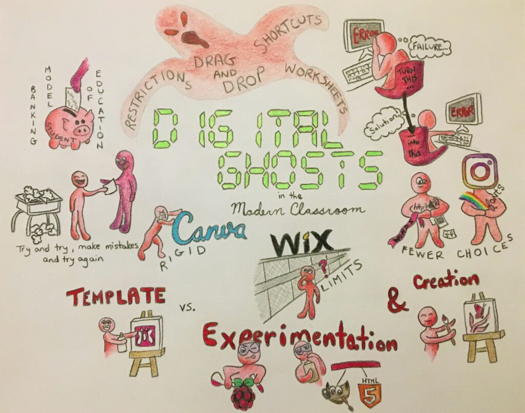
Enough with my struggles, let’s talk about the process of making this sketchnote. It was my hope that the article’s title would be the focal point of the drawing. By selecting a very vibrant green for the lettering similar to what people may see on their own digital clock at home and using red (green’s complementary colour) for nearly everything else in the drawing, the intent was to have the words “Digital Ghosts” really pop out. I would like to note that I wanted the product and corporate logos to remain as close to their official colours as possible so they were spared the red touch! Finally, it is probably obvious that my sketchnote relies heavily on drawings more than words to get the points across. I wanted to focus more on the sketch part of the sketch note!
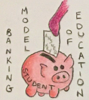
Hinck discusses a shortcoming that has appeared in her classrooms recently: a lack of enthusiasm in her students when building digital artifacts of their own. She brings up the banking model of education that she fears is still being instilled into students today; the idea that students are simply containers to be filled with answers. It was this statement that gave me the idea to draw her thoughts and ideas as little cartoons. In this illustration, someone is filling the student piggy bank with an answer key.
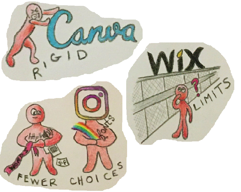
Hinck mentions several platforms that she believes contribute to students’ reluctance to learn digital skills from scratch. Platforms such as Instagram, Canva and Wix are some of the drag-and-drop websites that add to many students’ preconceptions of how to make anything digital. By providing pre-made templates, these websites hinder creativity since filling out a template can be much easier than designing your own format. The final piece may not come out looking exactly as planned and can lack originality due to the limitations imposed on users. I chose to focus on three of these platforms (though I drew rough sketches of a few others that did not make the cut to the final sketch including Facebook, Snapchat and GIPHY.)
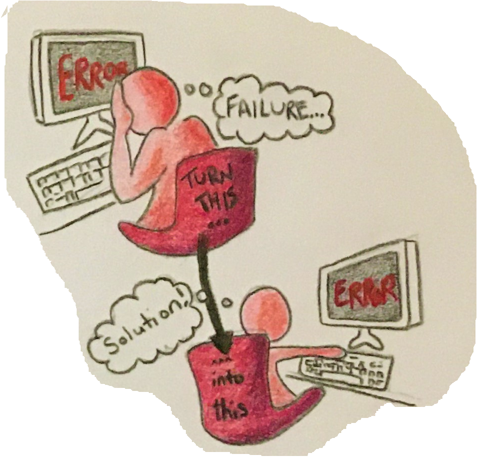
The article mentions that some students feel very discouraged when they are confronted with difficulties and errors when learning how to format their own digital works without the aid of the template platforms. To drive home the idea that a mistake need not be a reason to quit, I thought of two images: a person despairing with the old fashioned head-in-the-hands pose we’ve all probably felt at some point in our lives (or possibly at some point while completing this assignment!) and a person continuing to work through their difficulties.
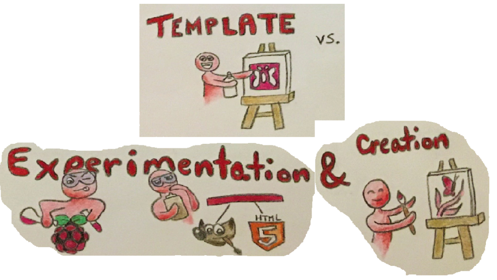
I made this set of images to show the limitations the template platforms place on creativity. The student in the top image is pleased that the stencil (or template) they are using will produce a butterfly (or a program/website) on the canvas, though it will be fairly basic-looking. The bottom two images has the student experiment with different hardware (Raspberry Pi), software (GIMP) and languages (HTML5) to create a much more customized and original work.
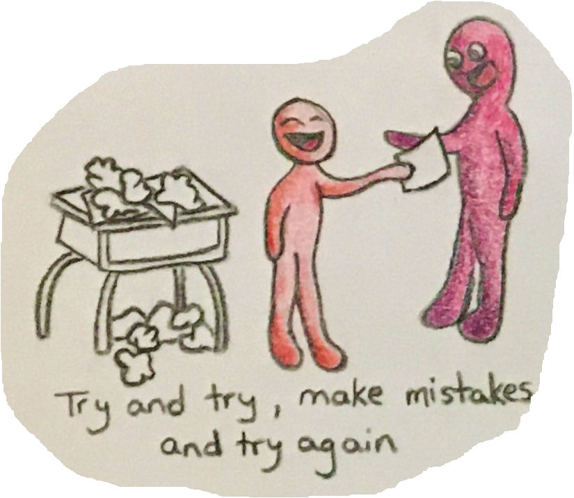
The last piece of my sketchnote I want to invesitgate in this reflection is the image of a student handing in a finished work to their teacher. Even though there is a pile of previous attempts and mistakes cluttering their desk, there is also a big smile on their face. The message I took away from Hinck’s article is that students have become afraid or ashamed to make mistakes, especially when making digital works. This may be largely due to template platforms offering easy-to-create cookie cutter works with little chance for experimentation and failure. The satisfaction of hunkering down, correcting errors and completing your work exactly how you envisioned it is lost on many students.
Perhaps if teachers focused more on the process of creating the digital work (or the process of completing schoolwork in general) rather than only acknowledging the finished work, students would be more enthusiastic and willing to try new things, experiment with new software and languages, and will be less likely to hide their progress and mistakes. This could also be accomplished if teachers showed students their own struggles with learning these new techniques.
On a side note, I took the article’s message to heart when preparing this blog post! I wanted the page to look a certain way, but the standard controls in WordPress did not include the formatting options I wanted. Luckily, this site also supports html code so I was able to move beyond the default setup of the website and customize it to look exactly how I wanted!

