Monthly Archives: September 2019

Ready to Learn? Not yet…

I chose to listen to the podcast of Amy Collier being interviewed by Chris Friend.
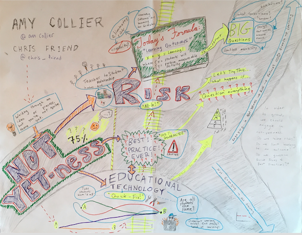
This image is a sketchnote summarizing a podcast by Amy Collier and Chris Friend. It discusses Collier's idea of "not-yetness" as it intersects with educational technology, questioning best practices, taking risks, and learning outcomes. The sketchnote is set up with the idea of "not yetness" being like a vehicle that is waiting for a train to pass by. Cars of the train include ideas on educational technology, best practices, risk, and learning outcomes. The learner is placed in the vehicle of not-yetness, and their level of engagement with these ideas either allows them to stay the same (by not engaging with these ideas) or to grow (by integrating these concepts into their learning).
This image is a sketchnote I composed summarizing a podcast by Amy Collier and Chris Friend. It discusses Collier’s idea of “not-yetness” as it intersects with educational technology, questioning best practices, taking risks, and learning outcomes. The sketchnote is set up with the idea of “not-yetness” being like a vehicle that is waiting for a train to pass by. Cars of the train include ideas on educational technology, best practices, risk, and learning outcomes. The learner is placed in the vehicle of not-yetness, and their level of engagement with these ideas either allows them to stay the same (by not engaging with these ideas) or to grow (by integrating these concepts into their learning).

This project was quite the learning experience for me! A little bit about my process: I had decided to reflect on the podcast, since it was a learning experience for me different from summarizing an article. I initially wanted to do a video response, but decided on the sketchnote because it was something new that I could try… I had watched some sketch-noting in the past, but never thought I’d be “able” to do that. So I channeled my inner Amy Collier and put the idea of not-yetness to the test!

picture of laboratory test tubes
https://www.pexels.com/photo/laboratory-test-tubes-2280549/

I decided to map out the ideas as they stood out to me. There was a wealth of information covered in the 40-minute interview, but what I have outlined in my sketchnote is what I found to be the key take-aways. First off, the concept of not-yetness was the main theme, and then I decided to create a railroad track with the other ideas as they relate to not-yetness in learning… more specifically, educational technology, “best practices”, risk-taking, and learning outcomes.

map with coffee cup on it
https://www.pexels.com/photo/white-ceramic-cup-on-map-2678301/

When reflecting on the content of this podcast, I was reminded of some fantastic music teachers I’ve had the opportunity to learn from. Their mantra’s of “failing forward” and “progress over perfection” combined with a proposal-based-experiment approach to learning were real-life examples of the idea of not-yetness. In these learning environments, failing is used as a tool to learn from, not-yetness is embraced as progress instead of perfection, and risk-taking and learning outcomes are combined in a way that enhances exploration, curiosity, and creativity.
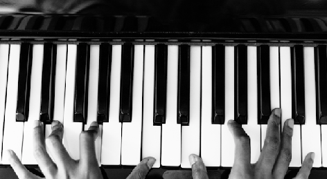
person playing piano
https://www.pexels.com/photo/person-playing-piano-1288489/

I think the concepts outlined by Collier lead to an active participation of risk-taking students, who build confidence by taking action and doing something. This type of learning trains students for the real world. I don’t know about you, but I’m faced with decisions regularly that I feel I’m “not-yet” able to handle, or that I don’t have all the information I need to decide the “best course of action”. These decisions provide me with an opportunity to take a risk – to experiment, grow, and learn –  or not to take a risk. Taking that risk and engaging in not-yetness allows me to grow and learn from situations so that in the future I have more knowledge and experience to base my decisions off of. But if I don’t engage in not-yetness, I just say, “No, not yet…” I risk staying in the same place – not growing, not taking risks, not evolving, and not reaching my full potential.

light bulb in though bubble
https://www.pexels.com/photo/analysis-blackboard-board-bubble-355952/

As a lifelong learner, I am glad I chose to represent this podcast as a sketchnote. I know it’s not perfect, but I wanted to experience Collier’s concept of not-yetness and taking a risk in order to learn something new. Thanks for reading!

-TG

Will Creativity Be Haunting Our Classrooms Next?

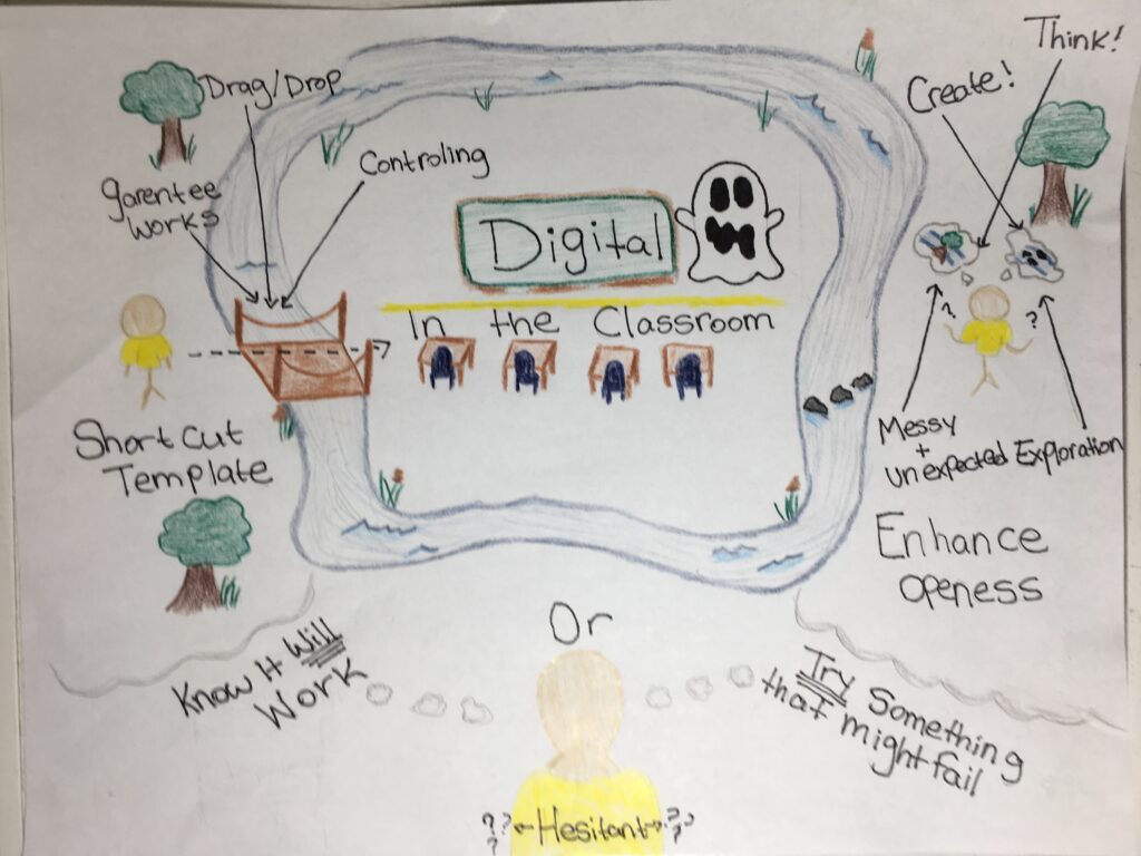
I read Ashley Hinck’s Digital Ghosts In The Classroom http://hybridpedagogy.org/digital-ghosts-modern-classroom/ and I decided to create a sketch note to showcase my findings. I chose to do a sketch note focusing on pictures because I am a visual learner. This article is so fitting to this project because we were given plenty of creative freedom. 

image of empty classroom with a ghost

The article was based around the different types of technological tools used in classrooms. The first tool is the standard ‘drag and drop’ software and the second tool is softwares that allow you to create. However it goes way beyond these softwares, in schools today the ability for creative freedom is lacking. We are teaching students the material the curriculum says the need then send them off into the world, and in the real world there is never just one right answer. 

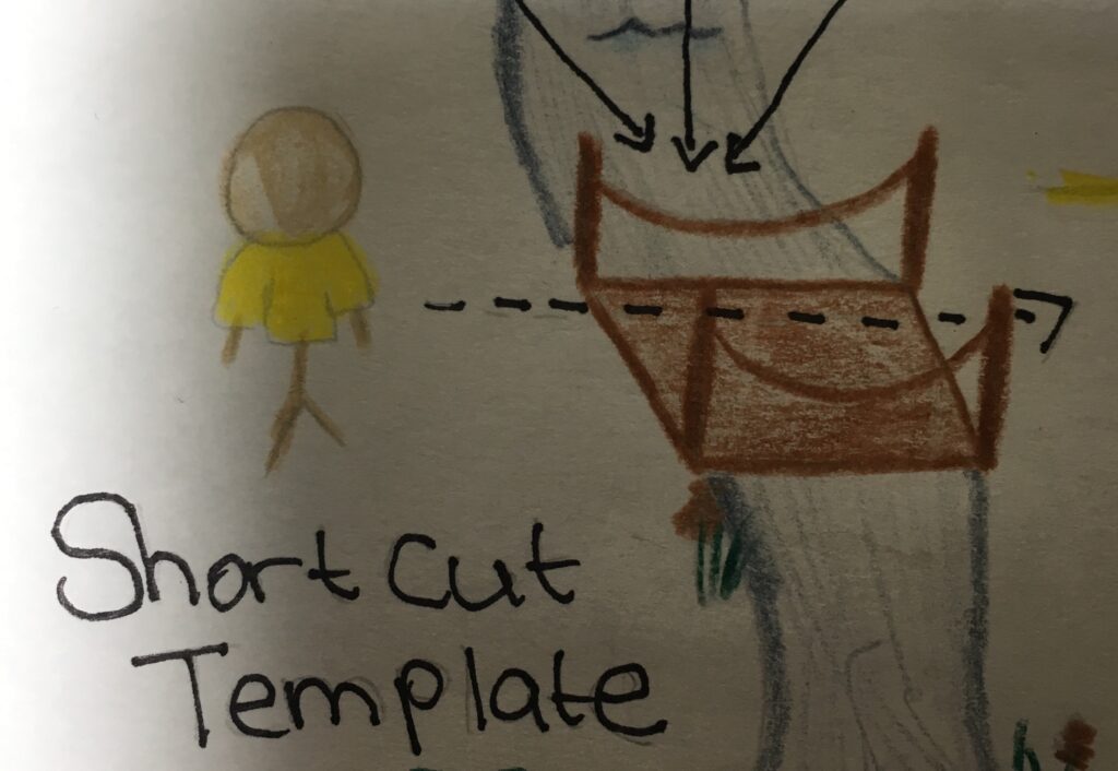
The problem with the ‘drag drop’ softwares is that there is no room for exploration. These softwares give students boxes and expect them to fill it with the information. It is almost like those fill in the blank sheets you would do in elementary school. This leave no room for exploration or creativity. However, a good thing about this format is that you know your end product will always work. That you will get from point A to point B. This format can be intriguing for students because it is simple and they know the end product will be successful. These softwares have more control than the student creating them.The student just adds what they want and the software decides where it goes. Some students might not be bale to make these decisions themselves, so having the software control it makes the student more comfortable. This is still lacking a lot of room for creativity. 

Stick figure about to cross a bridge over a river

Schools are really just trying to force all the curriculum information into the students brains and this does not really give them any room for exploration.  When teacher are too focused on getting the work done they leave out the importance of creativity and exploration. Teachers give the students tests to fill in all the information they are meant to know and that is all. This can work for some students, but some students, like myself, do not do well with fill in the blank tests. I always find that the fill in the blank tests could have multiple answers for one question. That is another thing teachers are doing they are forcing students to have the ‘right’ answer. This scares me because in the real world there is no ‘right’ or ‘wrong’ answer. Giving students the ability to explore gives them multiple answers to one problem. As students try these answers they found they will soon realize that some might not work, and that is ok. Creativity lets them explore multiple ways to get a ‘right’ answer. And not all ‘right’ answers are the same.  

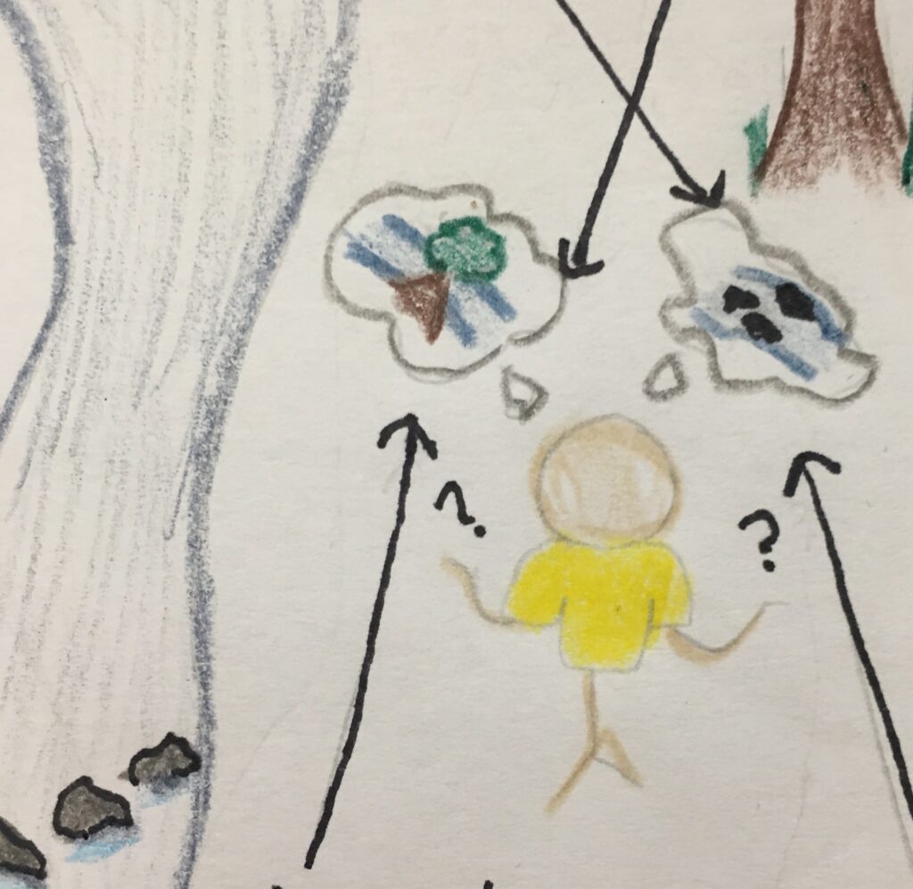
Stick figure with thought bubbles with ideas how they can cross the river

Success is something that every student strives for, but how they achieve it is a completely different story. As said above, most students will feel more comfortable going the ‘drag drop’ method, whereas few others will go out of the comfort zone and try to create something new. Why do humans gravitate more towards the ‘drag drop’ choices in life? It is a fear of failing. Ever since we were in school we were told that failing is bad, that getting that F on a paper is a shame. But failing is such an important part of learning. No one is going to be perfect and master whatever they are doing on their first try, instead it takes many attempts. In the classroom students are scared to fail because all they have ever been taught is failing is bad. As a future educator I hope to be able to create a space classroom where my students feel completely comfortable to try new thing and be open to failure. Because when you fail you might unexpectedly end up creating something great. 

Stick figure is looking at both options

Lastly, I feel it is so important for us as future educators to start encouraging creativity in schools, or else the next generation will be reading an article about the creative ghosts that haunt the classroom. 

Ghosts in the Classroom!?!

My sketch note of the “Digital Ghosts in the Modern Classroom” article written by Ashley Hinck.

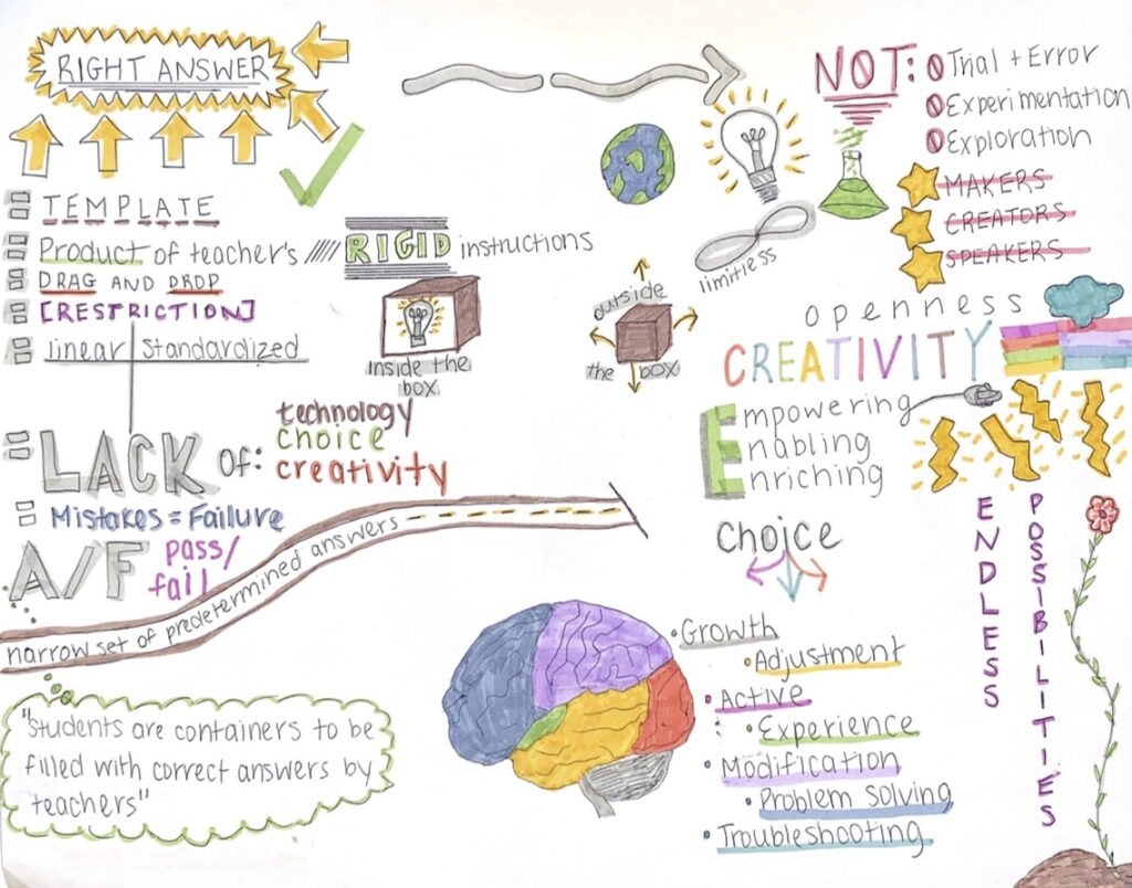
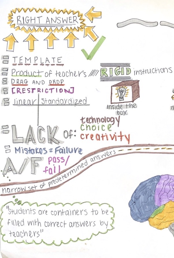
I chose to read Ashley Hinck’s article titled: “Digital Ghosts in the Modern Classroom”. I also decided to create a sketch note to visually portray the main ideas and points in the article as well as to show relationships of concepts. I started my sketch note in the top left corner with “right answer” printed in a large font with bright yellow colouring surrounding it. I chose to begin my sketch note this way because the concept of “right answers” was an important theme in the article. Hinck explains that a “right answer” is a structured element and a product of the teacher’s rigid instructions. This leads to assignments having essentially the same characteristics: drag-and-drop, templates, lack of technology, lack of choice, lack of creativity. Hinck describes that this is due to teachers portraying that there is, “a narrow set of predetermined correct answers” (Hinck, 2018) which leads to linear and standardized answers as well as a restricted possibility of right answers. These ideologies are all shown on the left hand side of my sketch note. 

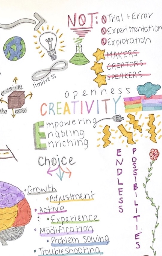
The opposite side of my sketch note shows the opposite view of predetermined correct answers. It involves teachers encouraging students to be makers, creators, and speakers. Furthermore, it inspires trial and error, experimentation, and exploration. This way of thinking inspires creativity, choices for students and an endless possibility of correct answers for students. This view of learning and evaluation empowers, enables, as well as enriches the learning experience of students. 

Personally, I have always been a visual person who learns best using visual strategies and tools, however, I have rarely had the opportunity to submit an assignment in a way that is able to heighten my learning and understanding. High-graded assignments are normally those that provide in-depth explanations of concepts and ideas, but are rarely those that provide visuals or demonstrations because these strategies are harder to place on a grading scale.

Finally, I would like to explain my reasoning for placing the quote, “Students are containers to be filled with correct answers by teachers” (Hinck, 2018) on the bottom left hand corner. This quote sums up the main idea of the article which is that right answers are limited and restricted to non-creative tasks that do not involve experimentation, exploration, or trial and error. Having a narrow set of “predetermined correct answers” limits creativity, choice, and openness of students. I agree with Hinck’s point of view and will try my hardest to ensure that I am not continuing the trend of narrow set of right answers when I become a teacher. I will always try to keep things new and exciting in my classroom by introducing educational technologies, creative assignments/projects, as well as differentiated evaluation to encourage experimentation and exploration.

You Can Be A Ghostbuster… Read this Blog Post to Find Out How

I created an interactive sketchnote to represent ideas presented in Ashley Hinck’s ““Digital Ghosts in the Modern Classroom”.

Interactive Sketchnote of Hinck’s “Digital Ghosts in the Modern Classroom”

Hinck presents three main ideas involving the use of shortcut and template platforms in modern classrooms. She first discusses how these templates “make making easier”, as no technical knowledge is necessary to producing a final product. Some of these platforms include Canva, Google Slides, and WIX. Students have adapted to following series of linear, standardized steps with guaranteed products at the end and little risk of failure. This is dangerous. This method does not require open-endedness, exploration, and discovery. Shortcut and template platforms can be compared to worksheets, as views of students being containers to be filled with correct answers are reinforced.

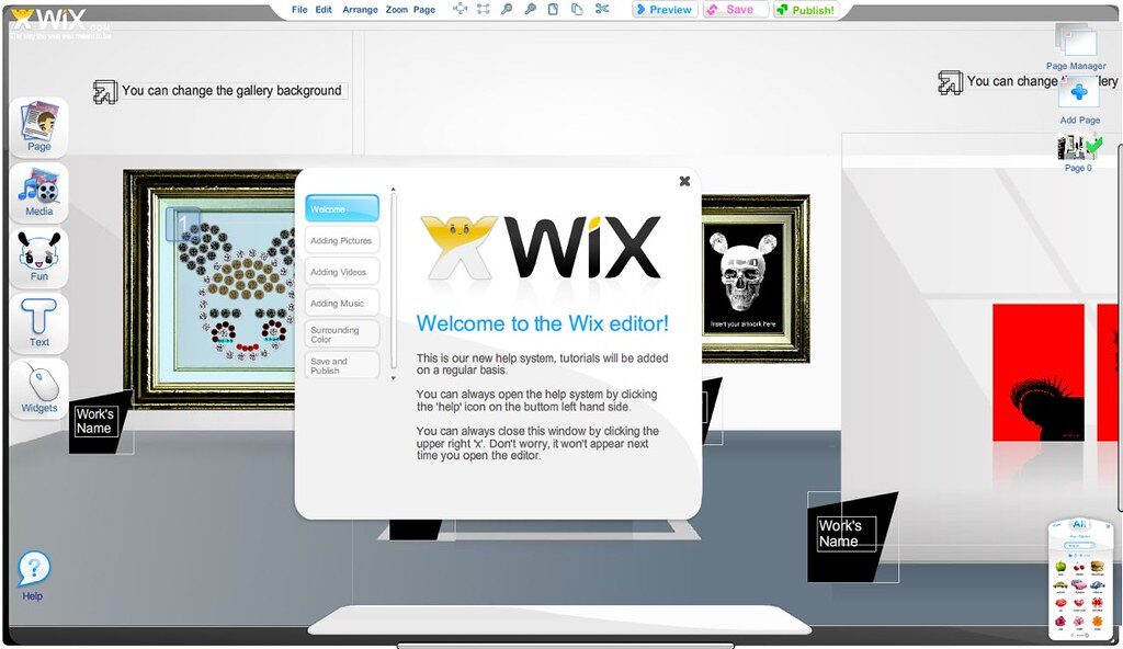
WIX is a digital template platform, well-known for its drag-and-drop, step-by-step features.

Hinck also states that worksheets, templates, and shortcuts have lingered, like ghosts, in the working mentalities of students. Students are influenced by their past experiences: following linear steps with clear end goals. Many individuals do not expect the difficulties and messiness associated with digital media making. This consequently affects their confidence as creators and decision makers. Their focus should be centered in problem-solving, rather than if they “got it” or “got it wrong”.

You have the power to banish these ghosts within your own classroom. You can be a ghostbuster!

So how can you banish these ghosts and dislodge expectations that students have attained through past experiences with worksheets, templates, and shortcuts? Hinck suggests that you can give students permission to try and fail. She also suggests that teachers enable discussion where students can compare and contrast making experiences inside and outside of the classroom. Analyzing the limits and possibilities of different platforms can also banish these digital ghosts.

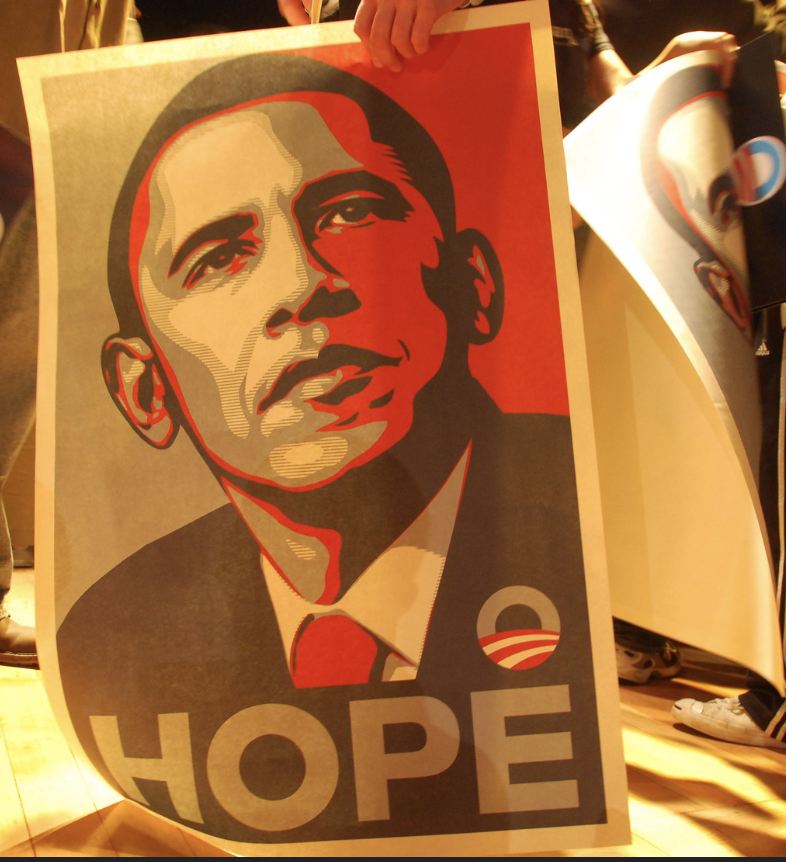
Hinck used the Barack Obama “Hope” poster as an example for analyzing the limits and possibilities of different platforms. “Could this poster have been created using Canva?”

This article helped me gain perspective on shortcut/template websites and platforms and their effects on education and the creative process. While reading the article, I reflected on my own experiences creating digital media on these platforms. As a musician, I have used many of these platforms to create advertisements for myself and my projects. Bandzoogle is a “Drag-and-drop” website maker that resembles WIX. The platform is specifically tailored to musicians and bands. This website enabled me to easily and neatly present information about myself and my product; however, there were limited opportunities for me to make my page distinctive amongst the pages made by other musicians using the platform. The implications of this issue could be dangerous in educational settings as it promotes conformity and standardization.

Worksheets, Templates, Shortcuts = The Box

Inspired by the ideas written in the article, I wanted to incorporate another dimension to my artifact. A sketchnote does not have many limitations to what students can creatively produce. I am not a strong illustrator; however, I love thinking “outside the box” in terms of presenting information. The interactive component of this artifact provides more opportunity for differentiated learning experiences, as students can see and feel the ideas written by Ashley Hinck.

Madeline Doornaert

Tagged

You Won’t Believe What Exists in Classrooms Today!

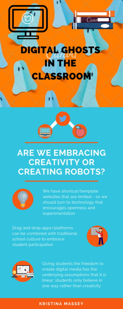
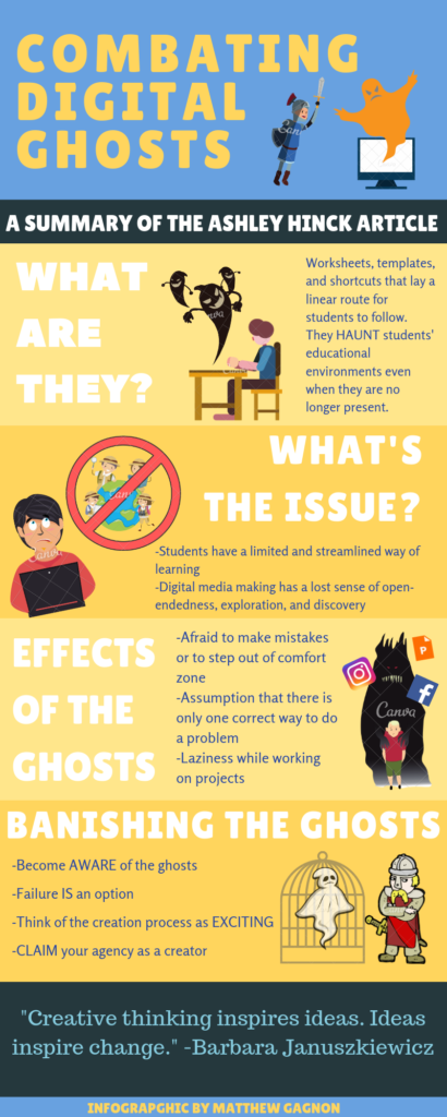
For this assignment, my infographic is based off of Ashley Hinck’s Digital Ghosts in the Modern Classroom. Hinck raises the argument about class structure and missing technologies from classrooms. Digital skills are becoming an increasing importance for jobs – and today’s students know this.

The above question is crucial to our classrooms. With the given class structure, students today are still experiencing what I did years ago. The same assessment after assessment to the final exam. Some students (like myself) found comfort in the rigid structure while those more creative struggled with this concept. Are we embracing creativity or creating robots to “drag and drop in a rigid structure to achieve a static goal?” (Lee Skallerup Bessette). Hinck, argues that we are potentially risking students creating something else envisioned or they learn to create, compose and make. (2018).

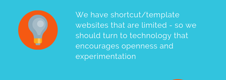
The major drawback from digital media in today’s society is the limitation of creativity. However, the ease and practicality of such websites have the appeal. Today’s teachers stray away from new digital technologies in their classrooms. We are still very comfortable using PowerPoint or Prezi. Hinck wants us as educators to switch from Canva to Photoshop or Gimp, since the assumptions (templates) under Canva are thriving. We can barely embrace creativity in scenarios like this.

Now that begs the question, should we leave these classics behind?

Technology was accessible during my time as a student, but no where near it is today. I feel that tradition is to blame. Once teachers find which technologies work for them (and not necessarily digital!), they tend to stick to it. Comparing my math classes in high school to the current digital technologies available, I will try to incorporate some of these in my practicum. We are still missing some technologies from the classroom, such as platforms and websites. We should be making students creators, makers and speakers. After all, they are our future.

Students draw on past experiences from school and the digital world in their personal life. Student teachers will also draw on past experiences in their classrooms. The linear thinking towards digital technology is a generational thing. We want to stray away from the linear thinking and make it abstract. Students are hindered by their own thoughts of failure. One way we can curb this is to show them our own failures. Give the students permission to try and fail and revise. They can collaborate to try to figure out what went wrong, instead of being afraid of being wrong. We all need to step out of our comfort zones – including me. Creativity is not my strong suit but I am glad I was able to create this Canva infographic.

All images supplied by Canva.

Overall with this assignment, it was my first time using or even hearing about Canva. I thought it was quite ironic for me to use a template website to complete my infographic. I can personally relate to the linear way of thinking opposed to creativity. I actually made two different infographics; the first one following a rigid template with very little room for my own input. This infographic I am sharing with you today is still supplied from a Canva template, but I found more creative identity with this one. Thanks for reading!

Taking Risks in the Classroom

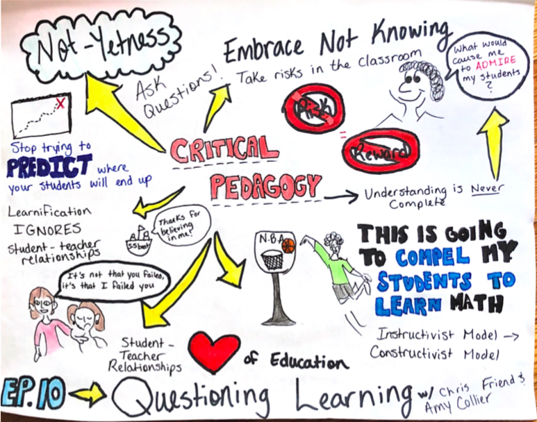
For my multimedia reflection, I chose to listen to Chris Friend’s podcast titled Questioning Learning featuring Amy Collier. I was immediately interested in Collier’s idea of Not-Yetness, and how integrating critical pedagogy in the classroom is beneficial for the long-term success of students.

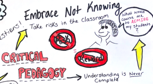
First of all, let me just say that drawing this sketchnote was very much out of my comfort zone; I’m not very artistically inclined, but I am a visual learner, which is why I thought this would be a good fit. In the centre of my sketchnote is the idea of critical pedagogy, this is what Collier describes as “the notion of asking questions and being comfortable asking questions, to embrace not always having clear answers”.  Embracing the fact that you don’t know everything there is to know about the subject you’re teaching creates a safe environment where students are in control of their learning. It allows us, the teachers, to take risks in the classroom. No risk, no reward, right?

Adding onto the idea of “embracing not knowing” is Collier’s idea that Understanding is Never Complete. There are always new concepts to learn, and information that can be added onto what you already know. 

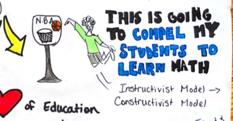
My favourite part of the podcast was when Collier gave the example of the math teacher who played a video of him standing on a basketball court holding a basketball, aiming for the hoop. He launches the basketball and then stops the video, while the ball is halfway through its arc. His students immediately ask, “Did he make it?” This creates a sense of uncertainty and curiosity. This math teacher isn’t saying “My students are going to learn this formula”, he’s saying “This is going to COMPEL my students to learn”. I chose to colour “compel students to learn” in a different colour because I believe that this is an idea that should be integrated into every subject we teach. Making students want to learn is the most efficient way to get them to learn.

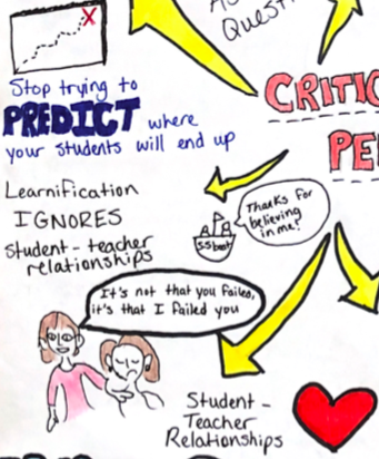
Another idea Chris and Amy bring up throughout the podcast is the idea of learnification, and how when you exclusively use an “instructivist model” in your classroom, you tend to lose the student-teacher relationship; which really is the heart of education. I’ve always believed that learning in the classroom should be focused on the learner, aka a “constructivist model”, and that when we stop using learning outcomes as a “map” and saying things like “all students should be at the exact same place by the end of my lesson” amazing things tend to happen. It’s not about a measurable outcome, rather, it’s about asking yourself “what could my students know at the end of the semester that would make me happy? That would make me admire them?” 

In conclusion, Collier and Friend talk in detail about critical pedagogy and how to incorporate it into everyday teachings. The idea of creating a comforting classroom environment is very important to me, as I know how important that can be for a middle/high school student. Being a teenager is tough, and I want to make sure I can create a happy environment where my students feel supported and excited to learn.

Why are there Ghosts in my Classroom?

I decided to do my assignment on Ashley Hinck’s “Digital Ghosts in the Classroom” article. This article focuses on the lack of creativity coming from students when it comes to Digital Pedagogy due to how they are taught in the school system. It talks about the fact that students are so afraid of failure, that they will not try something new or more challenging. For this assignment I decided to do a sketch note. I wanted to challenge myself. I usually stay away from anything pertaining to art, but I wanted to try something new.

Image

The first topic I decided to add was the fear of failing and the process of just dragging and dropping. The Article explains how students always think to do the assignment that will be less creative, but will give the teacher what they want. Students are taught throughout their education that doing simple drag and drop tasks will get you the top marks. I put the logos of Facebook and Canva. Ashley Hinck goes into detail about how Canva and Facebook work together to bring the users a easy drag and drop experience. This makes people put aside their creative side and take part in a simple user experience that these platforms provide.

Image

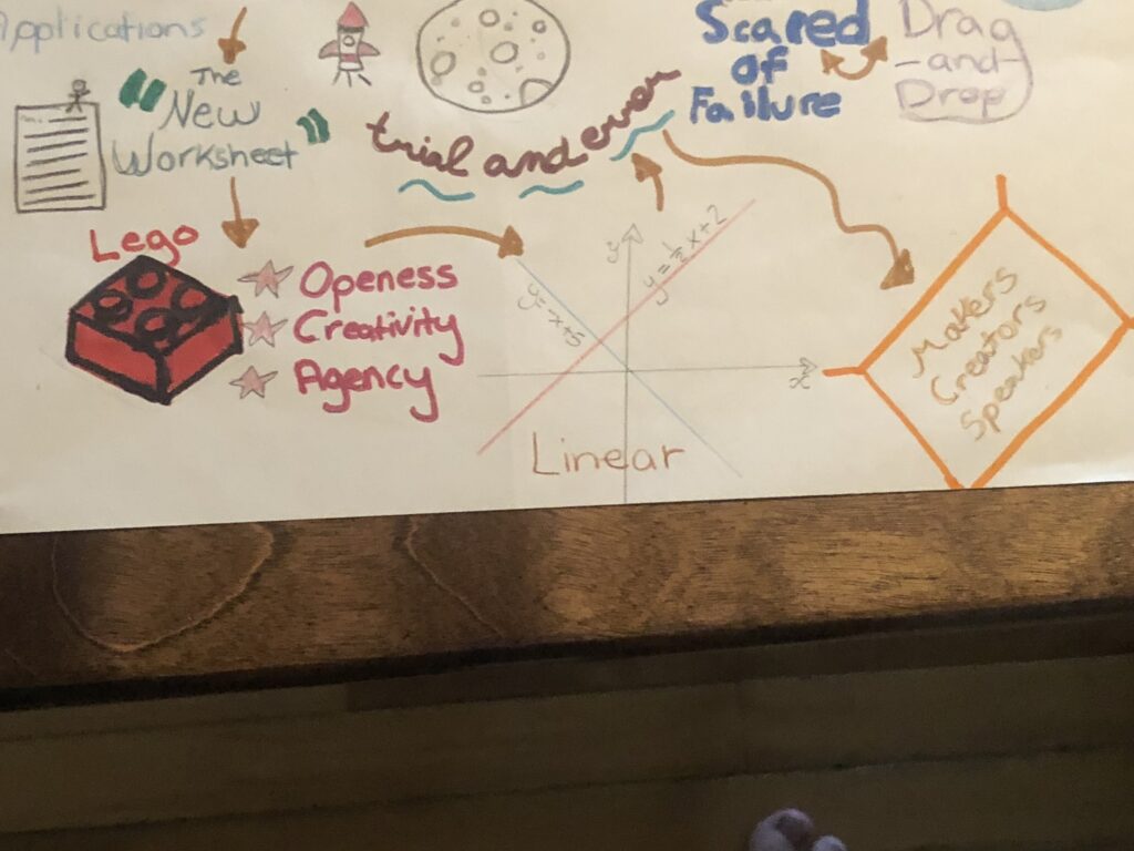
The next topics I visited were the amount of potential from no limit applications, the idea of “The New Worksheet” as Hinck calls it, and the importance of trial and error. The idea that people have so much potential when they use more complex applications, instead of drag and drop apps that they usually use. “The New Worksheet” idea looks at how the basic digital projects that students know well, is like giving out an old fashion worksheet. Like a worksheet, there is no creativity in a linear digital project. I put trial and error because the article expresses the important process of trying, failing and getting it just right. Without trial and error are world would be a lot different.

Image

The last topics I tackled on my sketch note was the example of the lego, the linear thinking of digital projects in education, and the idea that we are all makers, creators, and speakers. The article uses the example of a lego to explain what kind of digital projects we should be doing in the classroom. Building legos with no instructions allows us to be open, creative and have agency. The article says these things should be in all digital projects throughout our schooling. The author feels that digital projects in traditional school culture only provide a linear approach to thinking, instead of being open, creative, and having agency. The article also tells that teachers should be giving students the tools to be makers, creators, and speakers. Instead of linear projects, there should be more complex projects that allow students to reach their potential.

Creating a sketch note allowed me to put the information from this article into action. I went out of my comfort zone and tried something I was not comfortable with. It allowed me to try some trial and error creating this artifact. It did not turn out exactly how I wanted it, but I will keep trying to perfect it throughout time.

This article provided me with a lot of information that I will take with me into my classroom. I will add some creative digital projects that will allow my students to use their creativity. I will try to give my students the tools they need to become makers, creators, and speakers. I will also continue to increase my Digital Pedagogy.

Digital Ghosts in the Modern Classroom

In this assignment, I decided to take a look at Ashley Hinck’s article “Digital Ghosts in the Modern Classroom”. In short, Ashley’s belief in today’s school system is that students are forced to follow a strict path while digital media making. She explains that the tools students use or are used to using in the classroom tend to create an environment lacking diversity, creativity, and exploration. Tools such as Canva, GIPHY, Facebook, and various other apps create an easily accessible template or mold of whatever the student wants to create. Students think that they are expected to follow a step-by-step, strict, and extremely linear route to success, but with this comes many harmful side effects to not only children but to the whole classroom in the long run. 

The everlasting presence, or ghosts as Hinck calls them, haunts the class even if they are no longer present. Their extremely user-friendly interface is very appealing to students who need a slight push in the right direction, but Hinck would like to think that the “slight push” has become more of a stern shove over years of being pounded into the minds of students. Instead of using these tools to explore new and exciting avenues in their education, kids have come to rely on these programs to find any sort of success at all. Students have become afraid to step out of their comfort zones and rarely take risks. They have also become super lazy during the creation process after being given all the resources they could ever need; they assume that there are only one answer and one way of going about a problem when in reality teachers should be forcing the exact opposite. 

If Hinck’s assumptions are correct, how are we supposed to fix a problem that is ingrained into a class’ society? Ashley says that the first step is raising awareness of the existence of said digital ghosts. Other things that students could do to help their situation could be claiming their agencies as creators instead of followers. The creation process is something that should be exciting and students must start truly believing that a failure IS an option!

Reading this article has proved to me that this sort of issue is affecting everyone, even myself. I laugh at the irony of me making a Canva, but now that I’m aware of the existence of such an epidemic, I will be trying to break out of the habit. Ever since high school, it seems like I’ve been using templates upon templates to achieve success in my classes, but now I have a feeling that taking more risks to be creative could not only benefit my work as a student but also benefit my teaching styles when/if I become a teacher. I just wish someone would have told me this information sooner!

Ghost Buster

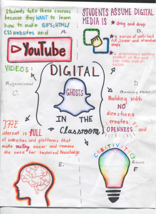
I would like to inform you that I did study the article “Digital Ghosts in the class room” by Ashley Hinck. I made a sketch note with key points.

  1. YouTube, GIF, HTMW, and CSS:  Students needs to know how to make GIFs, YouTube videos, and HTML, CSS websites. They are used to make funny photo shopped pictures of their friends and capable to make personalized GIFs. They are used to get digital skills as increasingly important for jobs, both summer internships and careers after graduation. Students enter their class convinced that what they will learn to do will be useful in their professional and personal lives. Students assume their ideas in digital media: i) drag-and-drop, ii) a master of well-laid out, linear, and standard steps and iii) personal information, guaranteed working product etc.
Related image
  1. Digital Multi-Media: Usually, template websites and platforms are the new worksheet. Students might shift to a more critical digital pedagogy by leaving those template websites and platforms behind. They might turn instead to technologies that enable and privilege openness and experimentation, like Raspberry Pi, Scratch, and HTML and CSS etc. They can trade more-flexible image manipulation software like Photoshop, videos. Resources help to students draw on their past experience of both school and their digital worlds. The ghosts of worksheets, templates, and shortcut websites linger on, hovering over their learning as well as teaching.
Image result for digital multi media images
  1. Professional Ideas:  Actually, students’ assumptions about education and digital media making aren’t panning out because they can see the frustration that experience. The frustration in their faces, and they hear their frustration on their course evaluations. It creates frustration from not getting their project working perfectly. It is a deeper frustration that their different ways of thinking.
Image may contain: 1 person
Gazi Farok
  1. Banking Model:  Students can redefine interesting learners apart from the banking concepts of education, ideas to give them explicit permission to try and fail and revise. In addition, they can share critiques of school culture with pedagogical choices. They are making clear the vision for learning and embrace. This movement toward trial-and-error and tinkering. Students have more of their own failures and enacted and demonstrated the tinkerer, trial-and-error approach explicitly, attitudes. During every class for two weeks, they set aside 15 minutes of class time for students to troubleshoot with partners. This helped students to see their projects as works in progress, proposal to maintain troubleshooting.
Image result for Banking model images
  1. Technological Knowledge (Internet etc): The internet is full of websites and platforms that make easier and introduce the need for technical knowledge. Google, apps provide pre-made themes for slideshow presentations, taking away the need for the user to make choices about font, color, and placement. GIPHY allows internet users to create GIFs using only YouTube URLs. WIX uses a survey to learn about a user’s aesthetic style before recommending themes for a homepage built through drag-and-drop sections.
Image result for technological knowledge images
  1. Creativity School and Traditional Culture: As critical digital pedagogues, students have to find ways to help students as makers, creators, speakers. They have to help themselves by using shortcut template platforms and websites. Actually they have shortcut template platforms and websites as models. Students should not have to settle for half-hearted, structured participation. They can become full, active, empowered participants. Students make possibilities beyond the exact outcome prescribed by creativity, template platforms, websites and their corresponding worksheets. Students needs to keep plugging away at disturbing the assumptions. They can use those resources in their working place. An urgently-needed ‘ontological turn’ in higher education is a greater concern. It is a concept of relation to teaching, learning, and nurturing in students of the ability of intellectual uncertainty and inventing new ideas as creative schools.

I carried out this assignment on banking concept for financial information, knowledge of technology as a platform to update for internet and relative websites information. Creative school and traditional cultures had significant impact on digital ghost ideas. Multi media had a series of product based influences for personal risk and that market was natural. YouTube, Videos, GIF, HTMW, CSS were the updated software to get information as social media. Finally, professional knowledge could incorporate all of those ideas in practical aspects.

Image result for gif images

Are Teachers Taking Enough Risks?

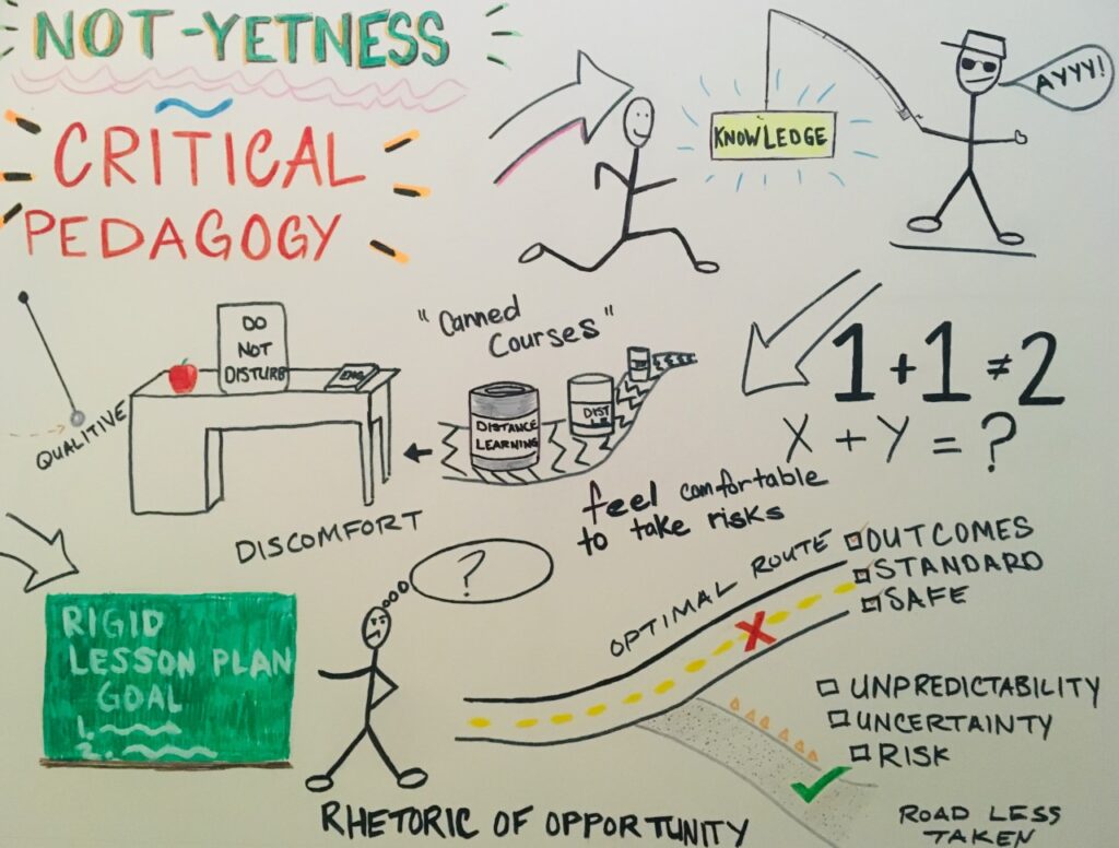
While listening to the podcast between Chris Friend and Amy Collier I created this sketch-note. The podcast discusses the options educators can take with students and their approach for self-knowledge. Collier discusses the idea of “Not-Yetness”, which is the notion of finding comfort in not knowing and not having everything perfectly ordered, and she believes this to be closely related to critical pedagogy. I represented this in the sketch-note with the running stick figure trying to grasp knowledge.

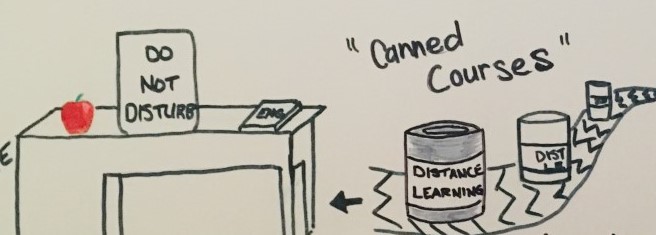
Collier then goes on to say that teachers staying in their comfort zone may be prone to becoming restricted or limited which may lead to the teacher transforming into “an enhanced grader.” She refers to this as the “canned course” model and cautions educators to be aware and urges educators to take risks.

So how can we avoid being the distant teacher who simply grades a paper? Or, how can we avoid embedding into the student’s mind that education is a clear-cut, right or wrong process?

Simple. Get comfortable with being uncomfortable.

The risk may be high but the reward is greater and I think some teachers can benefit with this mindset. Listening to Collier, I realized I can succeed even if I don’t have all the answers as long as I keep trying to find new ways to engage with my students and adapt to the constantly-changing classroom

For this multimedia reflection, I wanted to try something new. Throughout my undergrad degree I was accustomed to writing papers and I initially wanted to complete a Twitter essay but I was attracted to the idea of a Sketch-note. After seeing a few examples online I decided this was the best method for me to represent my response to the podcast. While listening to the podcast it was easy to draw/ write the ideas I heard. I’m not much of an artist but I feel this sketch-note was a good way to get out of my comfort zone. Hopefully you can relate, thanks for reading!