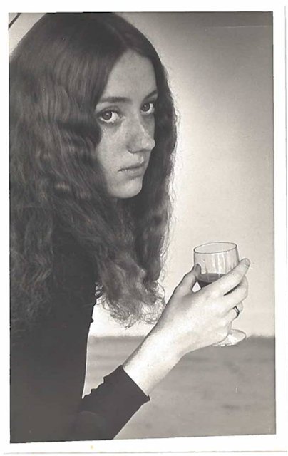
Found Portrait: Donna, my father’s first wife
Find a portrait, wait for further instruction.
That is how my first assignment began. Definitely intriguing. My portrait search began with local Value Villages and vintage shops, which I quickly exhausted. I then turned to our family’s collection of photographs, a particular one in mind.
When I was a child, while perusing through old photos of my parents, I found a black and white picture of a woman. This woman turned out to be my father’s first wife, Donna. This discovery rocked me, as all the secrets of my dad’s past tend to do. Adding to the mystery, while she and my father were separated, she died in a tragic logging accident. So my father was now a widower… a widower!
As you can imagine, I didn’t soon forget the image so it was naturally my first choice. I just needed to find it again. Ten hours later, I had it in my hands. Thank God I found it, the photo possessed me so that I’m not sure I could have changed directions at that point.
Transform the found portrait using shape and colour.
This, as it turned out, would prove difficult. The feelings I wanted to convey, of mystery, of tenderness, with an overall disconcerting air, didn’t seem to fit with the bright, geometric visions I initially saw when I thought of shape and colour. I fell back on my experience in watercolours. I created a dreamlike landscape inspired by the Prairies, where they were originally from. Then I made her a wedding dress, styled after 1970s trends, like she would have worn. I gave her her auburn hair and her green eyes. And so my ghost became incarnated.
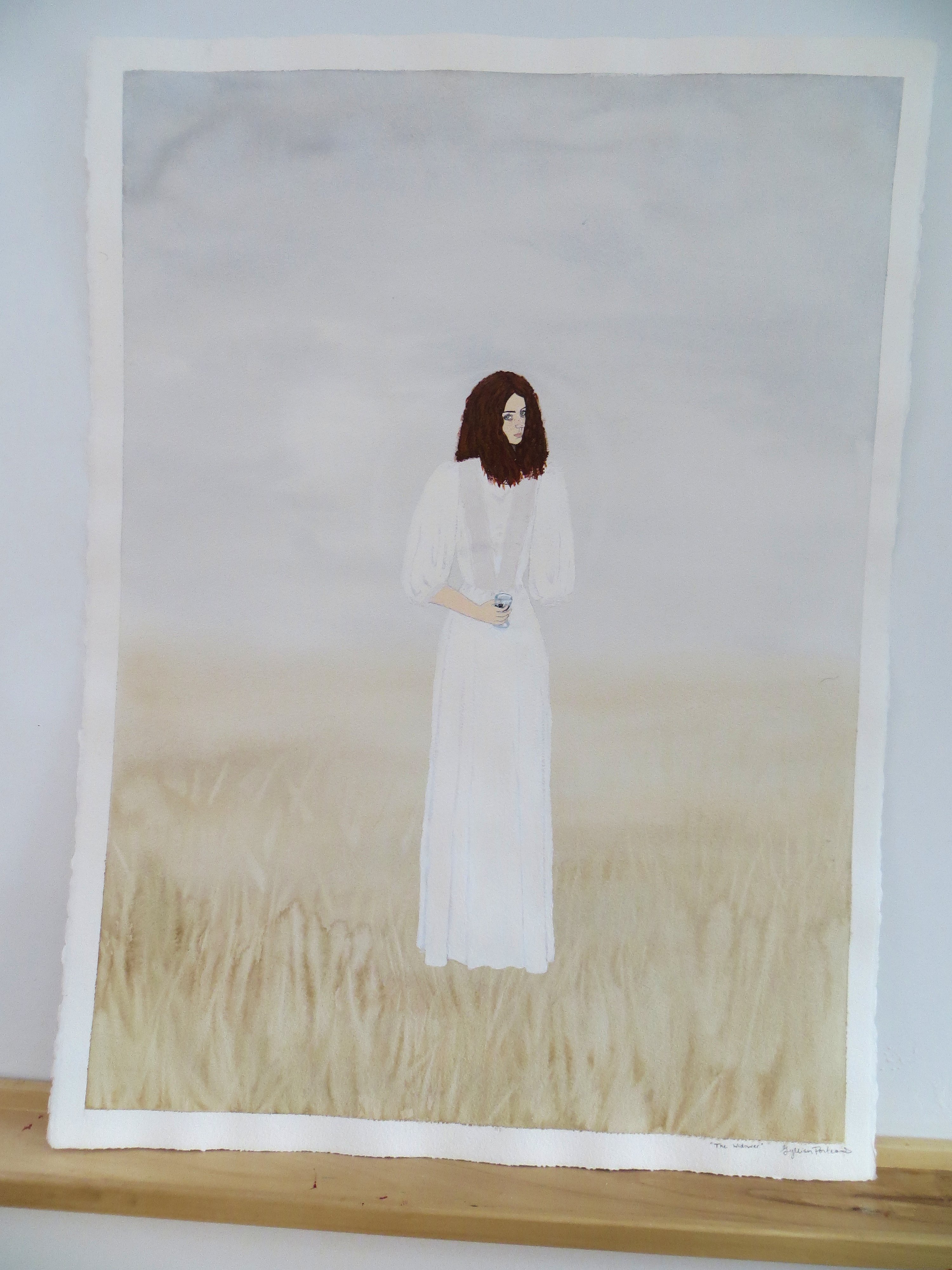
The Widower: Transformed Portrait
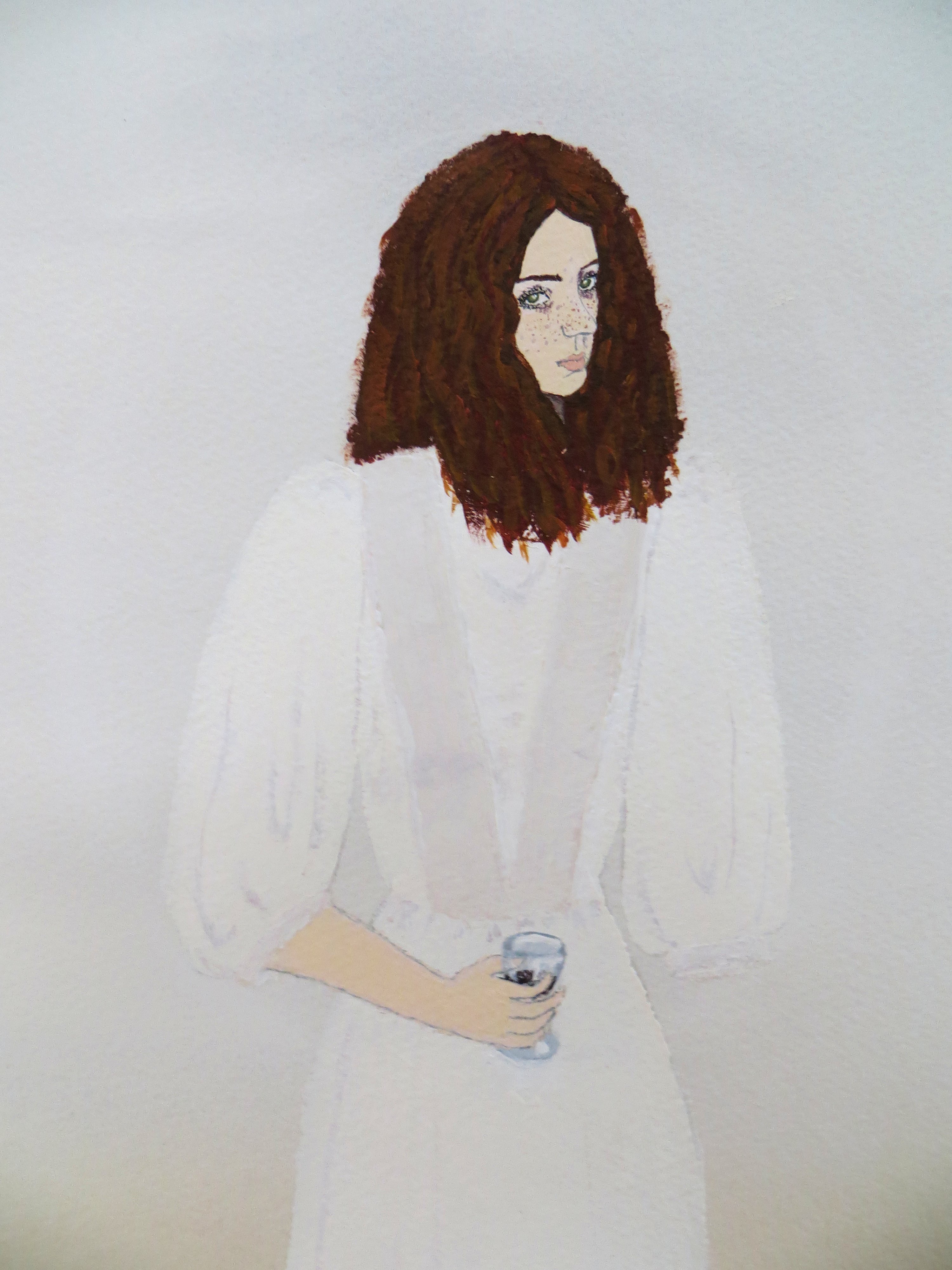
Close Up