Having once been a preteen girl, I have a little experience with collage. True, my previous works may have focused on cutting out pictures of Tom Welling from my YM magazines but, in my defense, I may have inspired Pinterest with the vigor with which I filled my journals with cut-outs of my dream wardrobe.

Cover of YM from 2004
Ten years later, I am participating in a collage party for my Studio Arts course at the University of Windsor and though my materials have changed (Beautiful British Columbia and Chatelaine magazines), my enthusiasm has not waned.
Our focus is colour: how contrasting colours interact, how you can deliver your point using the psychology of colour and how best to manipulate colour in your artwork. Before our party, we learned about past masters of colour, Johannes Itten and Josef Albers. Challenged to create my own studies of the interaction of colour in the style of Albers using magazine clippings, I was thrilled to observe my tiny quadrangles transformed into optical illusions.
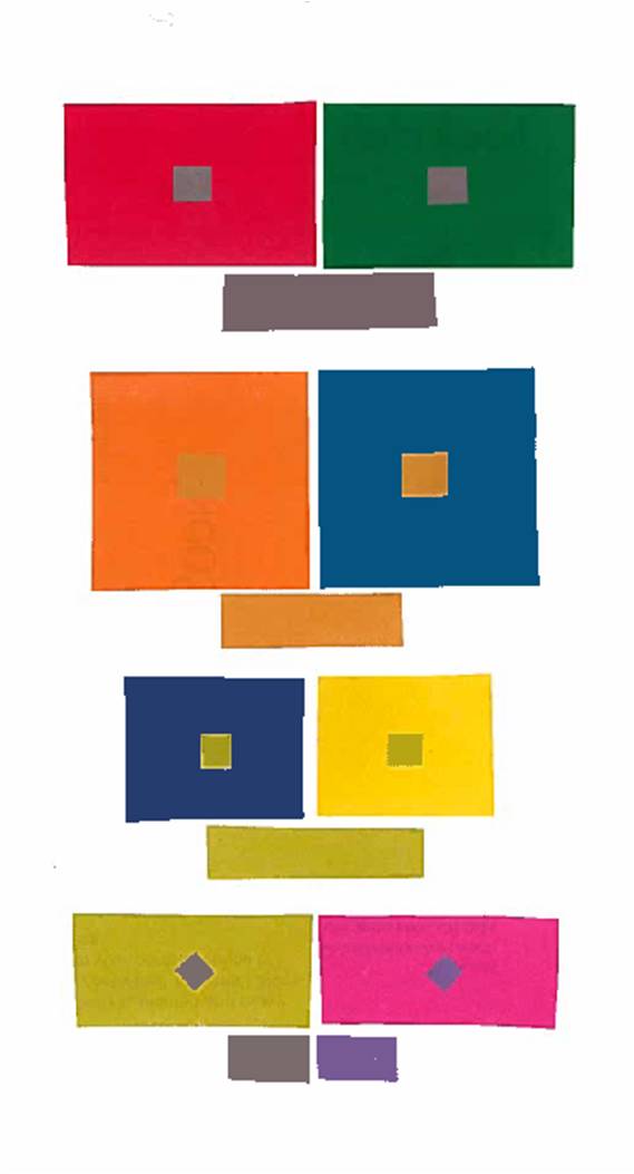
Interaction of Colour: How contrasting colour fields can transform how the eye perceives colour
Note how the smaller squares of colour appear cooler, as if receding, when placed on the red, orange or yellow fields, and warmer, as if coming forward, when placed on the green or blue colour fields. This is due to fatigue of the human eye, which copes by applying the contrasting colour (the colour opposite on the colour wheel to the larger colour field employed) to the smaller square. This is further demonstrated by the last pairing wherein two different colours, grey and purple, appear to be the same colour due to the red tone the eye imposes on the grey square and the green tone it applies to the purple.
Now that I am finished nerding out over Albers’ colour theory, we moved on to the creation of ironic collage! What is ironic collage? (Don’t ask Alanis). It is collage wherein you use contrasting colours to convey an ironic message through the psychology of colours.
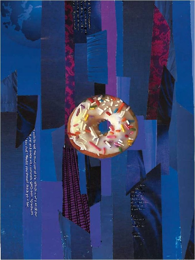
The Royal Pastry
Now I recognize that the irony in my work may not be the-nose-on-your-face style of obvious, but hear me out. I am using royal purple to contrast the overall yellow-orange colour of the mundane, humble doughnut. You see, all the pomp and circumstance of the ruling class for a mass-produced, sprinkle-covered delite! But I have digressed.
Back to the collage party: the day-of, arms loaded with magazines, my class and I began hunting through the glossy pages, tearing out treasures and cutting 3×3 cm squares from our booty. After experimenting with levels of control over our work (accepting additions from our neighbours), I came away with one piece I truly love. The fact that it is the sole piece over which I had complete control, not entirely sure what that says of me, but hey, I’m still learning. Clearly, I just need more collage parties in my future.
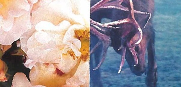
Love and War