This semester, my aptly-named studio arts class, Image, has seriously broadened my range as an artist, going from painting watercolour landscapes to experimenting with photography and relief. I have been thoroughly removed from my prior comfort zone (sometimes against my will) and discovered new and exciting territory. I truly thought that my horizons could not be further expanded, until I was introduced to our altermodern project. Really, I should have known.
We were challenged to create a piece of performance or installation art, a work that transcends gallery walls, inserts itself into the daily life of the public, and reimagines how and where art can be experienced. The idea of having to expose myself in such a way and in a public space was terrifying. I’ve been playing with concepts of vulnerability in my art over the last 3 months but this was a whole new level.
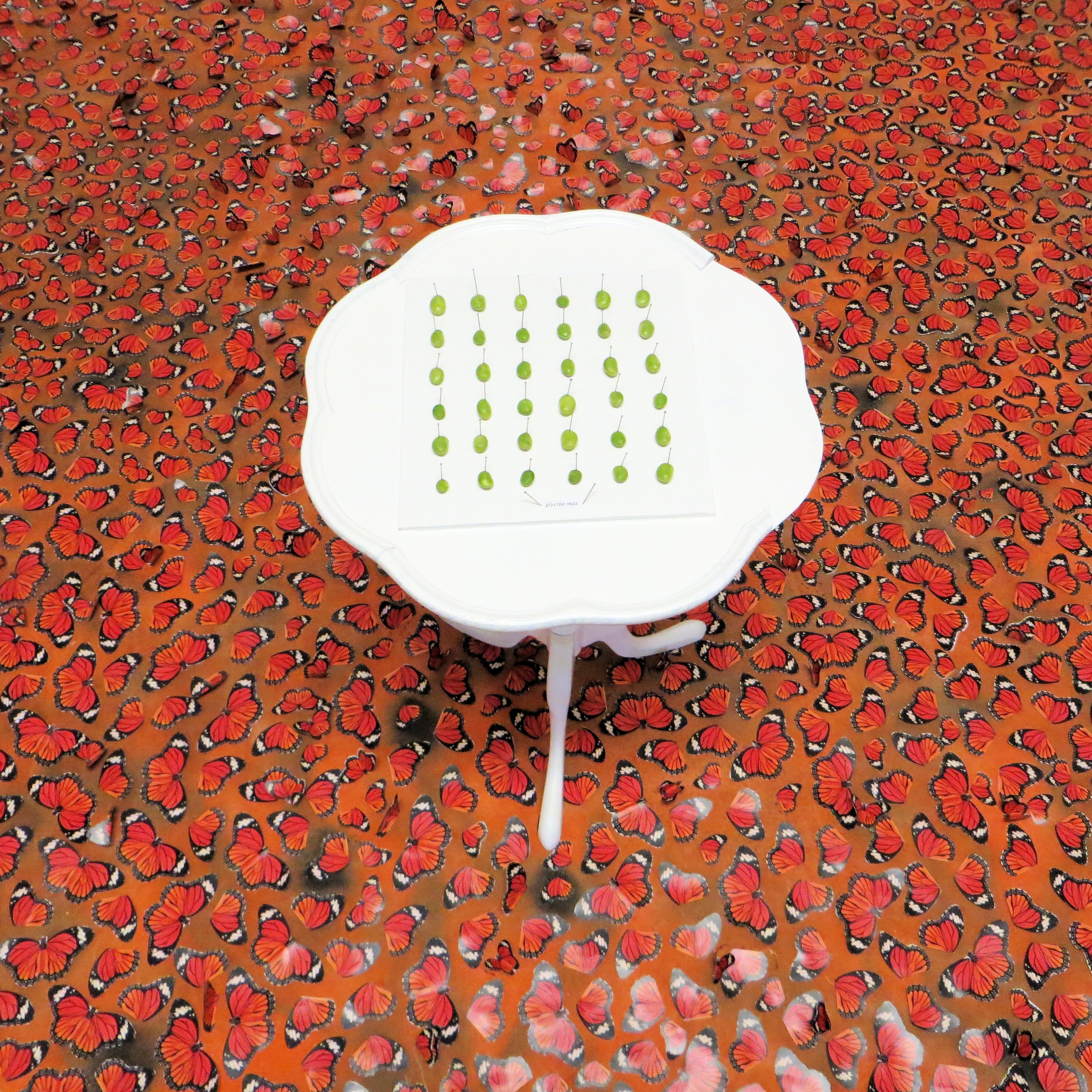
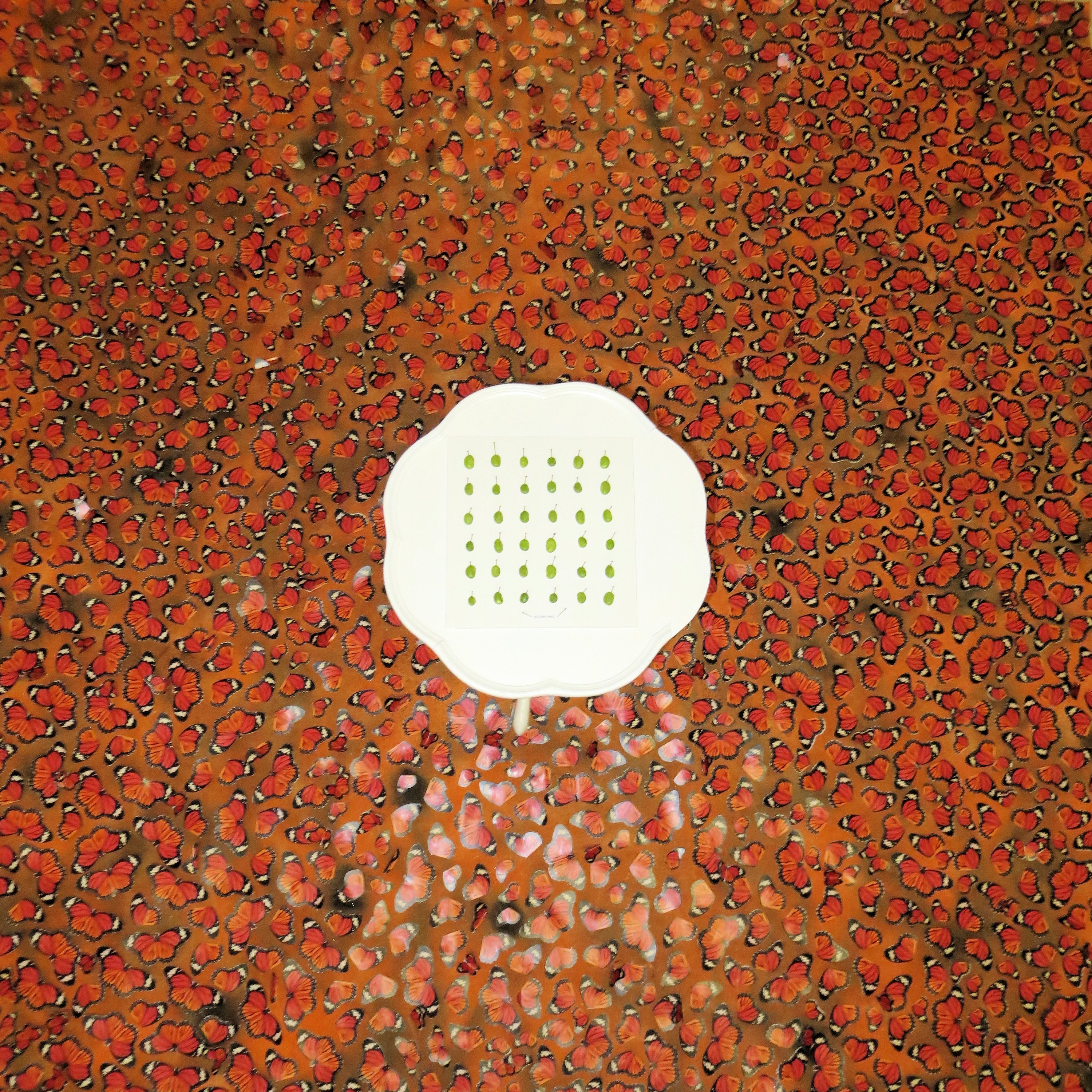
Sent out into the city to find inspiration, I was drawn to Windsor’s empty lots, displays of fake flowers in window boxes, statuary of wild life and the weather itself, our belated spring. I looked at how we as humans try to control our natural environments and the creatures living within and how we, in turn, fail to do so. Those empty lots in particular struck me as wasted space, space that could be actually employed to rehabilitate endangered species like the monarch butterfly. I had something there, what’s more vulnerable than a butterfly?
Drawing inspiration from Ai Weiwei’s sunflower seeds piece, I wanted to create a large scale field of colour and I wanted to make people feel uncomfortable, to feel vulnerable and uncertain. I printed and hand-cut hundreds of monarch butterflies, attached them to a 6×6 ft canvas. I put a white pedestal table at the centre of it with a display of soy beans, one of the crops which has led to the elimination of milkweed, the food of monarch caterpillars. Presentation of the bean was intended as a reversal of roles, displayed as butterflies are in museums, pinned in place, while the butterflies are relegated to the floor. Moreover, I wanted people to have to stand on the 3D raised butterflies to be able to observe the display. I wanted people to feel uncomfortable about stepping on the butterflies, I wanted them to wince upon hearing the crunch of the wings under their shoes. It was thrilling to me that this was exactly the reaction experienced by the viewer.
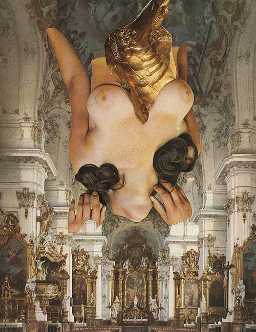
His collection, Hexen, is gruesome, gory, dark, opulent, vibrant, explicit, surreal, sexually perverse, disturbing, unnerving and unsettling, and consequently brilliant.
Whether or not these collage masterpieces can technically be classified as portraiture is open to debate (do bare breasts count as distinguishable features of one’s likeness?). But classifications seem trivial when such truly provocativeart is happening.
I feel that Honarvar’s work has the seductive appeal of bygone side-shows. He takes the taboo (nudity, sex and female masturbation) and the grotesque (amputated body parts, skulls and bloody innards) and mixes it with religious scenery, Baroque gilding, weaponry and flora/fauna. The contrast is intriguing and the juxtaposition leaves me with a feeling of both being drawn to further examine the works and wanting to look away quickly. Overlooking the subject matter itself, the colours are beautiful and very visually appealing, which may even make the content more shocking.
Viewing Honarvar’s work revealed to me there is a line when it comes to graphic depictions of sex and sexual violence, and Honarvar not only crosses my line but leaps across it with a phallic pole.
The vaginal penetration of The Examination, obscured by dog cut-outs, is too much for me. As a viewer, I found it too blatant. It lacks the mystery of his other collages. There is also some disturbing imagery of weeping women that I find deeply upsetting, stomach-churning even. It does cause a reaction, mine just happens to be one of rejection. I just don’t want to look at it. It’s not for me. I can’t attribute my distaste to purely a dislike of art depicting violence against women, because I do find the work of Kara Walker, for example, very significant. I think it is in part due the inclusion of the women’s faces; it feels more real and incites greater empathy. In fact, there is something cold, even clinical about the presentation of these images, lacking in the sensuality and romance one might expect or seek from art of a sexual nature. I feel very detached from the pieces though nonetheless curious.
There’s no doubt that my response to H’s work is complex and often contradictory in nature. I find his collages very exciting and his body of work is extensive. Galleries upon galleries of deeply, darkly, disturbing yet beguiling collages. So enjoy (but only if you’re 18+)!
When searching for photo-conceptual portraiture on the internet, the overwhelming majority of material one finds falls into one of two categories: ethereally-posed, partially-nude dancers with perfect faces, or close-ups of extremely wizened faces. I like to think of it as Beauty Alternatives 1 & 2.
This gets redundant and derivative rapidly. However, it does make the interesting and original work stand apart. Torn between two artists, I have chosen to address them both to the best of my abilities.
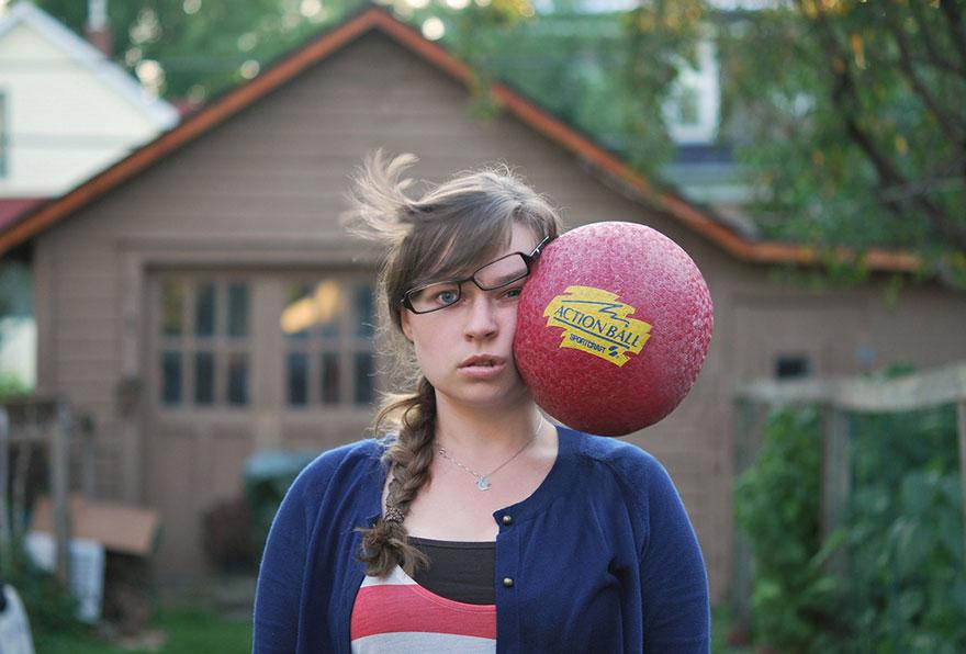
In part 1, we have Kaija Straumanis and her series aptly entitled “Head Shots”. I was initially drawn to them because they are not pretty, at least not in the boring made-over/manufactured sense. Secondly, I found them they are funny – or so I thought upon my first viewing.
The series is comprised of self-portraits of the artist in seemingly average places and poses which are made exceptional by the various objects colliding with her head. In most of the photos, she stares straight into camera, and in all the portraits, her face is neutral. It is the one picture in which the artist was not smiling that led me to question whether or not I should find the photos all that amusing.
First of all, props to her for being able to hold her head still while blunt objects sail at her face, repeatedly. I can see in my mind’s eye the slow motion smoosh as the ball makes contact, hear the sharp ping, feel the sting of the textured plastic. In fact, probably anyone who survived North American school systems can commiserate, having all been forced to take gym and consequently participate in a game of dodgeball. I feel like that is why this image is so successful. It is nostalgic and empathetic, while doling out a huge hit of schadenfreude.
The rest of the images follow this trend, strawberries sail, boots fly and Easter eggs float, all to my amused chuckling. That is until I viewed an image of Kaija being struck on the brow with the spine of a book. She grimaces, her arms tensed and for the first time, the viewer gets the sense she is actually experiencing pain. In the other images, we get the impression that gravity has stopped and time frozen, lending a surreal element to the photos. In contrast, this photo felt real. It made me uncomfortable and it made me wonder for the first time, who was throwing these things at her and why? It made me go back and rethink my previous impressions. The glass breaking across her face wasn’t so funny anymore, nor the glass scraper.
In brief, prolonged examination of Kaija’s work suggests that the initial impression of comedy and wonder that struck me upon viewing her portraits, is only a part of her intended message. Perhaps, she also sought to provoke a secondary reaction which questions what we find funny, causing us rethink our views on violence. I think as a whole, the series is highly successful, and when viewed from dodgeball to book, the increasing sense of concern I feel for her delivers a very important message on physical abuse.
There is a lot of art I love. I mean really, having studied art history, this should go without saying. However, choosing a portrait that inspires you, is a very different thing.
For myself, I feel like inspiration should be something that draws me out, that leads me to create something new, to use different media, different methods. I love colour and tend towards an illustrative style. Watercolour has always been my preferred medium. So, to find an inspirational portrait in the vastness of the web-verse, I began with black and white photography. This is the piece that caught my attention and held it.
Gravity by Vladimir Perfanov (500px.com)
I love the movement in this piece. I love its grainy quality, its grit.
The photo, Gravity, was taken by Vladimir Perfanov and I find all aspects of the work inspirational. The subject material is so simple and raw, it hasn’t been overcomplicated in any way. It portrays sensuality and passion. Sex without being overtly graphic. It’s a topic I generally avoid, probably from my youth and lack of life experience.
Altogether the piece inspires me to experiment with new media and new subject matter. Perfanov’s work shows me that subtle imagery can better express a message than a piece that is overworked and explicit. Romantic and real, what I’d like to see in my own work.
Choose a passage from a fiction novel wherein the portrait of a character is described. Wait for further instructions.
At this point in time, I’m pretty well adjusted to choosing a source of inspiration before knowing the criteria for an assignment. It’s all about the gut. You think of an idea, something deep in your core shifts, the idea is settled upon, and then you hope for the best. I initially considered something from Jane Eyre or Cat’s Cradle, possibly my two favourite books of all time, but I decided I might be too emotionally attached to them to be open to all the possibilities of expression. As it turned out, this was a very good choice.
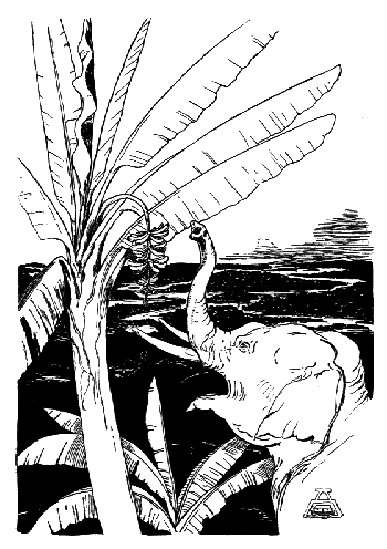
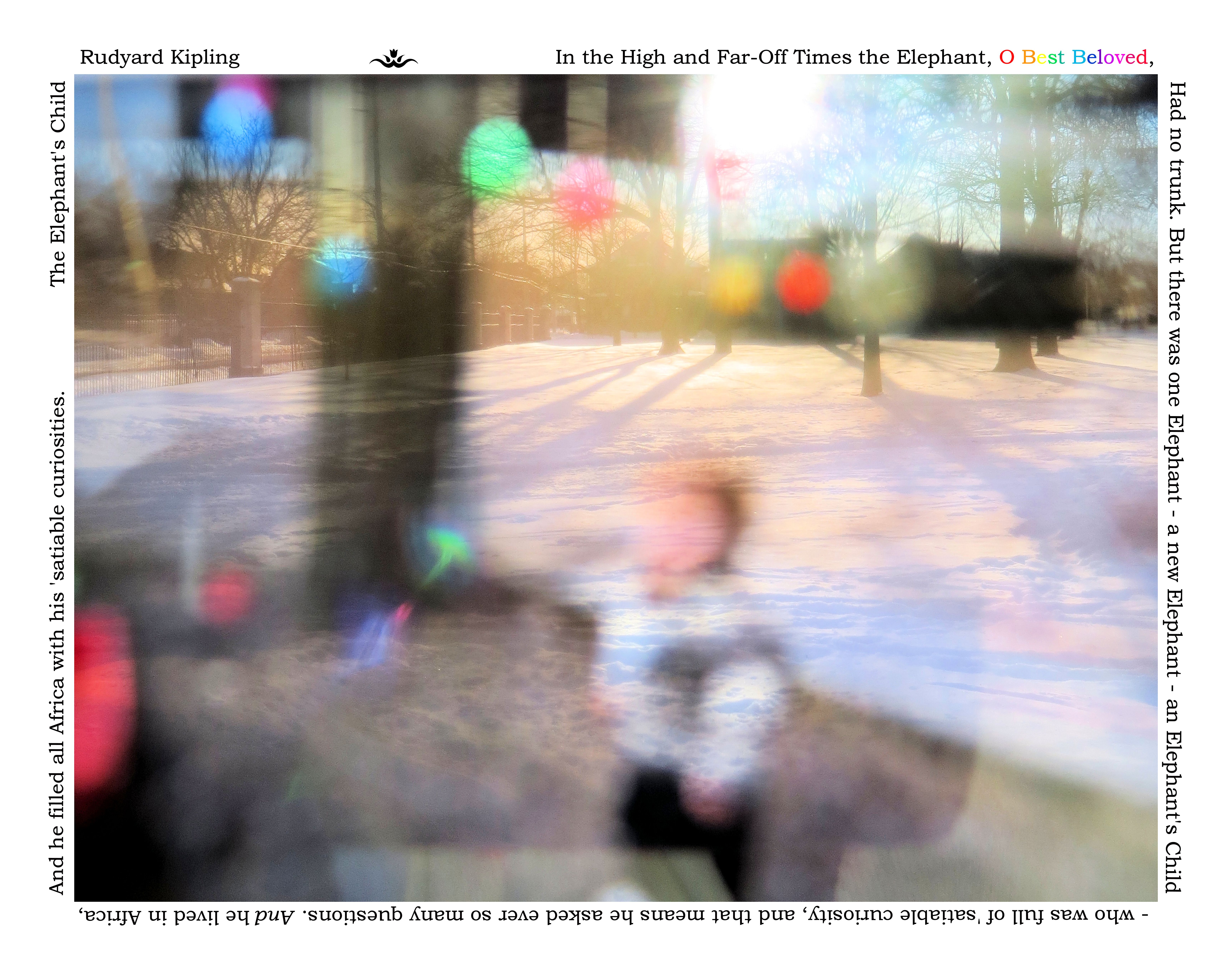
My next choice, and the one I would settle upon, was Rudyard Kipling’s The Just So Stories. Kipling is best known for having written TheJungle Book but also among his collection of works, is a book of comical fables, telling the origins of things like the Leopard’s spots or the Rhinoceros’ wrinkles. These are the Just So Stories. For those of you who have never read the book, the Just So Stories are beautiful little pieces of literature, filled with childlike humour and absurd phenomena (like the Rhino’s ability to remove his skin) that speak to the wondrous, magical way in which we understand the world as children. Kipling addresses his stories to “O Best Beloved” which added a bitter tenderness to the book (Kipling, who lost his daughter Josephine to pneumonia, is thought to have been referring to her).
The passage I chose was from The Elephant’s Child, the story that tells us how the elephant got its trunk. In it, Kipling repetitively refers to the ” ‘satiable curiosities” of the Elephant’s Child, the Elephant whose endless questions lead him to the edge of the Limpopo River and his nose to the mouth of the Crocodile. It was the tenderness of parental love, and the childlike wonder and curiosity that lead me to this passage:
“In the High and Far-Off Times the Elephant, O Best Beloved, had no trunk. He had only a blackish, bulgy nose, as big as a boot, that he could wriggle about from side to side; but he couldn’t pick up things with it. But there was one Elephant–a new Elephant–an Elephant’s Child–who was full of ‘satiable curiosity, and that means he asked ever so many questions. And he lived in Africa, and he filled all Africa with his ‘satiable curiosities.”
Illustration from The Elephant’s Child – by Rudyard Kipling
Convey your chosen passage through conceptual photography without illustrating it.
What is conceptual art? Well you’re going to have to Google it yourself because I am not taking that on. Basically what you need to know is that all things elephant were out. I put away the plastic elephant figurines and the plush elephant puppet from my childhood and started a new.
When in doubt, dig through the basement. This has become my new modus operandi. There I came upon our family’s old collection of slides. In the past, if you wanted to preview your pictures before printing them, you had them made into slides. You also did this if you wanted to bore regale your family with photos from your travels. We have slides from my aunt’s 1960s tour of Europe, pictures of my parents from the 1970s and 80s and a small collection from my childhood. But I have digressed.
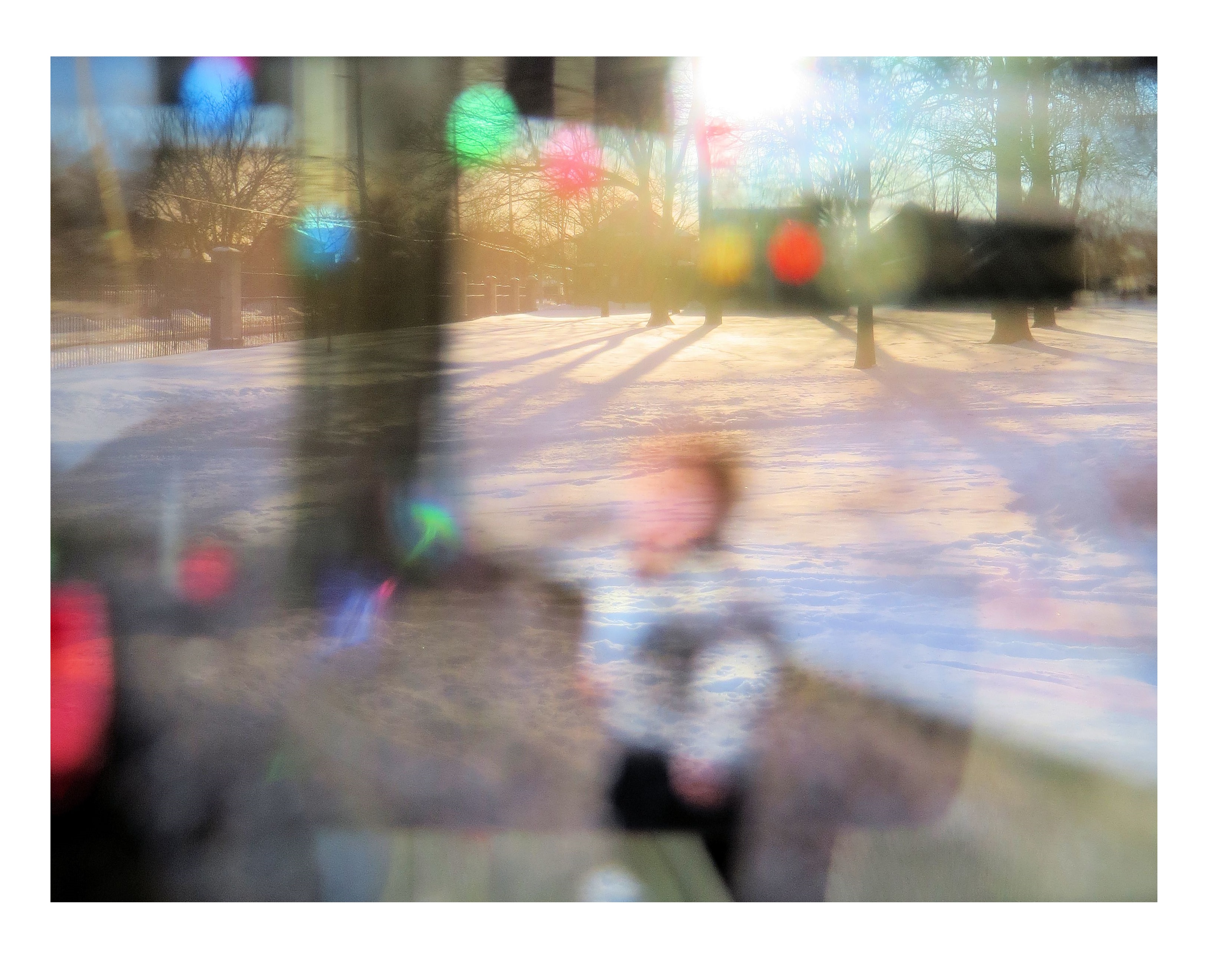
On a whim, I took a quick shot of my dinning room with a slide pressed against my camera lens. Lo and behold, I liked the effect, a lot! It had an otherworldly quality that gave me the nostalgic feel I was going for.
I headed for a local park with my selection of slides, most of my brother and I as toddlers, playing outside our old house. Out of the multitude of photos, a number appealed to me but, under the guidance of my teacher, I narrowed it down to one.
I learned a very important lesson from this project that I would like to share: if you are showing a series of pieces, each should bring a new element to the overall work. There is no point to showing a series of three images if they all make the same point, it just muddies the message.
The slide I used for my final piece is of my younger brother, at around the age of 18 months, at Easter time, standing in our front yard, with plastic eggs hanging from the tree above. I particularly love the bright colours and the weblike branches of the trees from the background.
First submission for the conceptual photography project
I included the quote around the exterior due to the attachment I’d developed to the passage, specifically ‘O Best Beloved’. I twisted it around the image because I found it playful and wanted to force my viewers to turn their heads about in the way a child would.
In the critique of my work, the photo was well received. My classmates like my creative approach to shooting through slides. The one criticism I did get was a general dislike of the text, that it was unnecessary, that my message was strong enough without it. Flattering but slightly frustrating. That is until my teacher suggested I include the passage in audio form. So for everyone’s viewing (and listening) pleasure, I have my completed work with optional audio.
His ‘Satiable Curiosities (narration by David Davis, originally recorded by the BBC for the Children’s Hour)
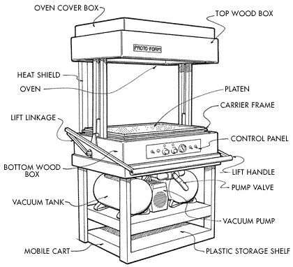
Now those of you who understand what these two words mean, you can imagine my excitement when we were offered this as an option for our second project. Those of you who don’t know what a vacuform machine is, let me catch you up.
Essentially, a vacuform machine is a marvelous contraption that allows you to replicate objects in plastic with extreme detail using the powers of heat and suction! If you’d like to better understand the intricacies of the vacuform machine, I have provided a schematic.
Vacuform Machine Diagram from build-stuff.com
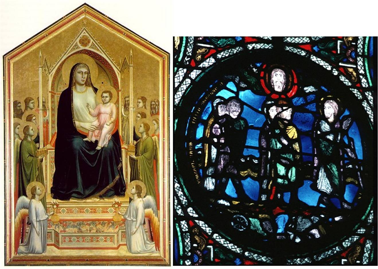
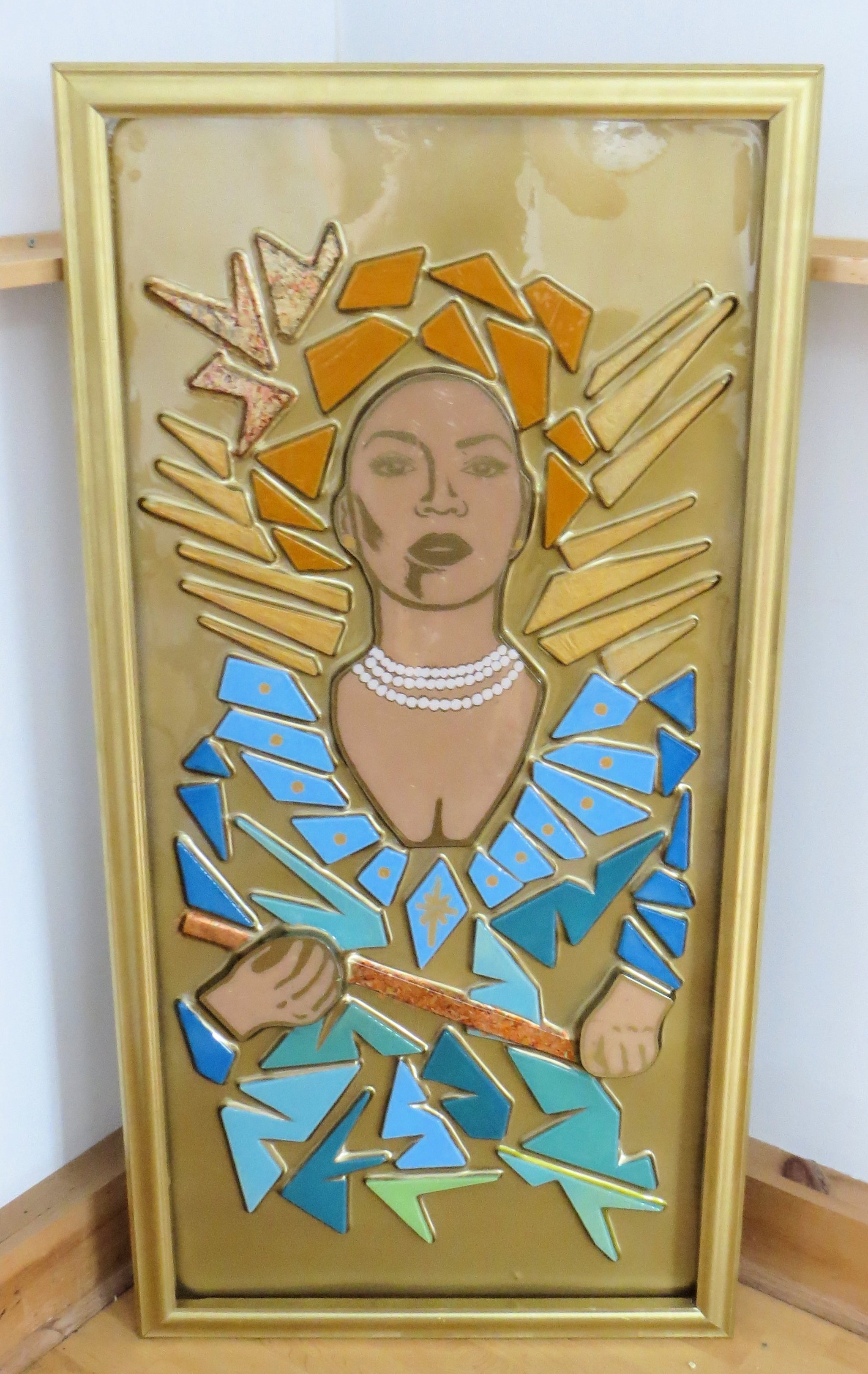
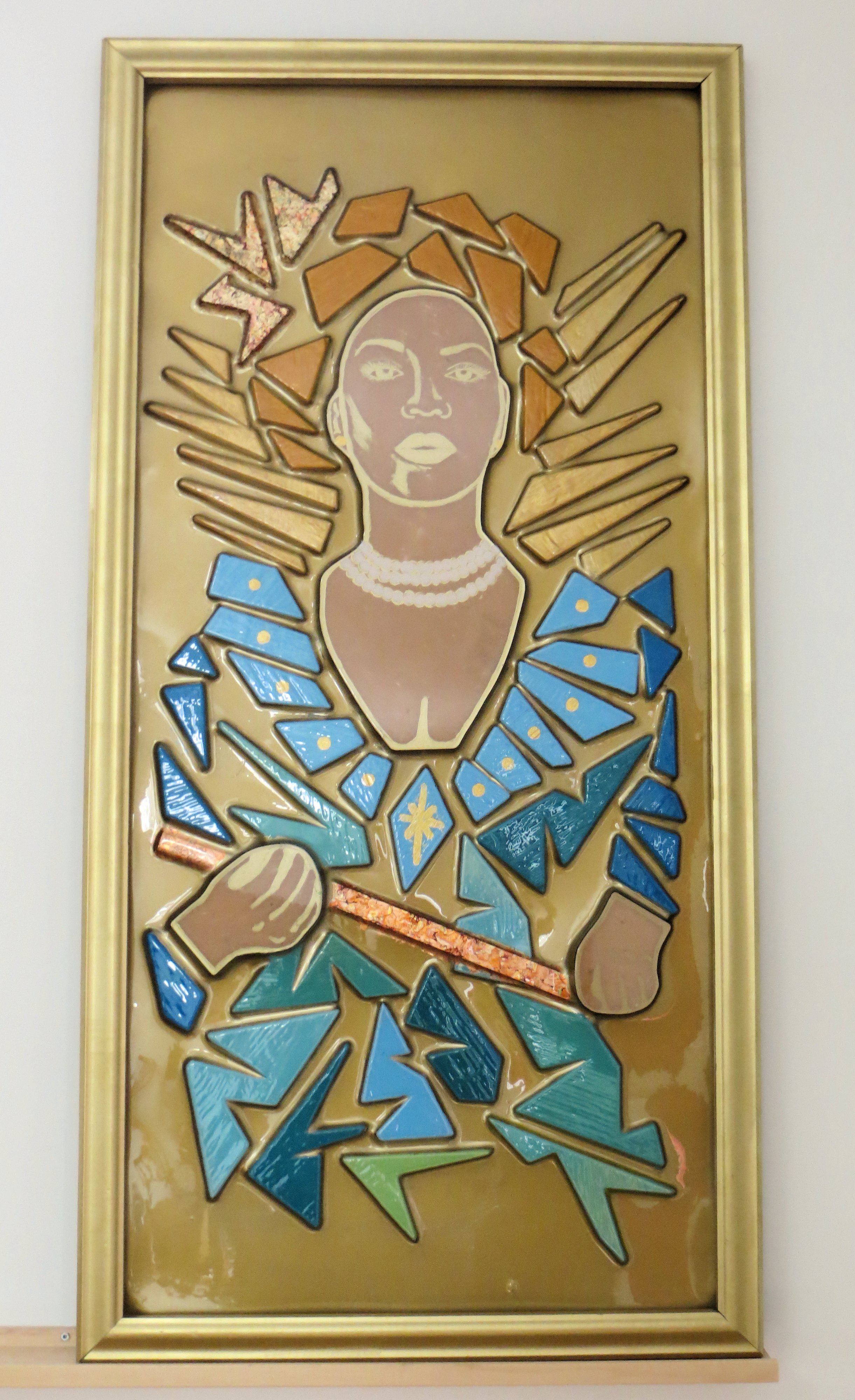
The aim of the project was to choose a nonmaterial portrait and materialize it using colour, shape and relief. Nonmaterial meaning no physical copy exists to us, a portrait we have only seen through a computer screen. This is significant: the images we see on our computers and televisions are composed of backlit pixels and so their appearance does not translate to the physical realm of print. In reality, the majority of images to which we are exposed are backlit. It got me thinking about the visual formats to which the average person would have been exposed in the past, the distant past. I came to realize that these images were also backlit, the religious icons of stained glass windows. I decided I wanted to transform a contemporary image using stained glass windows and religious icon paintings for inspiration.
Ognissanti Madonna c. 1310 by Giotto di Bondone and Pharoah crosses the Red Sea c. 1140 from St. Denis, France
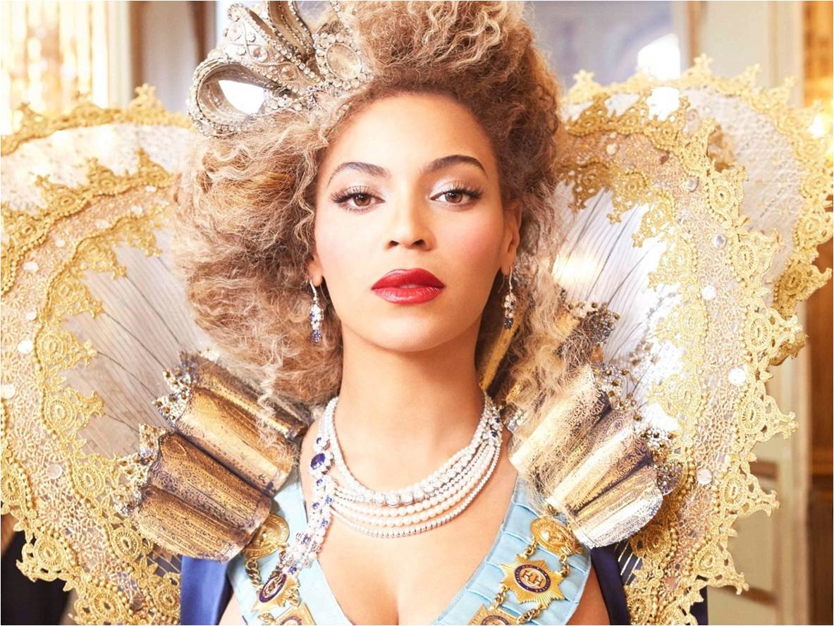
As for subject matter, I knew exactly whose portrait I wanted to transform, after all who better to make over in the style of religious icons than a modern icon.
Beyoncé: Mrs Carter Tour
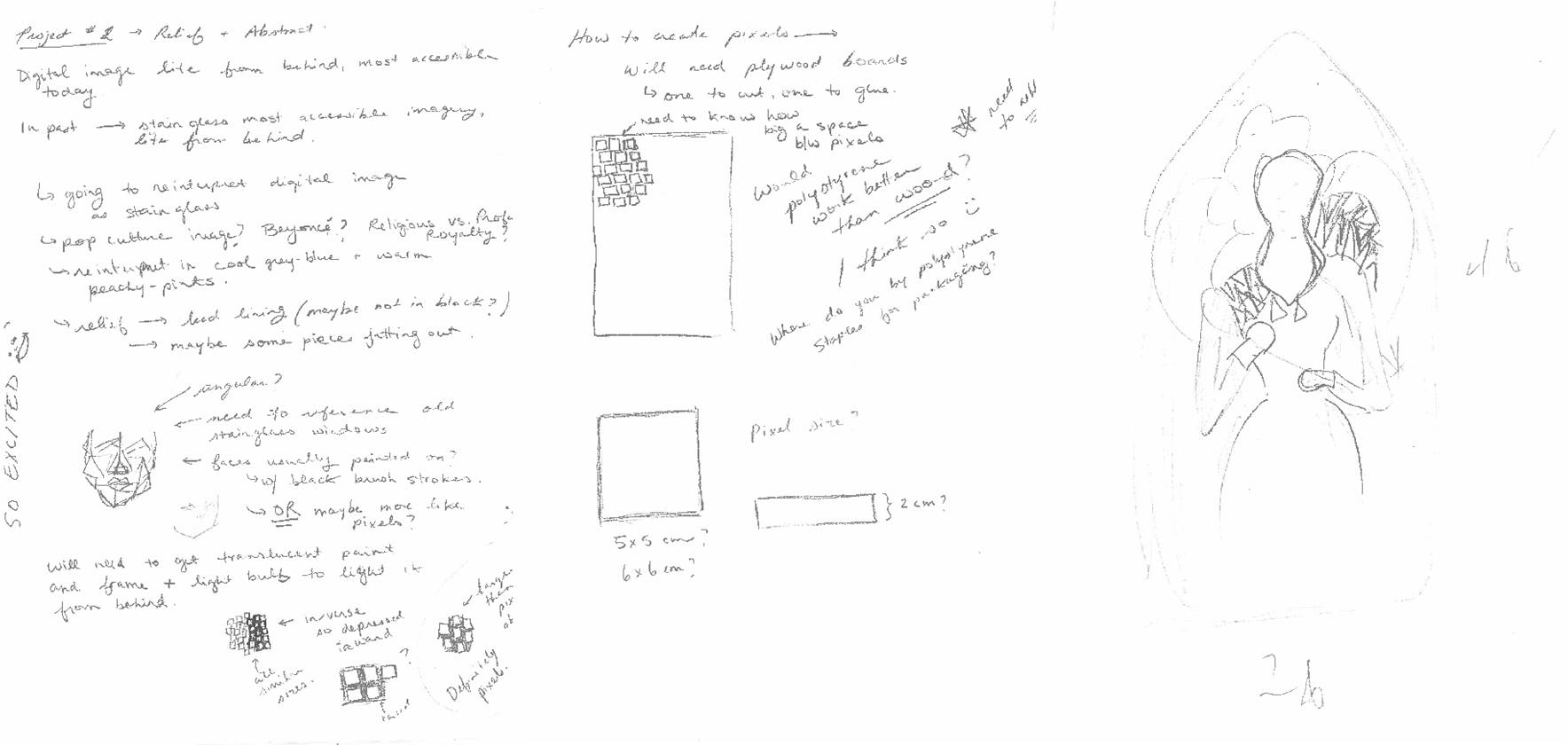
It was quite the process deciding how I actually wanted to tackle the image (some of my sketches are shown below). I had to decide on materials for making the stained glass pieces, how best to position them to still allow for the vacuum to function properly. I opted for shards of wood stolen from the scrap pile which gave a nice rippled texture to the plastic when vacuformed. I made custom pieces for the face and hands using MDF board. I was also limited in the size of the piece by the maximum size of the vacuform machine (4×2 feet).
Sketchbook: Working through my ideas for a stained glass inspired vacuform piece
I wanted to keep the palette of blues and gold. I mixed my acrylic paints with Rhoplex to give it a semi-translucent quality. All colour I applied from the back of the piece to keep with shiny surface of the plastic. I painted the fine details of the face and hands in gold and the reflectiveness makes the image changeable depending on the viewing angle. I also applied gold leaf to her crown and scepter, backing it with bole-coloured paint, another tip-of-the-hat to the past. Initially I left the background clear. I had wanted to paint it out black to mimic leaded glass but I decided that would be to heavy. After consulting with my class and holding up the piece in front of almost every shirt I own, testing out different colours, I decided to follow my teacher’s (Julie Sando) suggestion of painting it out gold. One can of spray paint later I am very pleased with the choice and feel it truly was the best option.
Yoncé: Modern Icon
Yoncé: Modern Icon
Overall I am very pleased with how the piece turned out. It has all the drama I wanted it to have. It captures the extravagant costumery of Beyoncé, to a drag queen level of over-the-top. I chose her stance to show strength, she challenges the viewer with the upward tilt of chin. Cutting through the controversy, I believe Beyoncé is a feminist, even if it’s simply for being brave enough to claim the title as her own.