Graphic Design with Millennials in Mind
This year I’ve developed something of a specialty in the department of marketing to the Millennial generation. I’ve even had the opportunity to present “Marketing to Millennials” at Michigan State University and the University of Toronto Mississauga at various student leadership conferences. I developed this expertise after beginning a job with residence services at the University of Windsor as an events and programming specialist for our 1,300 student community.
The graphic work I’ve done is extensive: I manage a team of seven staff, each producing an average of four events per month that are all branded through with the same helvetica-based look. As a hobbyist graphic designer I get to create posters, mugs, online graphics, business cards – and get paid. It’s phenomenal.
rezReal is the umbrella brand for all UWindsor residence engagement teams. When I began my job a year ago, I initiated a complete rebranding of the program. The program and each team all received new modern names, while old acronyms that had been lost in translation were phased out. Stuff corporate language was eliminated from the marketing strategy to make room for a bright, punchy new personality. The function remained the same while the marketing received a much needed makeover.
Most digital brands established in the early 2000’s were host to a smattering of clip art and bad design as a result of early and simple technology. As technology grew in sophistication, millennials – the internet generation – came of age, and the internet became a place for aesthetes and luddites alike. Millennials have carved out a niche in marketing that has some serious personality with technology to back it up.
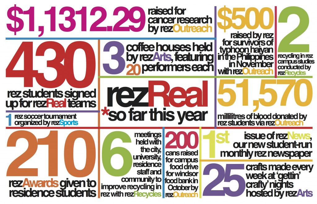
The brand I developed represents a young, inspired generation of leaders interested in building a strong community. The infographic (above) is an amalgam of the work all of my teams have achieved since September using the design strategy I developed for this brand. I used helvetica for its simple, clean lines and easily read type. Each team was assigned its own colour to create separation between the six teams. Participation is up by over 50% across the board since the reinvigoration of the ten-year-old brand. See more of my work on this project here.
